A positioning that fits a market leader in sorting solutions
Aweta is the worldwide market leader when it comes to innovative solutions for sorting and packaging fresh fruit and vegetables. But what if others in the market apply their marketing more effectively? If their story is more visible than yours? At a time when digital resources are consulted more by the customer, you cannot wait but you have to take steps. This starts with an international beating story in which everyone recognizes. Only in this way can you maintain and expand existing success.
client
Aweta
services
brand positioningbrand identitywebsite
approach
We started the process with determining the brand positioning.
Inspiring brand story
Conversations with the management and various interviews with customers and employees showed that Aweta adds the most value through a combination of the latest technology, understanding customer needs and adapting to every market. "We Add Value to Our Customers" is the starting point in everything that Aweta does. From the positioning, an inspiring brand story has been written that gives both internal and external direction and guidance.
Unique brand identity
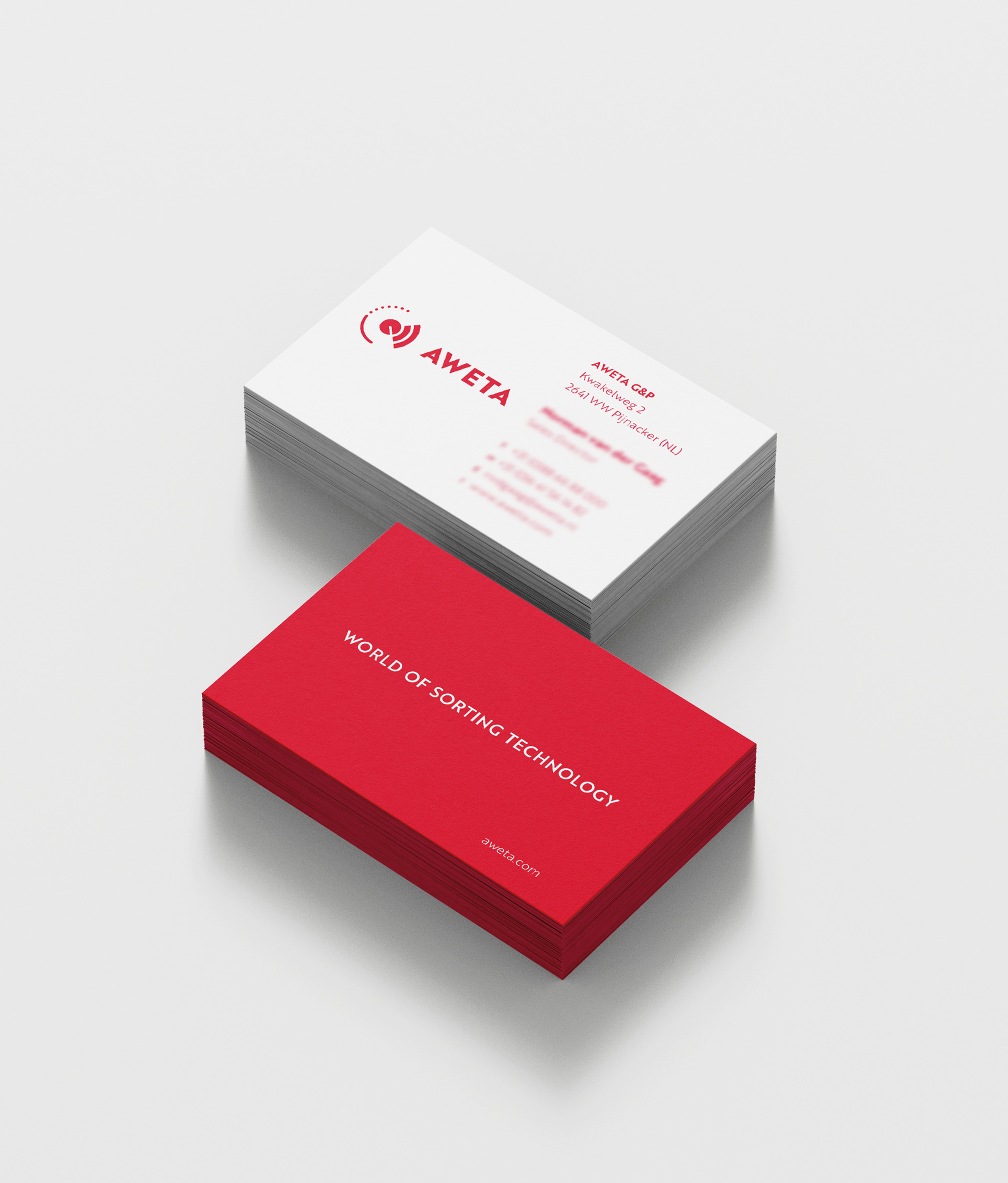
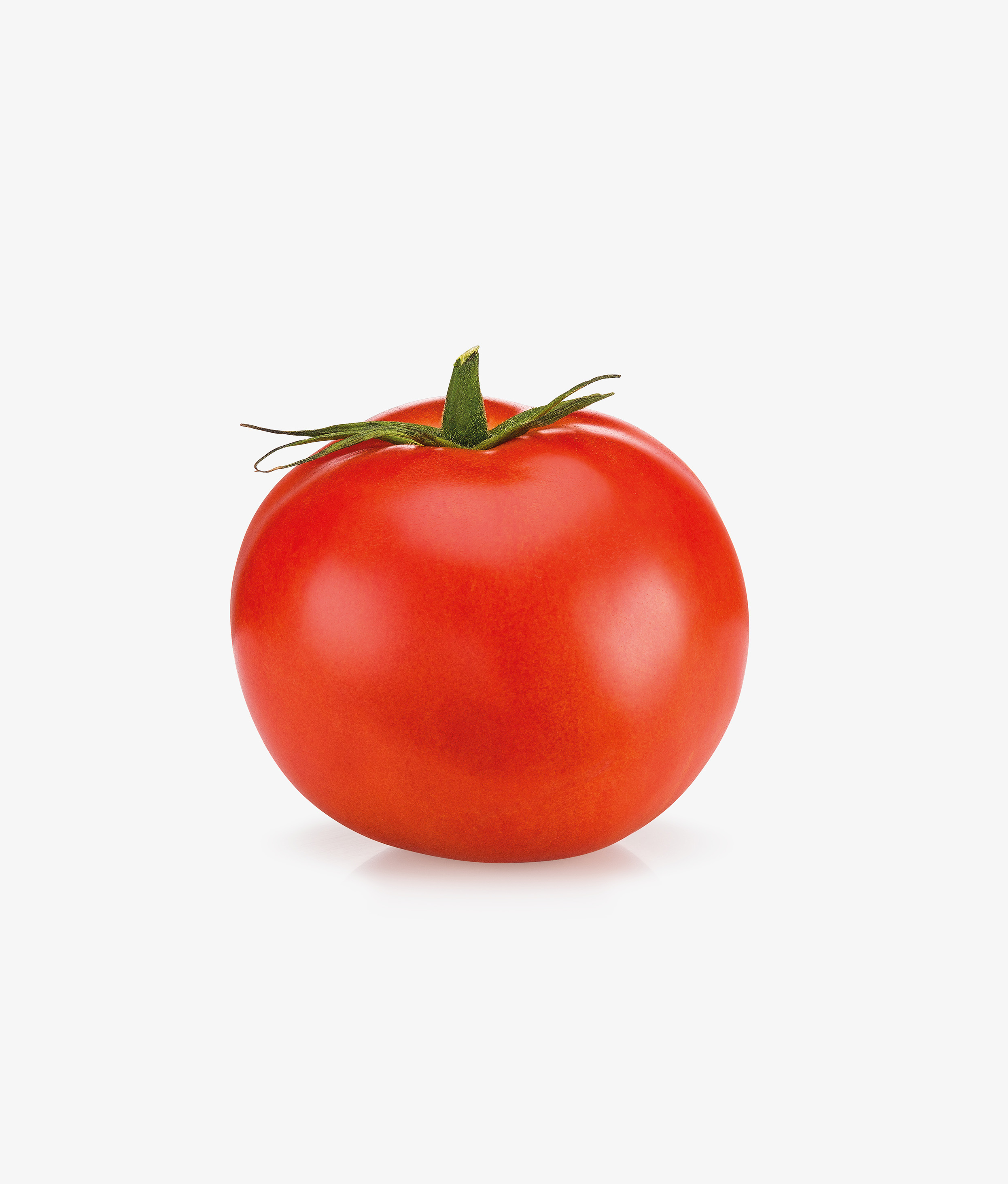
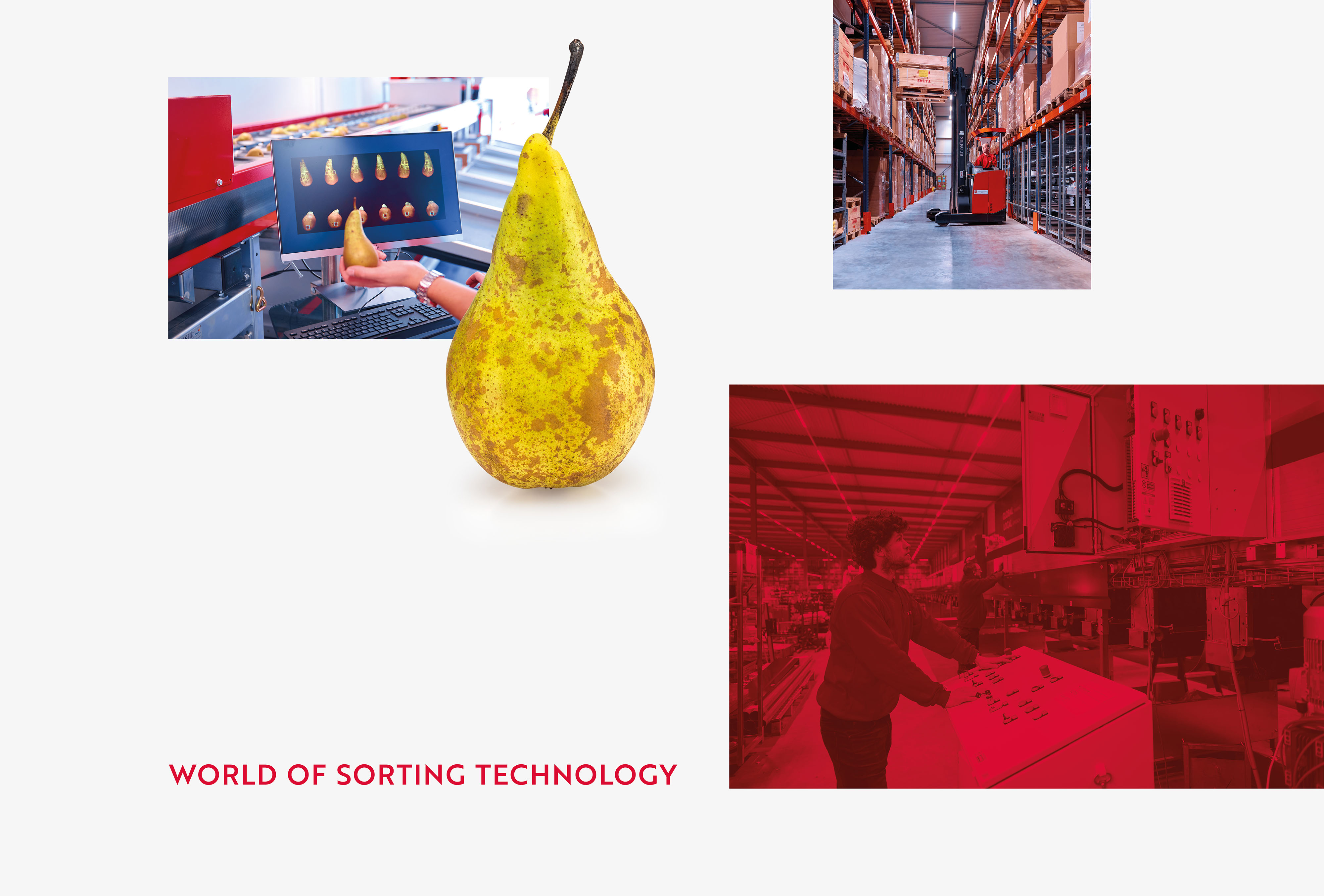
The brand positioning was then translated into a refreshed visual identity . In the logo and the visual identity we have made the characteristic red color fresher, simplified the shape language and made the font firmer. This way the recognizable elements are retained, but with a modern identity that is attractive to all target groups. The products of Aweta's customers have also been given a prominent place within the visual identity , which shows that Aweta offers solutions that are optimally tailored to customers' products.
New website and brand expressions
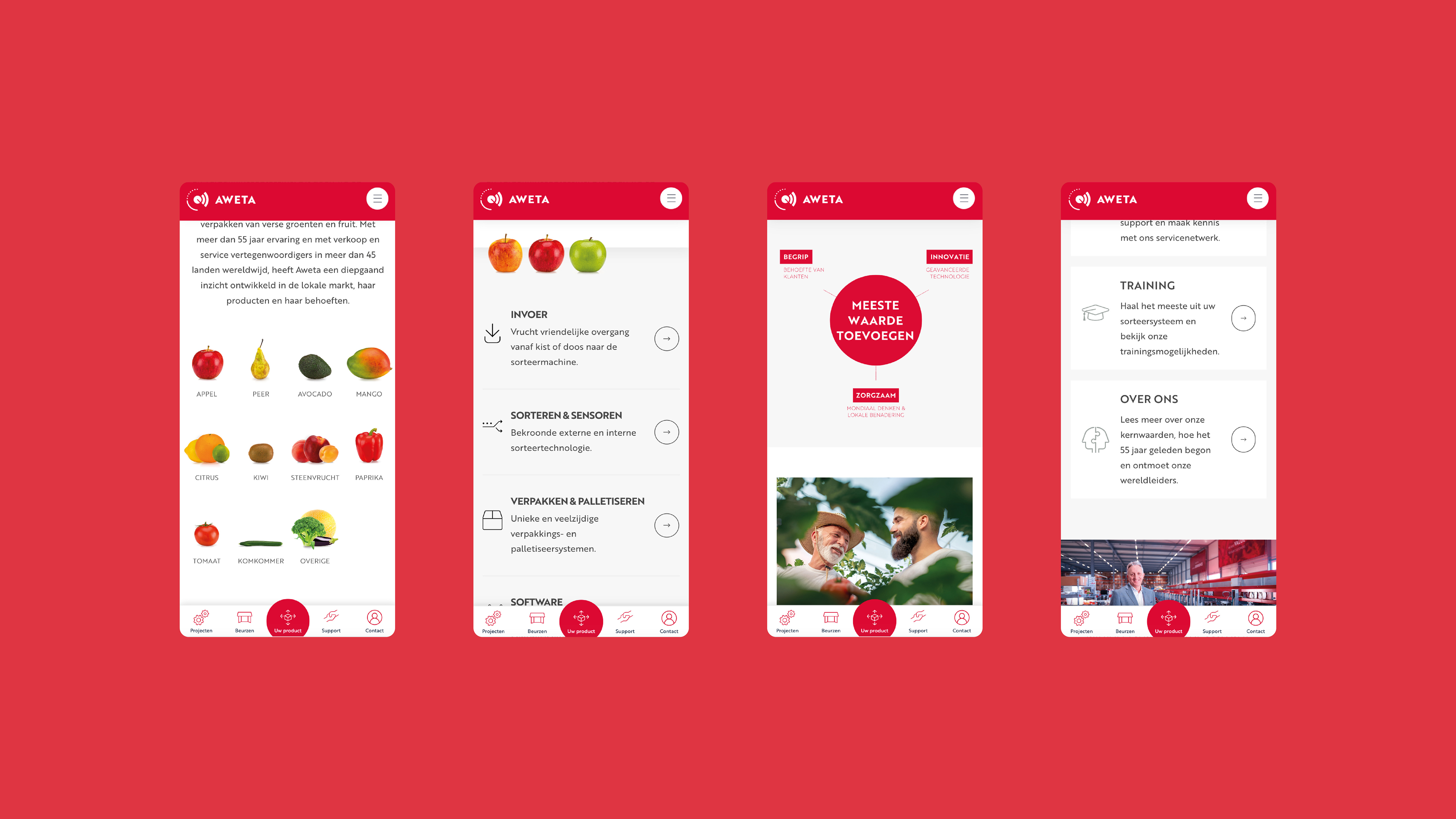
The new brand identity has been applied to all expressions of Aweta, whereby the new user-friendly website is most likely. We have also realized new product brochures, corporate clothing, powerpoints, signing on the facade and decoration of the head office and the factory hall. All suitable for the identity, customer demand and ambitions of Aweta in the market of sorting solutions.
result
A positioning and identity that match their position as the market leader and have support within the organization worldwide. Now that the complete story is and the distinctive character is clear, Aweta can spread it in everything they do. From brochures and business premises to machines and exhibition presentations. Moreover, they now have a website with which they can effectively communicate with leads, new business and existing customers. Here the different needs of the target groups are provided and quality and innovation come into their own.
"This is the step-up that we were looking for at Aweta . There is a pride feeling about our renewed positioning."
Norman van der Gaag - Sales Director
Norman van der Gaag - Sales Director
About Aweta
Aweta originated from the desire of one man to help vegetable growers in the Netherlands to carefully sort their cucumbers and tomatoes. Today, Aweta has more than 55 years of experience and is recognized as the global market leader when it comes to large -scale and innovative solutions for sorting and packaging fresh fruit and vegetables. With sales and service representation in more than 45 countries worldwide, Aweta has developed a deep understanding of the products and needs of both the worldwide and the local market.
Also view
Intertoys
Translate the Intertoys feeling to the identity brand
Intertoys
Uylenburg - Du Midi
Shared ambitions for Café du Midi and Buitengoed de Uylenburg
Uylenburg - Du Midi
Autumn campaign 'Gerbera always surprises'
Autumn campaign 'Gerbera always surprises'
Autumn campaign 'Gerbera always surprises'
Eef Advocatuur
A new brand within the legal profession: Eef Advocatuur!
Eef Advocatuur
Coloured by Gerbera
Collective promotion of the Dutch Gerbera in Europe
Coloured by Gerbera
PlantPartners
Development and launch of the new brand PlantPartners
PlantPartners
Oostland Company
Restyling and new website
Oostland Company
Collaborate with vandeez ?
brand strategy ?
Brand identity ?
website?
Brand activation?
get started with your
contact us
Erik den Blaauwen
operational manager
Every day we work on great projects: from local entrepreneurs to companies with international ambitions. We see companies grow because we let their brand shine again.
Wendy Groenewegen
brand strategist
That we can make visible impact for our clients makes me happy!
Dennis Damen
brand strategist
Very nice to bring out 'the gold' for so many organizations.
Christy van der Sman
owner
With our team we are your creative partner for the long term. Together we get things done. Each from his own expertise. Together we celebrate successes.
Sjoerd van Viegen
Art Director
Great concepts, new creations, enthusiastic clients, that is what makes me happy.
Dennis de Baat
Digital Designer
We develop websites that our clients are proud of. It remains cool to think along and contribute to the growth of our clients.