Together with the Romynox team we held a strategic session at an external location. Another environment, just out of the box and full of energy, looking for the distinctive story.
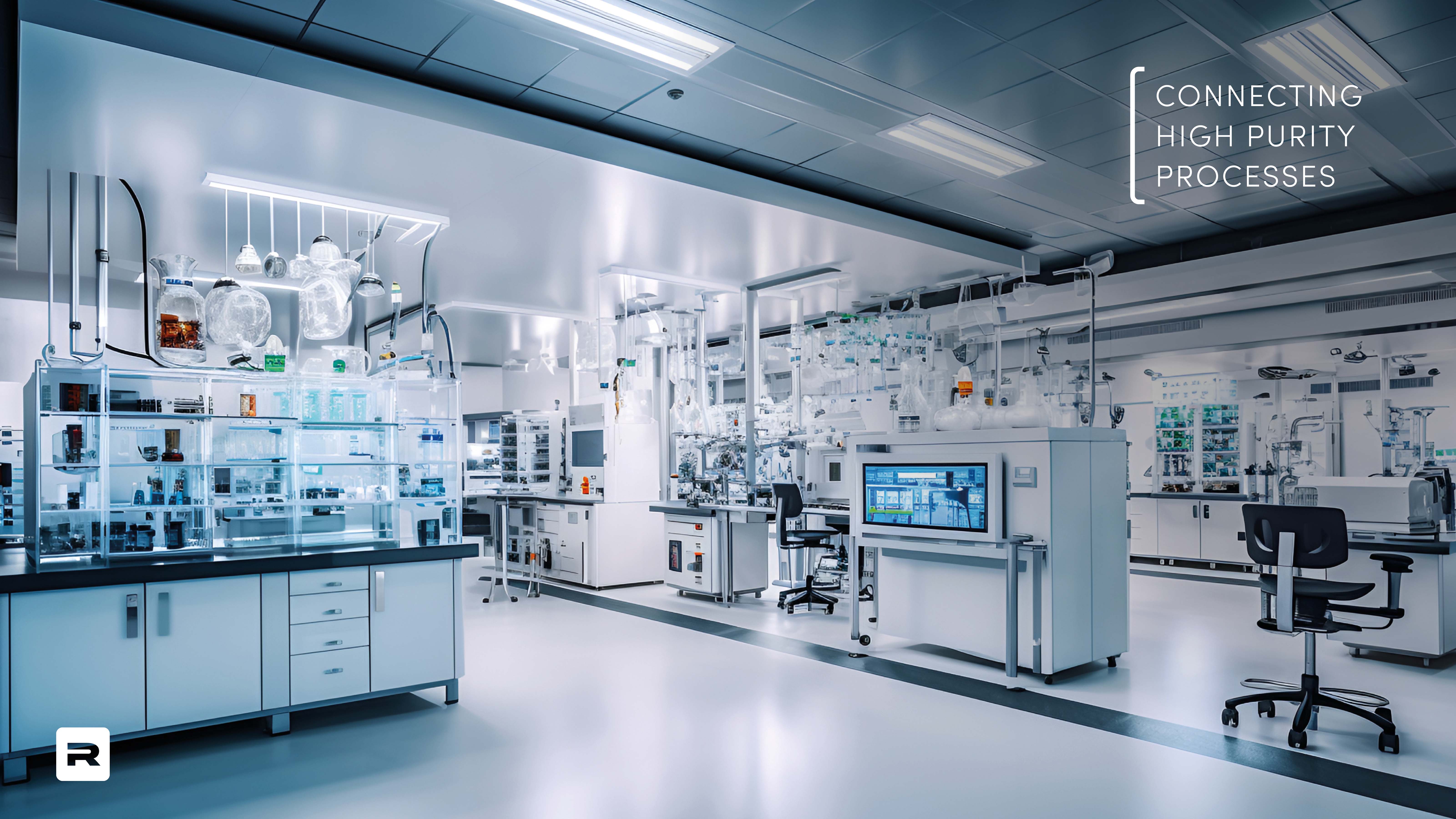
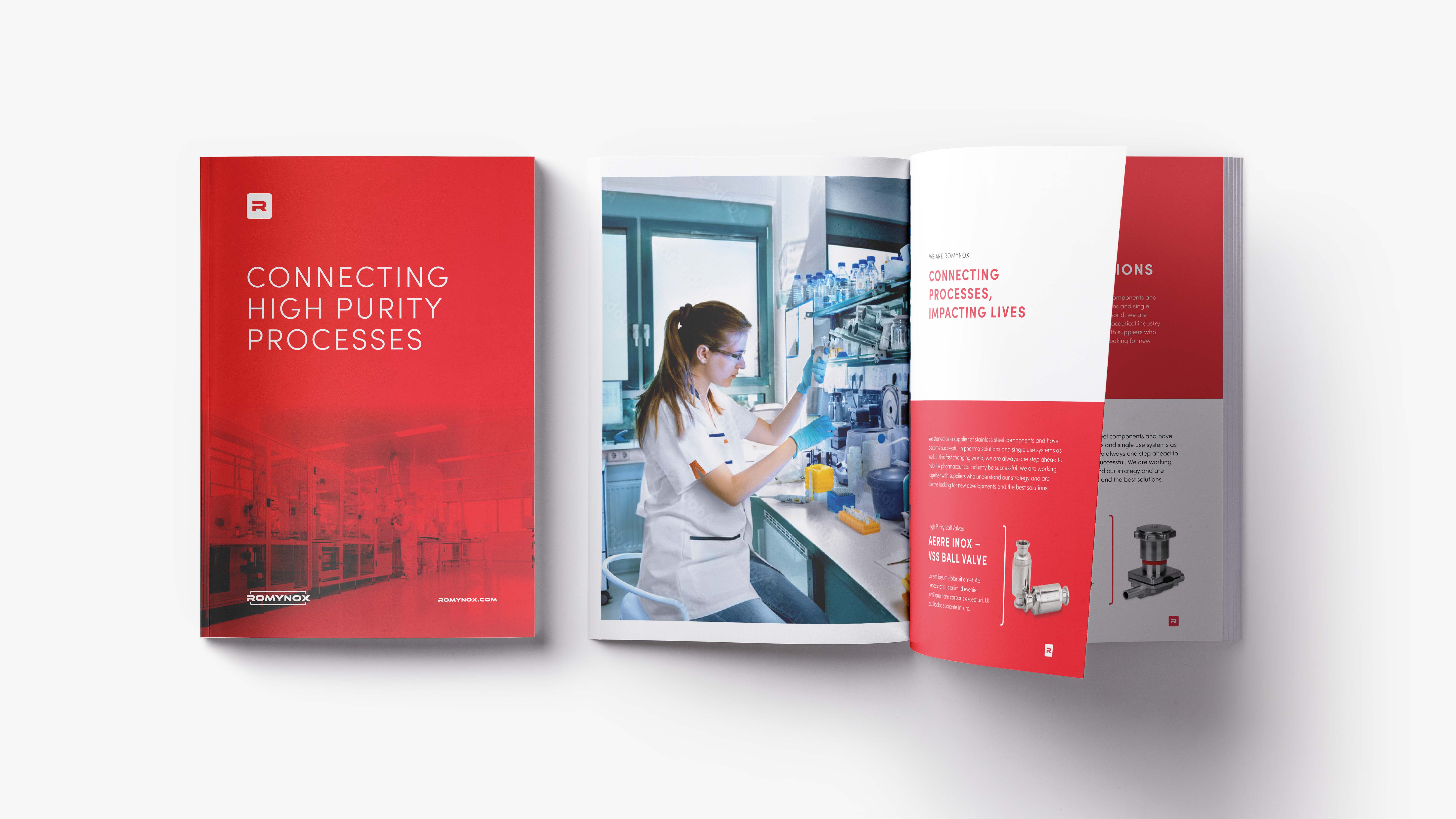
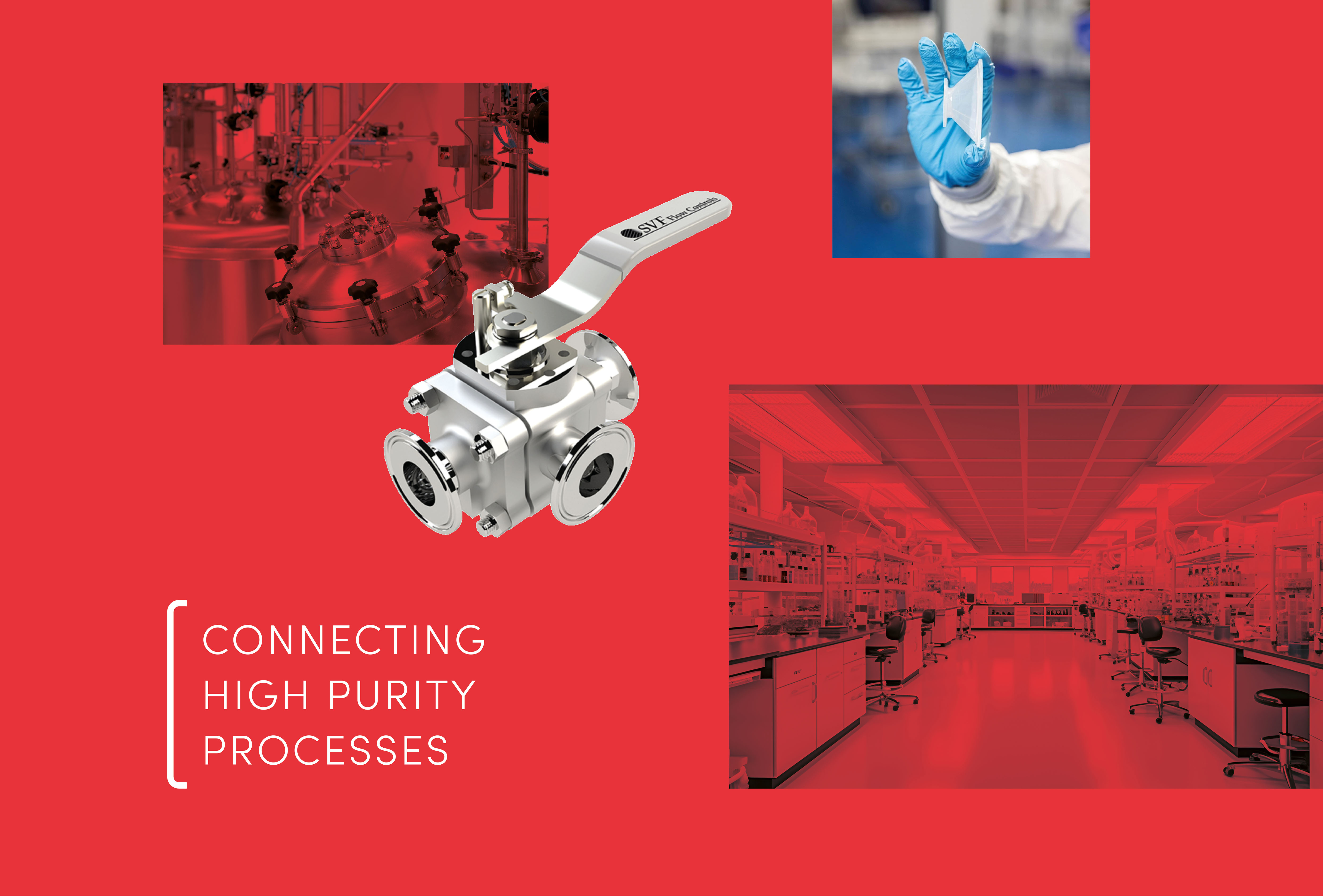
Connecting High Purity Processes
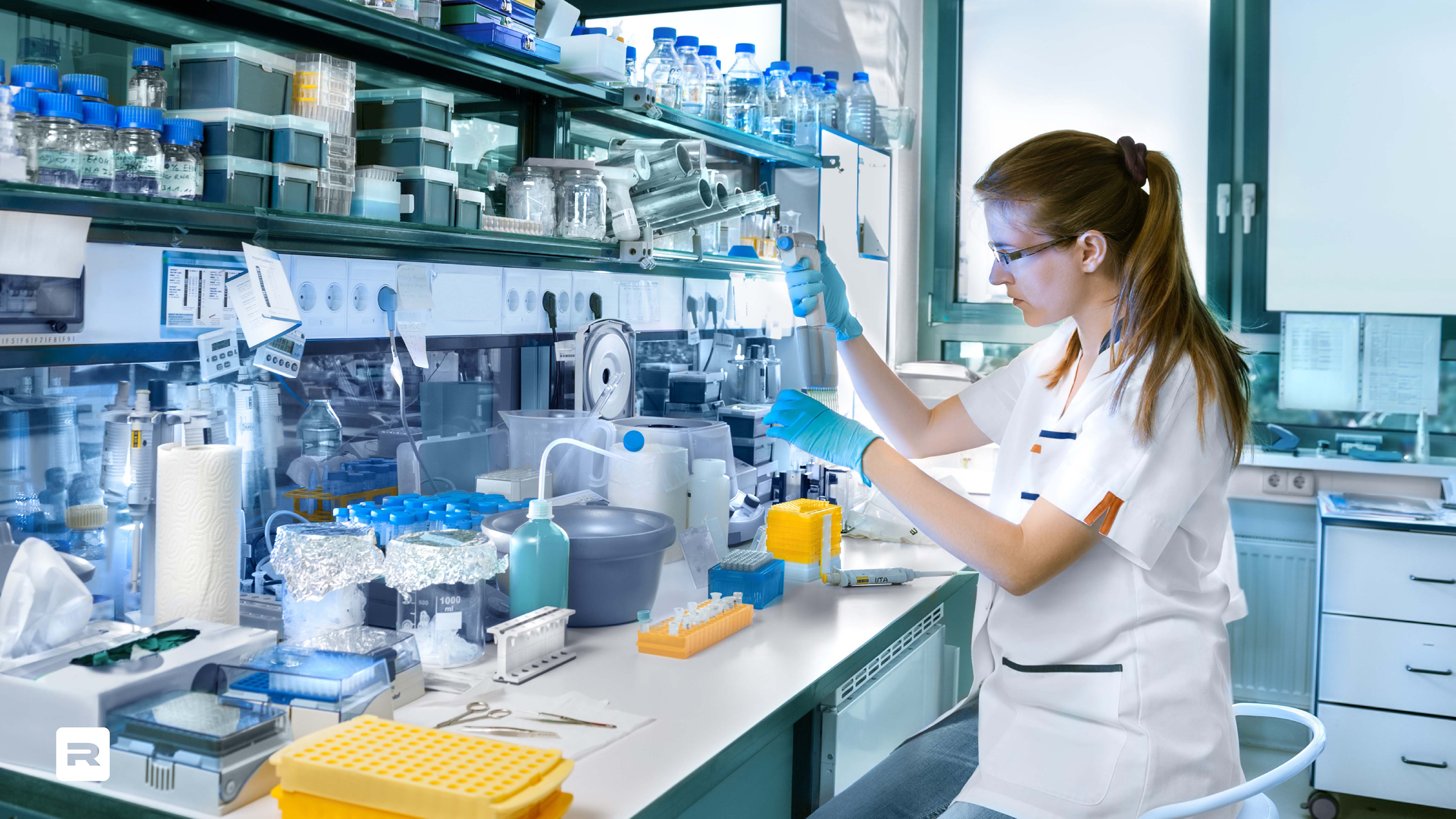
What is Romynox unique, what makes them different from competitors? After the session, research was done into the brand playground, including by interviewing employees and customers. Most heard terms: expertise, decisive, contact us ant. Very valuable input for the creation of the new brand foundation with an important role for the mission: 'Connecting High Purity Processes'
The original values: 'Fast, Focussed, Flexible and Friendly' have also been preserved, but more focused on the culture and behavior of De Romyteer, the employees and valuable ambassadors of the organization.
Restyling Brand identity
By fully aligning the Romynox brand identity to the DNA and the ambitions, it is a reinforcing whole with great attraction for the target group. Repetition is the power. One identity : from color to typography and from logo to visual language. Romynox is known in the market for the color red, the logo and the extensive product catalog. No rebranding in this case, but a restyling.
For the restyling of brand identity a more accessible color red has been chosen and a rounder and friendlier font. This use of round lines simulate the connections that makes Romynox products for customers. This way the identity fits 'Connecting processes'. A technical advice and redesign for optimizing the online product catalog was also part of the new identity brand.