- Product Category:
Brand identity , Website
- Slideshow:
- Type:
Image , Media Test:
- Type:
Image , Media Test:
- Type:
Video , Media Test:
vandeez -CASE-AHBC-Slider-3-Iphone video.mp4
- Type:
Image , Media Test:
- Type:
Image , Media Test:
- Type:
Image , Media Test:
- Type:
Image , Media Test:

- Type:
Image , Media Test:
- Type:
Image , Media Test:
- Type:
Image , Media Test:
- Type:
Image , Media Test:

- Type:
Image , Media Test:
- Type:
Image , Media Test:
- Type:
Image , Media Test:

- Type:
Image , Media Test:
- Type:
Image , Media Test:
- Cases Logo - Diap:

- Headline Subtitle:
Launch new brand: Altijd Het Beste Consultancy
- Sectors list:
professional services
- Headline Introduction:
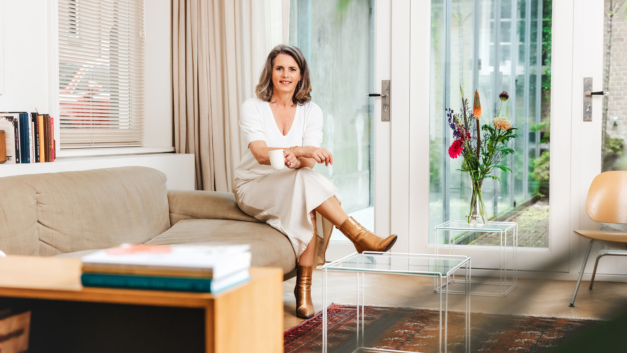
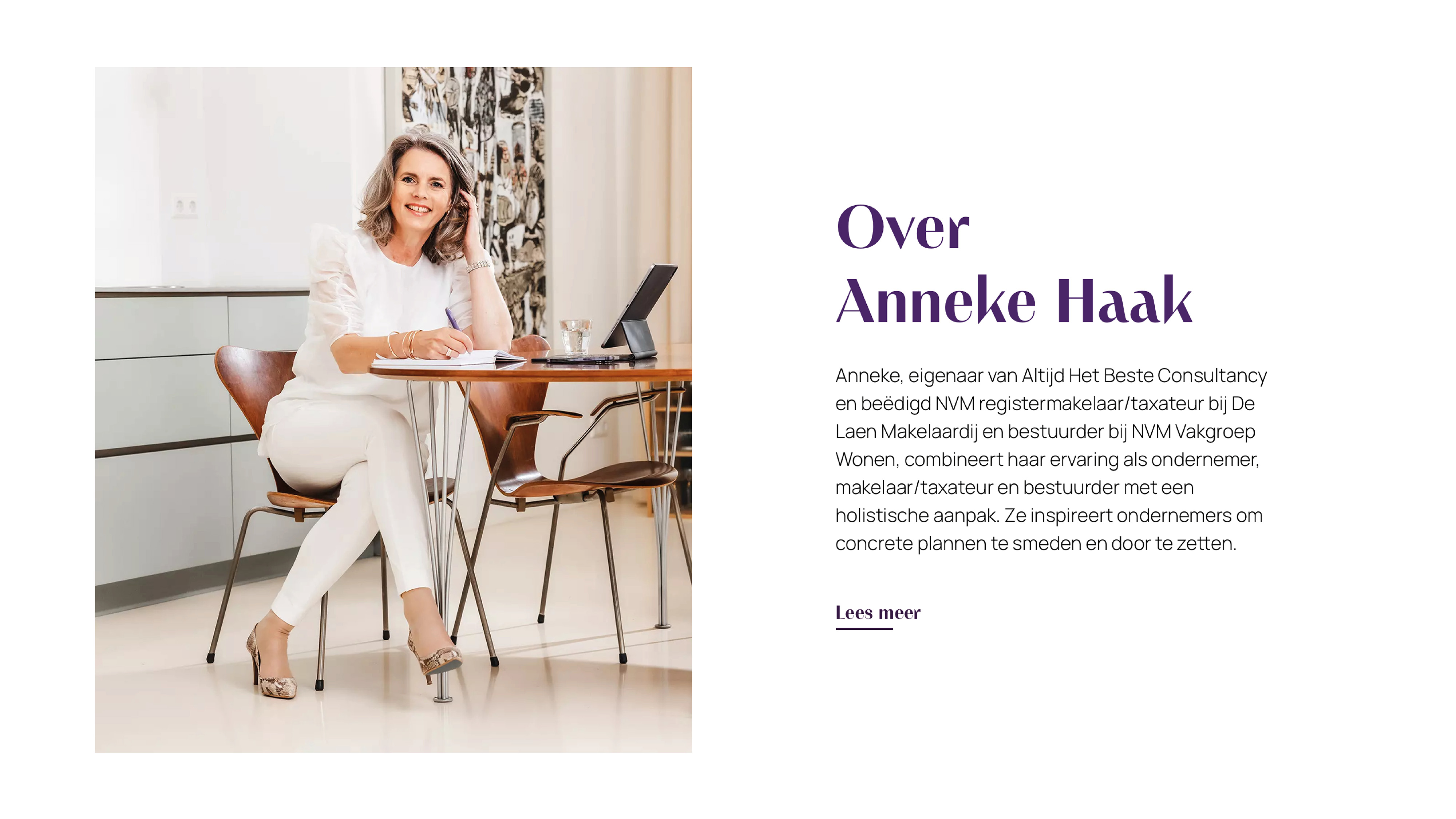
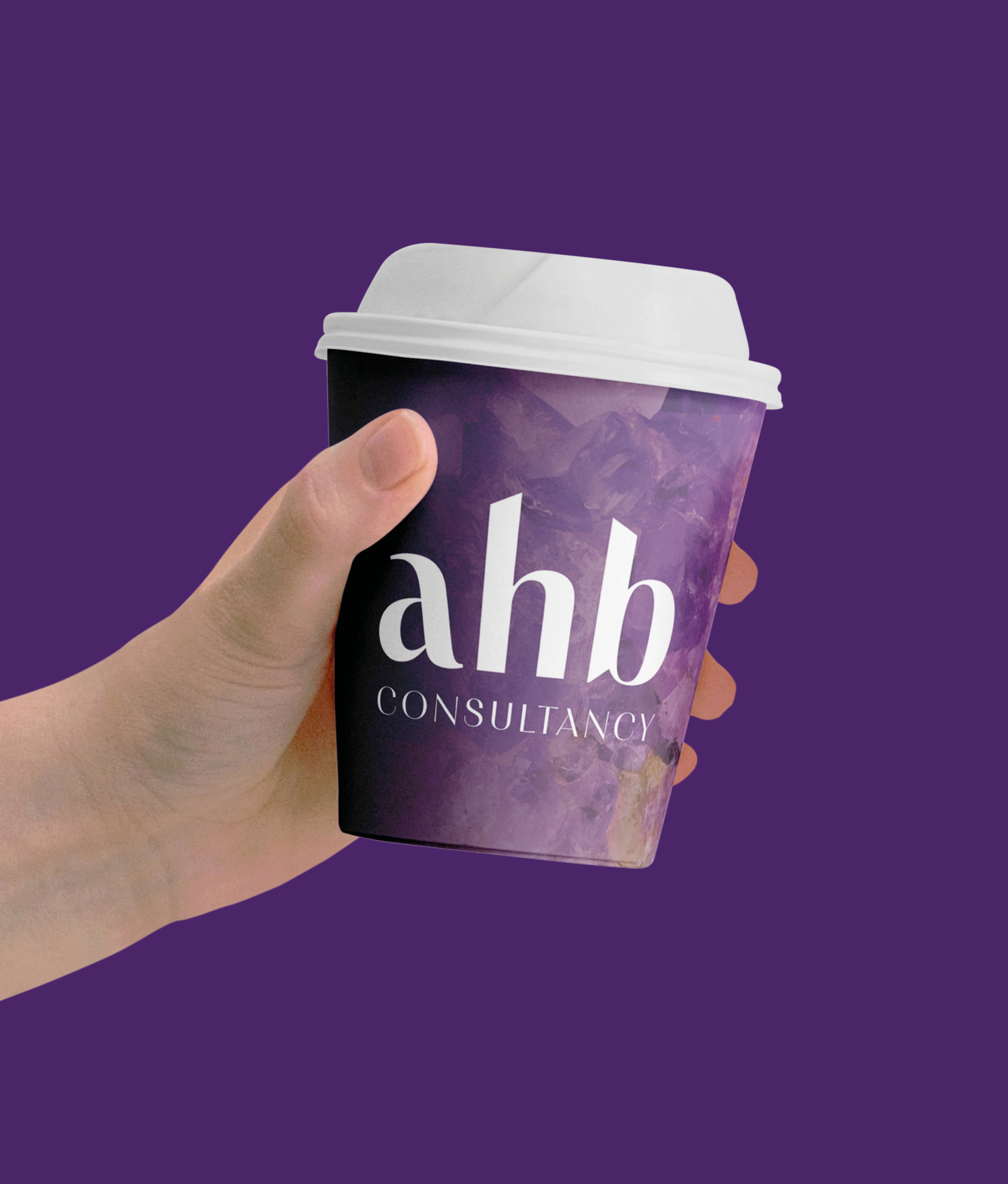
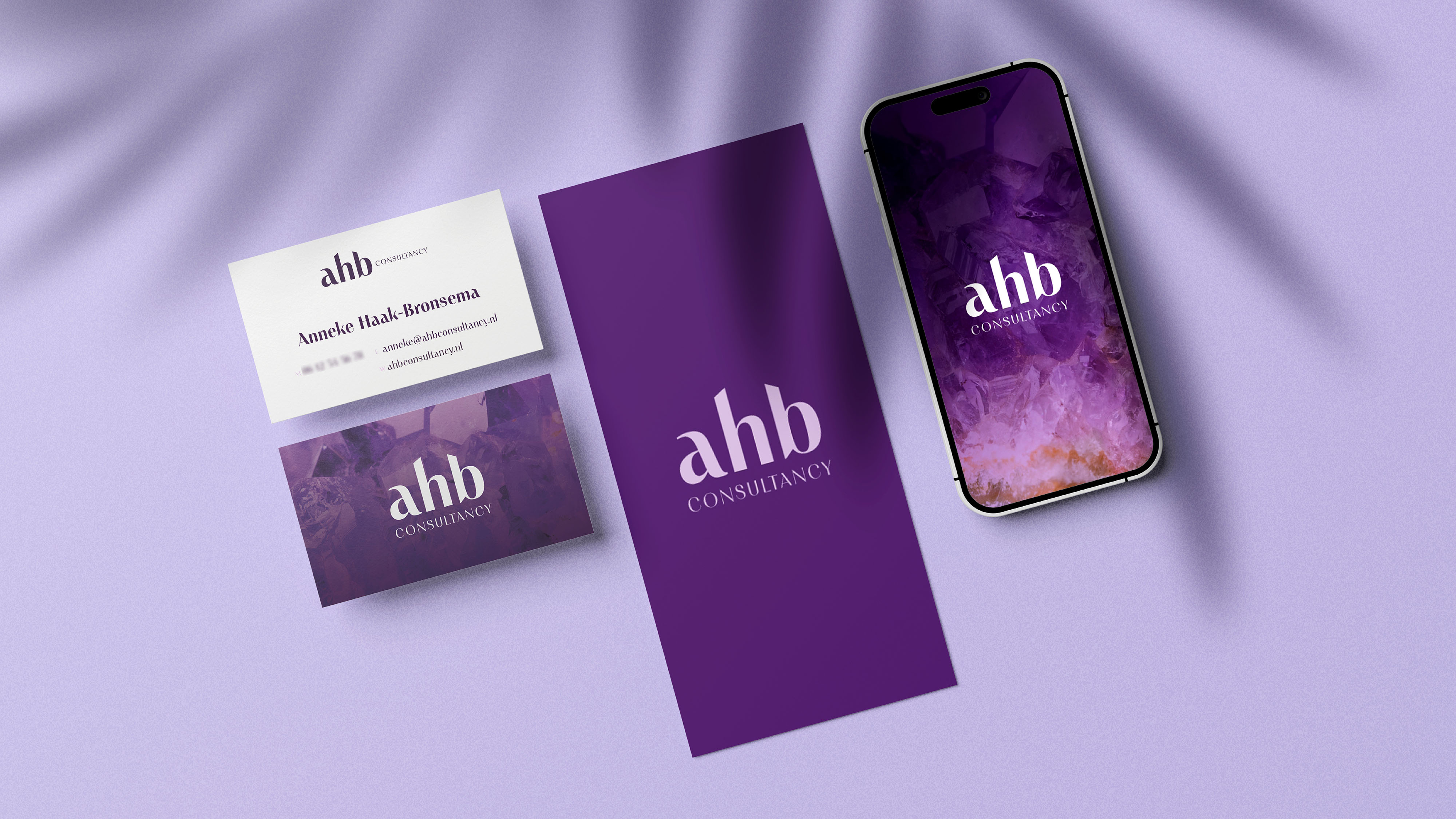
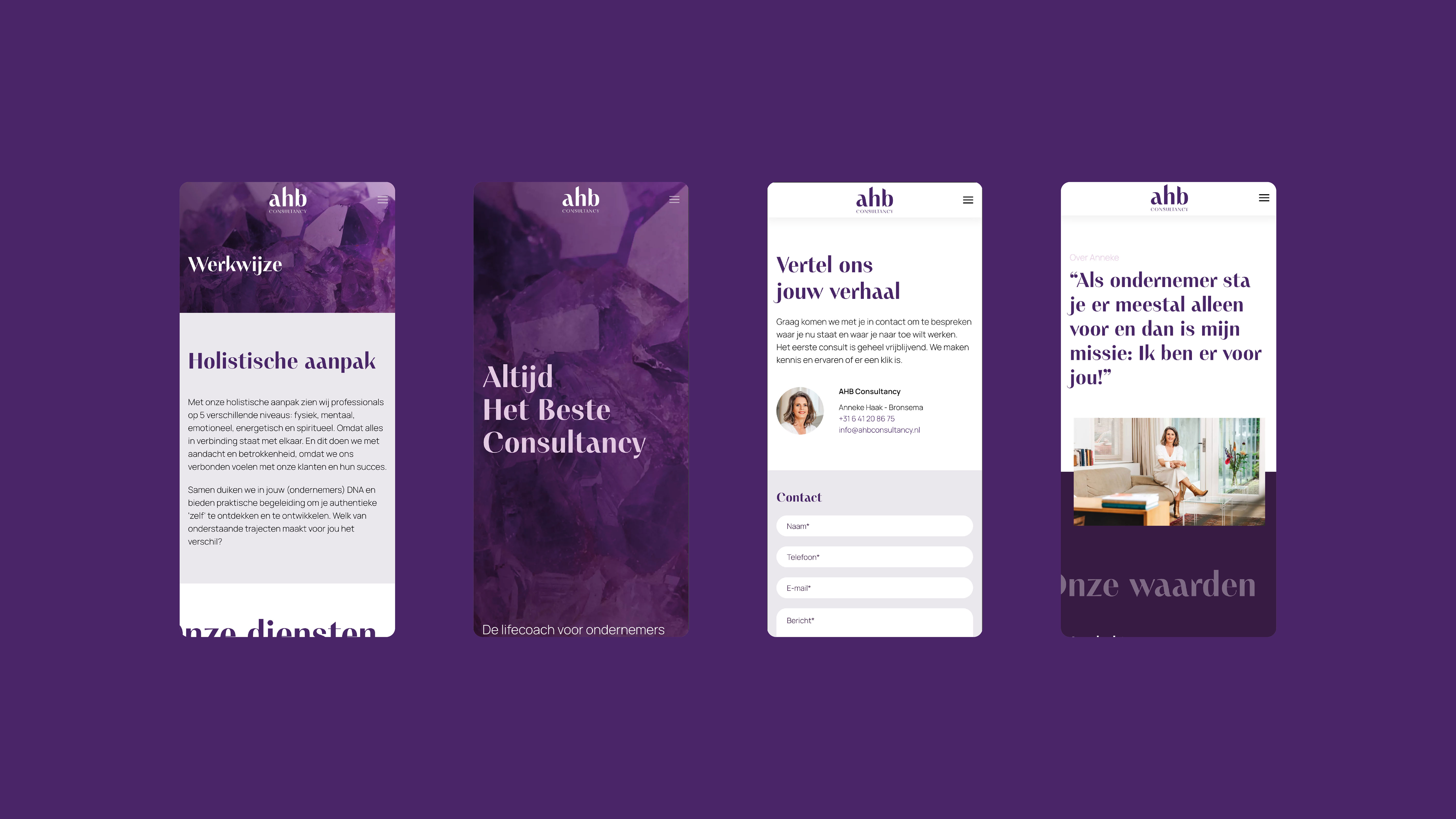
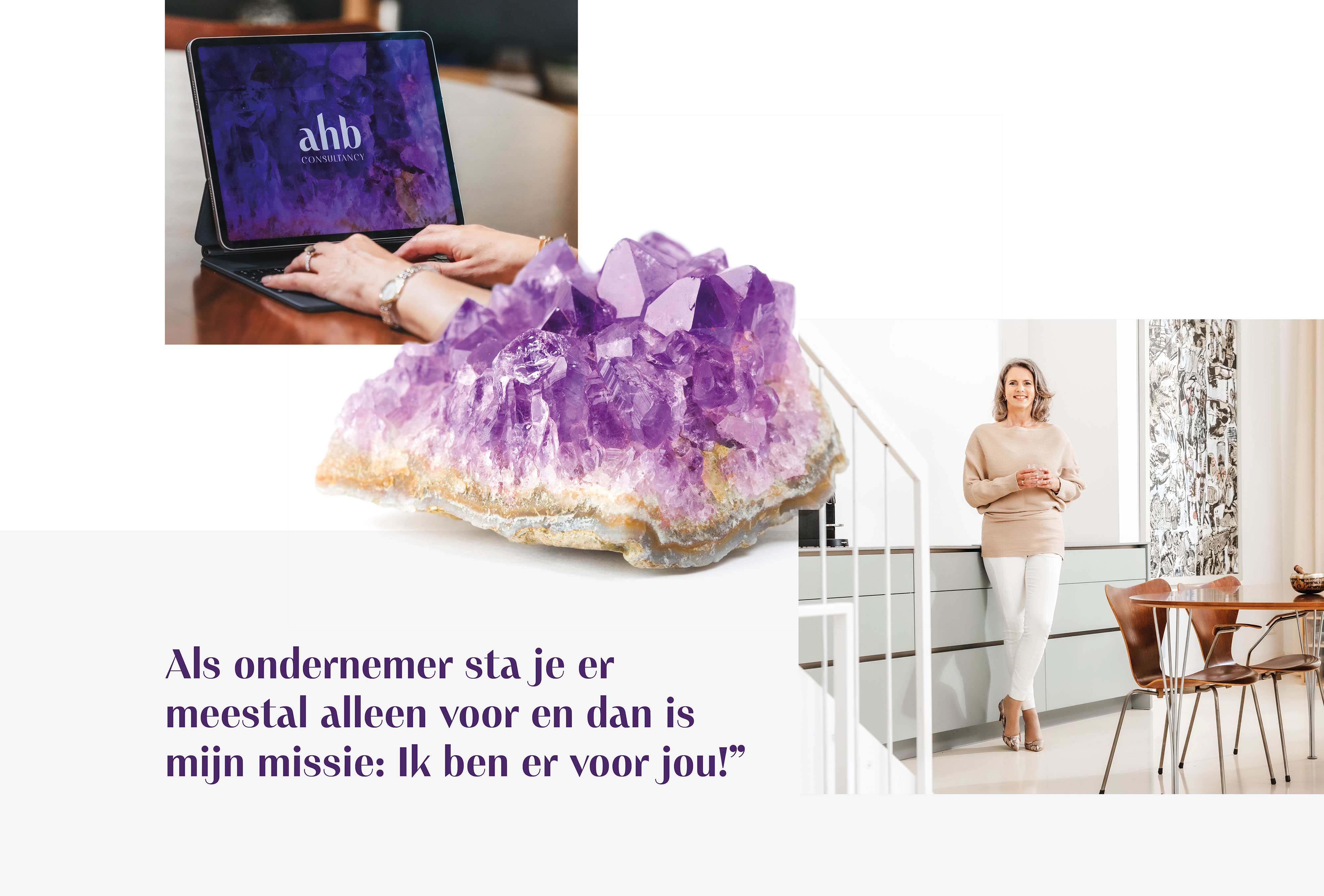
Anneke Haak-Bronsema has been working in commercial services since 1989. As the founder of De Laen Makelaardij in 2001 and since 2024 part -time connected to the same company. Partly because of her passion for personal growth and spirituality, she wants to share her experiences with other professionals. Hence the creation of its new company: Altijd Het Beste Consultancy . She is the life coach for entrepreneurs.
- Brand Essential List:
Brand identity , Website
- Approach:
Anneke approached Vandeez to support her with bringing her new brand to life: Altijd Het Beste Consultancy.
strategic session
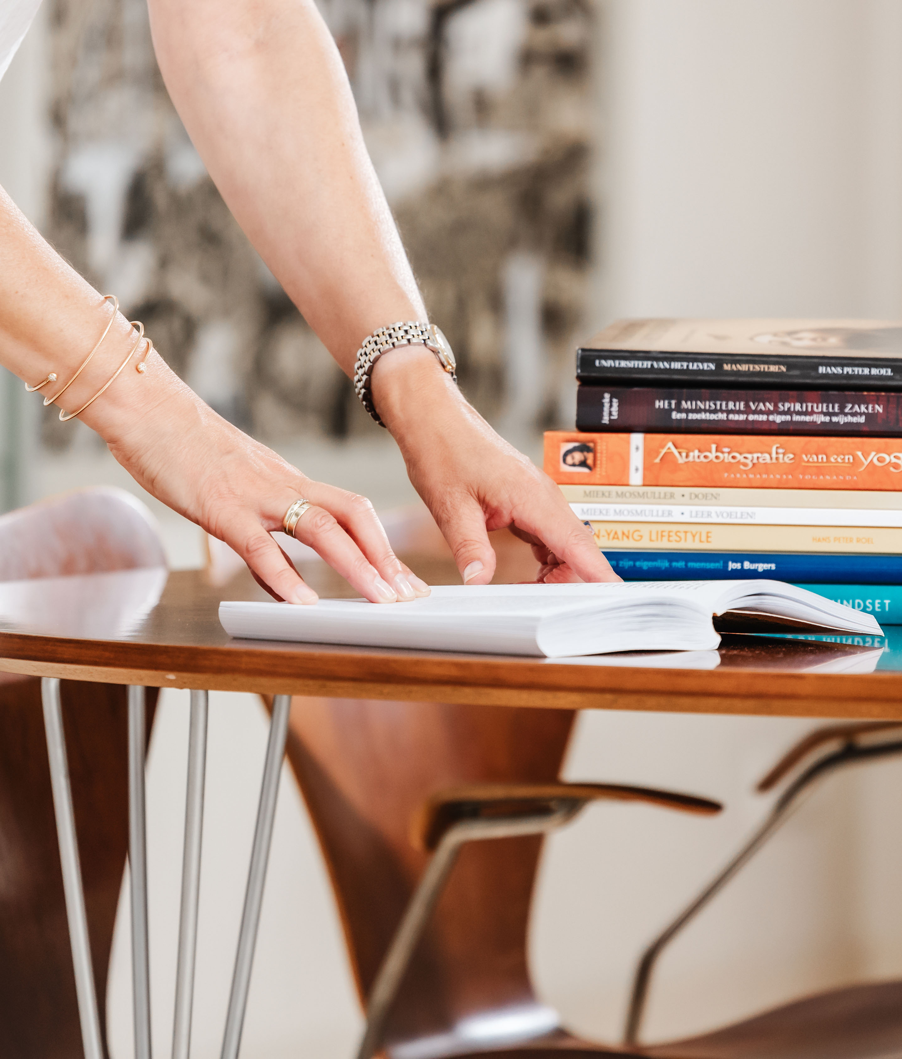
We started with a strategic insights session, where we dived into her passion, ambitions and her strength. So that we could make the right visual translation. Anneke is known for her decisive, no nonsense approach. She offers various consultancy services for entrepreneurs and uses a holistic approach. Because everything is connected to each other.
brand identity
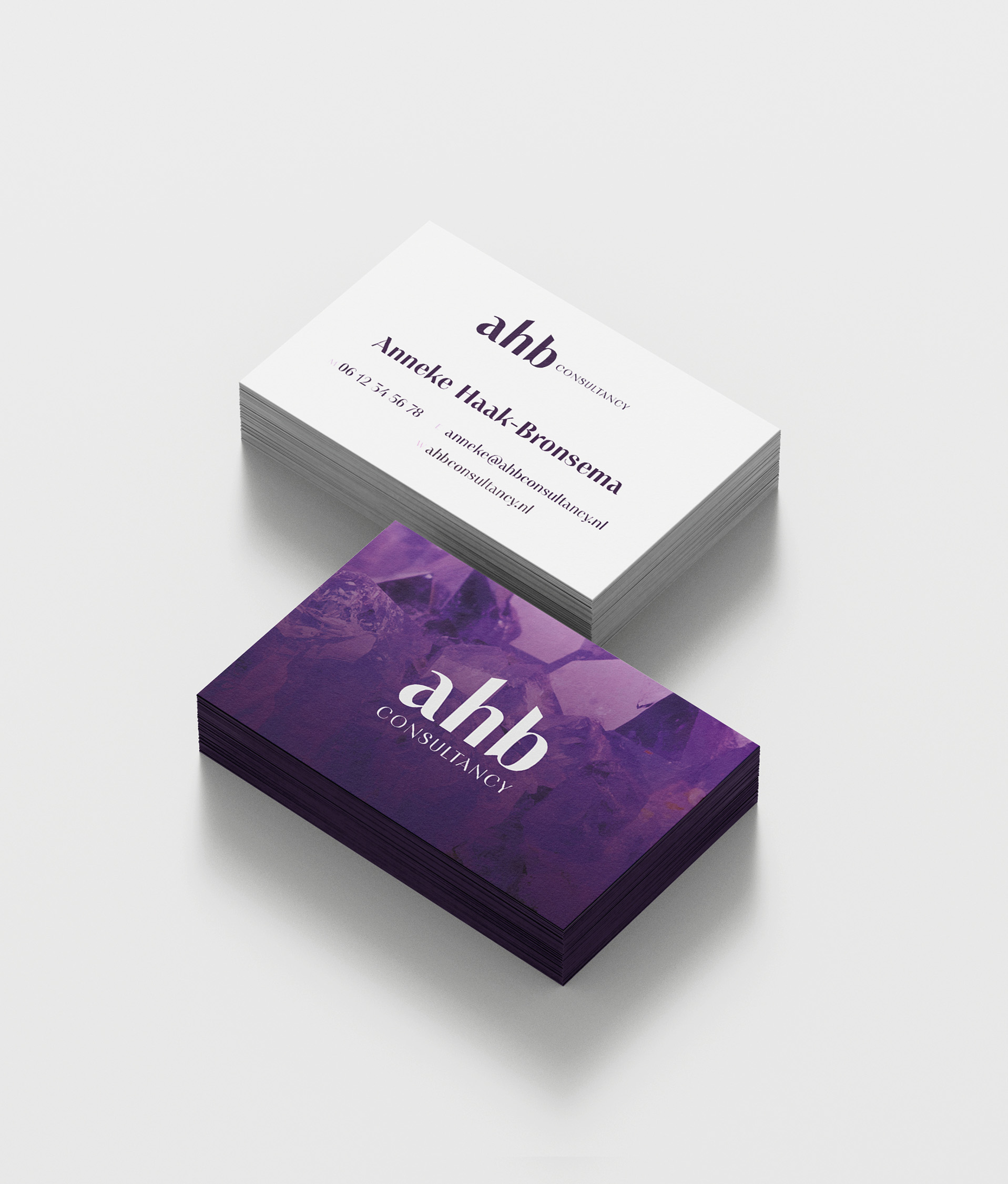
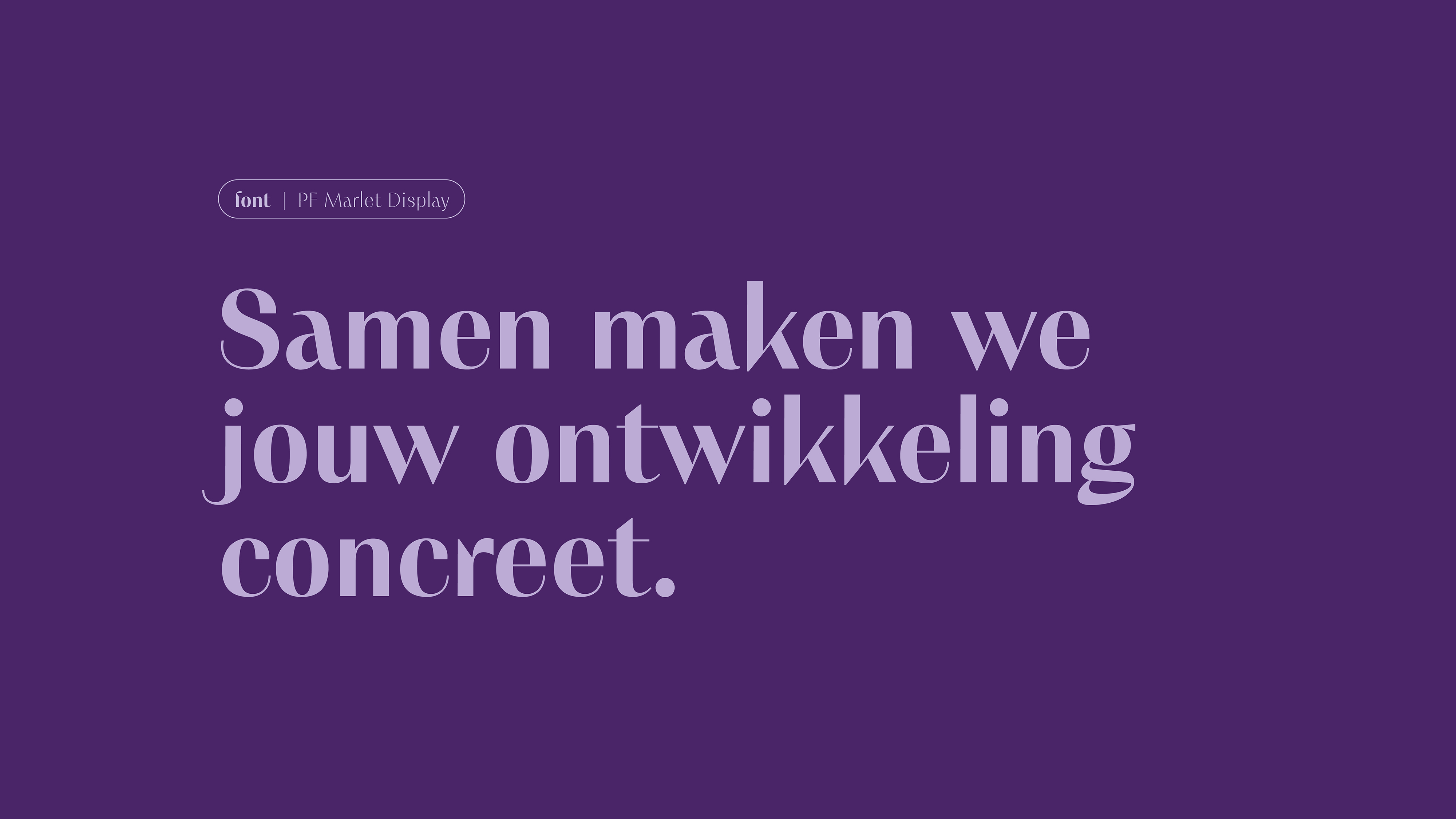
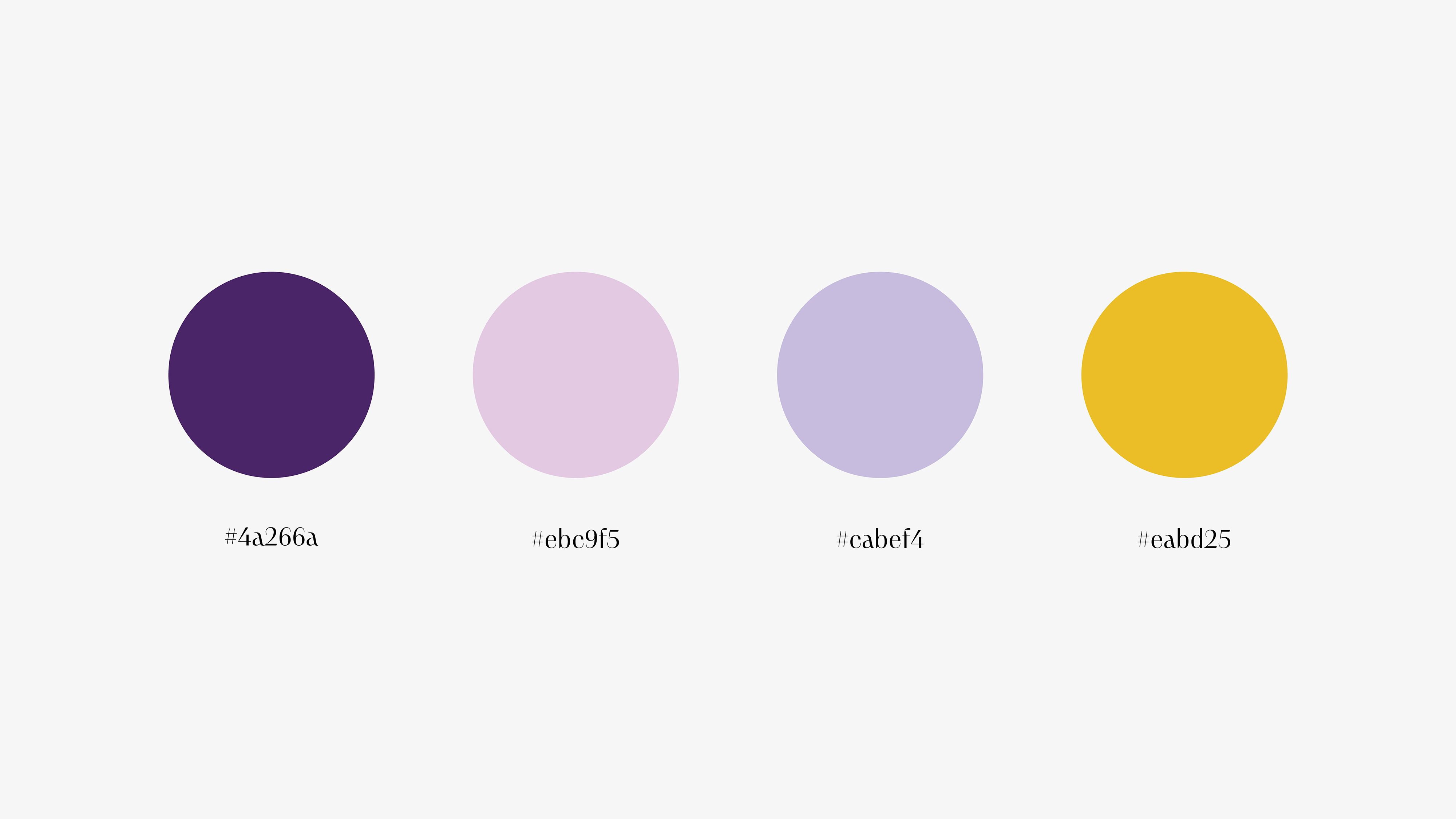
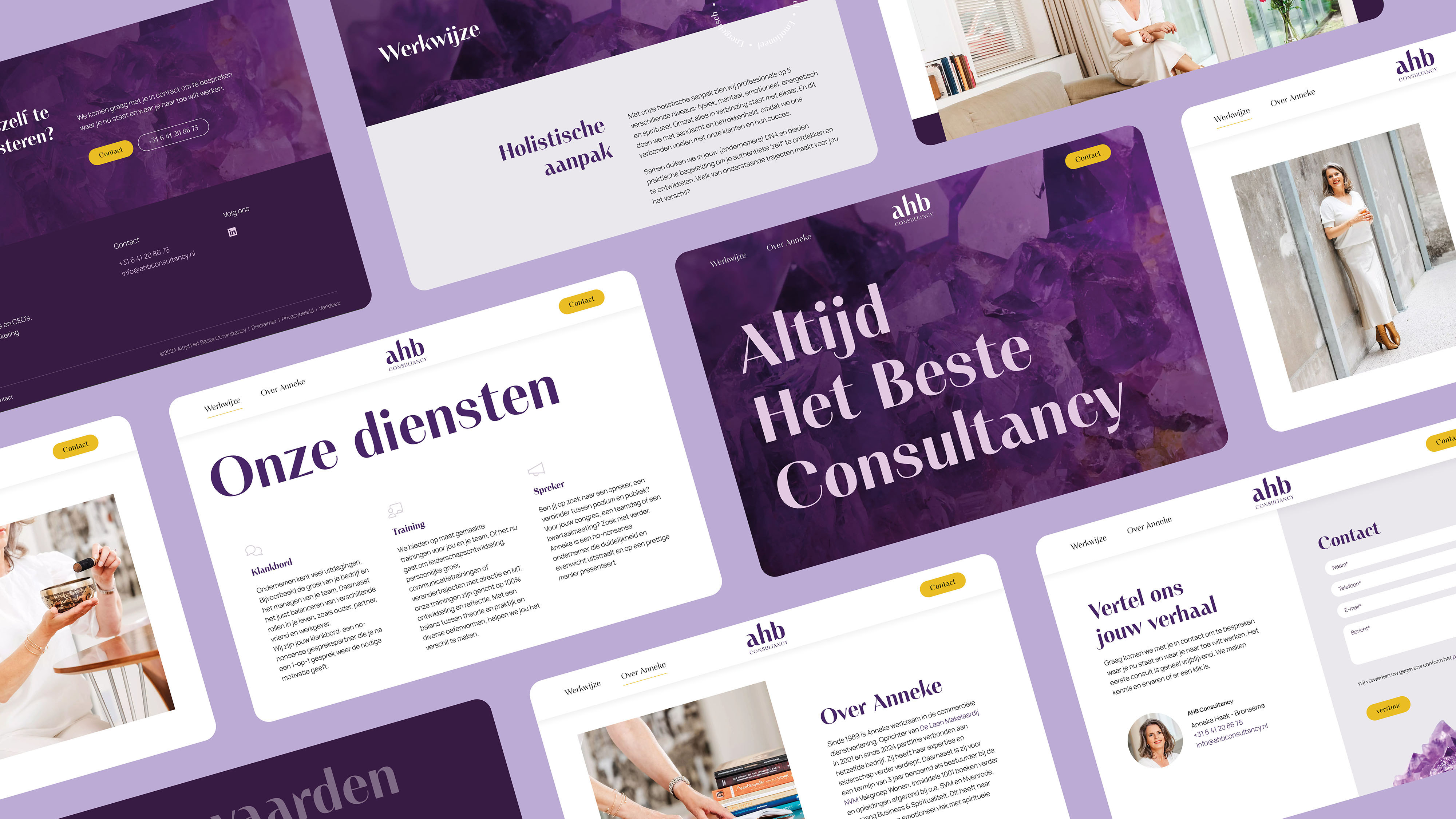
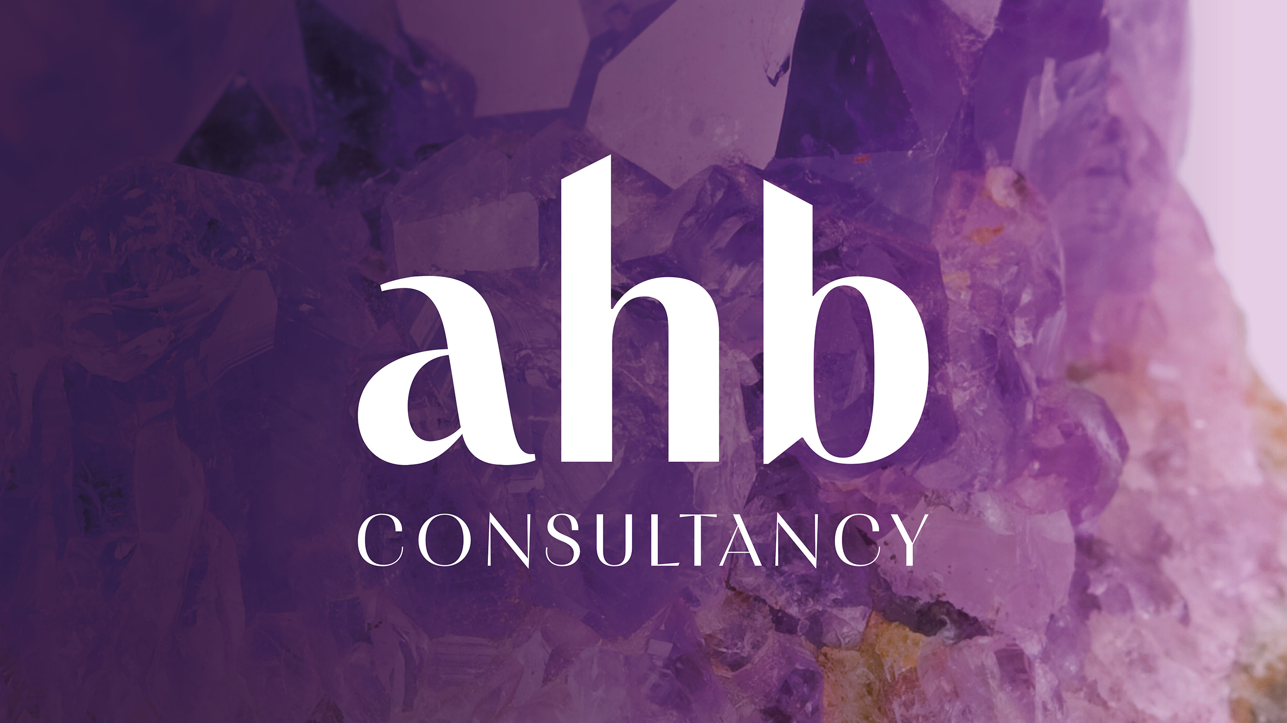
From the Insights session, the translation made to a distinctive visual identity . For color use we have opted for powerful dark purple and light pink, with the bold color gold. The basis for these colors is therefore the Amethyst, a dark purple gem that stands for inner peace, concentration, stress reduction and protection against negative energy. Her brand values attention, clarity and involvement are reflected in the chosen font and photography. Graceful and powerful, but also accessible and personal. Then her brand identity was translated into a web design.
- Result:
together we have launched a powerful brand. Very nice to see how we have translated her passion and ambition into a powerful visual identity and website. An online business card in which both the depth and spirituality returns, but also her pragmatic and no-nonsense approach has the right attention. We are proud of the contribution to the successful launch of Altijd Het Beste Consultancy .
- Logo:
- Quote:
"As an enthusiastic and enthusiastic entrepreneur, the collaboration with the enthusiastic and enthusiastic team from Vandeez a successful project in advance."
- Quote - Customer Name and Function:
Anneke Haak - Owner AHB Consultancy
- Quote image:

- About customer:
About AHB Consultancy
- About customer information:
Altijd Het Beste Consultancy offers various services to support professionals. From short sessions to longer processes. Anneke Haak - Bronsema inspires entrepreneurs and CEOs to forge and continue concrete plans
New Brand launch: Altijd Het Beste Consultancy
- Product Category:
Brand Strategy , Brand identity , Website
- Slideshow:
- Type:
Video , Media Test :
, Alt-Tag:
Aweta Video
- Type:
Image , Media Test :
 , Alt-Tag:
Aweta Visual Identity
, Alt-Tag:
Aweta Visual Identity - Type:
Video , Media Test:
vandeez -Case- aweta -Video website-Mobile.mp4 , Alt-Tag:
Aweta Website
- Type:
Image , Media Test :
 , Alt-Tag:
Aweta Visual Identity
, Alt-Tag:
Aweta Visual Identity - Type:
Image , Media Test :
 , Alt-Tag:
Aweta Website
, Alt-Tag:
Aweta Website - Type:
Image , Media Test :
 , Alt-Tag:
Aweta Visual Identity
, Alt-Tag:
Aweta Visual Identity - Type:
Video , Media Test:
Vandeez -Website-Cases- aweta -Lider-4.MP4 , Alt-Tag:
Aweta Visual Identity
- Type:
Image , Media Test :
 , Alt-Tag:
Aweta Visual Identity
, Alt-Tag:
Aweta Visual Identity - Type:
Image , Media Test :
 , Alt-Tag:
Aweta Photography
, Alt-Tag:
Aweta Photography - Type:
Image , Media Test :
 , Alt-Tag:
Aweta Photography
, Alt-Tag:
Aweta Photography - Type:
Image , Media Test :
 , Alt-Tag:
Aweta Photography
, Alt-Tag:
Aweta Photography - Type:
Image , Media Test :
 , Alt-Tag:
Aweta Photography
, Alt-Tag:
Aweta Photography - Type:
Image , Media Test :
 , Alt-Tag:
Aweta Visual Identity
, Alt-Tag:
Aweta Visual Identity - Type:
Image , Media Test :
 , Alt-Tag:
Aweta Photography
, Alt-Tag:
Aweta Photography - Type:
Image , Media Test :
 , Alt-Tag:
Aweta Website
, Alt-Tag:
Aweta Website - Type:
Image , Media Test :
 , Alt-Tag:
Aweta Visual Identity
, Alt-Tag:
Aweta Visual Identity
- Cases Logo - Diap:

- Headline Subtitel:
A positioning that matches a market leader in sorting solutions
- Sectors List:
agriculture and horticulture, manufacturing industry
- Headline Introduction:
Aweta is the worldwide market leader when it comes to innovative solutions for sorting and packaging fresh fruit and vegetables. But what if others in the market apply their marketing more effectively? If their story is more visible than yours? At a time when digital resources are consulted more by the customer, you cannot wait but you have to take steps. This starts with an international beating story in which everyone recognizes. Only in this way can you maintain and expand existing success.
- Brand Essential List:
Brand positioning, Brand identity , Website
- Approach:
We started the process with determining the brand positioning.
Inspiring brand story
Conversations with the management and various interviews with customers and employees showed that Aweta adds the most value through a combination of the latest technology, understanding customer needs and adapting to every market. "We Add Value to Our Customers" is the starting point in everything that Aweta does. From the positioning, an inspiring brand story has been written that gives both internal and external direction and guidance.
Unique brand identity
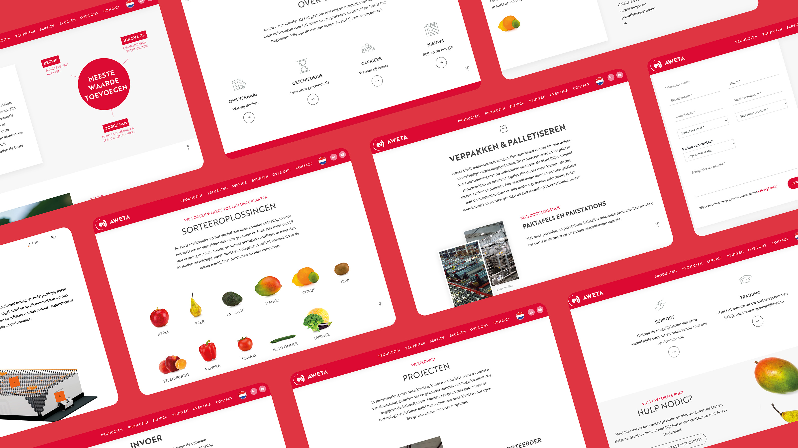
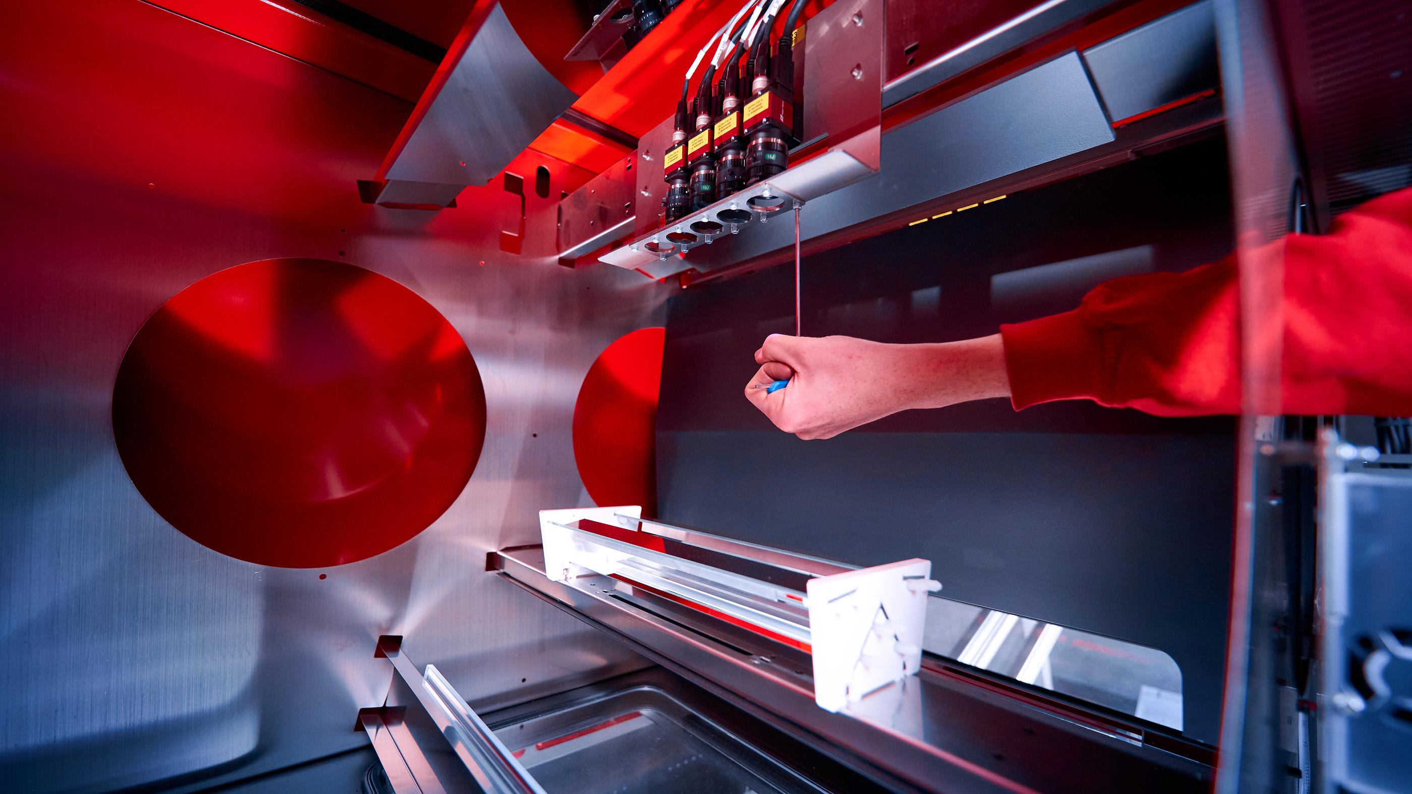
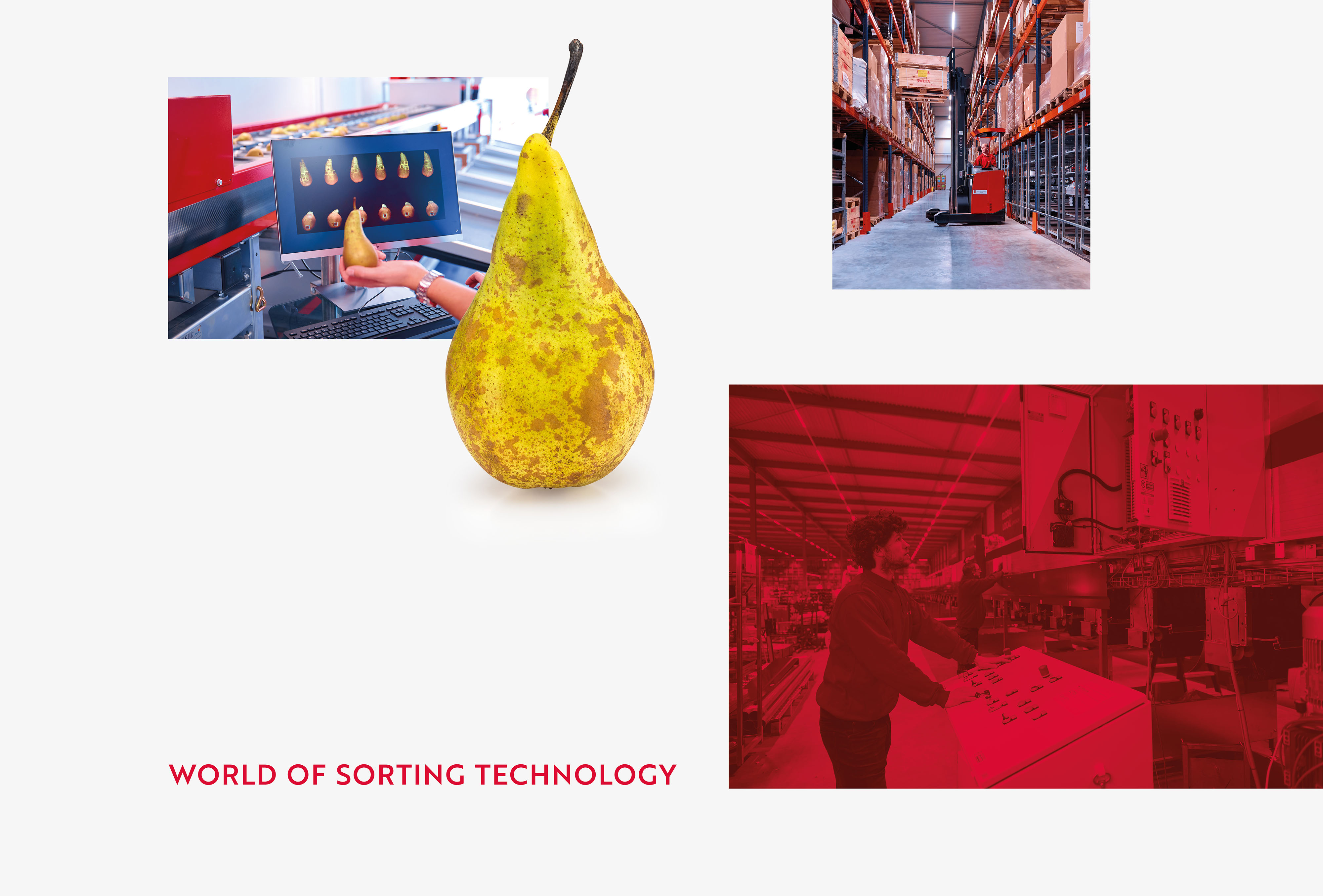
The brand positioning was then translated into a refreshed visual identity . In the logo and the visual identity we have made the characteristic red color fresher, simplified the shape language and made the font firmer. This way the recognizable elements are retained, but with a modern identity that is attractive to all target groups. The products of Aweta's customers have also been given a prominent place within the visual identity , which shows that Aweta offers solutions that are optimally tailored to customers' products.
New website and brand expressions
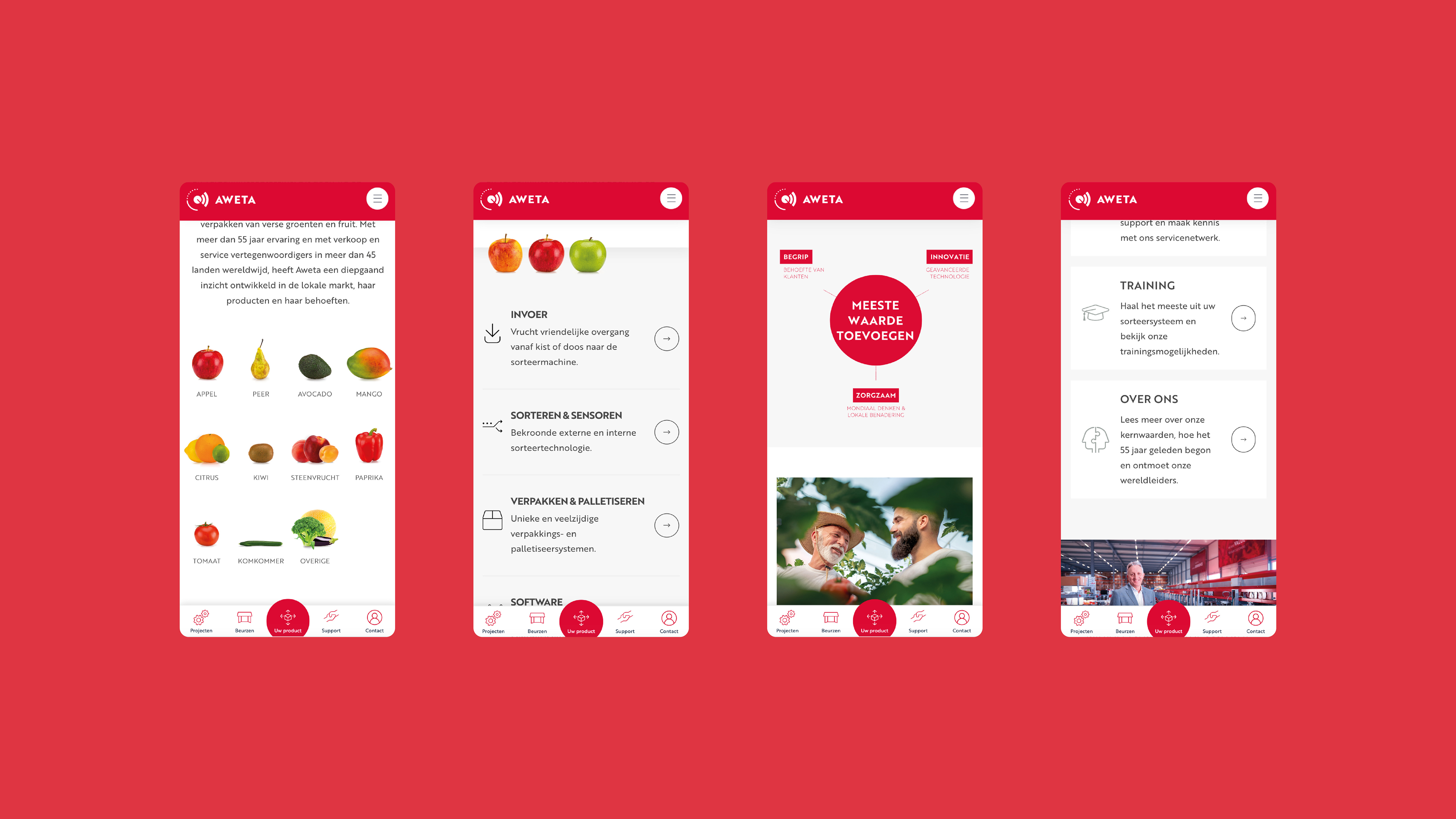
The new brand identity has been applied to all expressions of Aweta, whereby the new user-friendly website is most likely. We have also realized new product brochures, corporate clothing, powerpoints, signing on the facade and decoration of the head office and the factory hall. All suitable for the identity, customer demand and ambitions of Aweta in the market of sorting solutions.
- Result:
a positioning and identity that match their position as the market leader and have support within the organization worldwide. Now that the complete story is and the distinctive character is clear, Aweta spread it in everything they do. From brochures and business premises to machines and exhibition presentations. Moreover, they now have a website with which they can effectively communicate with leads, new business and existing customers. Here the different needs of the target groups are provided and quality and innovation come into their own.
- Logo:
- Quote:
"This is the step-up that we were looking for Aweta
- Quote - Customer Name and Function:
Norman van der Gaag - Sales Director
- Quote image:
- About Customer:
About Aweta
- About customer information:
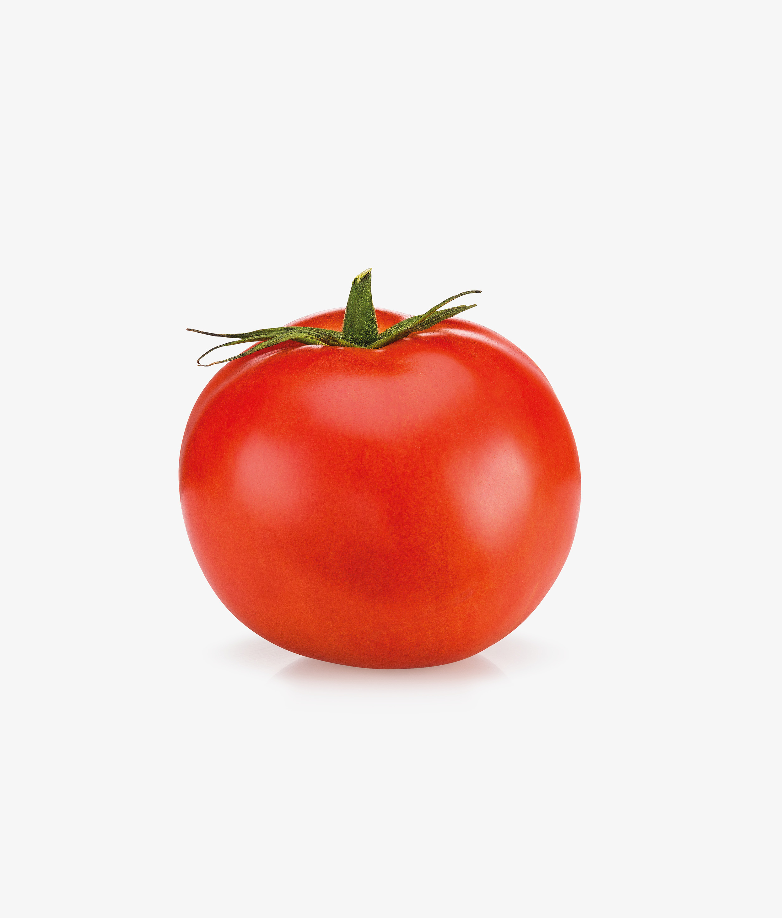
Aweta originated from the desire of one man to help vegetable growers in the Netherlands carefully sort their cucumbers and tomatoes. Aweta has more than 55 years of experience and is recognized as the global market leader when it comes to large -scale and innovative solutions for sorting and packaging fresh fruit and vegetables. With sales and service representation in more than 45 countries worldwide, Aweta developed a deep understanding of the products and needs of both the worldwide and the local market.
A positioning that fits a market leader in sorting solutions
- Product Category:
Home, Brand Strategy , Brand identity , Website
- Slideshow:
- Type:
Image , Media Test:
- Type:
Image , Media Test:
- Type:
Video , Media Test:
vandeez -Case- back2basics -2024-Slider video.mp4
- Type:
Image , Media Test:
- Type:
Image , Media Test:
- Type:
Image , Media Test:
- Type:
Image , Media Test:
- Type:
Image , Media Test:
- Type:
Image , Media Test:
- Type:
Image , Media Test:
- Type:
Image , Media Test:
- Type:
Image , Media Test:

- Type:
Image , Media Test:
- Type:
Image , Media Test:
- Type:
Image , Media Test:
- Type:
Image , Media Test:
- Cases Logo - Diap:

- Headline Subtitel:
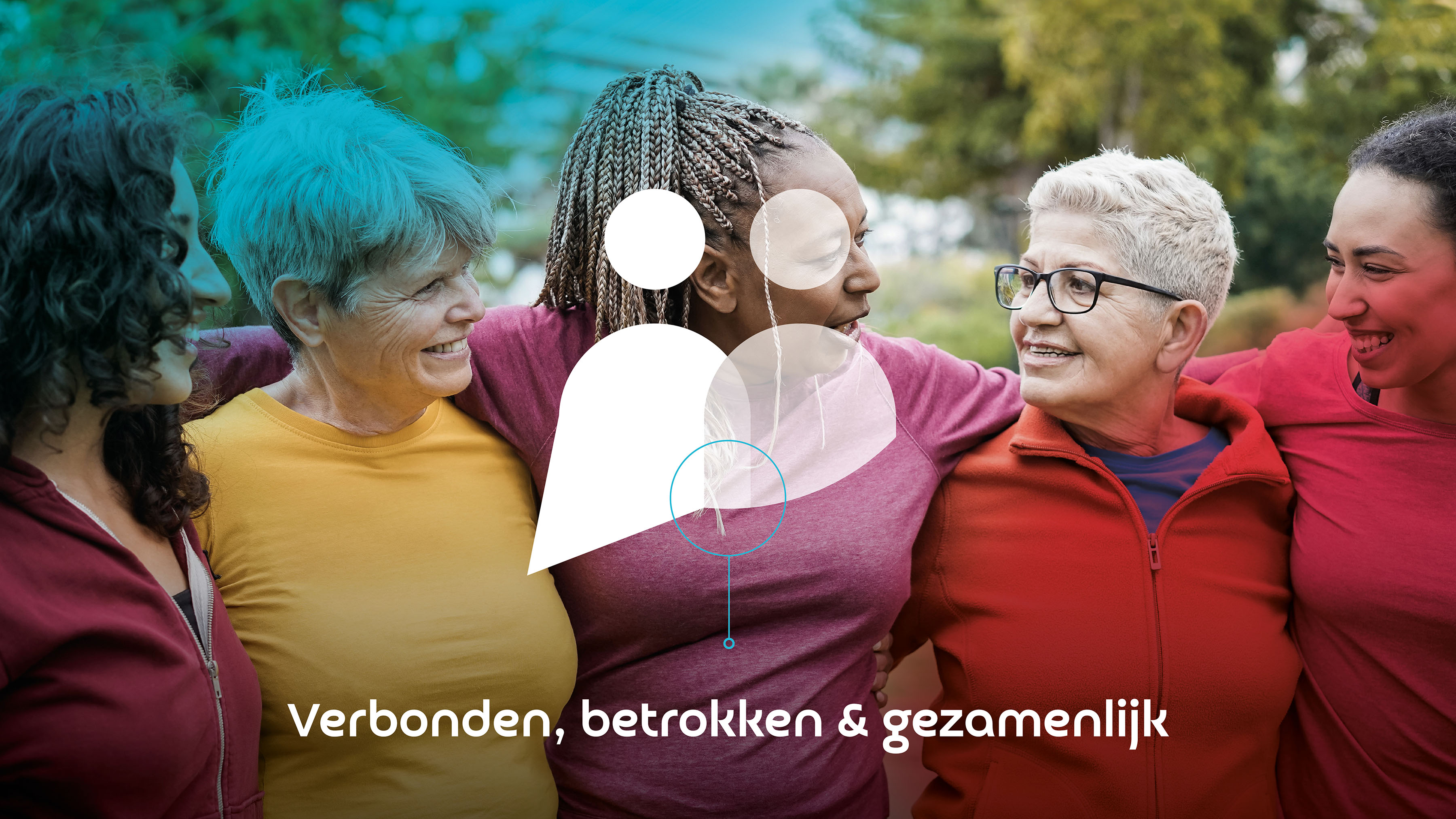
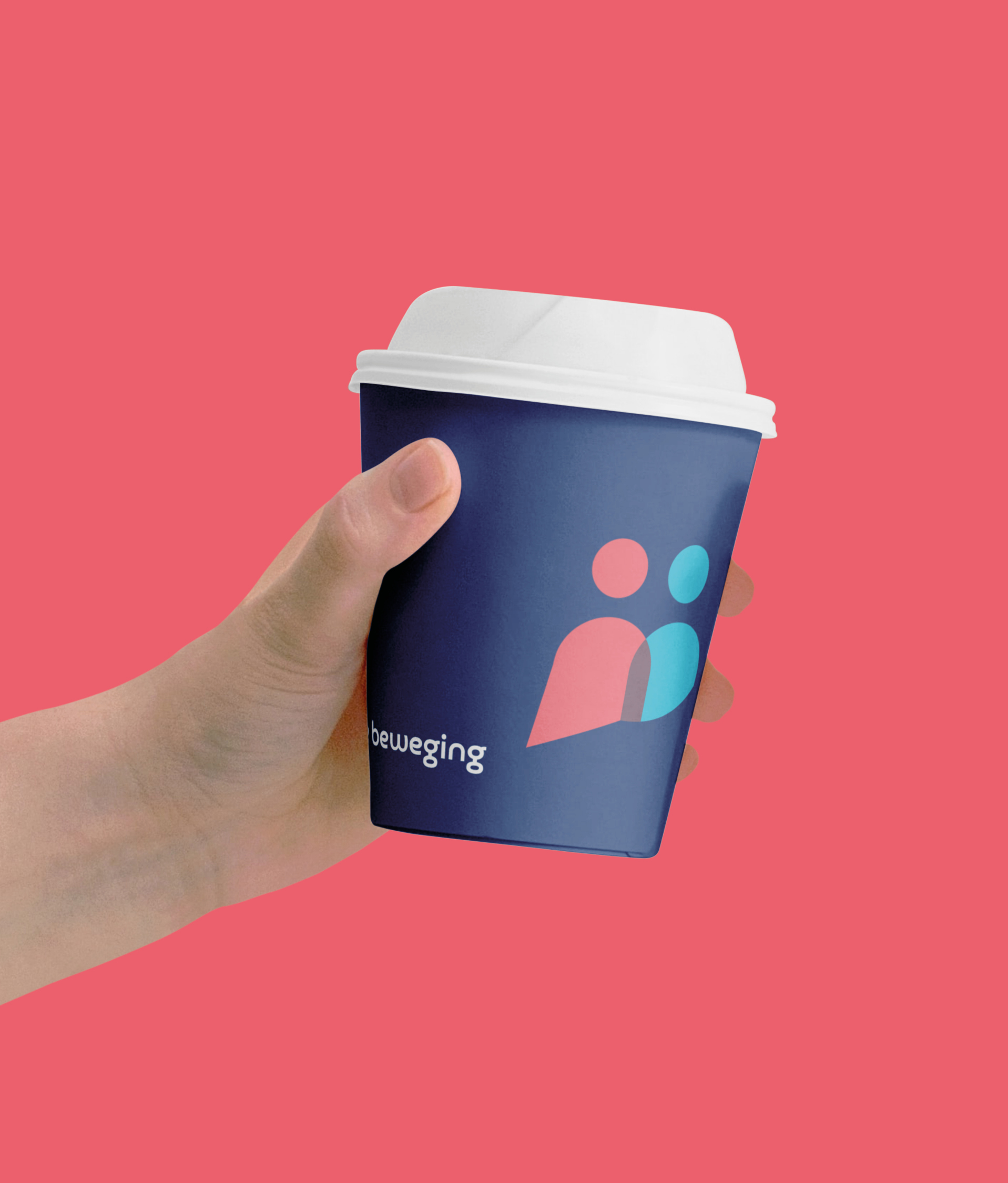
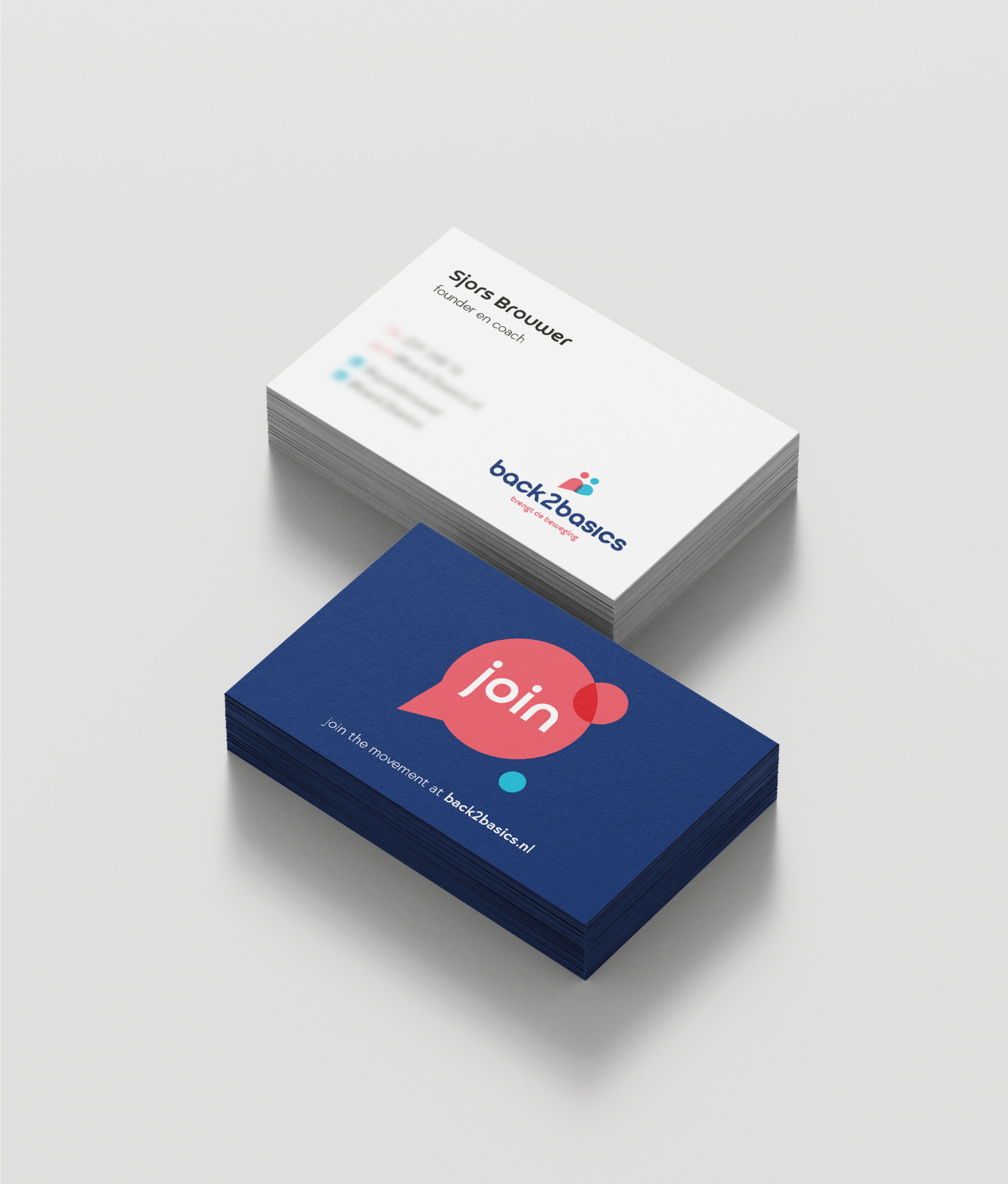
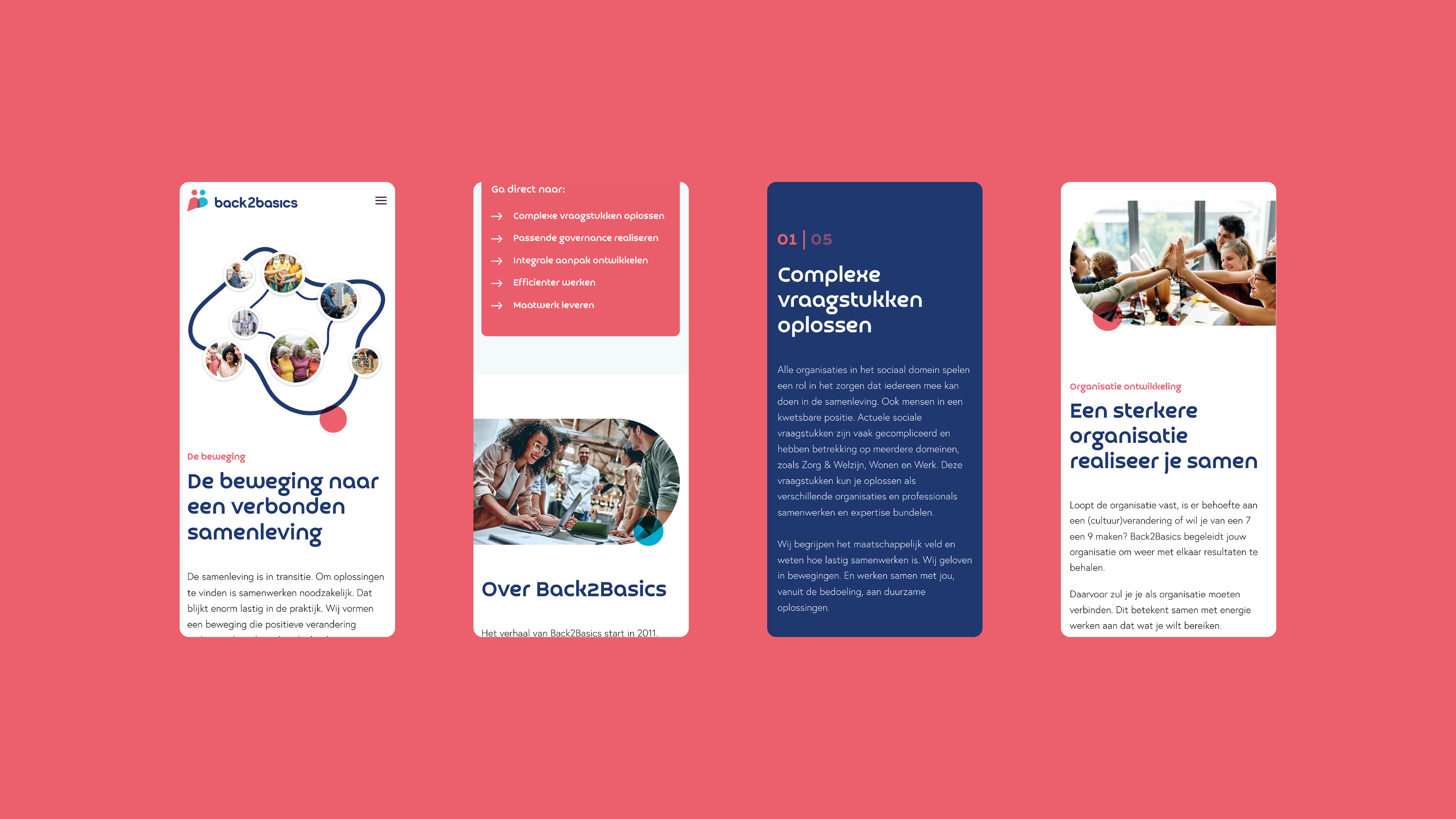
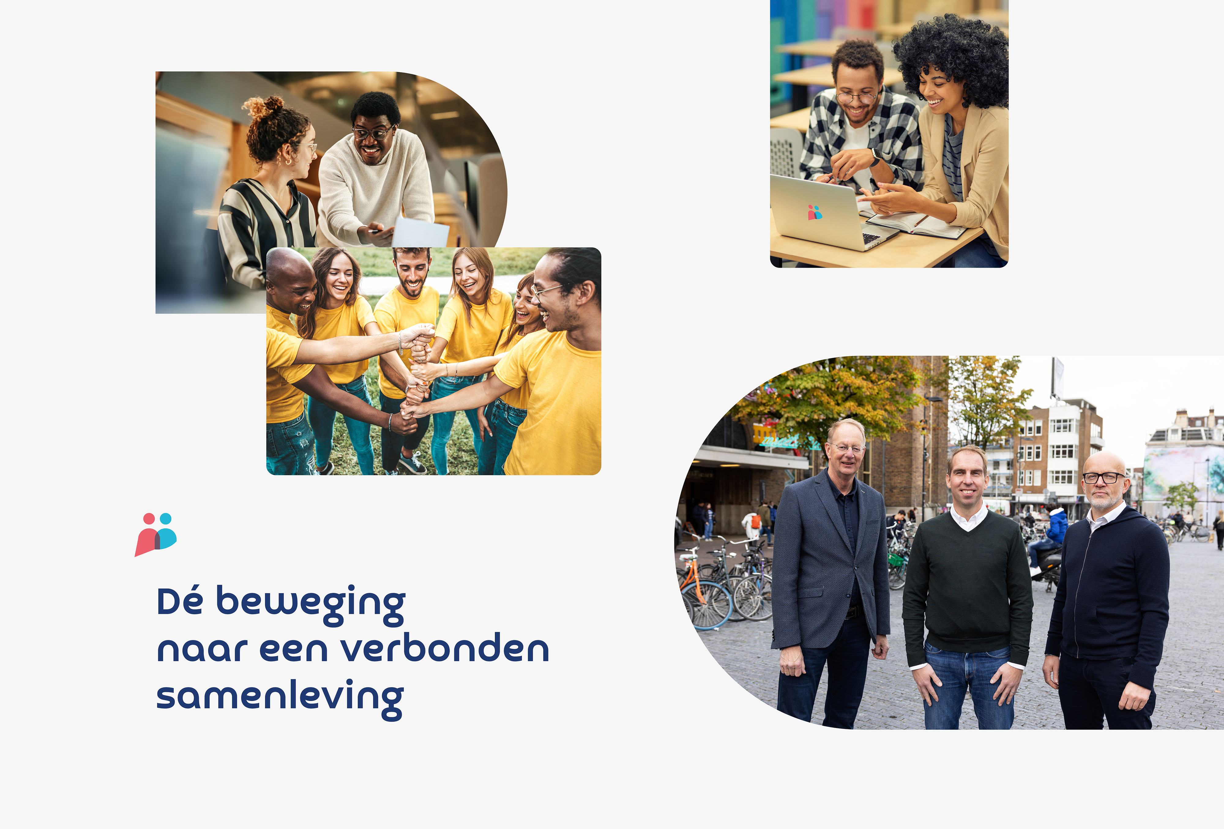
Herpositioning as a movement for the entire social domain
- Sectors list:
professional services
- Headline Introduction:
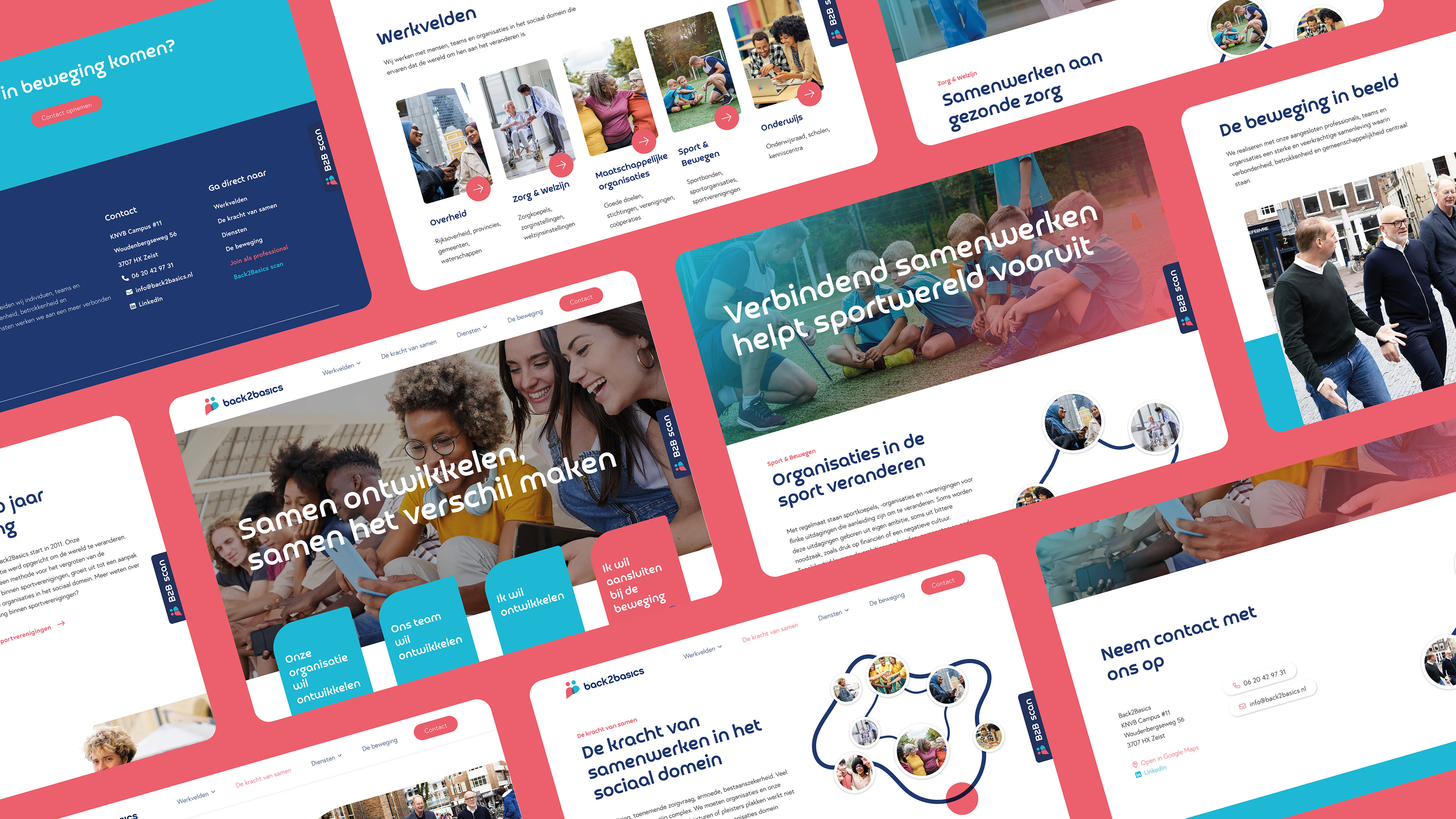
Back2Basics has more than 30 years of experience in increasing involvement within sports clubs. Their method has since grown into an approach for all organizations in the social domain. With the aim: connect society. To convey the right story and feeling with new target groups within the social domain, Back2Basics Vandeez chosen as a strategic partner.
- Brand Essential List:
Brand positioning, Brand identity , Website
- Approach:
We started determining the right brand strategy . What are the current pain points and the future ambitions? Together we decided to go Back2Basics From 'sub -brand' for sports clubs to 'Master Brand' for different target groups. With the rebranding we have realized a new brand foundation that consists of: brand positioning, brand identity and a new website.
- Result:
A clear positioning and distinctive brand identity in which it is clear that Back2Basics will do things differently: not complicating, meaningful and with impact.
credible and authentic
The way in which the brand values and brand promise are applied in, for example, the logo, logo and colors makes the brand credible and authentic. This new brand identity has been implemented in various means of communication, so that Back2Basics has the right tools to actually make an impact.
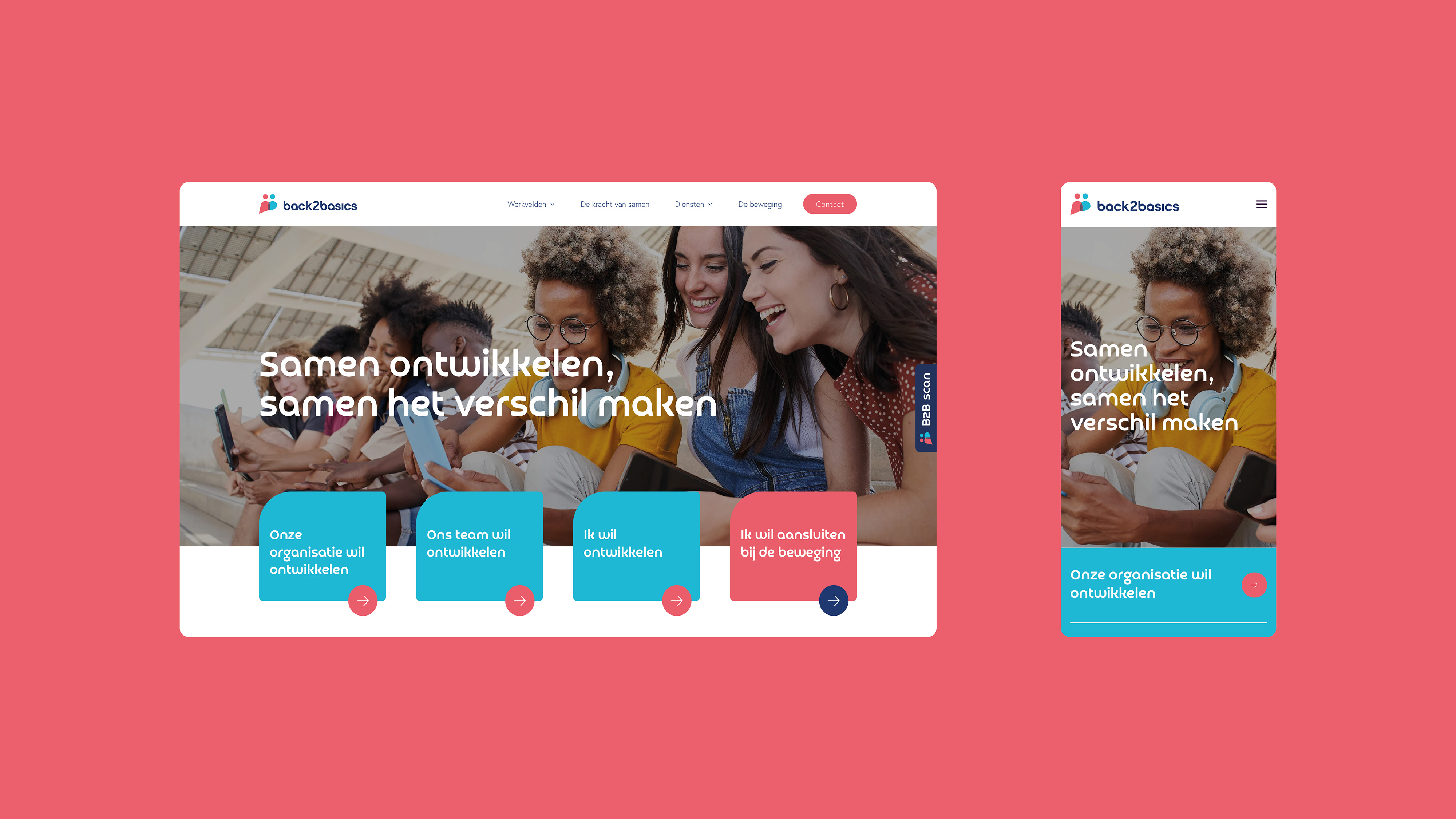
New website
The intention, design and content come together on a new recognizable website. Parallax elements simulate the movement. The chosen images and colors represent the mutual relationship between people. And in the context we emphasize that Back2Basics motivates, inspires and makes organizations move.
And so Team Vandeez also experienced this brand process. Back2Basics has motivated and inspired us. We include the ideas in new trajacts for future customers.
- Logo:
- Quote:
"This rebranding is the go -ahead for a growing movement. From sports clubs to the entire social domain. We bring society together and do this differently: not complex, meaningful and with impact.
- Quote - Customer Name and Function:
Sjors Brouwer - Founder
- Quote image:
- About customer:
About Back2Basics
- About customer information:
The story of Back2Basics starts in 2011. Founders Berend Rubingh, Hans van Egdom and Sjors Brouwer set up network organization Back2Basics to change the world. What starts as a method for increasing involvement within sports clubs is growing into an approach for all types of organizations in the social domain. With the aim: connect society.
Repositioning as a movement for the entire social domain
- Product Category:
Brand Strategy , Brand identity , Website
- Slideshow:
- Type:
Image , Media Test :
 , ALT -Tag:
BVBN - Branch Association in the Netherlands Emergency Response Netherlands
, ALT -Tag:
BVBN - Branch Association in the Netherlands Emergency Response Netherlands - Type:
Image , Media Test :
 , ALT -Tag:
BVBN - Branch Association in the Netherlands Emergency Response Netherlands
, ALT -Tag:
BVBN - Branch Association in the Netherlands Emergency Response Netherlands - Type:
Video , Media Test :
, ALT -Tag:
BVBN - Industry Association in the Netherlands Emergency Response Netherlands
- Type:
Image , Media Test :
 , ALT -Tag:
BVBN - Branch Association in the Netherlands Emergency Response Netherlands
, ALT -Tag:
BVBN - Branch Association in the Netherlands Emergency Response Netherlands - Type:
Image , Media Test :
 , ALT -Tag:
BVBN - Branch Association in the Netherlands Emergency Response Netherlands
, ALT -Tag:
BVBN - Branch Association in the Netherlands Emergency Response Netherlands - Type:
Image , Media Test :
 , ALT -Tag:
BVBN - Branch Association in the Netherlands Emergency Response Netherlands
, ALT -Tag:
BVBN - Branch Association in the Netherlands Emergency Response Netherlands - Type:
Image , Media Test :
 , ALT -Tag:
BVBN - Branch Association in the Netherlands Emergency Response Netherlands
, ALT -Tag:
BVBN - Branch Association in the Netherlands Emergency Response Netherlands - Type:
Image , Media Test :
 , ALT -Tag:
BVBN - Branch Association in the Netherlands Emergency Response Netherlands
, ALT -Tag:
BVBN - Branch Association in the Netherlands Emergency Response Netherlands - Type:
Image , Media Test :
 , ALT -Tag:
BVBN - Branch Association in the Netherlands Emergency Response Netherlands
, ALT -Tag:
BVBN - Branch Association in the Netherlands Emergency Response Netherlands - Type:
Image , Media Test :
 , ALT -Tag:
BVBN - Branch Association in the Netherlands Emergency Response Netherlands
, ALT -Tag:
BVBN - Branch Association in the Netherlands Emergency Response Netherlands - Type:
Image , Media Test :
 , ALT -Tag:
BVBN - Branch Association in the Netherlands Emergency Response Netherlands
, ALT -Tag:
BVBN - Branch Association in the Netherlands Emergency Response Netherlands - Type:
Image , Media Test :
 , ALT -Tag:
BVBN - Branch Association in the Netherlands Emergency Response Netherlands
, ALT -Tag:
BVBN - Branch Association in the Netherlands Emergency Response Netherlands - Type:
Image , Media Test :
 , ALT -Tag:
BVBN - Branch Association in the Netherlands Emergency Response Netherlands
, ALT -Tag:
BVBN - Branch Association in the Netherlands Emergency Response Netherlands - Type:
Image , Media Test :
 , ALT -Tag:
BVBN - Branch Association in the Netherlands Emergency Response Netherlands
, ALT -Tag:
BVBN - Branch Association in the Netherlands Emergency Response Netherlands
- Cases Logo - Diap:

- Headline Subtitle:
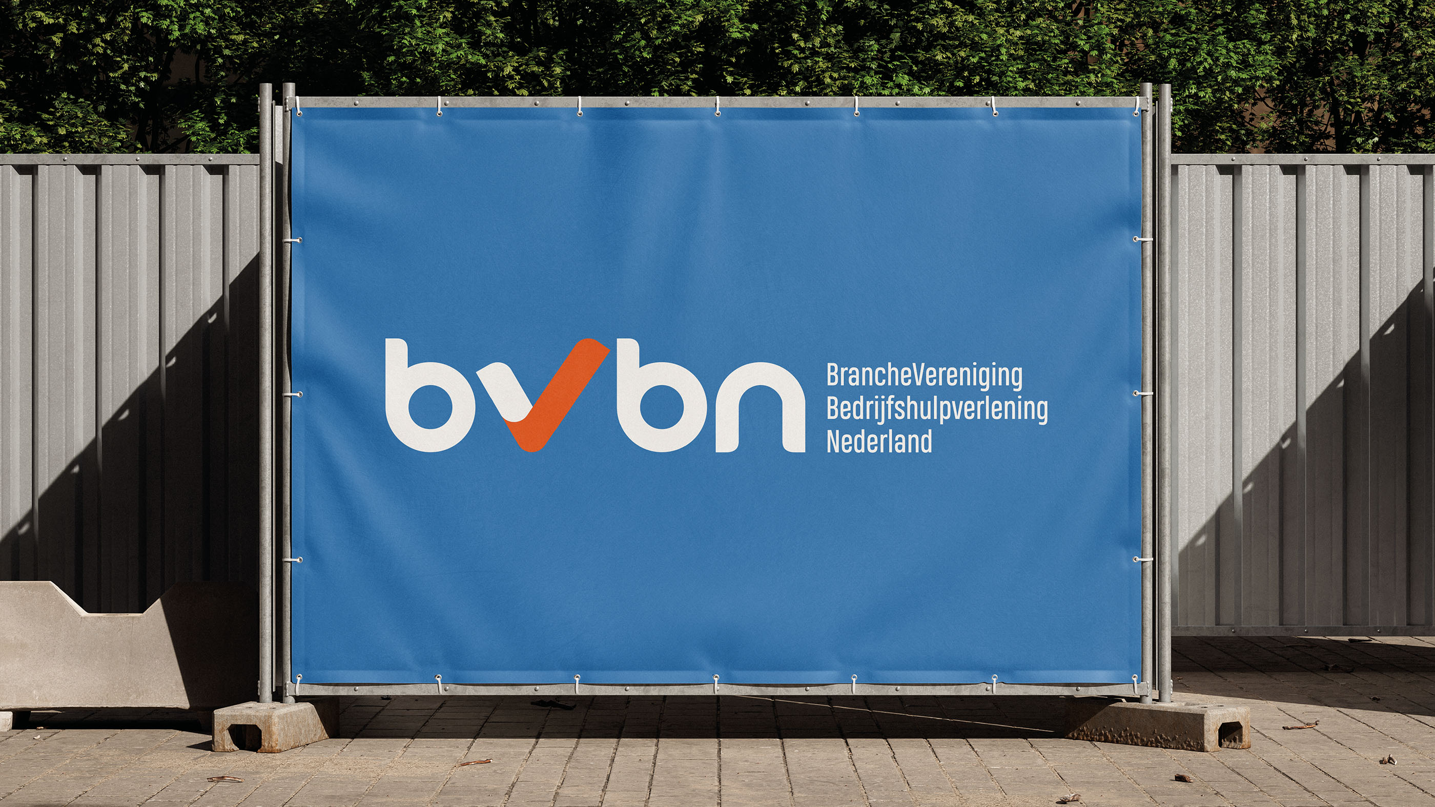
Rebranding of the BVBN brand
- Sectors List:
Construction
- Headline Introduction:
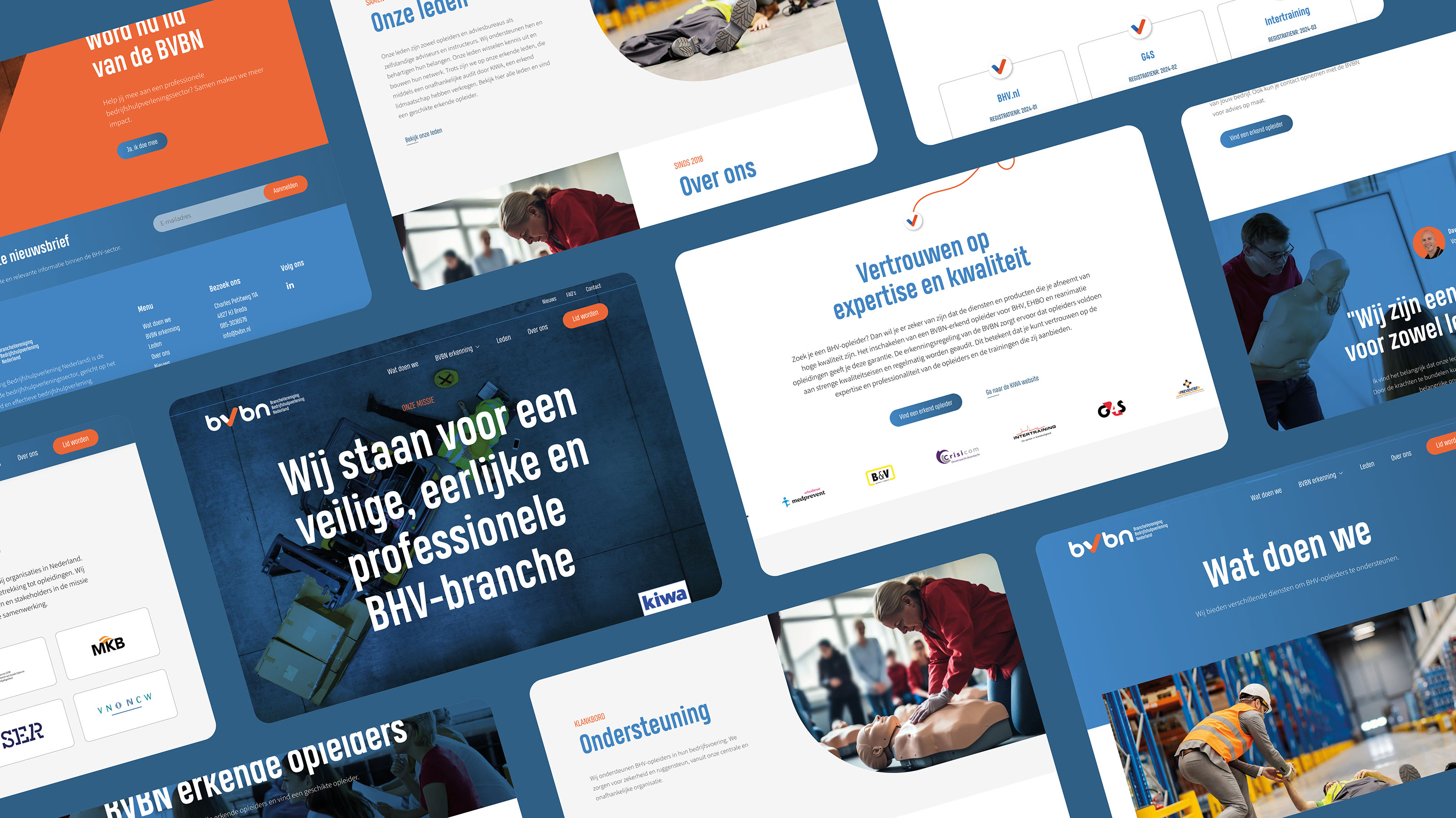
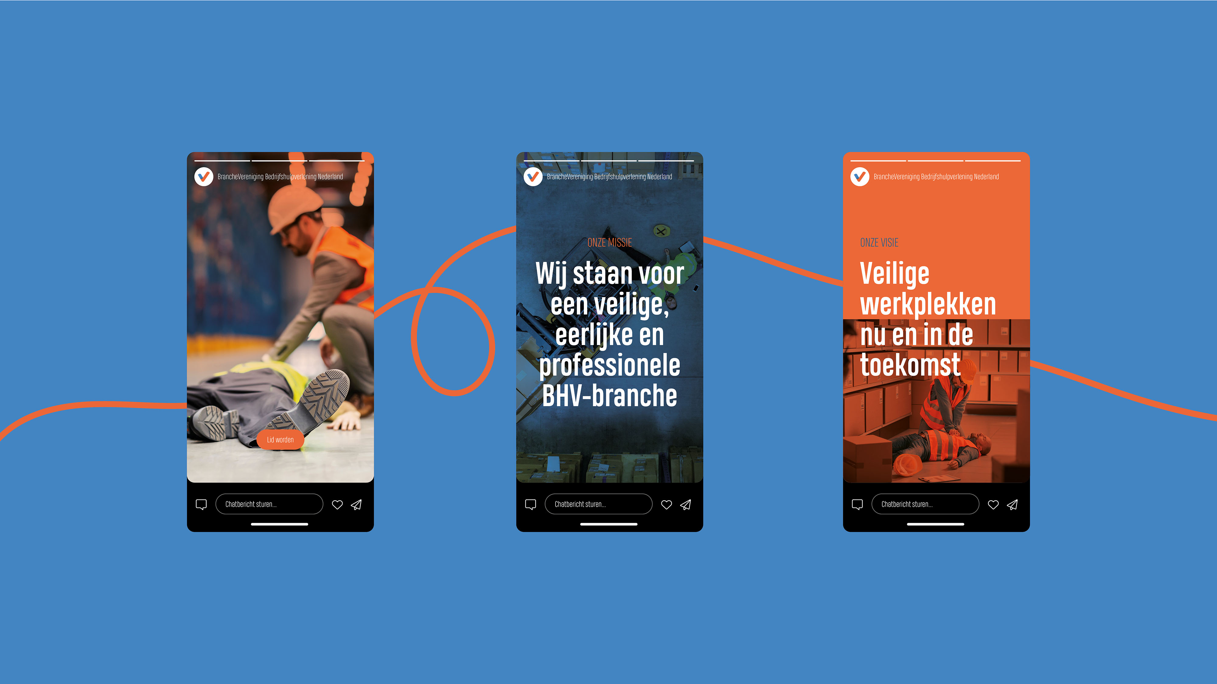
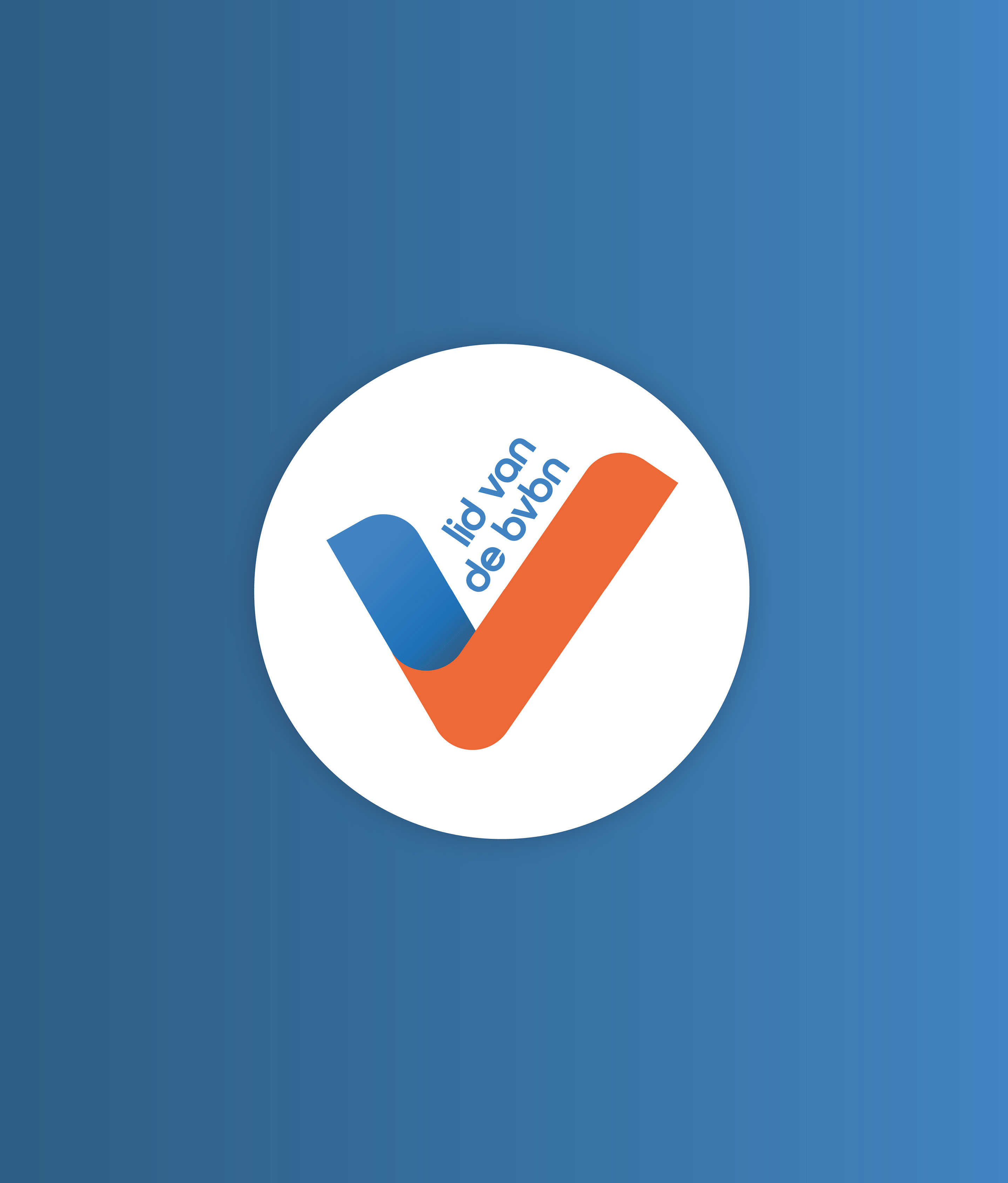
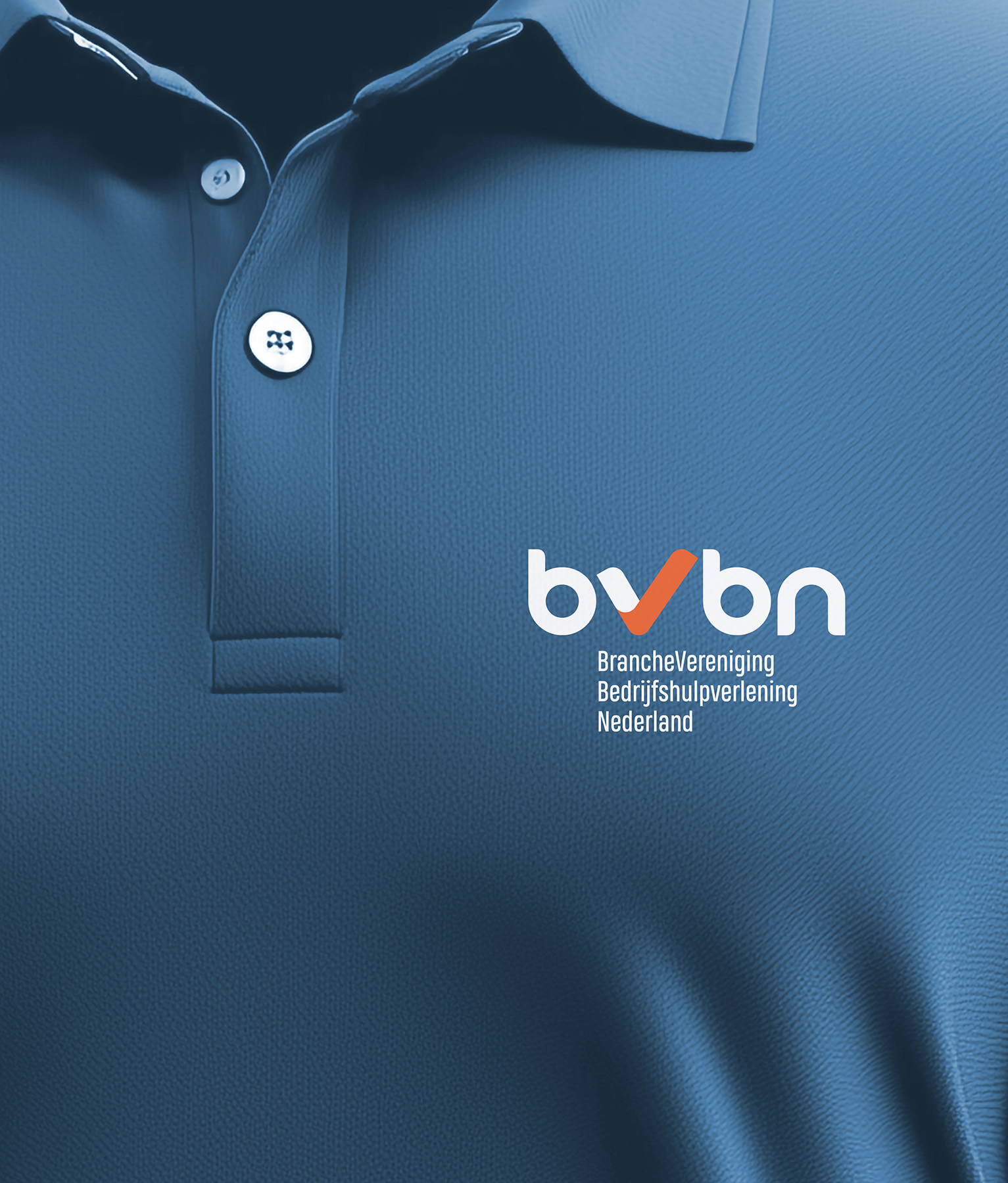
In 2024, the BVBN (industry organization Install Ranking Nederland) and Vandeez joined forces to give the BvbN brand a solid boost. The goal? Further professionalization of the brand, so that a stable transition takes place to the maturity phase. With a focus on growth in the number of members, the recognized membership and visibility increase among the end customers.
- Brand Essential List:
Brand positioning, Brand identity , Website
- Approach:
BVBN was founded during the COVID-19 Pandemie and grew at lightning speed into an important player in the industrial industry industry. But with growth, the question also comes: how do we ensure that our trade association is just as strong and recognizable as our translation contact us Ante services? Time for a current brand story, a contemporary identity and a brand new website.
Focus on quality and visibility
Together with a part of the board of the BVBN we dived deep into the core of the brand. These are enthusiastic people with an enormous amount of knowledge of the market. We recorded the mission, vision, unique values and brand promise in a brand compass and worked out the visual effect in an inspiring brand book . New colors and images that match the enthusiasm of their dynamic and proactive organization. They help their members and the sector ahead with a proactive attitude. The brand book forms the basis for all communication expressions. And it doesn't stop there. We designed a fresh, well -arranged website that perfectly translates the bvn mission into online.
- Result:
A strong brand for the future
The BVBN has everything in its hands to propagate their brand consistent and professionally. And with the new website, the BVBN is ready to make even more impact online.
- Logo:
- Quote:
" Vandeez has done fantastic work by putting our brand compass at a razor sharp and to grasp it precisely what we stand for as a trade association. Moreover, they have built a beautiful, fresh website. This is the start of a future collaboration. Thanks to Vandeez we are now really shining what we want to tell!"
- Quote - Customer Name and Function:
Dave van der Vliet - Chairman BVBN
- Quote image:

- About customer:
About the BVBN
- About customer information:
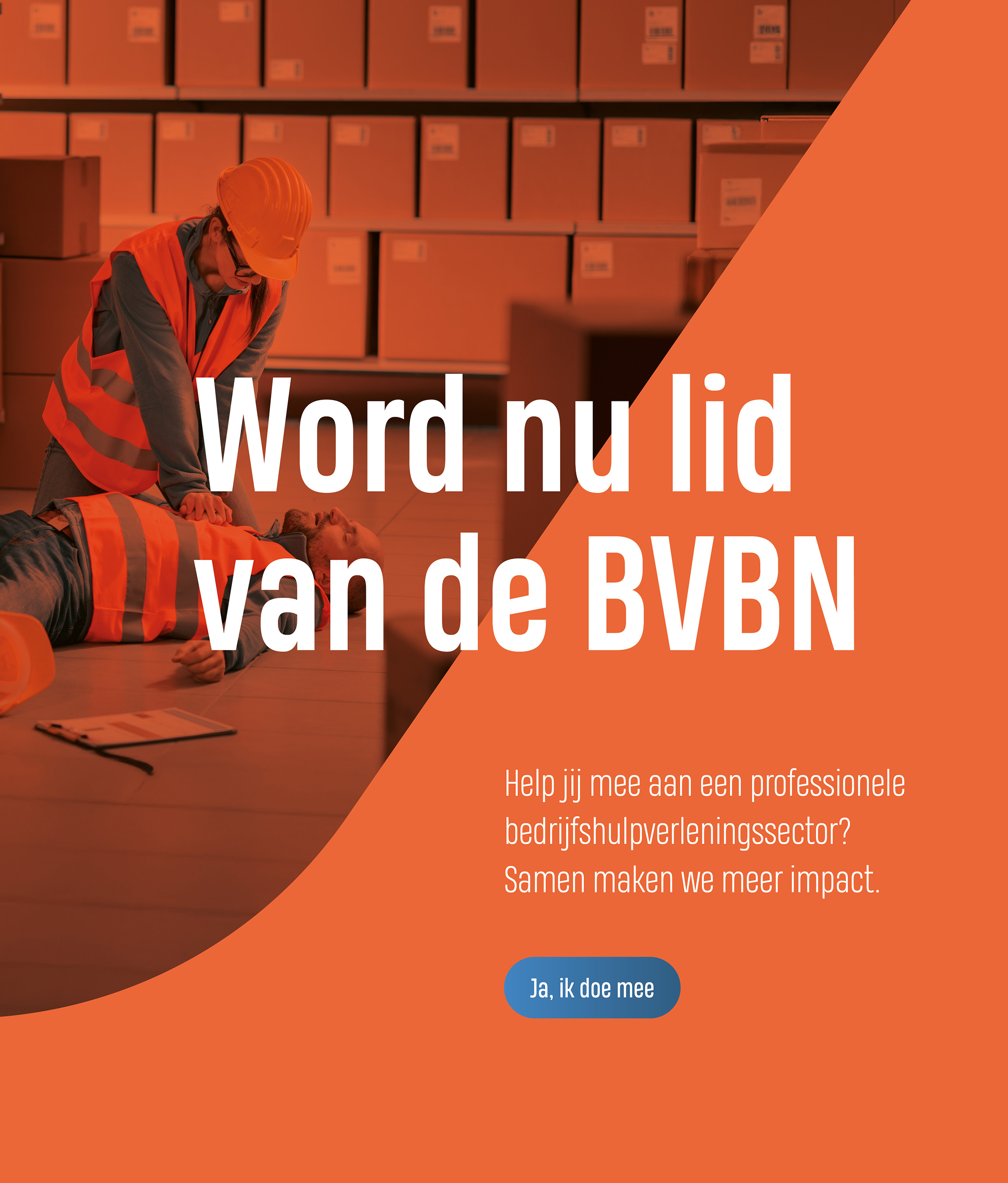
the BVBN (Branch Association for the Netherlands Emergency Response Netherlands) is the industry organization for the company emergency response sector, aimed at promoting safety and effective company emergency services.
The new brand foundation of the BVBN
- Product Category:
Website
- Slideshow:
- Type:
Image , Media Test :
 , Alt-Tag:
Car Dynamics
, Alt-Tag:
Car Dynamics - Type:
Image , Media Test :
 , Alt-Tag:
Car Dynamics
, Alt-Tag:
Car Dynamics - Type:
Video , Media Test :
, Alt-Tag:
Car Dynamics
- Type:
Image , Media Test :
 , Alt-Tag:
Car Dynamics
, Alt-Tag:
Car Dynamics - Type:
Image , Media Test :
 , Alt-Tag:
Car Dynamics
, Alt-Tag:
Car Dynamics - Type:
Image , Media Test :
 , Alt-Tag:
Car Dynamics
, Alt-Tag:
Car Dynamics - Type:
Image , Media Test :
 , Alt-Tag:
Car Dynamics
, Alt-Tag:
Car Dynamics - Type:
Image , Media Test :
 , Alt-Tag:
Car Dynamics
, Alt-Tag:
Car Dynamics - Type:
Image , Media Test :
 , Alt-Tag:
Car Dynamics
, Alt-Tag:
Car Dynamics - Type:
Image , Media Test :
 , Alt-Tag:
Car Dynamics
, Alt-Tag:
Car Dynamics - Type:
Image , Media Test :
 , Alt-Tag:
Car Dynamics
, Alt-Tag:
Car Dynamics - Type:
Image , Media Test :
 , Alt-Tag:
Car Dynamics
, Alt-Tag:
Car Dynamics - Type:
Image , Media Test :
 , Alt-Tag:
Car Dynamics
, Alt-Tag:
Car Dynamics - Type:
Image , Media Test :
 , Alt-Tag:
Car Dynamics
, Alt-Tag:
Car Dynamics
- Cases Logo - Diap:

- Headline Subtitle:
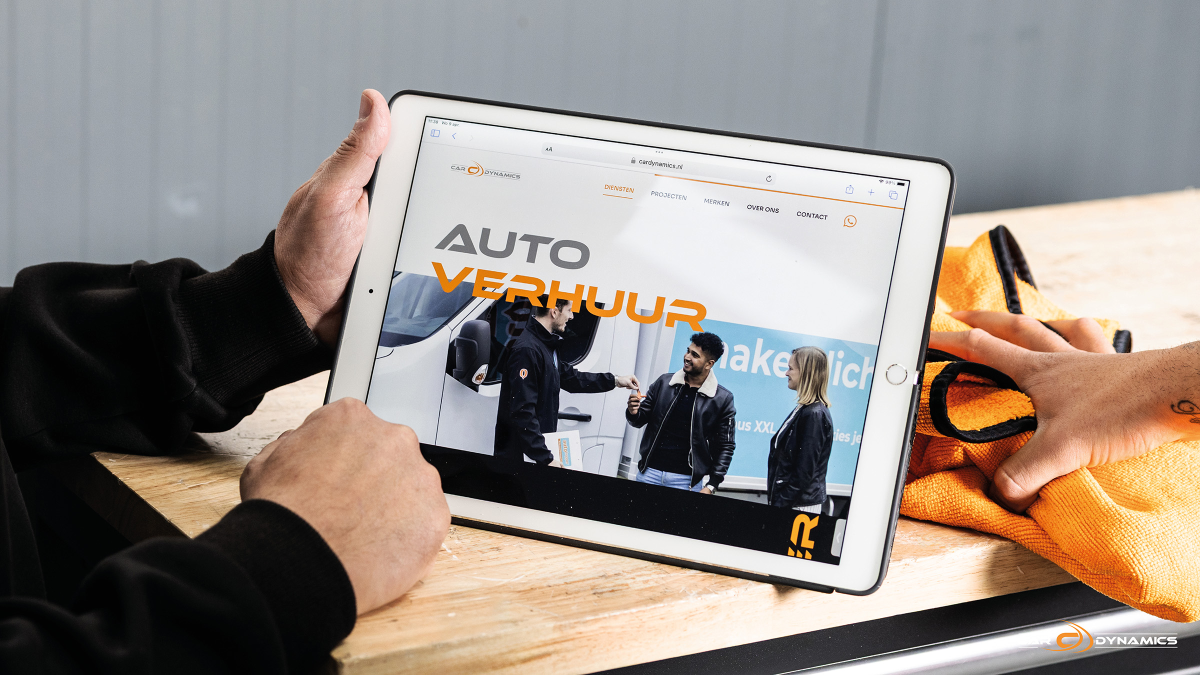
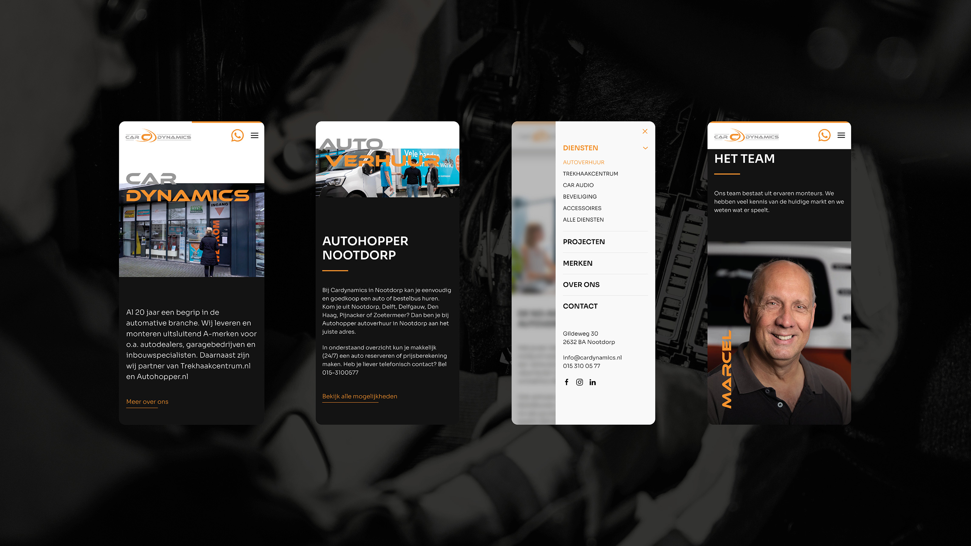
New website for Car Dynamics
- Sectors List:
manufacturing industry
- Headline Introduction:
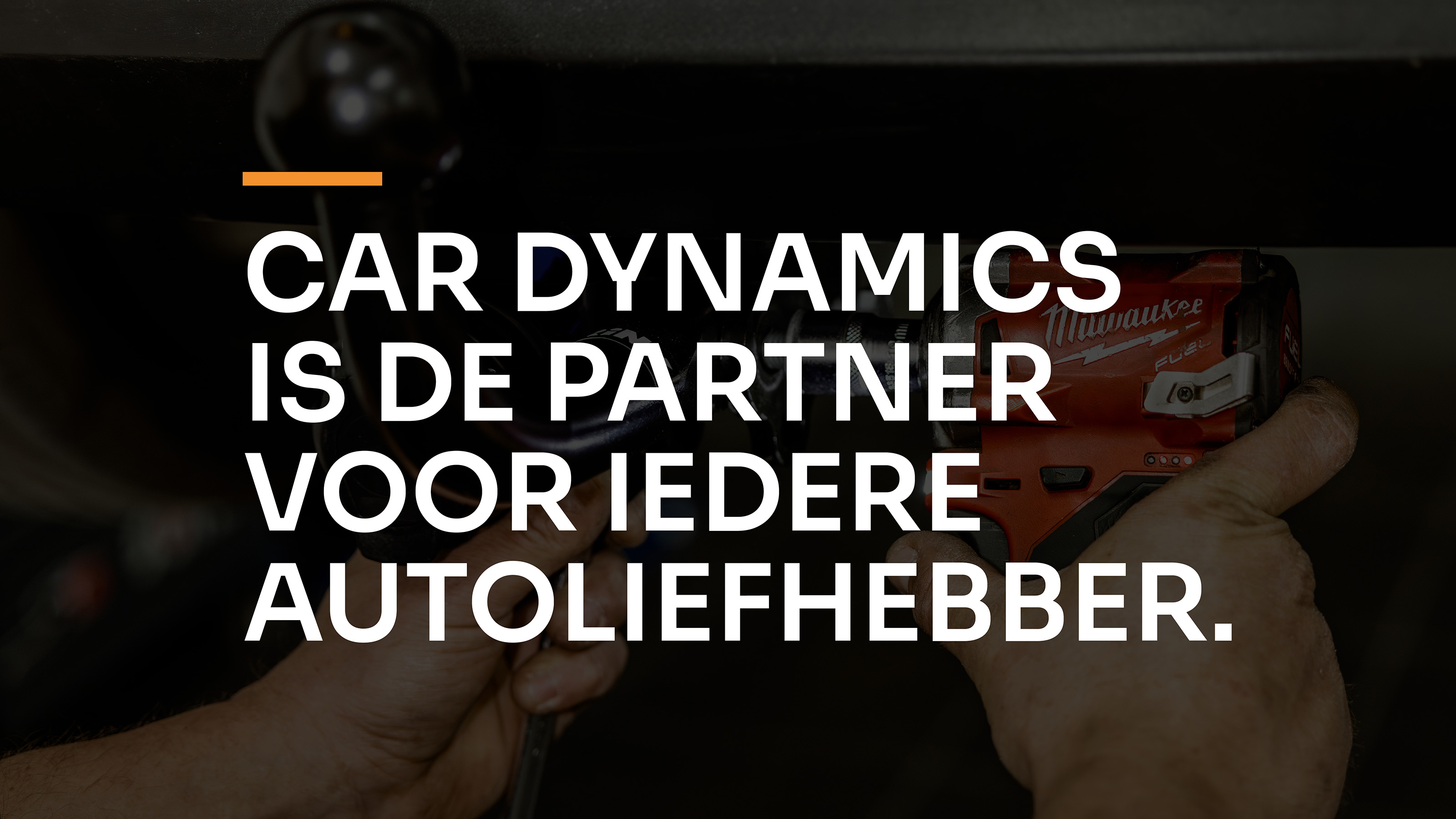
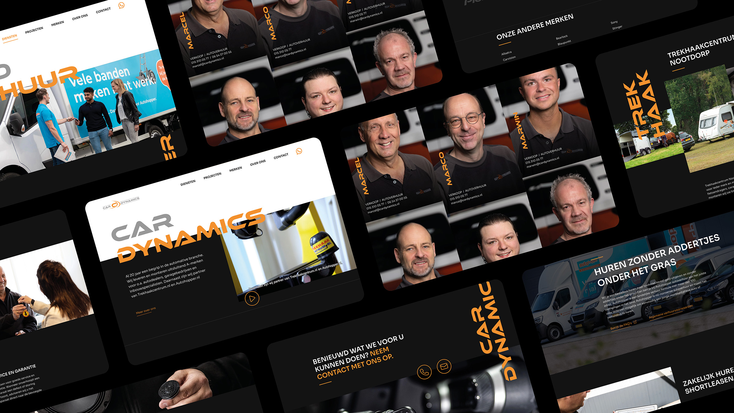
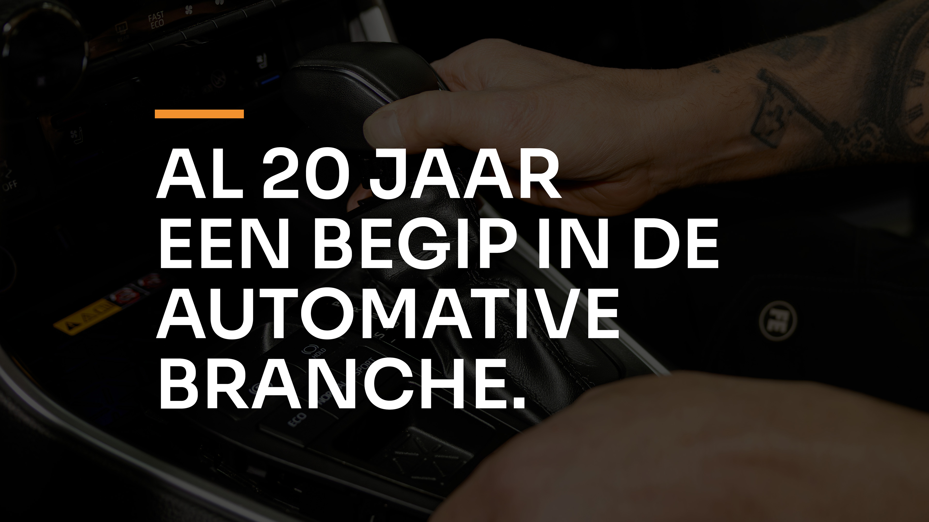
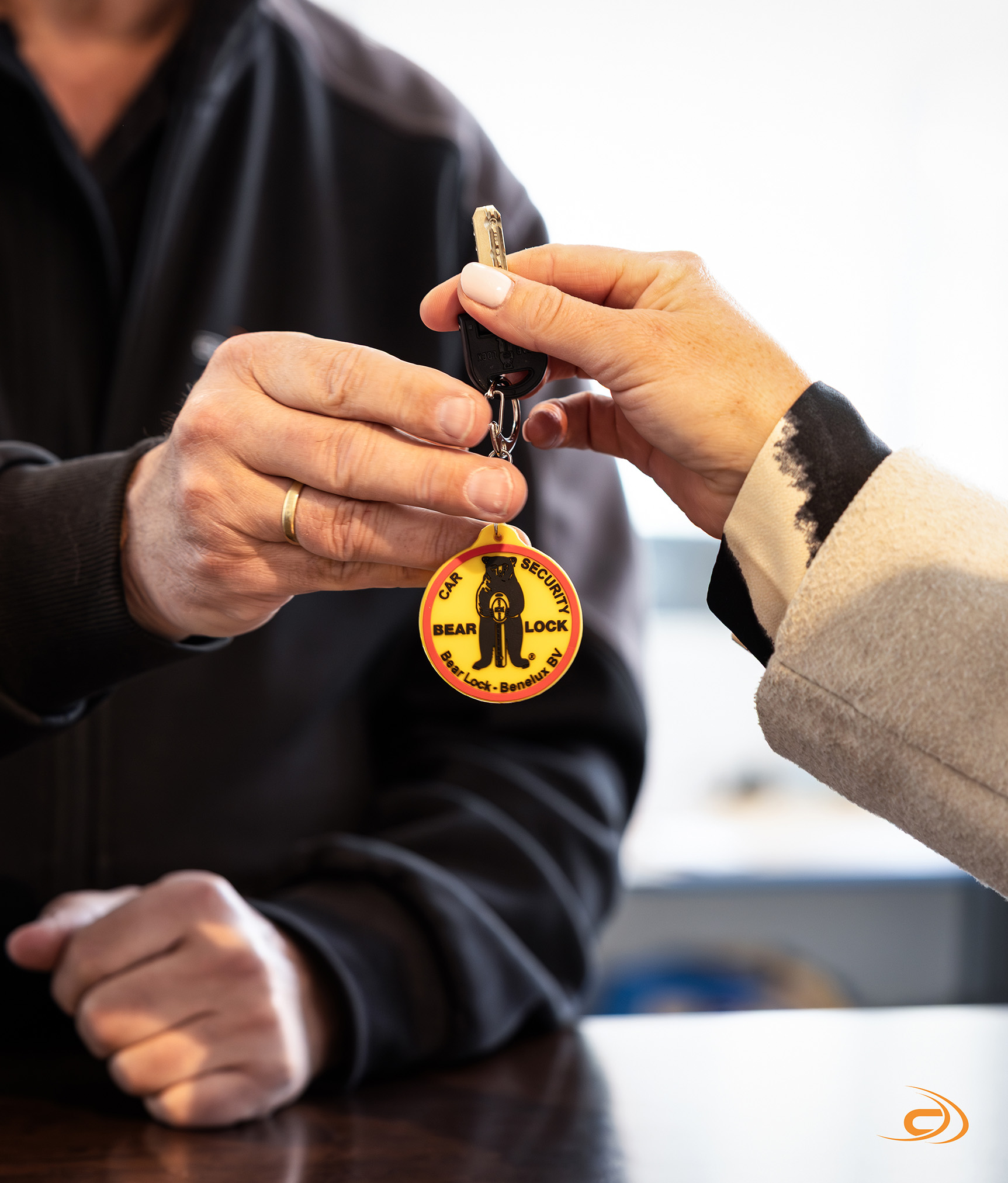
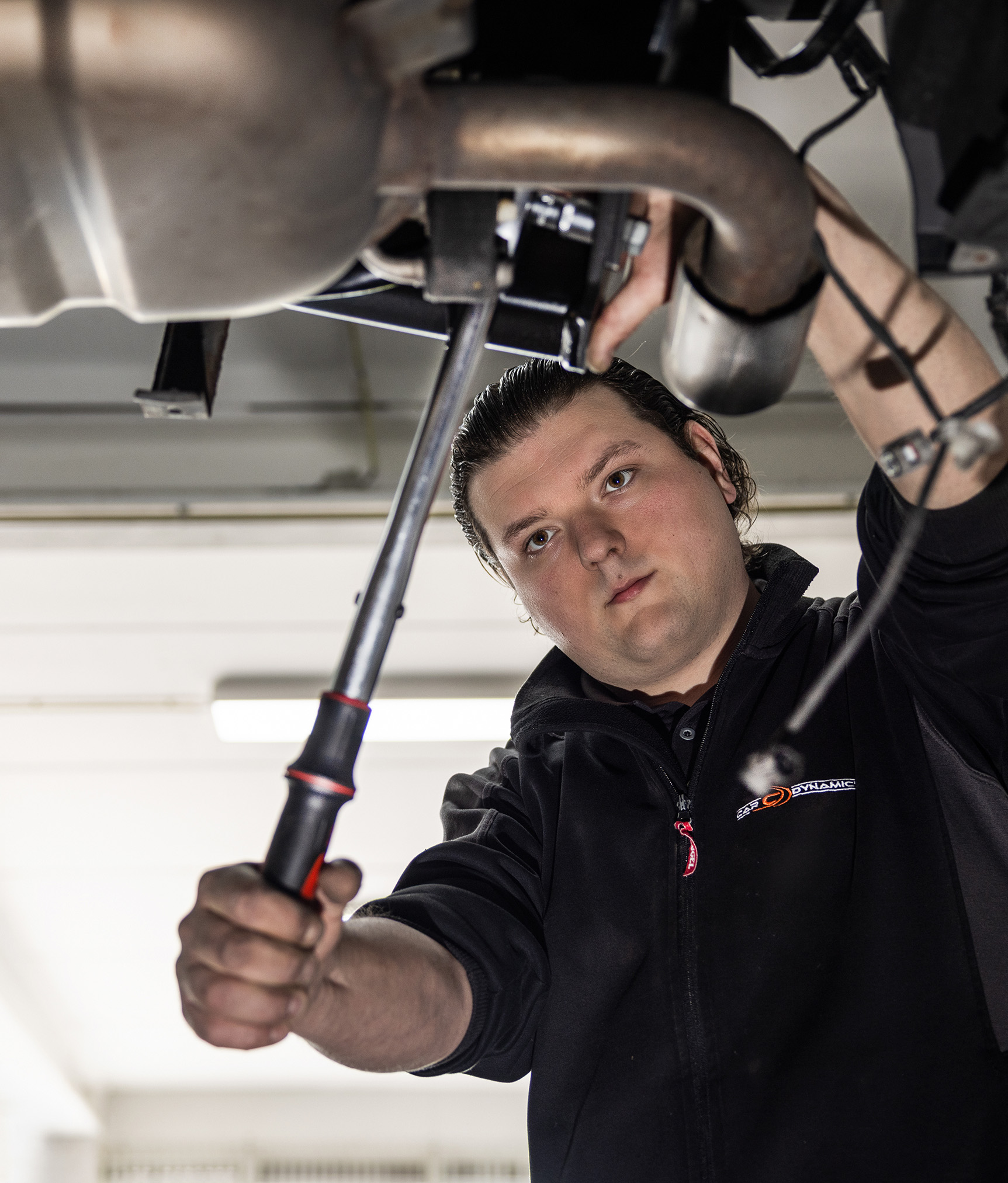
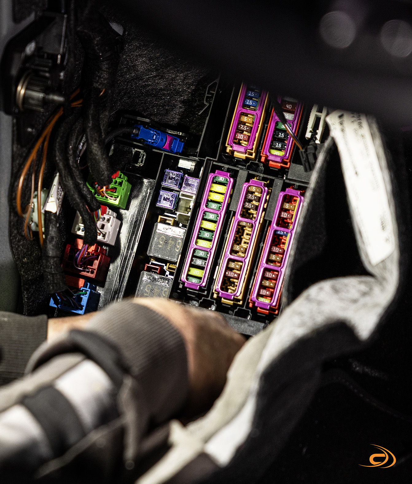
Car Dynamics has been a household name in the automotive industry for 20 years. They serve a wide audience with an impressive palette of services. From supplying and assembling car entertainment to car rental and as a recognized towing center: Car Dynamics stands for craftsmanship, innovation and pure love for cars.
- Brand Essential List:
Website
- Approach:
How do you translate such a versatile offer into one clear and strong story? That question was central to our collaboration. Because Car Dynamics is not one thing - it is a specialist club with multiple expertise under one roof. Our goal: to develop a website that tells that complete story.
creative cooperation
The collaboration was a hit from day one. We visited the company several times and spoke to the team. That not only gave us insight into the technical precision with which they work, but also into culture: professional, involved and pride. We wanted to catch that feeling in every detail of the design, the tone of voice and photography.
High-end look & feel, without Pooha
The result is a website that breathes the power of Car Dynamics: exclusive, but accessible. The combination of a sleek UX, high -quality photography and a powerful design ensures a premium identity that fits their craftsmanship. At the same time it remains human - you feel the enthusiasm of the team and you see their dedication in every pixel.
Strong brand recognition and SEO-proof
We have consciously opted for a structure that strengthens the existing brand recognition, with a focus on organic findability. No tricks, but relevant content for real car enthusiasts. Whether you are looking for a towbar for your camper, a customized sound system, or temporarily need a car via AutoHopper, you immediately feel: here they know what they are talking about.
- Result:
proud of a great result
From the first sketch to the live: this collaboration was one to be proud of. The new website not only shows what Car Dynamics does, but especially who they are: a team with a heart for technology and an eye for people. Exactly as their customers have been experiencing it for twenty years.
- Logo:

- Quote:
"The way Vandeez has dived into our company with attention and involvement, our services and our strength is really unique. I have not experienced that often yet. Very happy with the result!"
- Quote - Customer Name and Function:
Marcel Toet - Owner Car Dynamics
- Quote image:

- About customer:
About Car Dynamics
- About customer information:
Car Dynamics has been a household name in the automotive industry for 20 years. They supply, install and assemble electronics, hardware and software from car accessories.
New website for Car Dynamics
- Product Category:
Brand Strategy , Brand identity , Website
- Slideshow:
- Type:
Video , Media Test:
- Type:
Image , Media Test:

- Type:
Video , Media Test:
vandeez -CASE-CBG-Gerbera Always Surprises-2024-Video-growers-mobile.mp4
- Type:
Image , Media Test:
- Type:
Image , Media Test:
- Type:
Image , Media Test:
- Type:
Image , Media Test:
- Type:
Image , Media Test:
- Type:
Image , Media Test:
- Type:
Image , Media Test:
- Type:
Video , Media Test:
vandeez -CASE-CBG-GERBERA Always surprise-2024-Video-growers-tour.mp4
- Type:
Image , Media Test:
- Type:
Image , Media Test:

- Type:
Image , Media Test:

- Type:
Image , Media Test:
- Type:
Image , Media Test:
- Cases Logo - Diap:

- Headline Subtitle:
Collective Promotion of the Dutch Gerbera in Europe
- Sectors list:
agriculture and horticulture
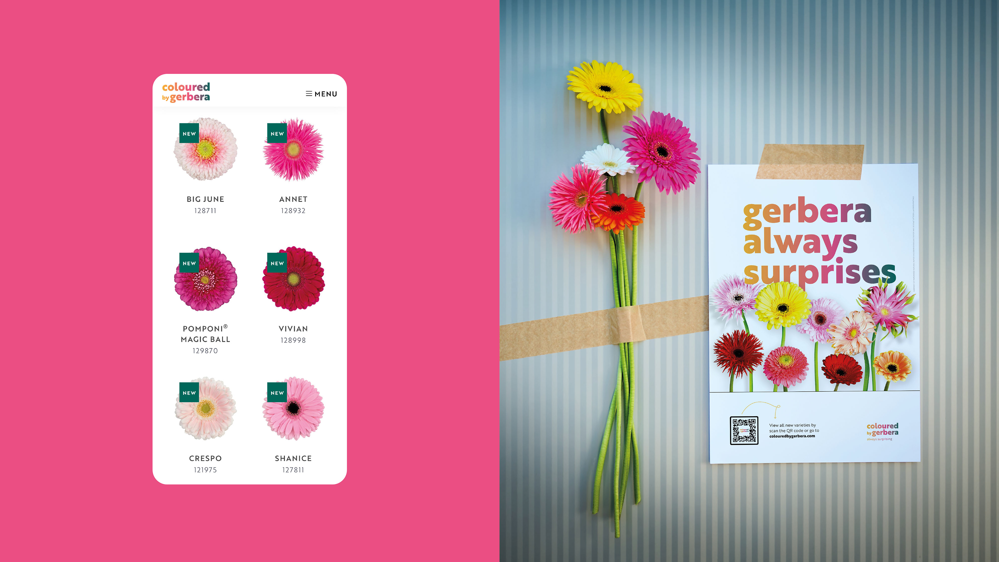
- Headline Introduction:
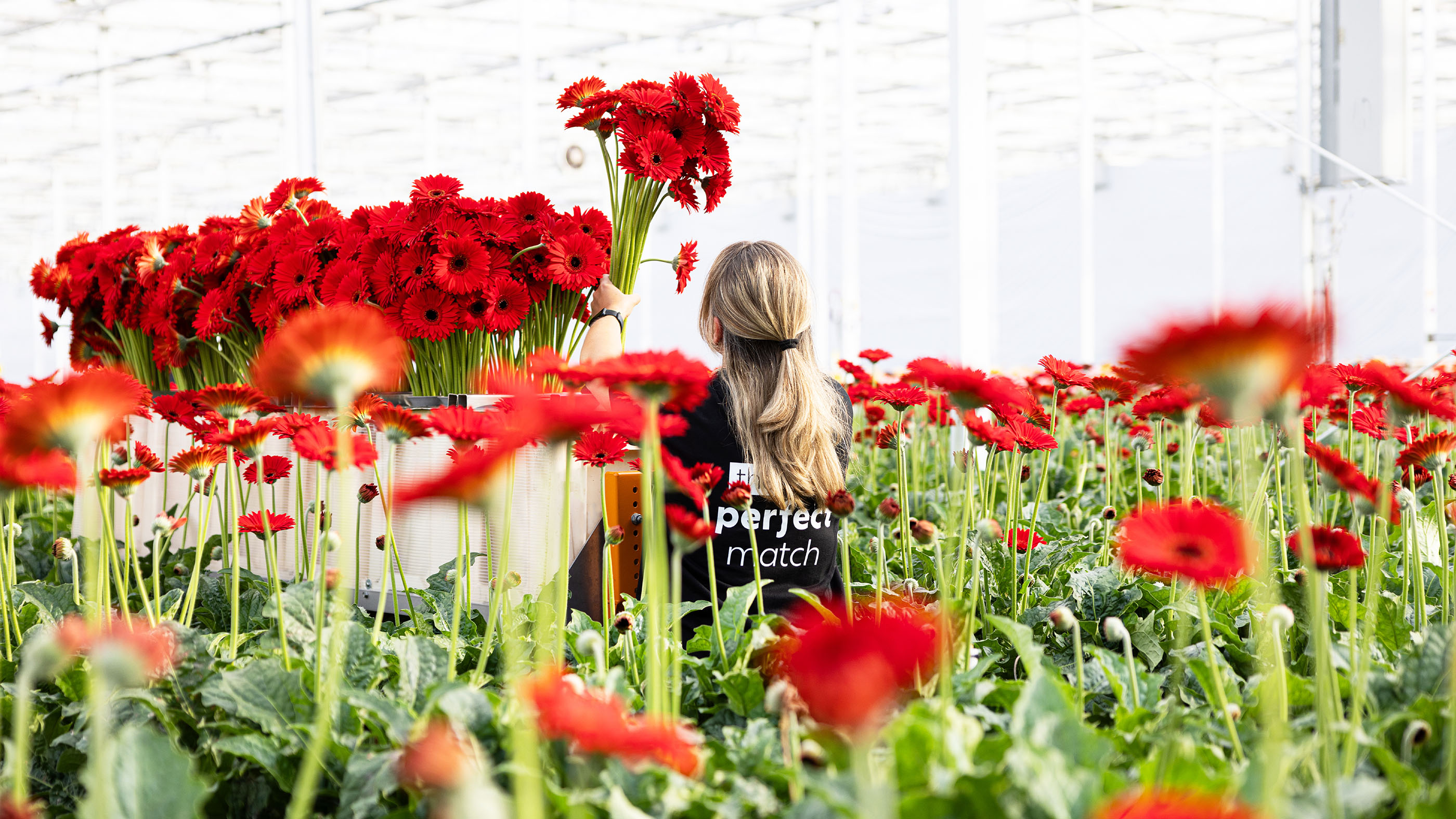
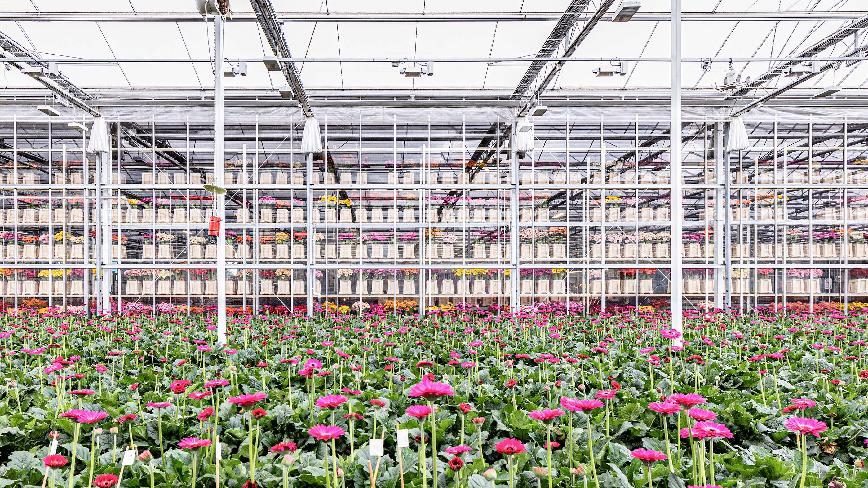
Coloured by Gerbera is the collective Gerberapromotie Nederland and aims to promote Gerbera internationally towards florist, retail and wholesaler. But what is it that the Gerbera makes different than other flowers? What is their distinctive character? And how do they make the various target groups aware of this?
- Brand Essential List:
Brand positioning, Brand identity , Website
- Approach:
We started the brand positioning. By talking to the growers and breeders, we have clearly gained the story and distinctive character of the Gerbera. A colorful, cheerful and trendy flower that becomes stronger every day and is always available in many variations. We have also determined the brand values that the Gerbera can be recognized.
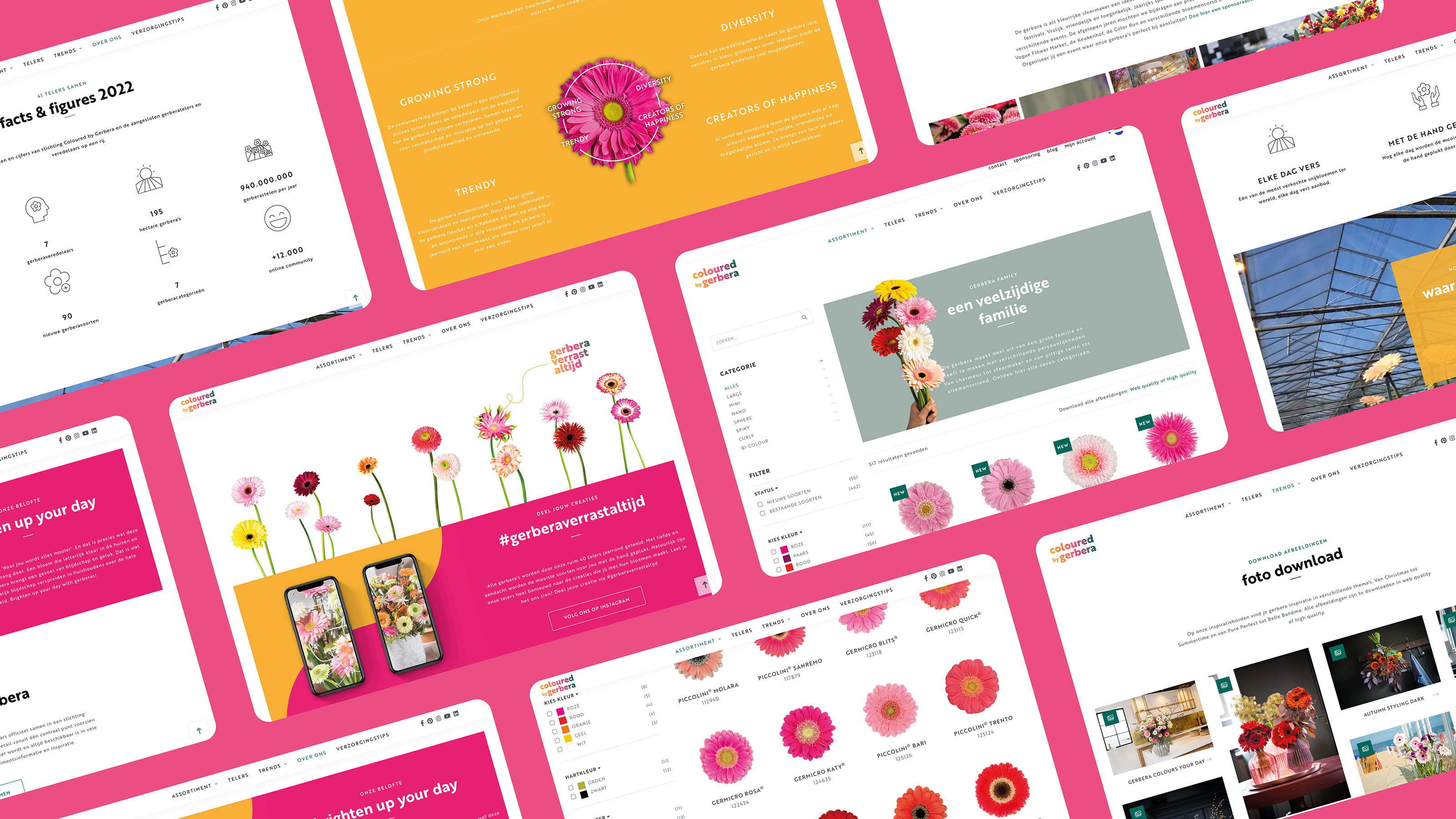
Appropriate brand identity and Website
When that base was standing, we divided the wide range into categories, which make this versatile family more transparent and also give experience and emotion. We then translated this on the website and the social media channels with a suitable brand identity .
- Result:
a controversial brand with a recognizable identity that evokes positive reactions in the various target groups. We have created a powerful basis from which the collective can continue to build. being developed for Coloured by Gerbera
- Logo:
- Quote:
"Fantastic how Gerbera van Product has become a brand. The commitment of the promotion can be seen in the sale"
- Quote - Customer Name and Function:
WP van den Berg - Chairman
- Quote image:
- About customer:
About Coloured by Gerbera
- About customer information:
In 2013 all Dutch gerberatelers and breeders officially came together in a foundation: Coloured by Gerbera . This is the collective Gerberapromotie Nederland. Here you will find assortment information and inspiration.
Collective promotion of the Dutch Gerbera in Europe
- Product Category:
Home, Brand identity , Website
- Slideshow:
- Type:
Image , Media Test :
 , Alt-Tag:
Logo Eef Advocatuur
, Alt-Tag:
Logo Eef Advocatuur - Type:
Image , Media Test :
 , Alt-Tag:
Photography Eva
, Alt-Tag:
Photography Eva - Type:
Image , Media Test :
 , Alt-Tag:
LSA Advocaat
, Alt-Tag:
LSA Advocaat - Type:
Image , Media Test :
 , Alt-Tag:
Mission Eef Advocatuur
, Alt-Tag:
Mission Eef Advocatuur - Type:
Image , Media Test :
 , Alt-Tag:
Brand Identity Eef Advocatuur
, Alt-Tag:
Brand Identity Eef Advocatuur - Type:
Image , Media Test :
 , Alt-Tag:
Brand expressions Eef Advocatuur
, Alt-Tag:
Brand expressions Eef Advocatuur - Type:
Image , Media Test :
 , Alt-Tag:
Websiite Eef Advocatuur
, Alt-Tag:
Websiite Eef Advocatuur - Type:
Image , Media Test :
 , Alt-Tag:
Icons Eef Advocatuur
, Alt-Tag:
Icons Eef Advocatuur - Type:
Image , Media Test :
 , Alt-Tag:
Visual Identity Eef Advocatuur
, Alt-Tag:
Visual Identity Eef Advocatuur - Type:
Image , Media Test :
 , Alt-Tag:
Eva
, Alt-Tag:
Eva - Type:
Video , Media Test:
vandeez -Case- eef advocatuur -slider website-Mobile.mp4 , Alt-Tag:
About Eef
- Type:
Image , Media Test :
 , Alt-Tag:
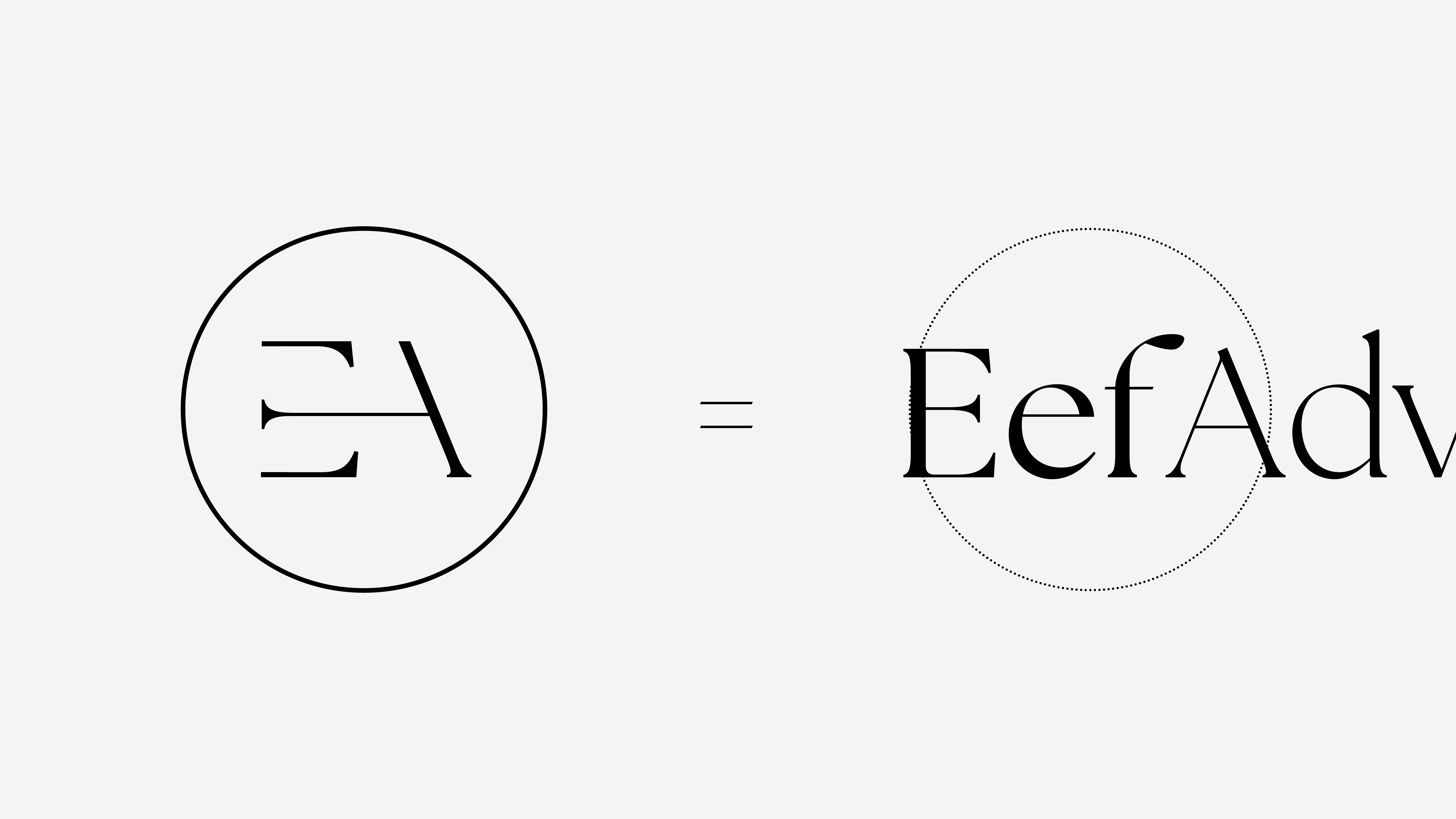
Explanation Logo Eef
, Alt-Tag:
Explanation Logo Eef - Type:
Image , Media Test :
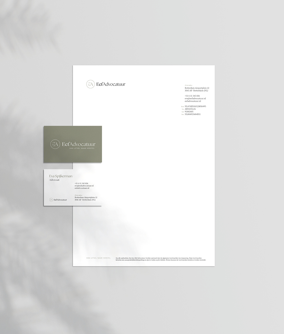 , Alt-Tag:
Stationery Eef Advocatuur
, Alt-Tag:
Stationery Eef Advocatuur - Type:
Image , Media Test :
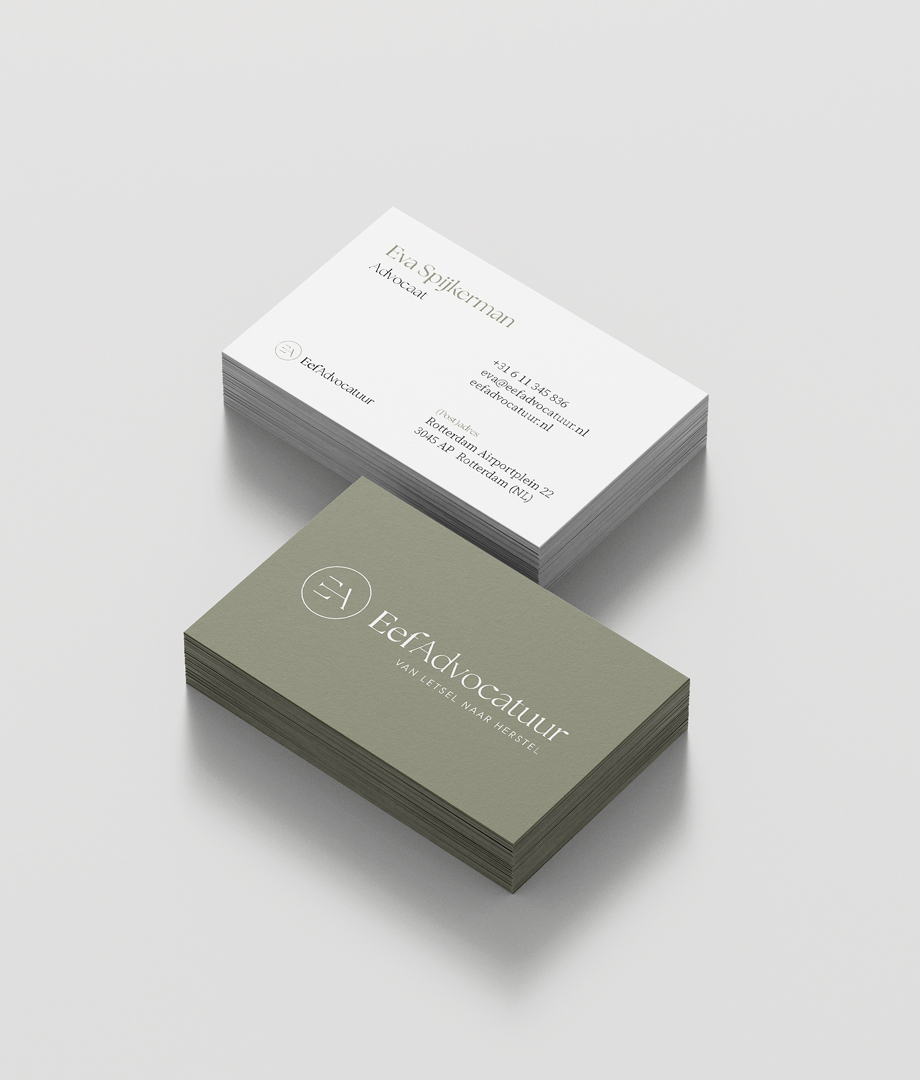 , Alt-Tag:
Business Card Eef Advocatuur
, Alt-Tag:
Business Card Eef Advocatuur - Type:
Image , Media Test :
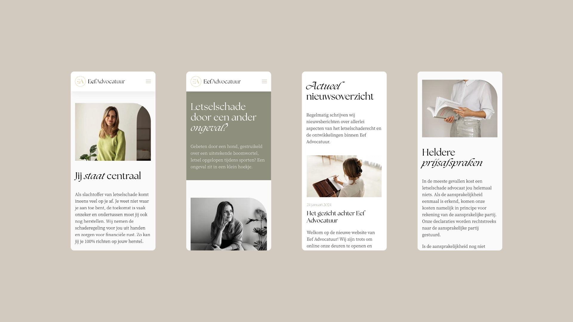 , Alt-Tag:
Mobile Website
, Alt-Tag:
Mobile Website - Type:
Image , Media Test :
 , Alt-Tag:
Quote Eva
, Alt-Tag:
Quote Eva
- Cases Logo - Diap:

- Headline Subtitel:
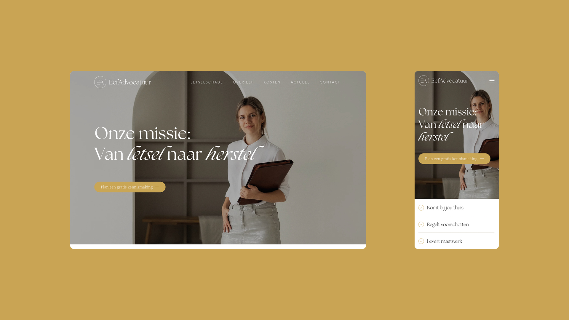
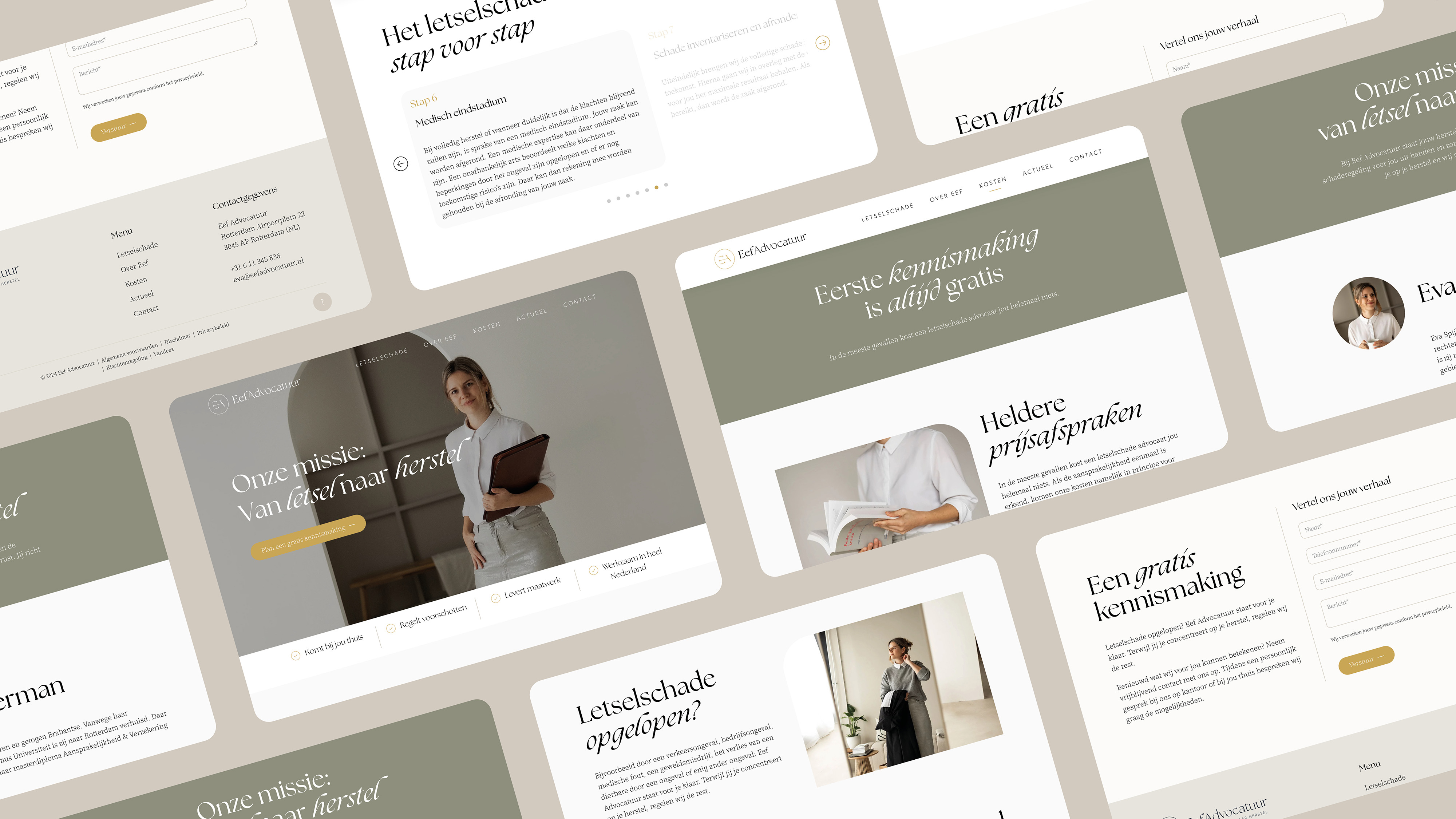
A new brand within the legal profession: Eef Advocatuur !
- Sectors list:
professional services
- Headline Introduction:
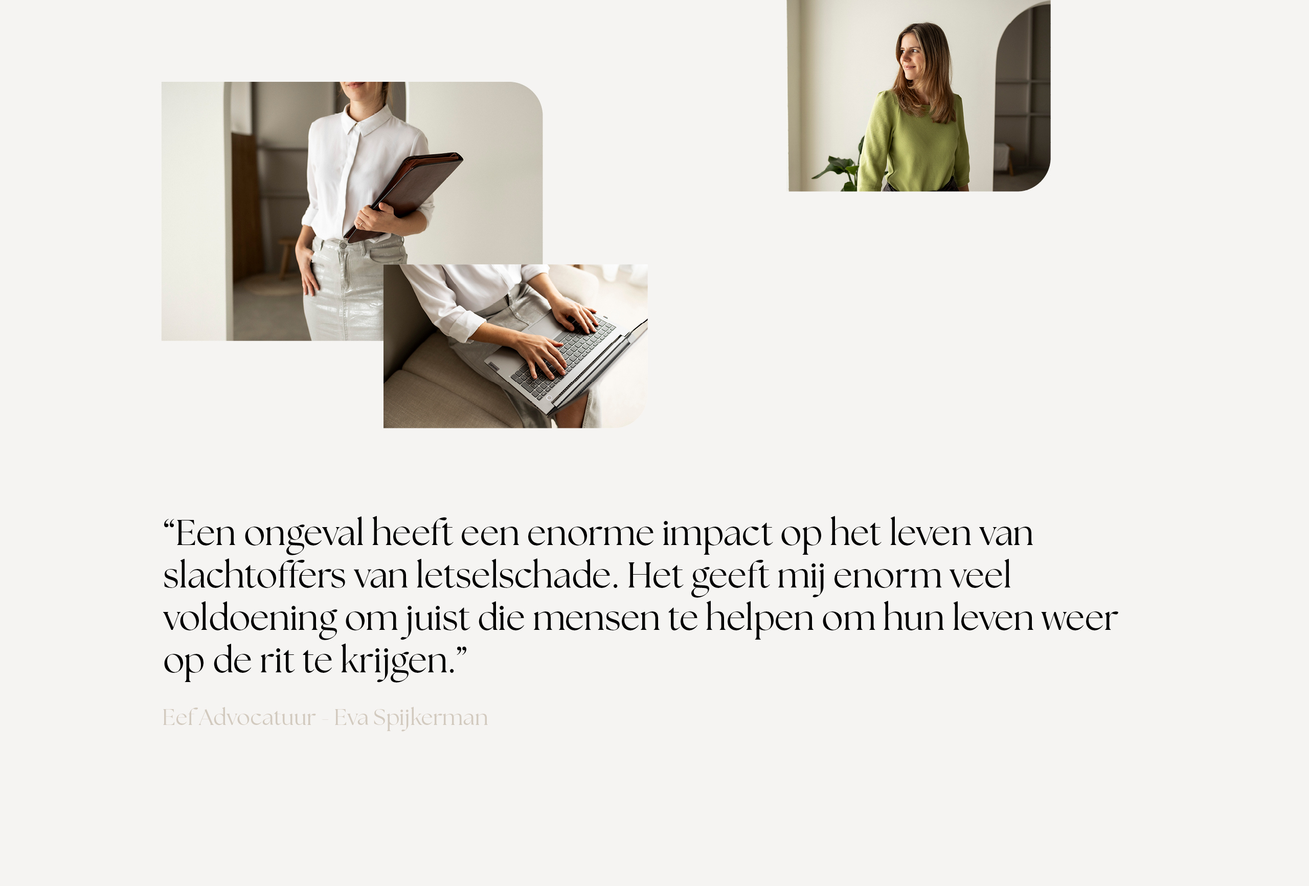
Eva Spijkerman is a born and raised Brabantse. After a law studies in Rotterdam, she finally exchanged Brabant to work in Rotterdam at a renowned law firm to learn the tricks of the trade there. For more than nine years, she has worked there with heart and soul for victims of personal injury. Then it started to tickle for itself and Eef Advocatuur came into existence.
- Brand Essential List:
Brand identity , Website
- Approach:
We spoke to her former employer for the first time in 2020 in 2020. Now more than 3 years later, she approached Vandeez again, for strategic and creative advice for her own company. How to make an impact as a 'new player' within one, for her, well -known market.
creative insights session
Together with Eva we had a creative insights session. A brainstorm in which we have determined the frameworks for its visual identity and new website. Eva had clear ideas and valuable input. She is known for a personal approach, hence her office name: Eef Advocatuur. The good feeling with clients and the fact that Eva relieves you is very important in its brand identity and new website. The creatives from Vandeez have started with a color palette of pastel colors, a chic typography and personal, accessible photography. With the aim, radiate trust!
website that makes impact
The new brand identity comes into its own on its new website. Naturally, developed in the latest technology, optimally for every device and user-friendly for both user and visitor. In short, a website that makes an impact. With Focus on SEO (technology and content) which will help Eva in findability and fame.
- Result:
Eef Advocatuur has a distinctive brand identity , which makes it stand out between the 350 Personal Injury Lawyers (LSA) that the Netherlands has. A distinctive look and feel, catchy texts, in short a wonderful start to load her own brand. And to work with heart and soul for victims of personal injury. Thanks for the trust Eva!
- Logo:

- Quote:
'From offline to online business card. Everything has been thought of. Together with Vandeez a beautiful overall picture has been created. '
- Quote - Customer Name and Function:
Eva Spijkerman - LSA Advocaat
- Quote image:

- About Customer:
About Eef Advocatuur
- About customer information:
Eva Spijkerman is a born and raised Brabantse. Because of her law studies at Erasmus University, she moved to Rotterdam. There she remained liability & insurance after obtaining her master's degree. From September 2014, EVA has been working in the legal profession and at the beginning of 2015 she was sworn in as a lawyer. Since then she has been involved in personal injury every day. Eva has worked at a reputable law firm for more than nine years and learned the tricks of the trade there. In 2020 she successfully completed the Grotius Specialization Training course, after which she was admitted to the Association of Personal Injury Advocaten (LSA).
A new brand within the legal profession: Eef Advocatuur!
- Product Category:
Home, Brand Strategy , Brand identity , Website
- Slideshow:
- Type:
Image , Media Test :
 , Alt-Tag:
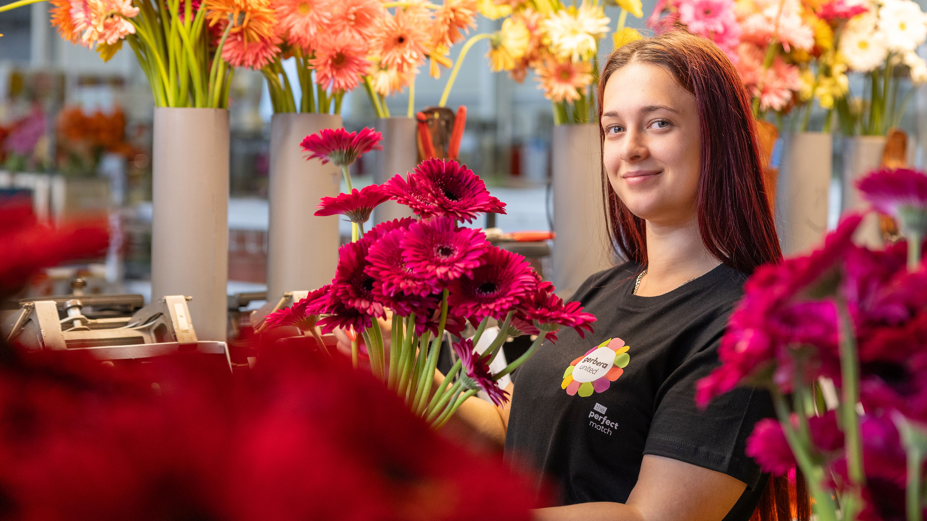
Gerbera United Photography
, Alt-Tag:
Gerbera United Photography - Type:
Image , Media Test :
 , Alt-Tag:
Gerbera United Photography
, Alt-Tag:
Gerbera United Photography - Type:
Video , Media Test:
vandeez -Case- gerbera united -Video website.mp4 , Alt-Tag:
Gerbera United Website
- Type:
Image , Media Test :
 , Alt-Tag:
Gerbera United Photography
, Alt-Tag:
Gerbera United Photography - Type:
Image , Media Test :
 , Alt-Tag:
Gerbera United Visual Identity
, Alt-Tag:
Gerbera United Visual Identity - Type:
Image , Media Test :
 , Alt-Tag:
Gerbera United Visual Identity
, Alt-Tag:
Gerbera United Visual Identity - Type:
Image , Media Test :
 , Alt-Tag:
Gerbera United Photography
, Alt-Tag:
Gerbera United Photography - Type:
Image , Media Test :
 , Alt-Tag:
Gerbera United Website
, Alt-Tag:
Gerbera United Website - Type:
Image , Media Test :
 , Alt-Tag:
Gerbera United Website
, Alt-Tag:
Gerbera United Website - Type:
Image , Media Test :
 , Alt-Tag:
Gerbera United Photography
, Alt-Tag:
Gerbera United Photography - Type:
Image , Media Test :
 , Alt-Tag:
Gerbera United Photography
, Alt-Tag:
Gerbera United Photography - Type:
Image , Media Test :
 , Alt-Tag:
Gerbera United Photography
, Alt-Tag:
Gerbera United Photography - Type:
Image , Media Test :
 , Alt-Tag:
Gerbera United Photography
, Alt-Tag:
Gerbera United Photography - Type:
Image , Media Test :
 , Alt-Tag:
Gerbera United Photography
, Alt-Tag:
Gerbera United Photography - Type:
Image , Media Test :
 , Alt-Tag:
Gerbera United Website
, Alt-Tag:
Gerbera United Website - Type:
Image , Media Test :
 , Alt-Tag:
Gerbera United Visual Identity
, Alt-Tag:
Gerbera United Visual Identity
- Cases Logo - Diap:

- Headline Subtitel:
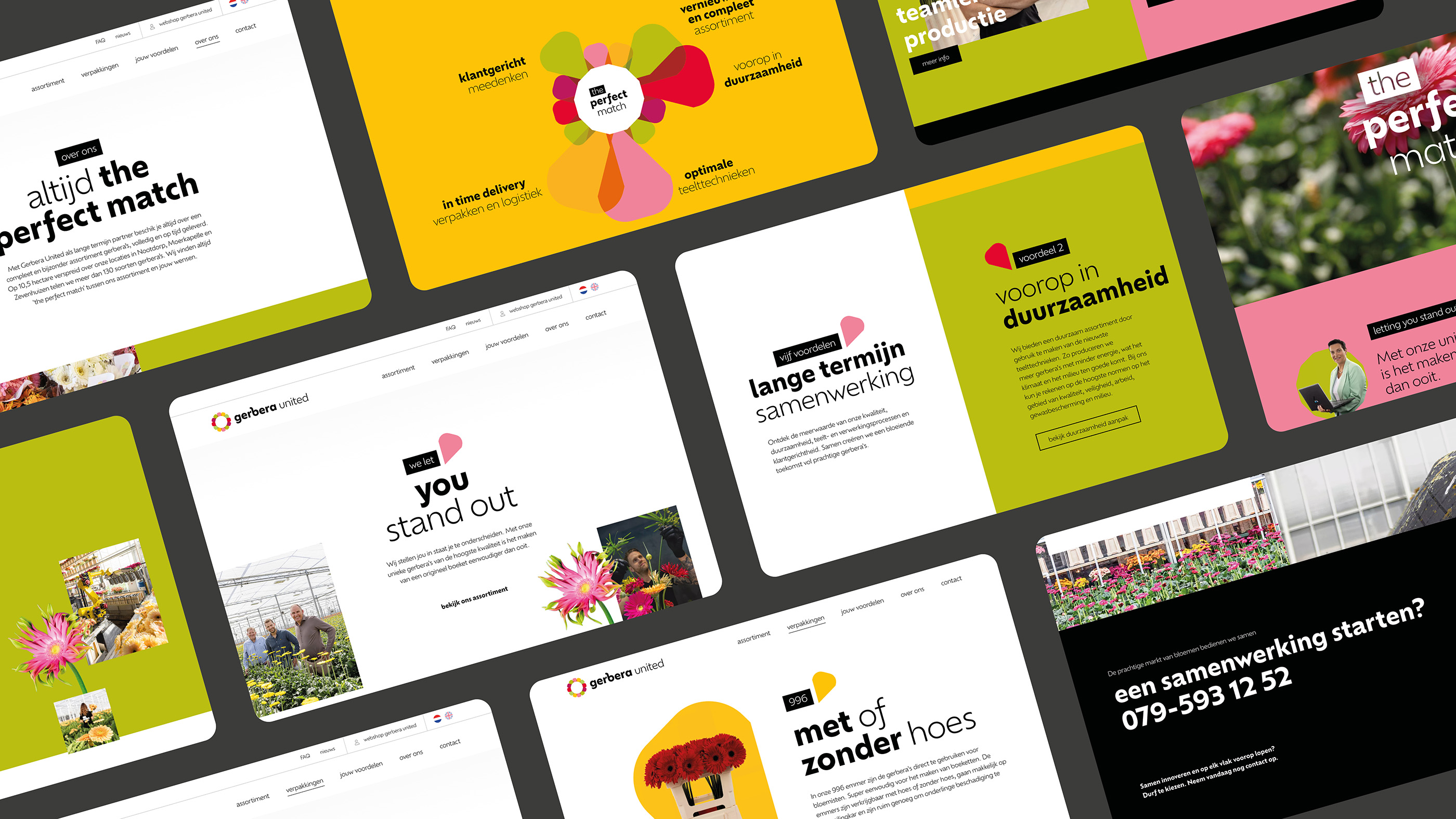
translated the new story into a powerful positioning and brand identity
- Sectors list:
agriculture and horticulture
- Headline Introduction:
Gerbera United has grown in recent years into a progressive Gerbera specialist with a special assortment and worldwide network of customers. Scaling up, sustainability and technological innovations continue to change the ornamental sector quickly. Gerbera United is at the forefront of this. A distinctive story and a consistent brand identity was missing. As a strategic and creative partner, we have created a new brand foundation Gerbera United
- Brand Essential List:
Brand positioning, Brand identity , Website
- Approach:
We started with strategic sessions with the Gerbera Unitedteam. We will look for the distinctive story of Gerbera United. What do you stand and go for? Why would the target group choose you? How do you stand out among other players in the ornamental sector? The insights have been tested and tightened through interviews with employees and customers.
Recognizable visual identity
As soon as the brand positioning was, the brand promise has been developed and the brand identity has been renewed while retaining brand recognition. Eigenheid in text, form and photography provides the recognizable Gerbera United visual identity .
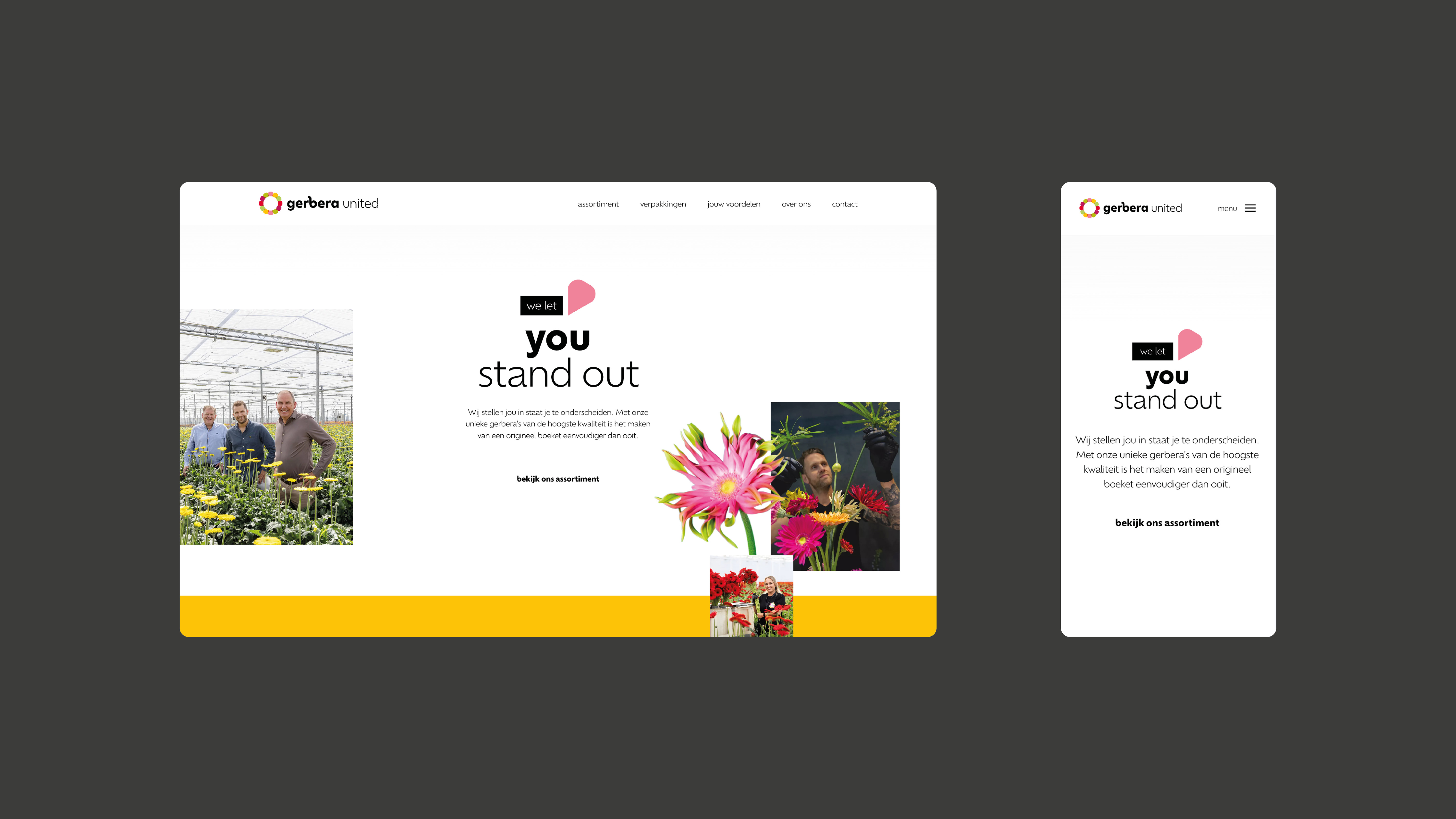
New website
The new website gives the visitor the required information, Scrolls optimally on mobile, is easy to maintain via the user-friendly CMS and tells the story of Gerbera United in all facets.
- Result:
from a clear strategy, distinctive story, recognizable brand identity Gerbera United claims its position in the ornamental sector. The foundation was laid for further growth towards the future.
- Logo:
- Quote:
"With this new brand foundation and the visual translation we are distinctive in a challenging market. It shows that we continue to renew and surprise!"
- Quote - Customer Name and Function:
WP van den Berg - Directorate
- Quote image:
- About customer:
About Gerbera United
- About customer information:
Gerbera United was created in 2009 after a merger between the nurseries of Dick Kooij and WP van den Berg. Both companies had the ambition to become the most progressive Gerberakwekerij and saw the potential to achieve this with each other. A new production location in Nootdorp was opened in 2018, where the most advanced cultivation and processing systems were developed. Together with the locations in Moerkapelle and Zevenhuizen, the cultivation area became 10.5 hectares. Gijsbert Verboom joined the team in 2021. In recent years, Gerbera United grown into a progressive Gerbera specialist with a special assortment and worldwide network of customers.
Translated the new story into a powerful positioning and brand identity
- Product Category:
Brand Strategy , Brand identity , Website
- Slideshow:
- Type:
Video , Media Test :
, Alt-Tag:
Intellistore Video
- Type:
Image , Media Test :
 , Alt-Tag:
Intellistore Photography
, Alt-Tag:
Intellistore Photography - Type:
Video , Media Test:
vandeez -Case- intellistore -Video website-Mobile.mp4 , Alt-Tag:
Intellistore Website
- Type:
Image , Media Test :
 , Alt-Tag:
Intellistore Visual Identity
, Alt-Tag:
Intellistore Visual Identity - Type:
Image , Media Test :
 , Alt-Tag:
Intellistore Visual Identity
, Alt-Tag:
Intellistore Visual Identity - Type:
Image , Media Test :
 , Alt-Tag:
Intellistore Photography
, Alt-Tag:
Intellistore Photography - Type:
Image , Media Test :
 , Alt-Tag:
Intellistore Photography
, Alt-Tag:
Intellistore Photography - Type:
Image , Media Test :
 , Alt-Tag:
Intellistore Website
, Alt-Tag:
Intellistore Website - Type:
Image , Media Test :
 , Alt-Tag:
Intellistore Website
, Alt-Tag:
Intellistore Website - Type:
Image , Media Test :
 , Alt-Tag:
Intellistore Visual Identity
, Alt-Tag:
Intellistore Visual Identity - Type:
Image , Media Test :
 , Alt-Tag:
Intellistore Photography
, Alt-Tag:
Intellistore Photography - Type:
Image , Media Test :
 , Alt-Tag:
Intellistore Photography
, Alt-Tag:
Intellistore Photography - Type:
Image , Media Test :
 , Alt-Tag:
Intellistore Visual Identity
, Alt-Tag:
Intellistore Visual Identity - Type:
Image , Media Test :
 , Alt-Tag:
Intellistore Visual Identity
, Alt-Tag:
Intellistore Visual Identity - Type:
Image , Media Test :
 , Alt-Tag:
Intellistore Website
, Alt-Tag:
Intellistore Website - Type:
Image , Media Test :
 , Alt-Tag:
Intellistore Visual Identity
, Alt-Tag:
Intellistore Visual Identity
- Cases Logo - Diap:

- Headline subtitle:
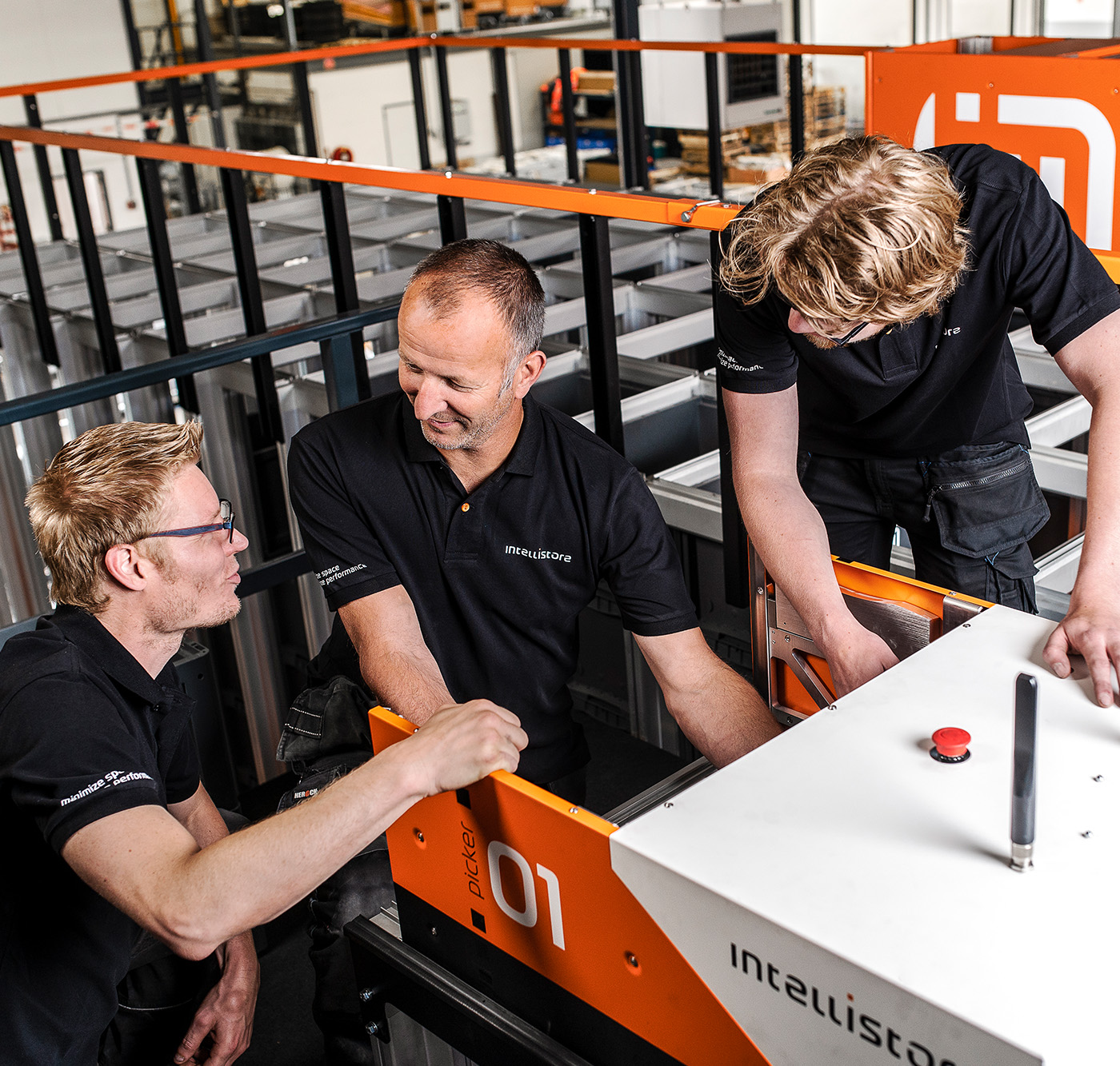
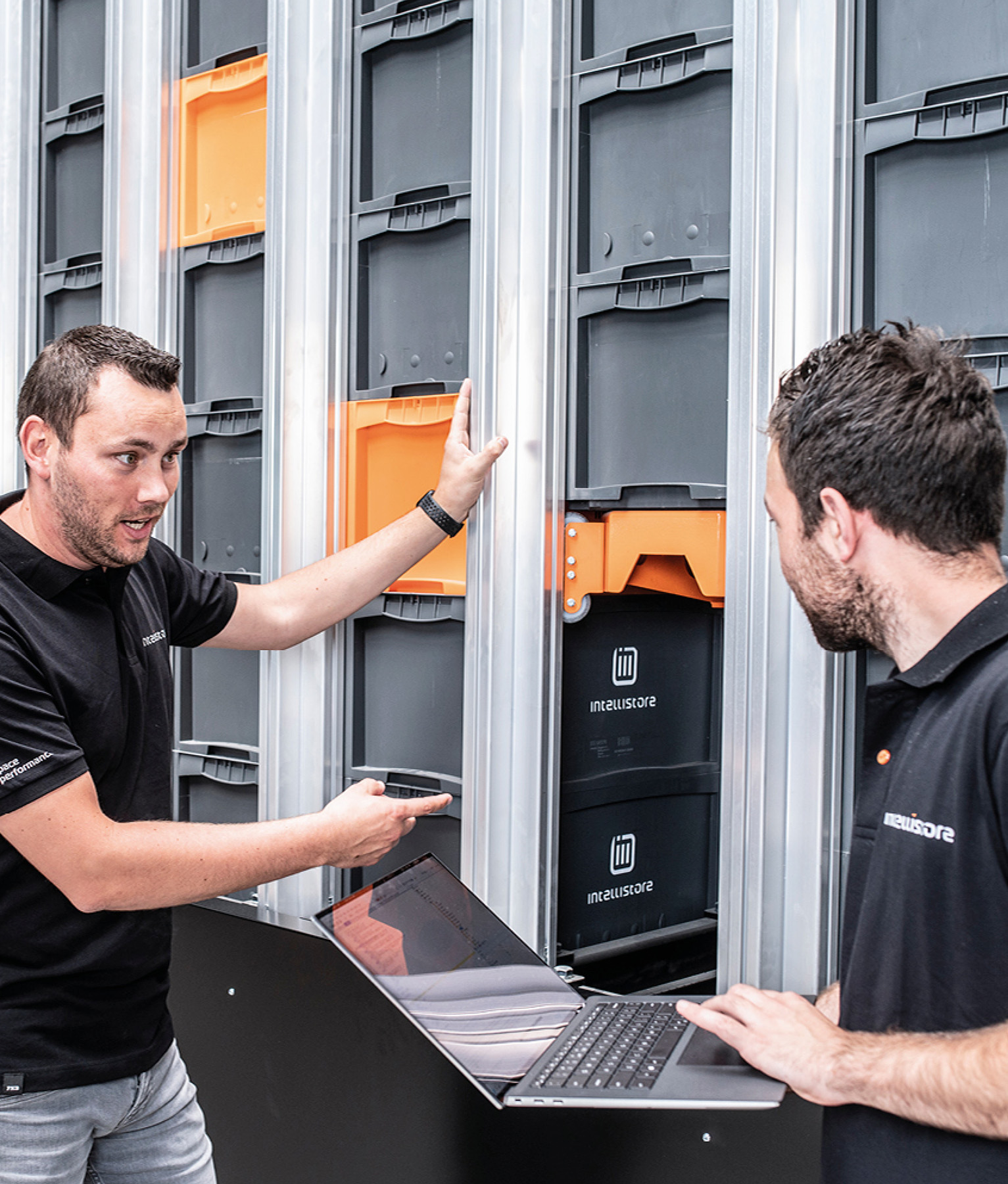
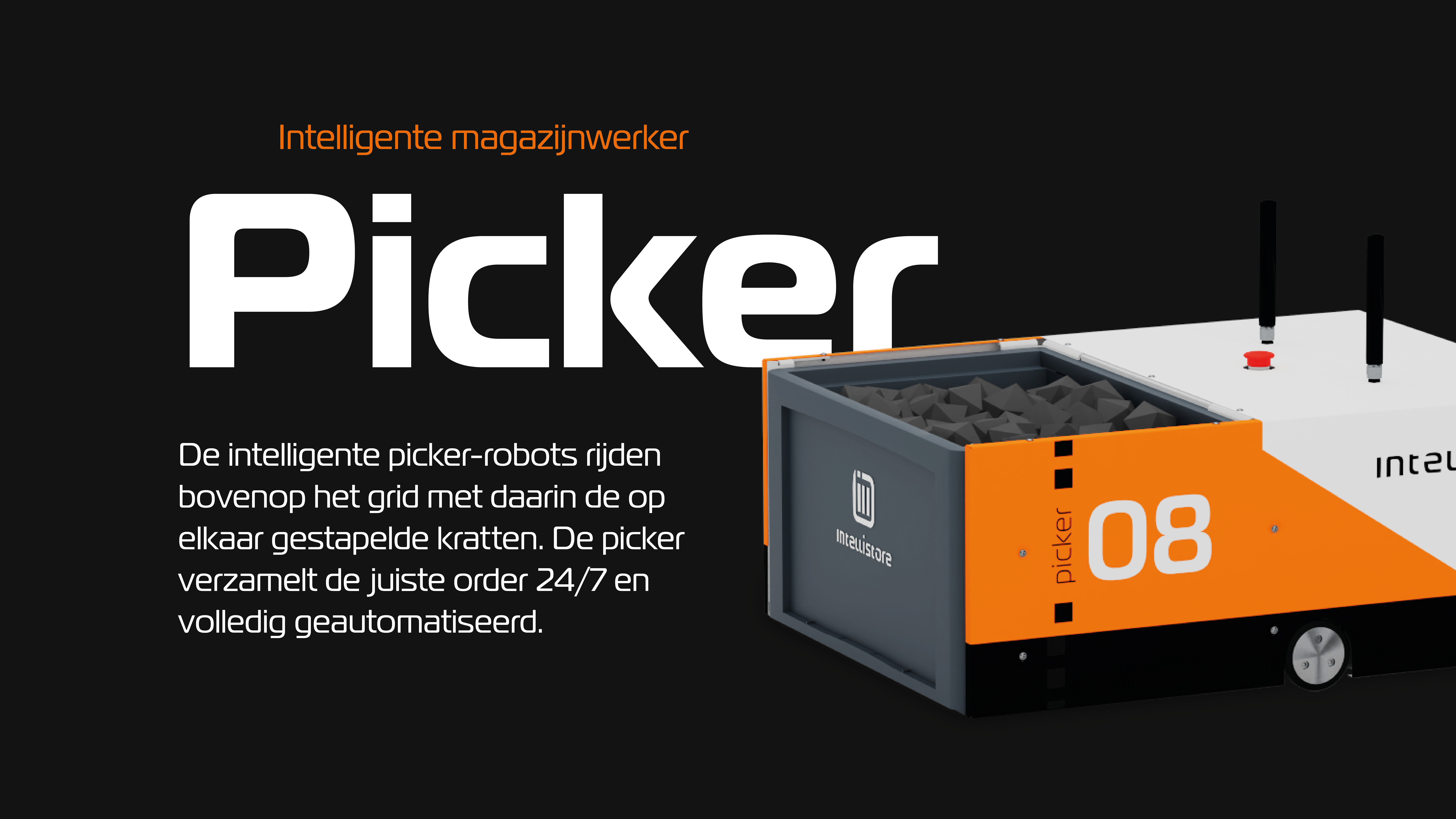
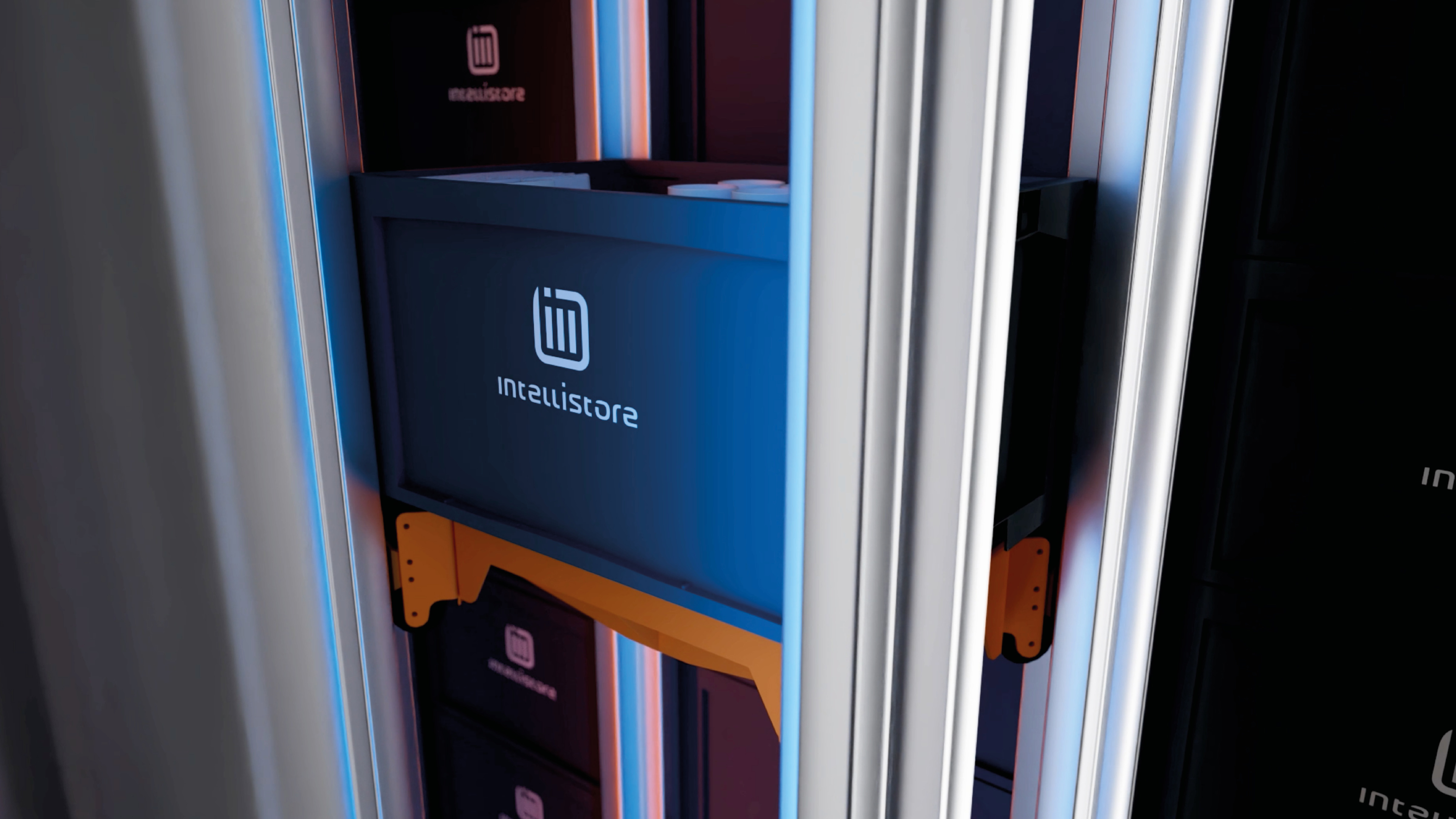
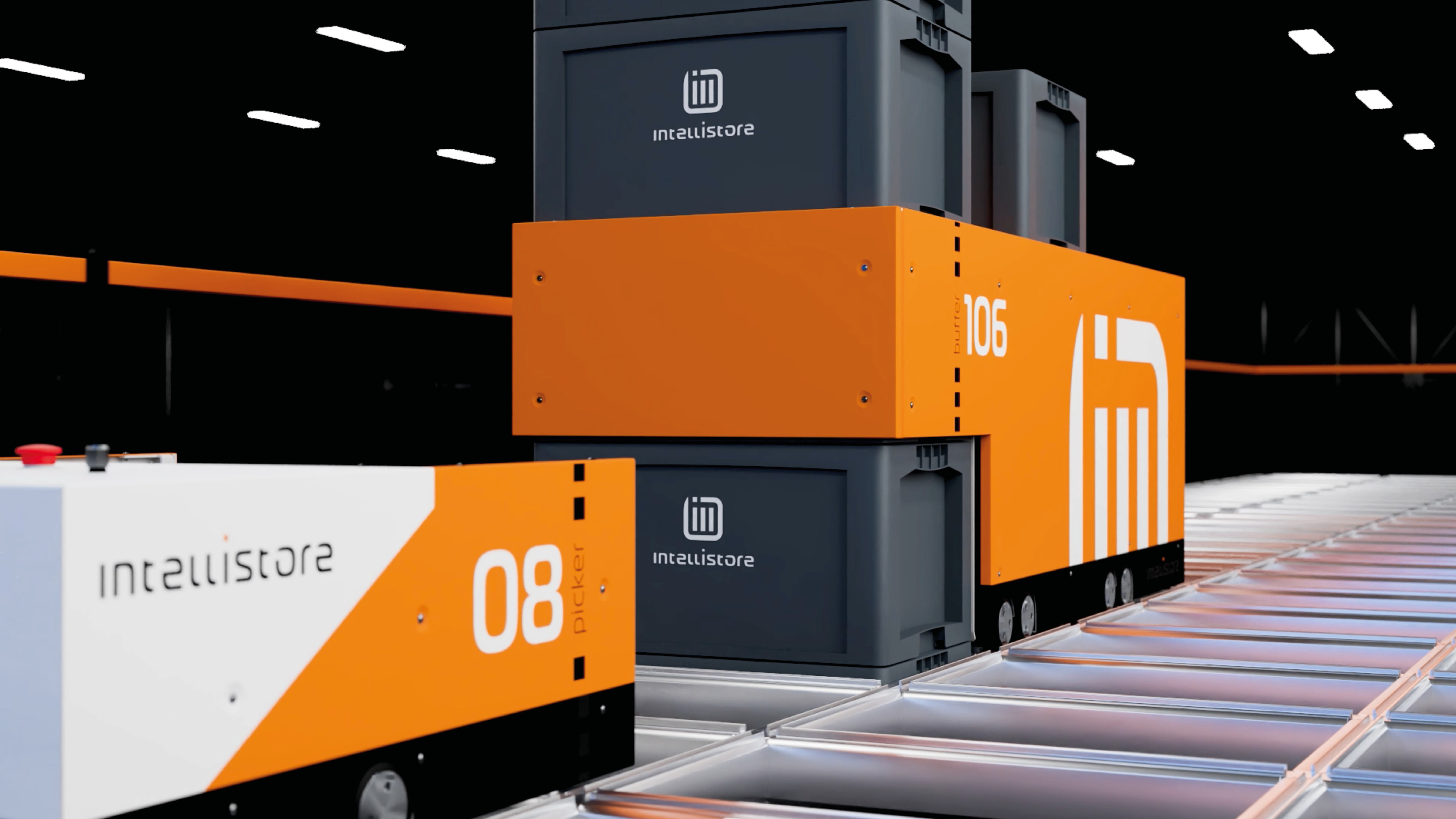
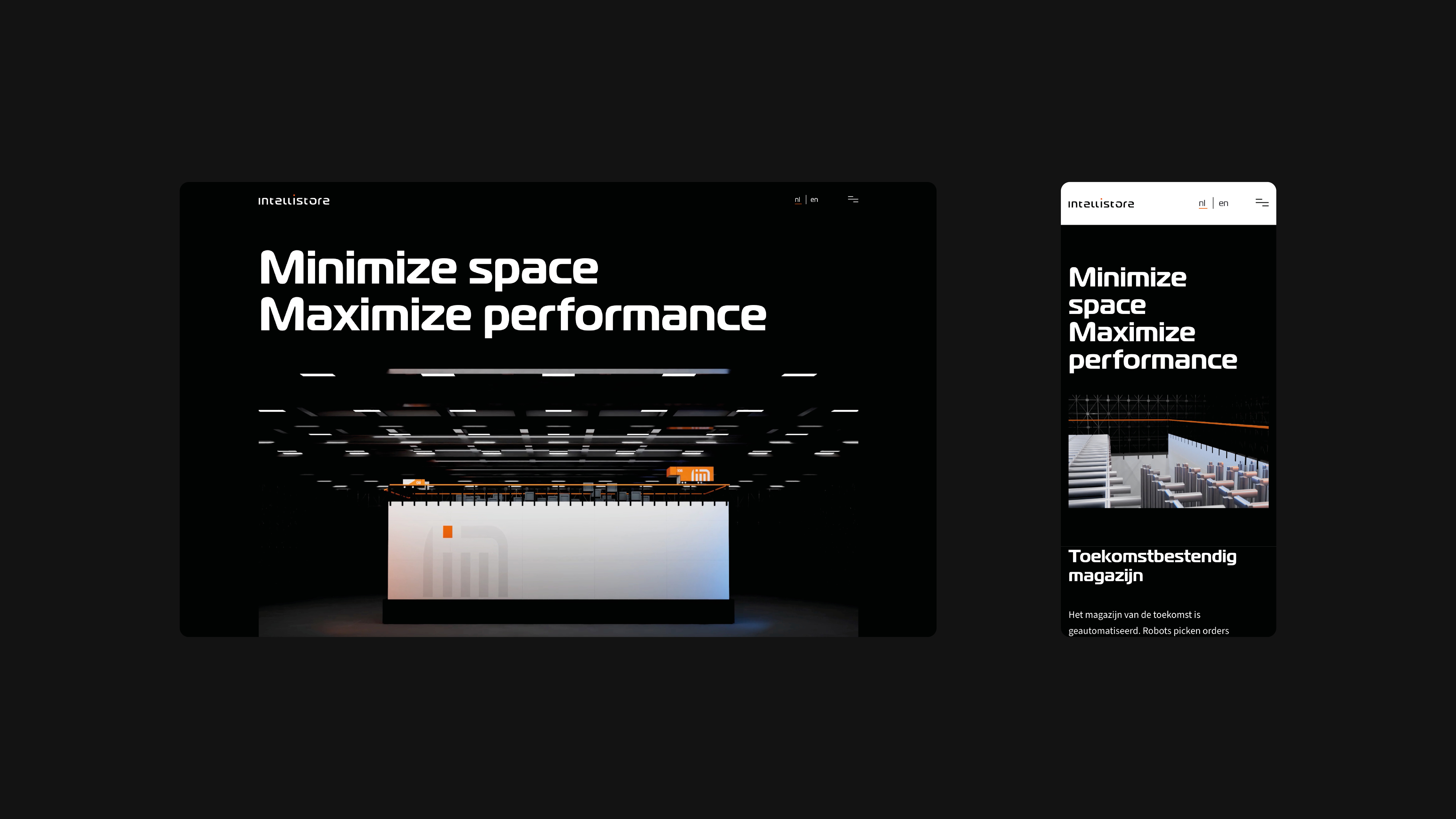
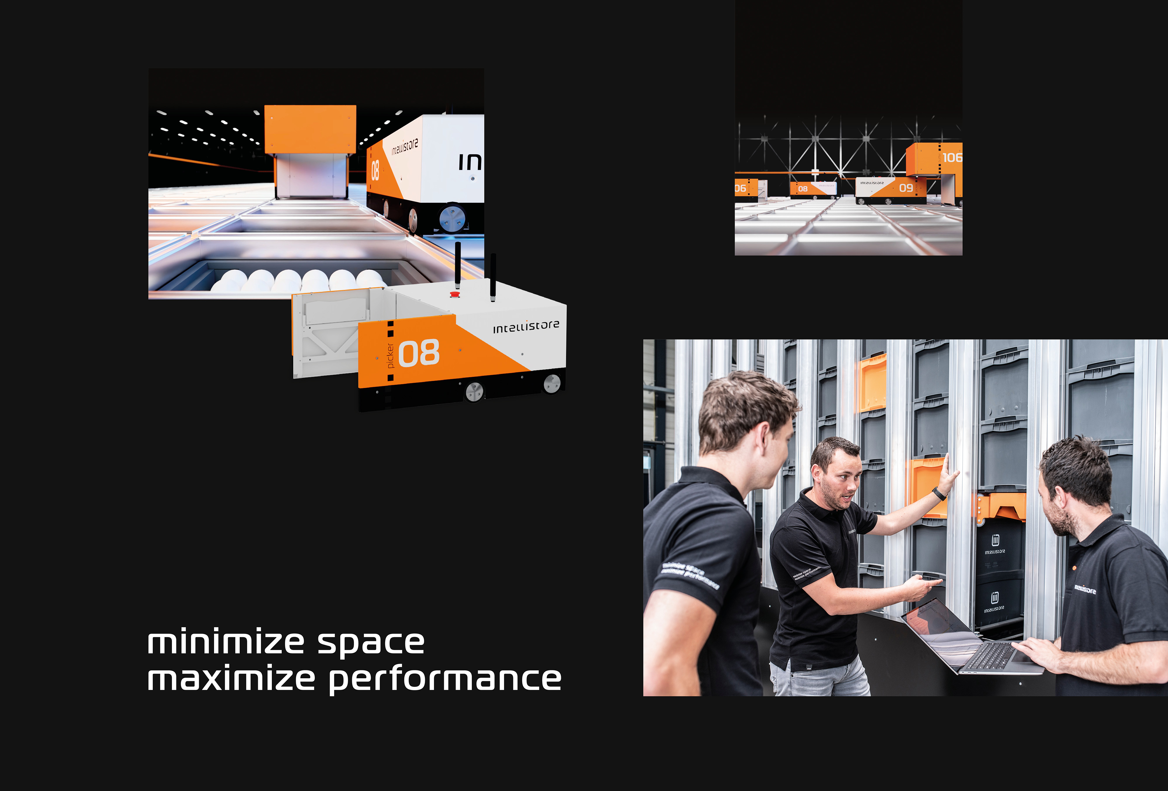
Introduction innovative storage and picking system for Intellistore
- Sectors List:
manufacturing industry
- Headline Introduction:
The E-Commerce market is growing. But at a time when construction costs are increasing and staff is scarce, expanding is a challenge for these companies. Innovator Oscar van Buijtene, owner of OBS Groep, developed an alternative: Intellistore . A new intelligent storage and order picking system, with which companies maximize the efficiency and profitability of their warehouse. But how do you introduce a new brand in the market? This requires a very strong brand foundation and a targeted launch campaign.
- Brand Essential List:
Brand positioning, Brand identity , Website
- Approach:
We started with strategic sessions with Intellistore. We pulled them out of the issues of the day to take a good look at their brand.
distinctive brand story
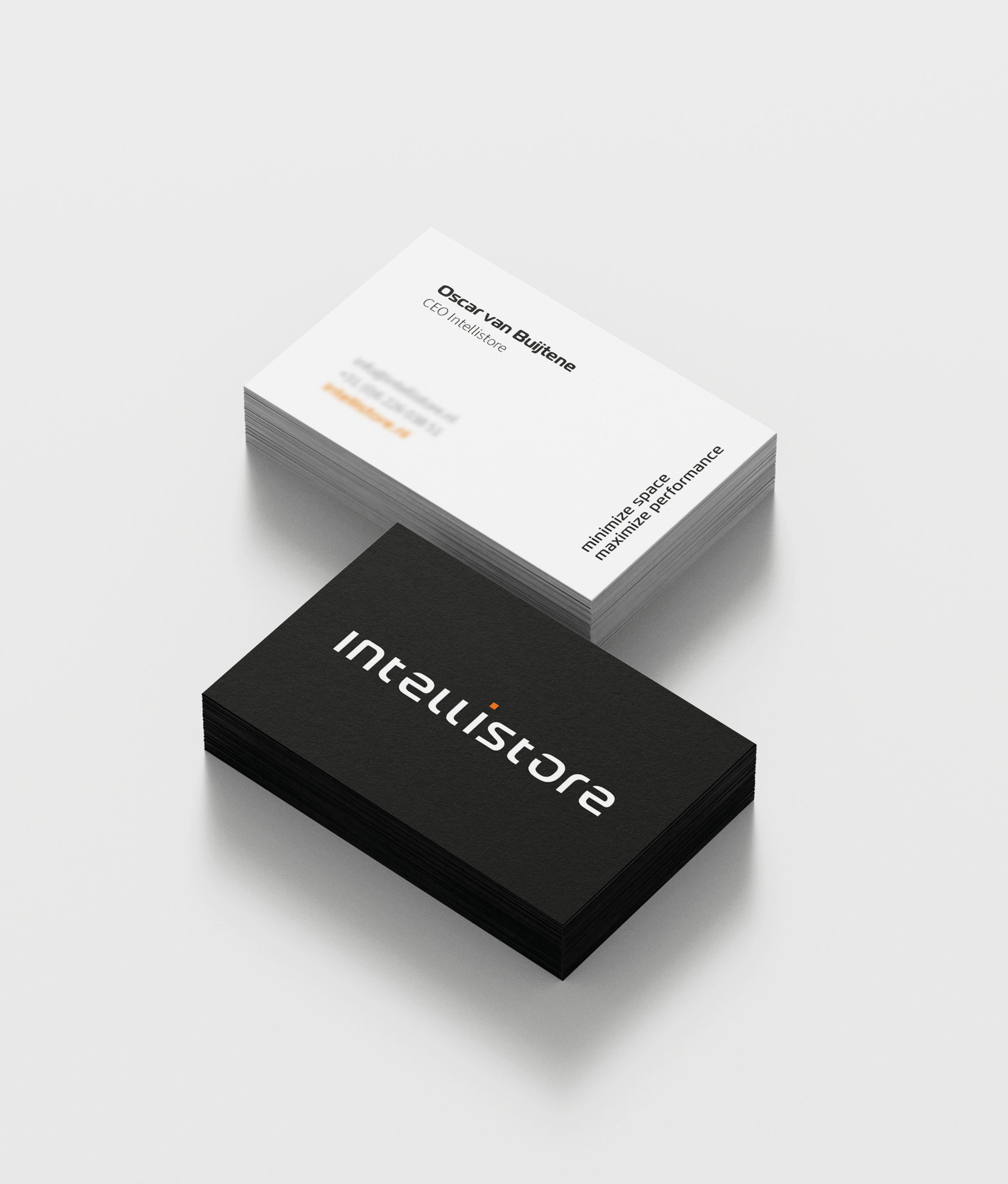
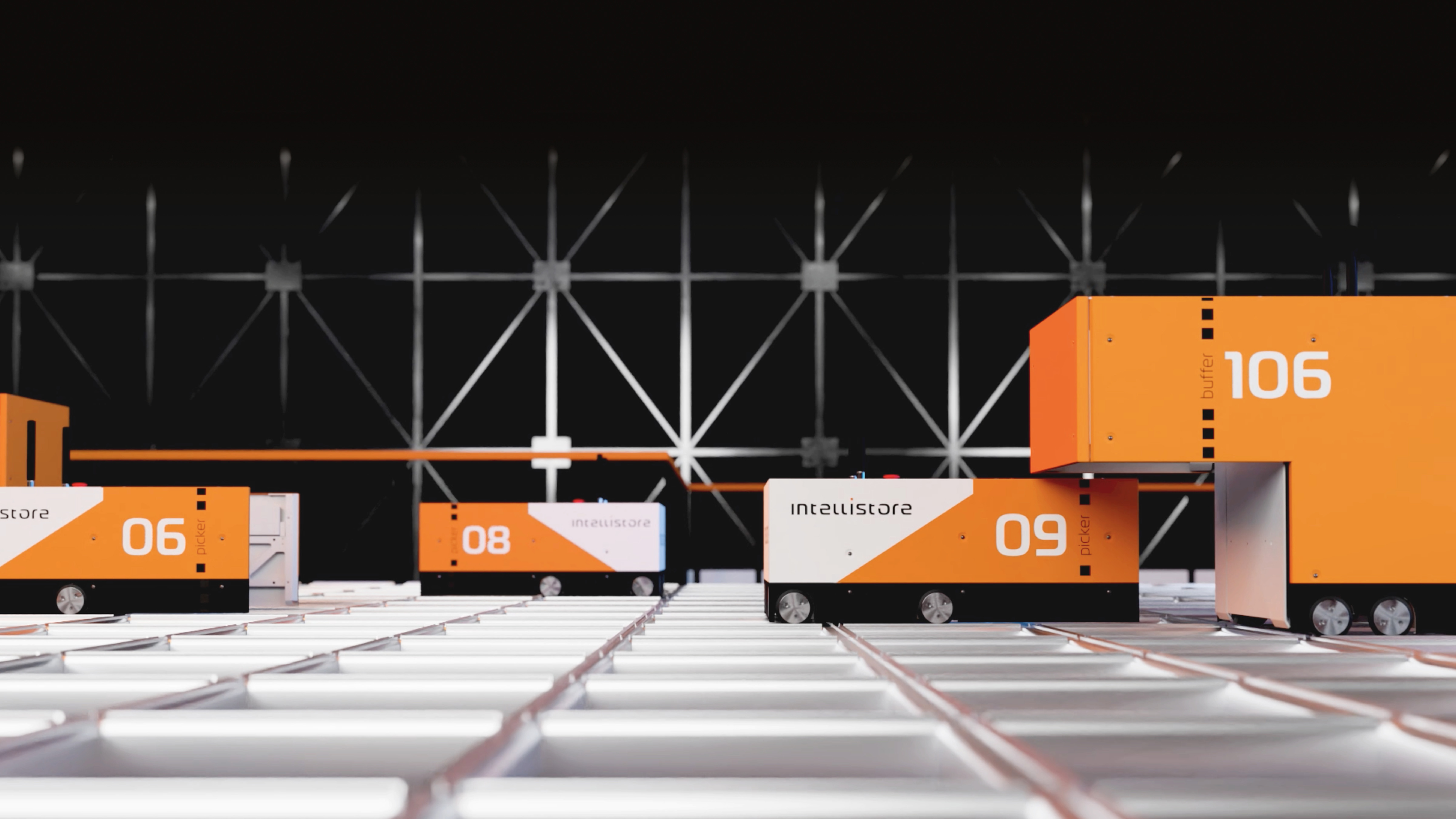
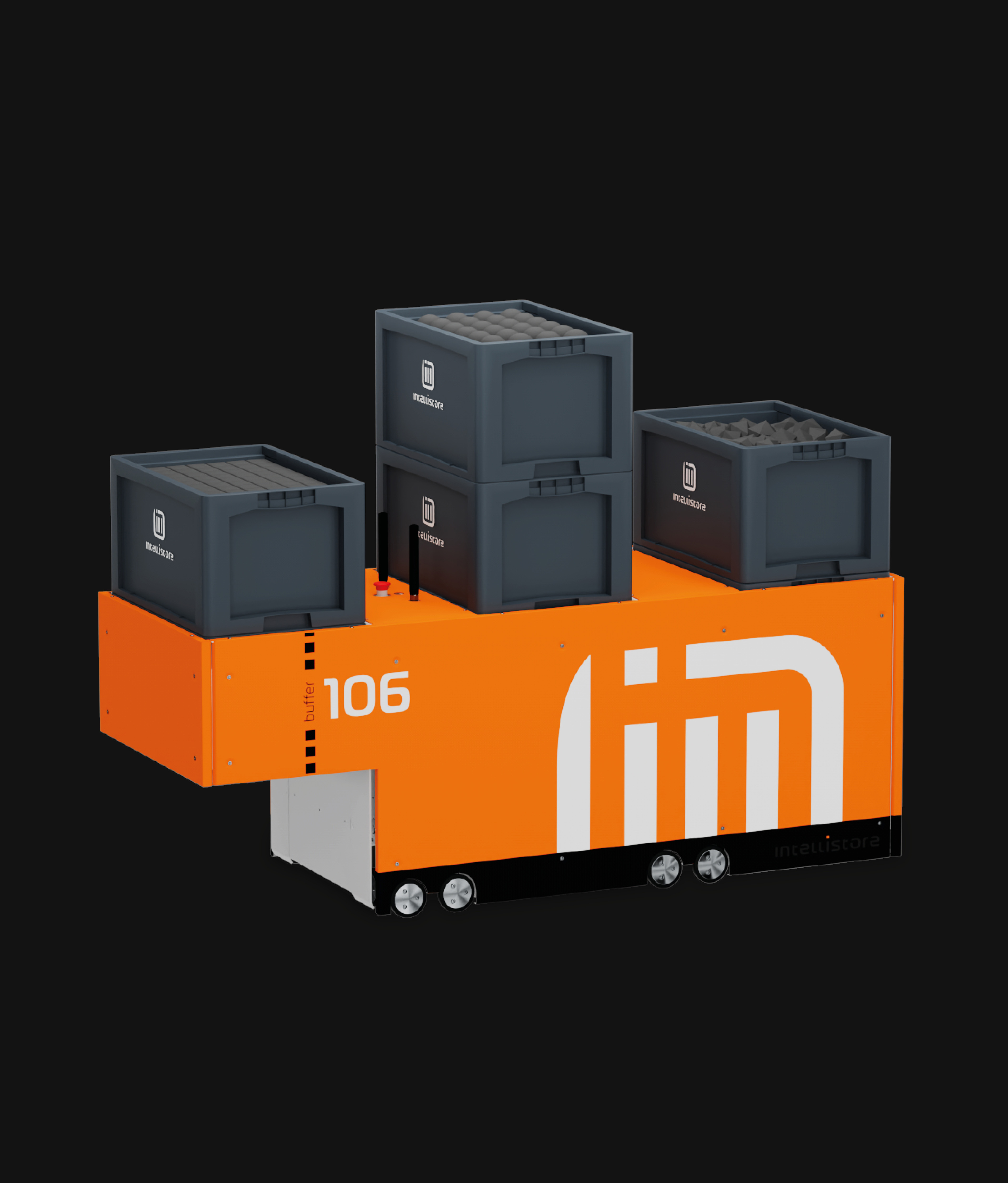
Together we managed to grasp the distinctive story of Intellistore . What do they stand and go for with this innovative system? Who is their target group and what are the needs they offer a solution for? We have recorded all this in the brand positioning with the brand promise: Minimize Space. Maximize performance.
unique identity
When this positioning was, we translated this into a unique brand identity . With a new product such as Intellistore it is important to make it visually insightful, we did this with the new visual identity and an animation video. Together we have given their company and product a unique identity ; From logo to typography and from forms to visual language.
Launch brand
We then translated the unique story of Intellistore to a user-friendly e website. On the website, the target group is convinced of the many benefits of the system. Finally, from a communication plan we have introduced the Groots brand in the market.
- Result:
a brand foundation has been developed with which Intellistore is ready to conquer the world. With the brand foundation they can convince potential customers of the power of Intellistore , even before they have seen the system in real life.
- Logo:
- Quote:
"With the realized brand foundation, Intellistore ready to conquer the world."
- Quote - Customer Name and Function:
Oscar Van Buijtene - Director
- Quote image:
- About customer:
About Intellistore
- About customer information:
Intellistore is a new fully automated storage and order processing system. A supercompact, fast, accurate and cost contact us end system that minimizes the required storage space for products and maximizes order picking performance. The system prepares companies for the logistics question of today and tomorrow. Intellistore is part of the OBS Group. The OBS Group consists of: OBS Techniek, 247 Waterslijds, 247 Laser cutting, OWM, CNC machining and Artomation software programming and Engineering.
Introduction to innovative storage and picking system
- Product Category:
Brand Strategy , Brand identity
- Slideshow:
- Type:
Video , Media Test :
, Alt-Tag:
Intertoys Video
- Type:
Image , Media Test :
 , Alt-Tag:
Intertoys Photography
, Alt-Tag:
Intertoys Photography - Type:
Video , Media Test:
vandeez -Case- intertoys -2024-entertainment-bot-small.mp4 , Alt-Tag:
Intertoys Visual Identity
- Type:
Image , Media Test :
 , Alt-Tag:
Intertoys Photography
, Alt-Tag:
Intertoys Photography - Type:
Image , Media Test :
 , Alt-Tag:
Intertoys Photography
, Alt-Tag:
Intertoys Photography - Type:
Image , Media Test :
 , Alt-Tag:
Intertoys Visual Identity
, Alt-Tag:
Intertoys Visual Identity - Type:
Image , Media Test :
 , Alt-Tag:
Intertoys Visual Identity
, Alt-Tag:
Intertoys Visual Identity - Type:
Image , Media Test :
 , Alt-Tag:
Intertoys Visual Identity
, Alt-Tag:
Intertoys Visual Identity - Type:
Image , Media Test :
 , Alt-Tag:
Intertoys Visual Identity
, Alt-Tag:
Intertoys Visual Identity - Type:
Image , Media Test :
 , Alt-Tag:
Intertoys Photography
, Alt-Tag:
Intertoys Photography - Type:
Image , Media Test :
 , Alt-Tag:
Intertoys Visual Identity
, Alt-Tag:
Intertoys Visual Identity - Type:
Image , Media Test :
 , Alt-Tag:
Intertoys Photography
, Alt-Tag:
Intertoys Photography - Type:
Image , Media Test :
 , Alt-Tag:
Intertoys Visual Identity
, Alt-Tag:
Intertoys Visual Identity - Type:
Image , Media Test :
 , Alt-Tag:
Intertoys Visual Identity
, Alt-Tag:
Intertoys Visual Identity - Type:
Image , Media Test :
 , Alt-Tag:
Intertoys Visual Identity
, Alt-Tag:
Intertoys Visual Identity - Type:
Image , Media Test :
 , Alt-Tag:
Intertoys Visual Identity
, Alt-Tag:
Intertoys Visual Identity
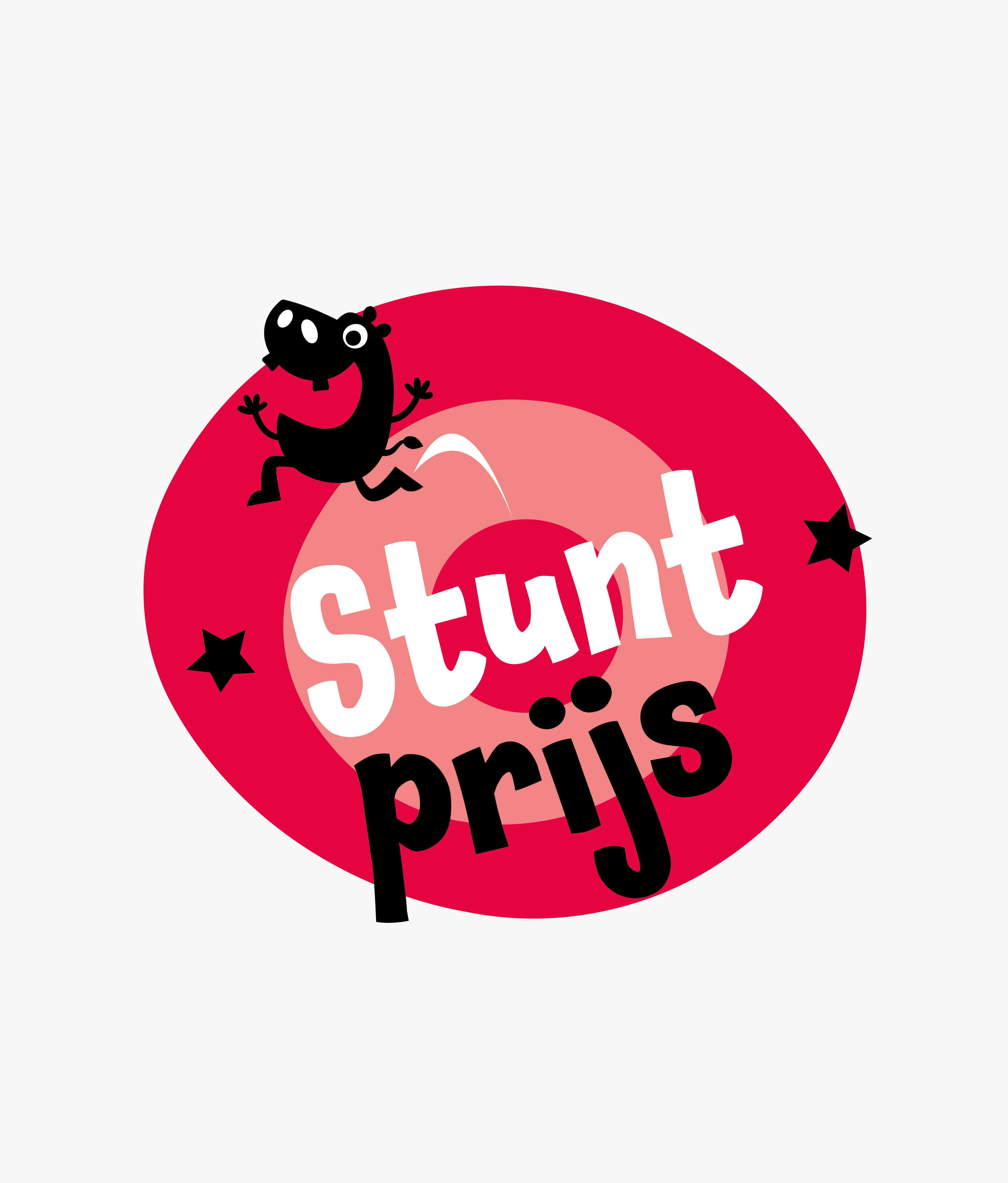
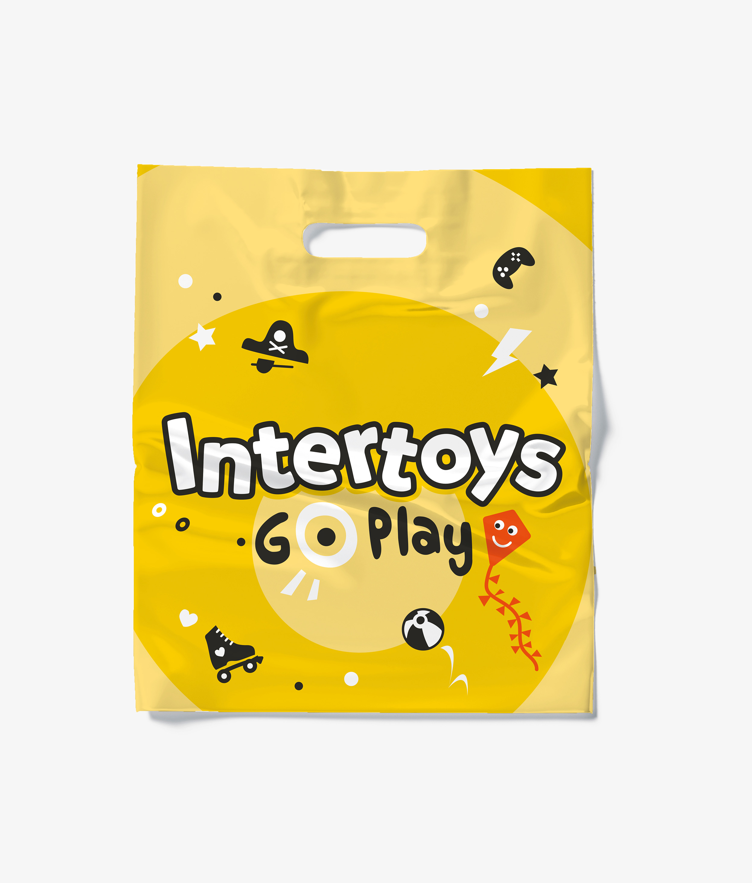
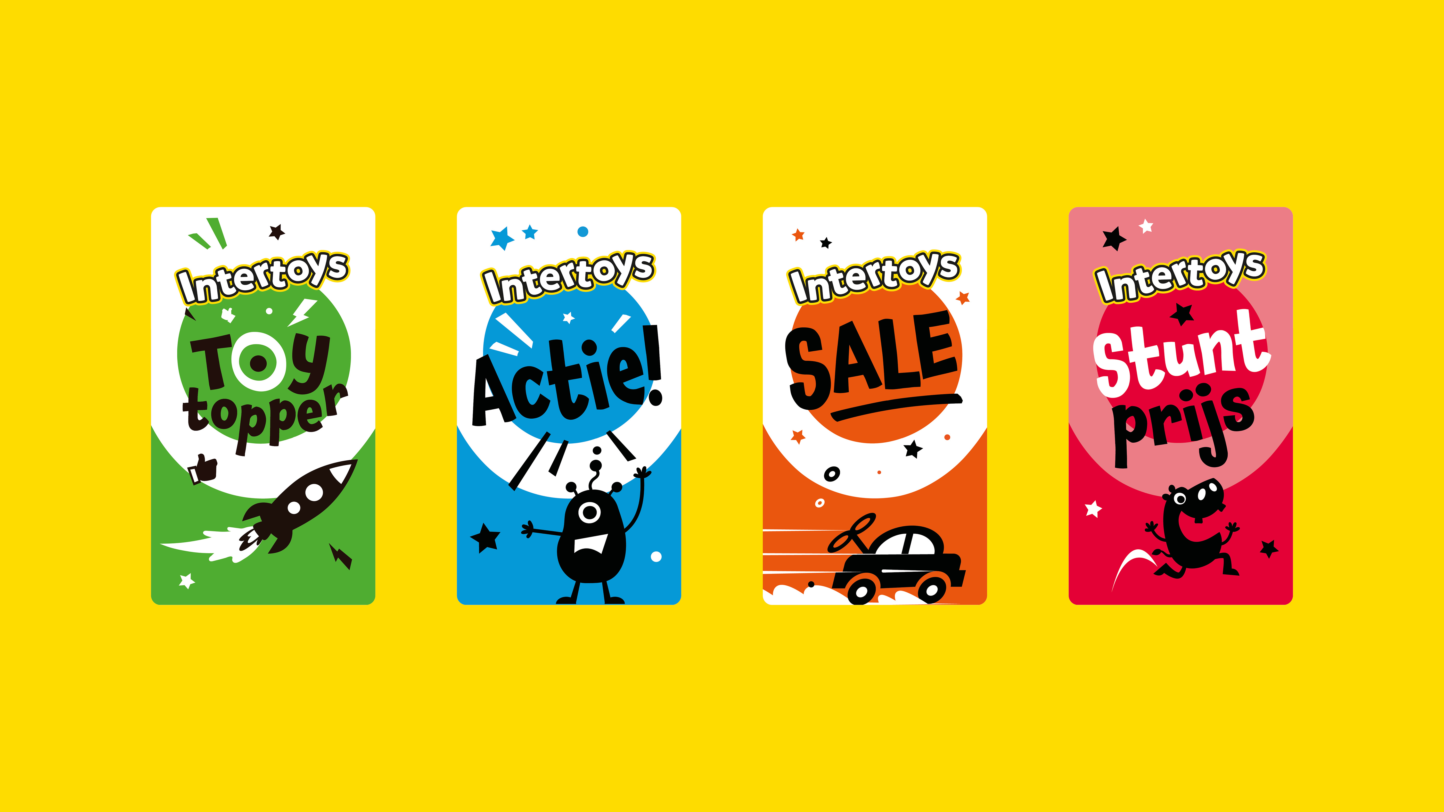
- Cases Logo - Diap:

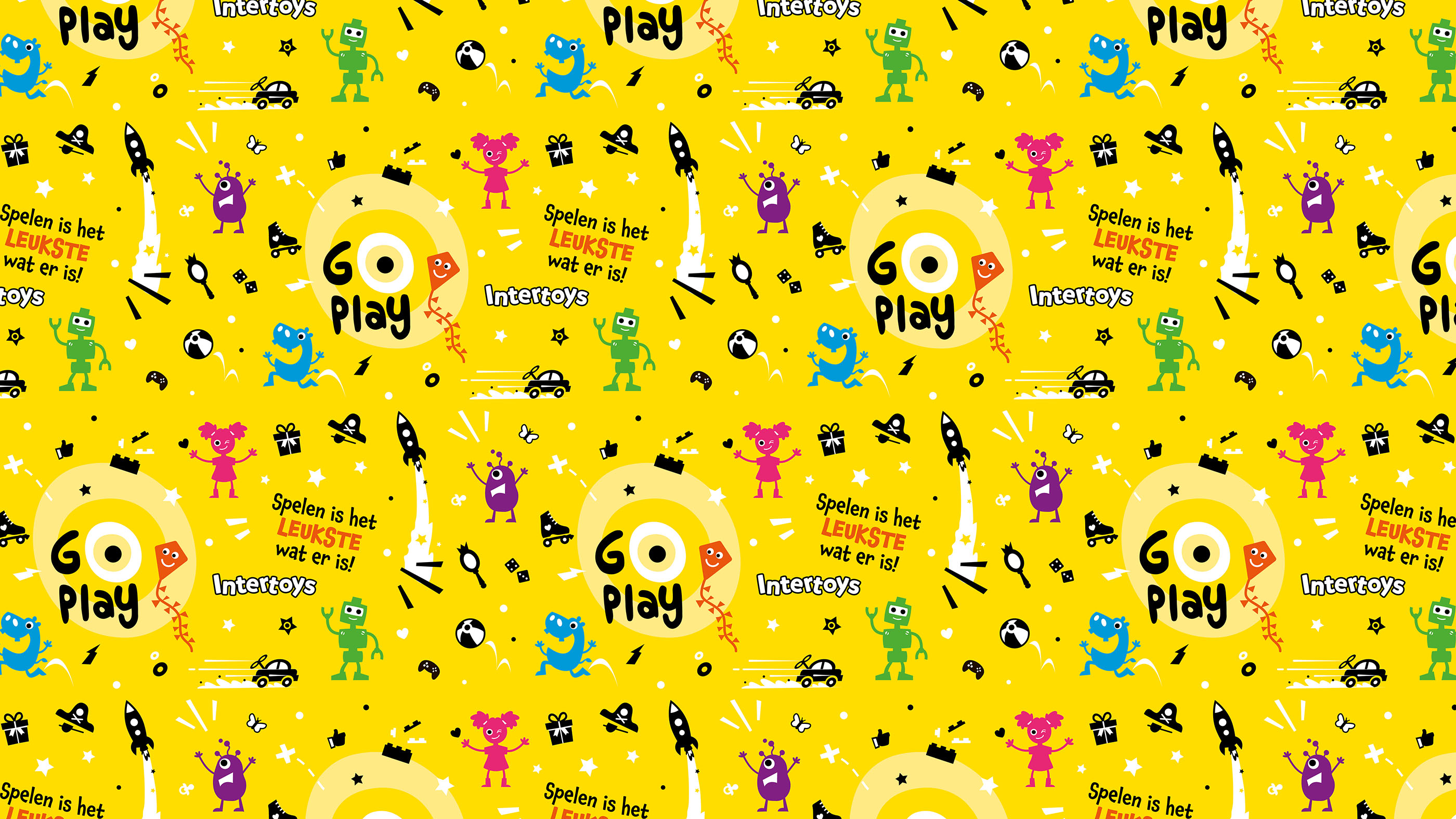
- Headline subtitle:
translate the Intertoys identity
- Sectors List:
Retail
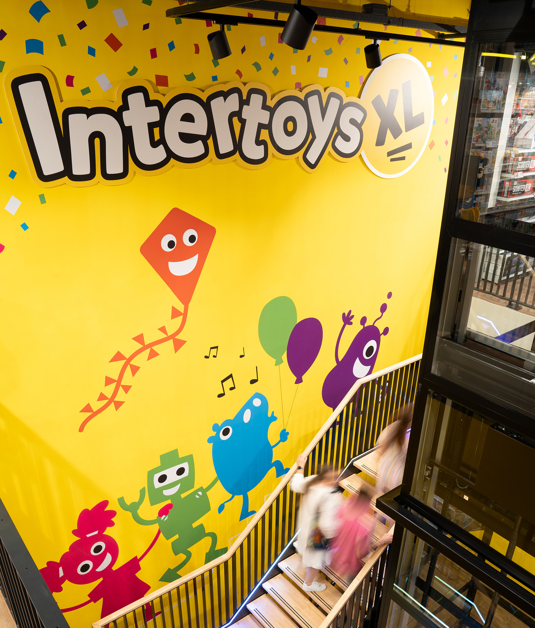
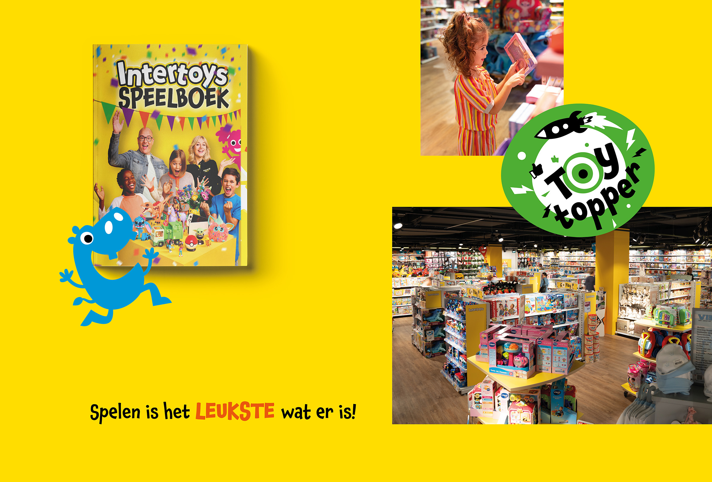
- Headline Introduction:
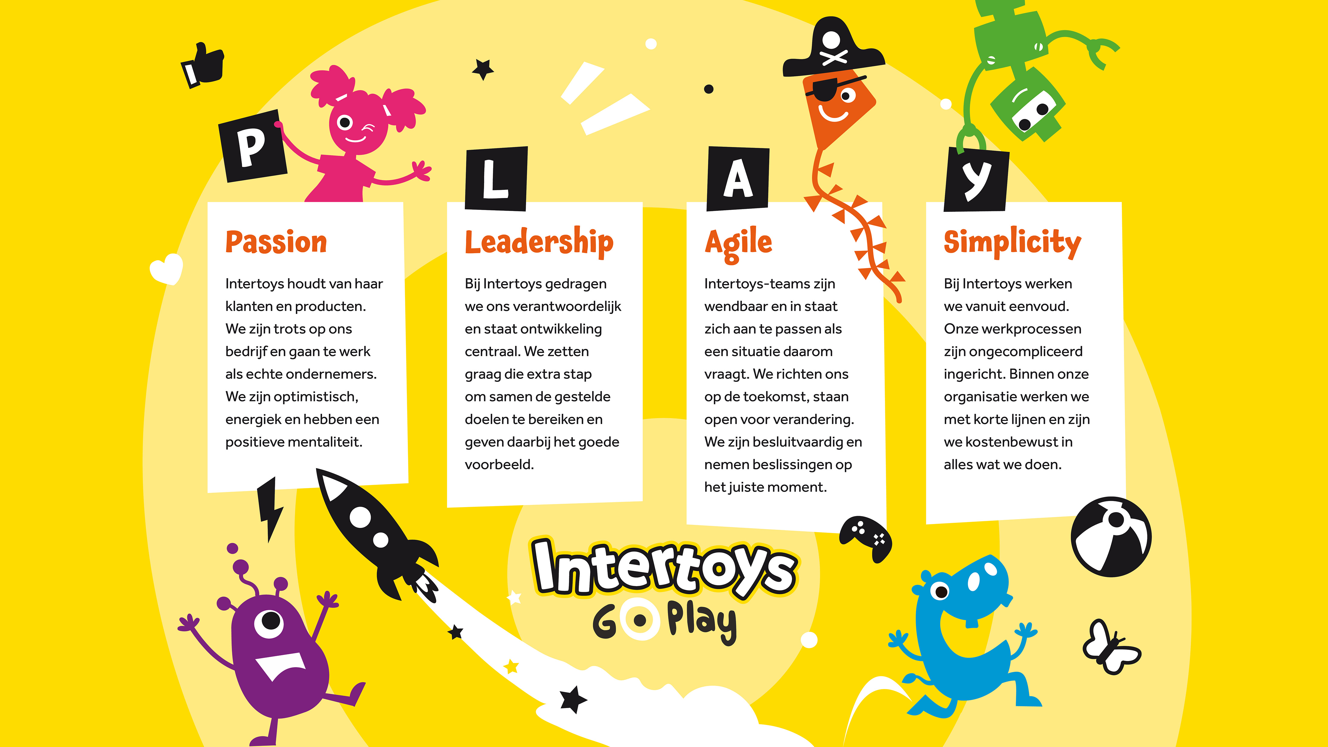
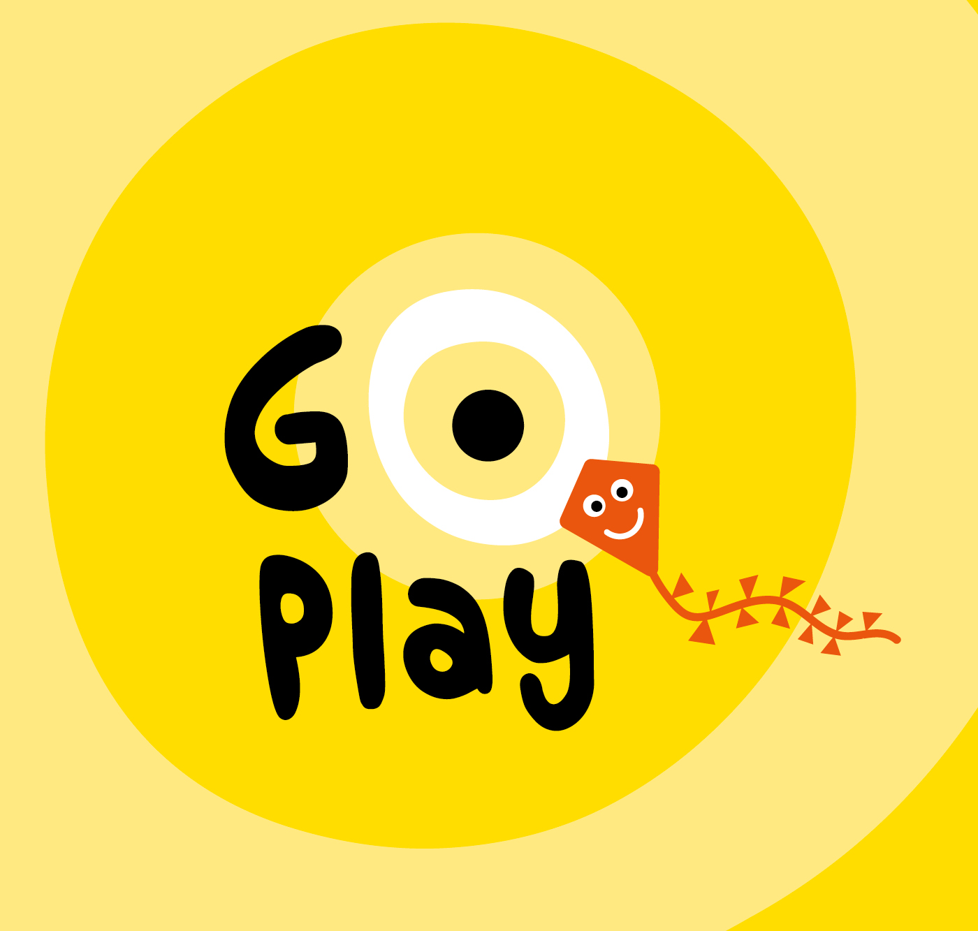
Toy chain Intertoys has had an eventful period, so that the identity has changed little in the last 10 years. The new management is determined to breathe new life into the brand and has already worked on the repositioning: Go Play. The basis was, but the rollout of this could be even better. We were called in to think along how we can better connect the new positioning.
- Brand Essential List:
Brand positioning, Brand identity
- Approach:
We started to make an inventory of four Intertoys stores, each with their own translation of the Go Play brand concept. We have also received all existing materials, including their brand book from 2020 and the new Go Play brand book . Our insights showed that Go Play was a stand -alone concept, but that the real Intertoys feeling was missing: color, kindness, fun.
beating brand experience
By restyle the already developed brand identity and adding emotion to this, we had it perfectly connected to their brand identity and brand values. We have applied this to all means: from store to wrapping paper and from website to social media. This created a powerful and throbbing brand experience. We have bundled the developed formats in a visual identity Handbook that everyone can work with.
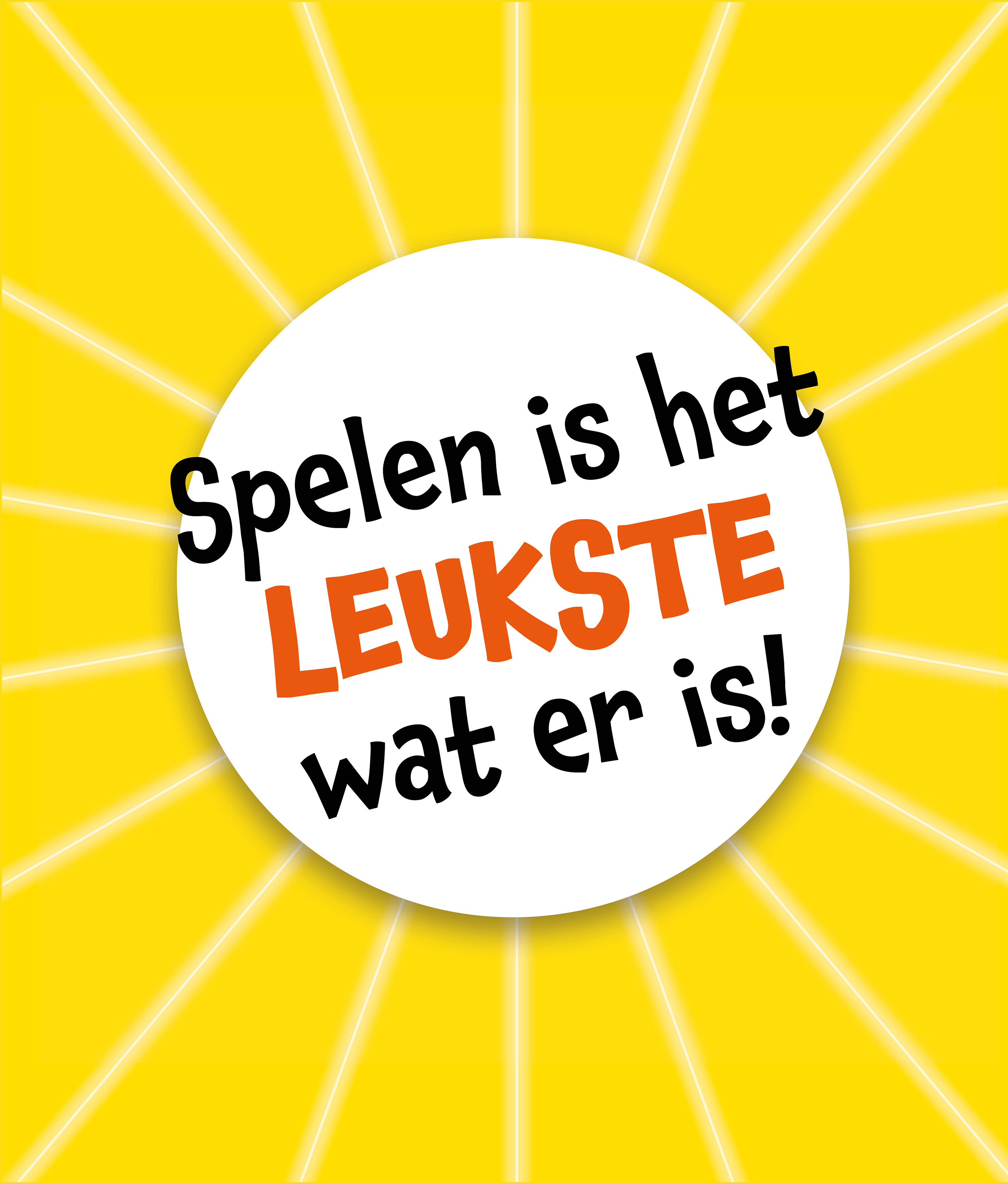
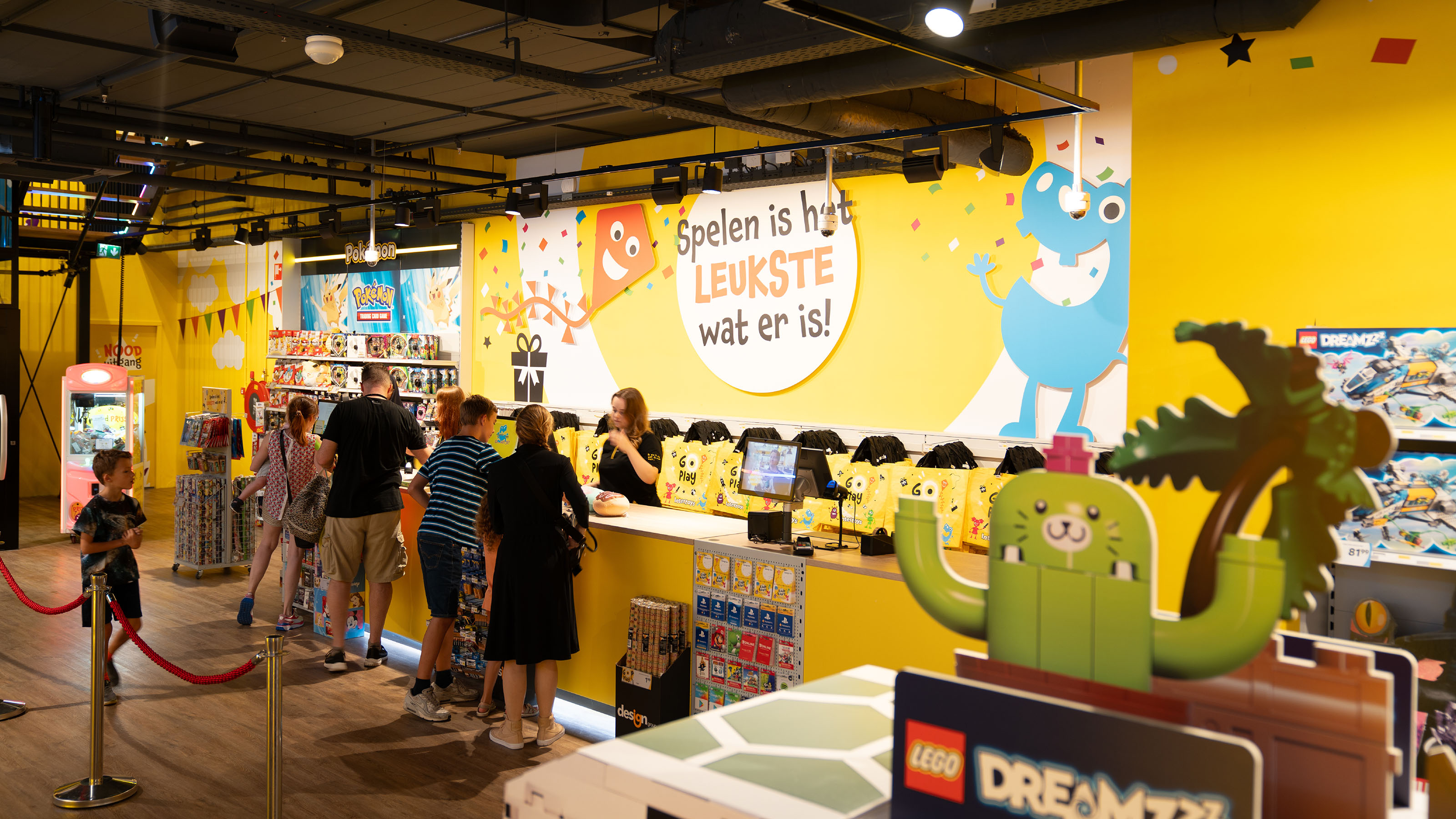
- Result:
that Intertoys is a fantastic brand, they now prove all the more. They also have the attention they have for toys for their identity . Together we have developed a uniform brand identity with which marketing, HR, store construction and franchisees can work and can translate the GO Play concept convincingly and purposefully. This results in support and enthusiasm among both employees and franchisees. With this rebranding they are proud to meet a new Intertoys era.
- Logo:
- Quote:
"Thanks to a strong empathy and pragmatic approach, we immediately spoke the same language."
- Quote - Customer Name and Function:
Stephan Buffing - Director
- Quote image:

- About customer:
About Intertoys
- About customer information:
Intertoys , with more than 200 branches, is the largest chain of toy stores in the Netherlands. The informal organization is characteristic of Intertoys There is a high involvement and atmosphere of collegiality within the company. The toys product makes the organization young, dynamic and flexible. In addition to a wide range of toy items for young to old, Intertoys an extensive collection of games for all platforms.
Translate the Intertoys feeling to the identity brand
- Product Category:
Home, Brand Strategy , Brand identity , Brand activation
- Slideshow:
- Type:
Image , Media Test :
 , Alt-Tag:
Intertoys Video
, Alt-Tag:
Intertoys Video - Type:
Image , Media Test :
 , Alt-Tag:
Intertoys Photography
, Alt-Tag:
Intertoys Photography - Type:
Image , Media Test :
 , Alt-Tag:
Intertoys Visual Identity
, Alt-Tag:
Intertoys Visual Identity - Type:
Image , Media Test :
 , Alt-Tag:
Intertoys Photography
, Alt-Tag:
Intertoys Photography - Type:
Image , Media Test :
 , Alt-Tag:
Intertoys Photography
, Alt-Tag:
Intertoys Photography - Type:
Image , Media Test :
 , Alt-Tag:
Intertoys Visual Identity
, Alt-Tag:
Intertoys Visual Identity - Type:
Image , Media Test :
 , Alt-Tag:
Intertoys Visual Identity
, Alt-Tag:
Intertoys Visual Identity - Type:
Image , Media Test :
 , Alt-Tag:
Intertoys Visual Identity
, Alt-Tag:
Intertoys Visual Identity - Type:
Image , Media Test :
 , Alt-Tag:
Intertoys Visual Identity
, Alt-Tag:
Intertoys Visual Identity - Type:
Image , Media Test :
 , Alt-Tag:
Intertoys Photography
, Alt-Tag:
Intertoys Photography - Type:
Image , Media Test :
 , Alt-Tag:
Intertoys Visual Identity
, Alt-Tag:
Intertoys Visual Identity - Type:
Image , Media Test :
 , Alt-Tag:
Intertoys Photography
, Alt-Tag:
Intertoys Photography - Type:
Image , Media Test :
, Alt-Tag:
Intertoys Visual Identity
- Type:
Image , Media Test :
 , Alt-Tag:
Intertoys Visual Identity
, Alt-Tag:
Intertoys Visual Identity - Type:
Image , Media Test :
 , Alt-Tag:
Intertoys Visual Identity
, Alt-Tag:
Intertoys Visual Identity - Type:
Image , Media Test :
 , Alt-Tag:
Intertoys Visual Identity
, Alt-Tag:
Intertoys Visual Identity
- Cases Logo - Diap:
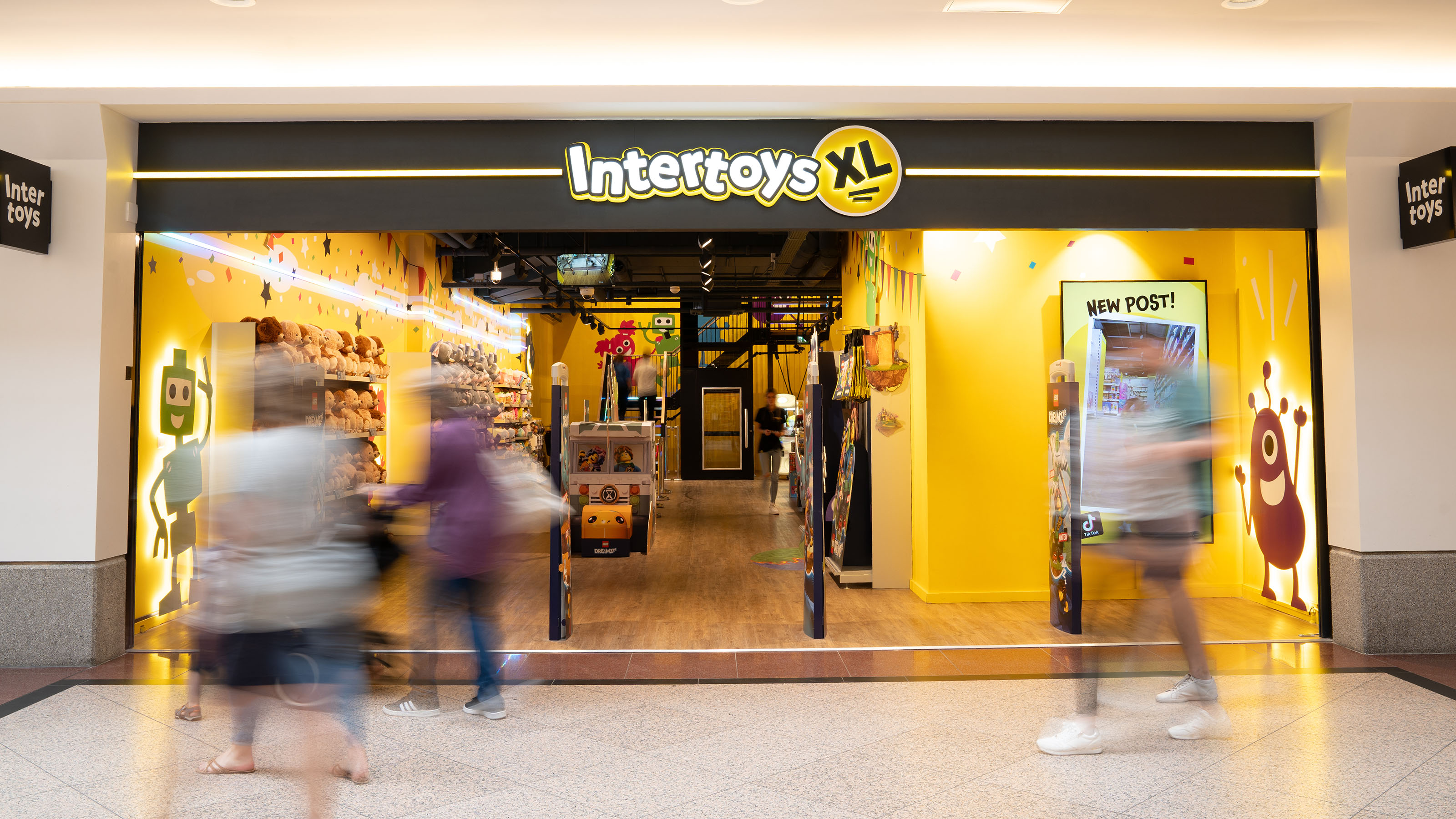
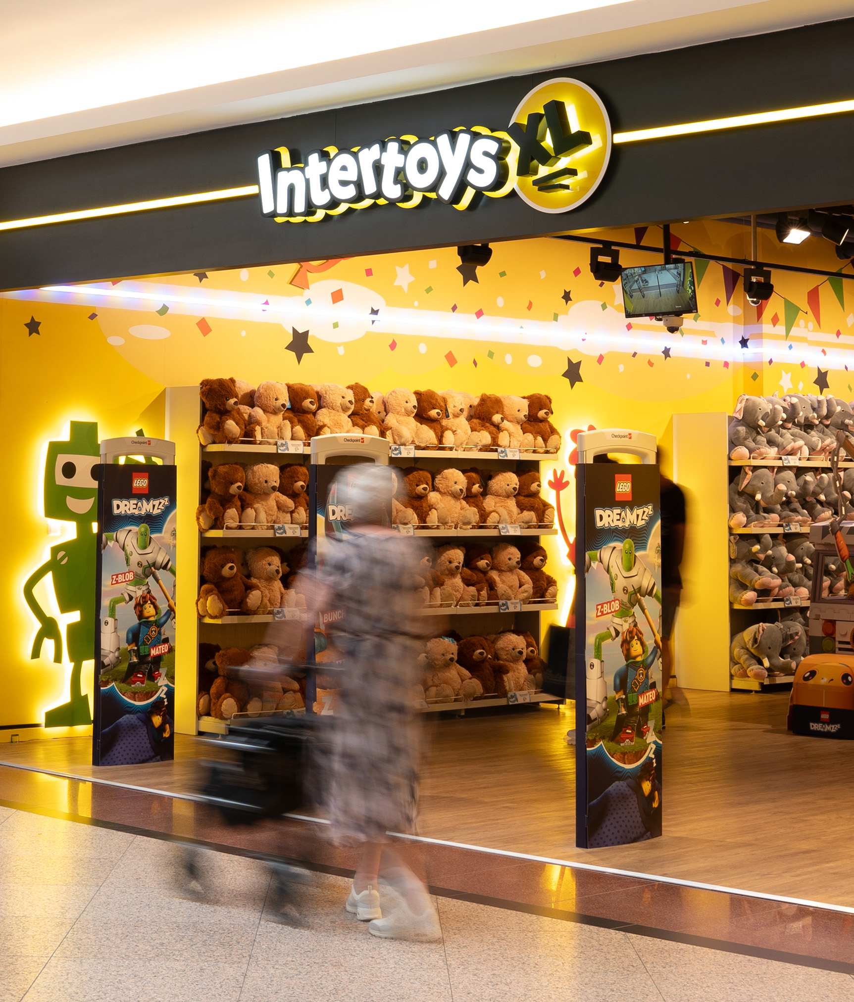
- Headline Subtitle:
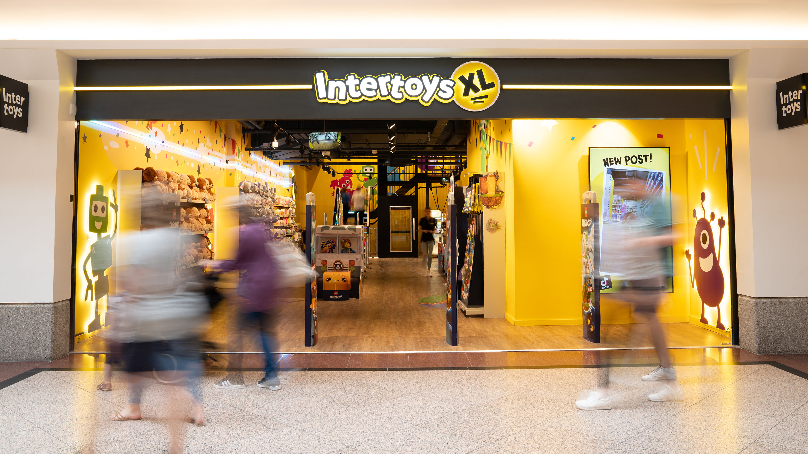
Ultimate store experience for new Intertoys Shops
- Sectors List:
Retail
- Headline Introduction:
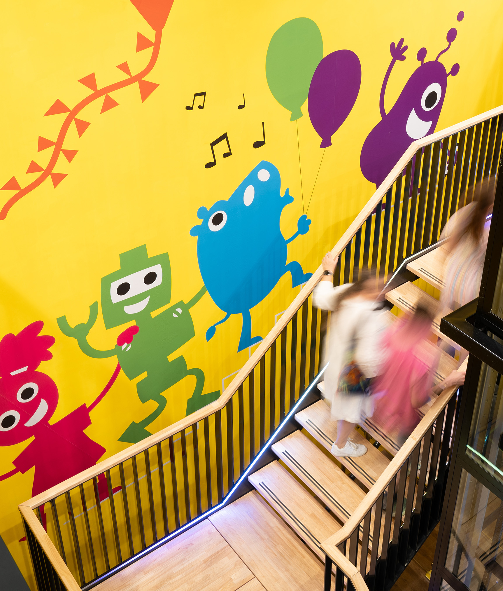
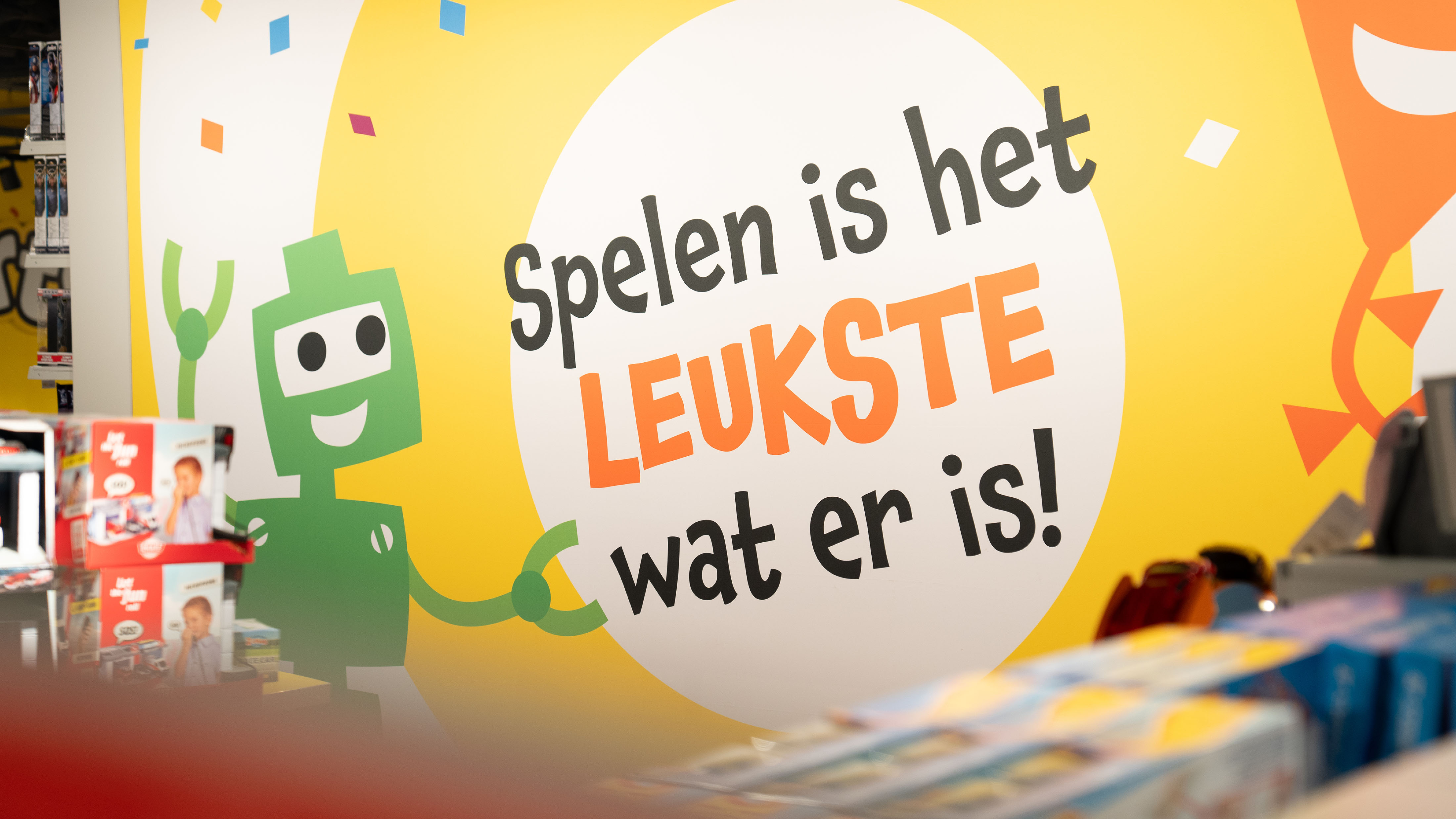
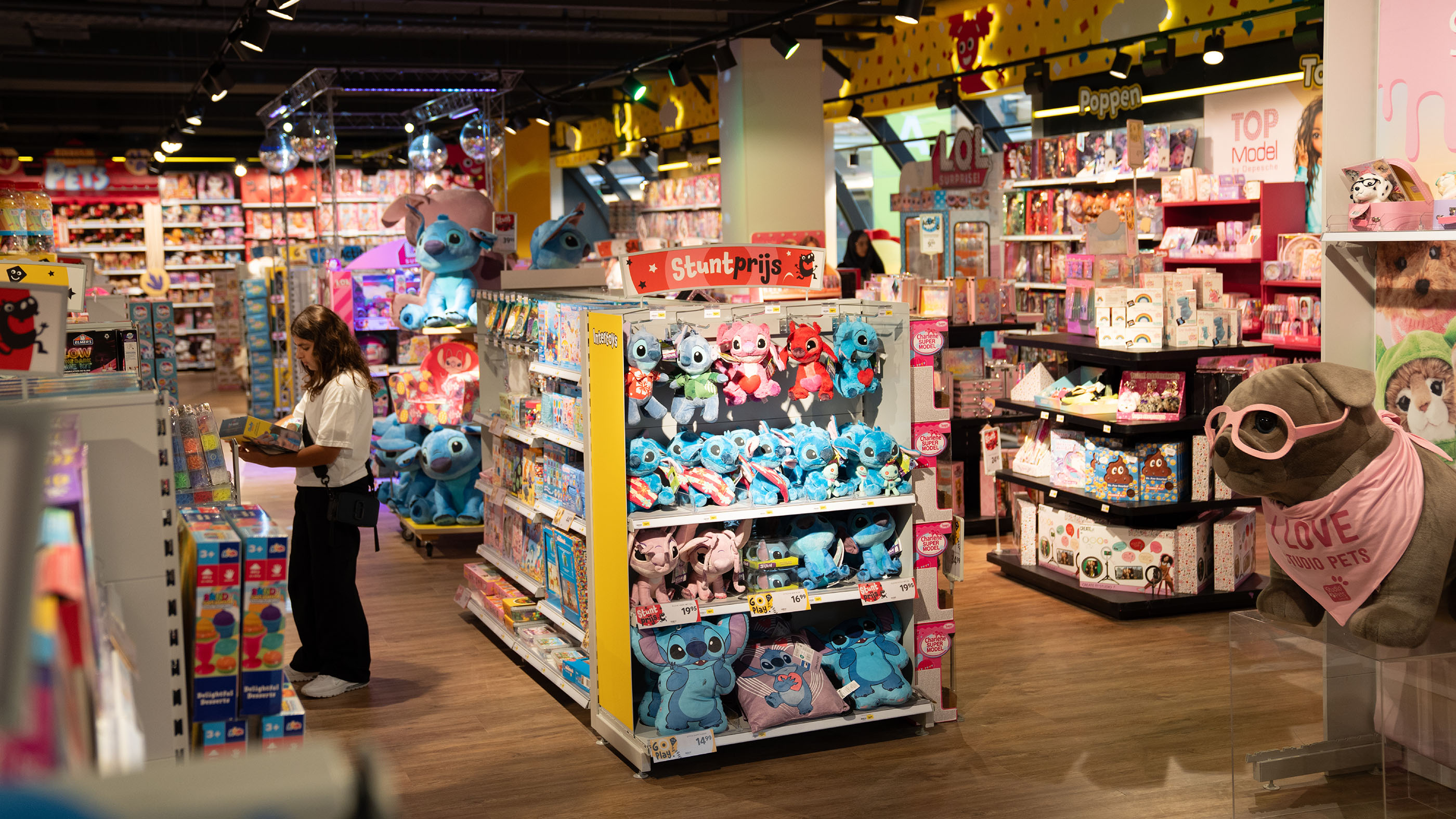
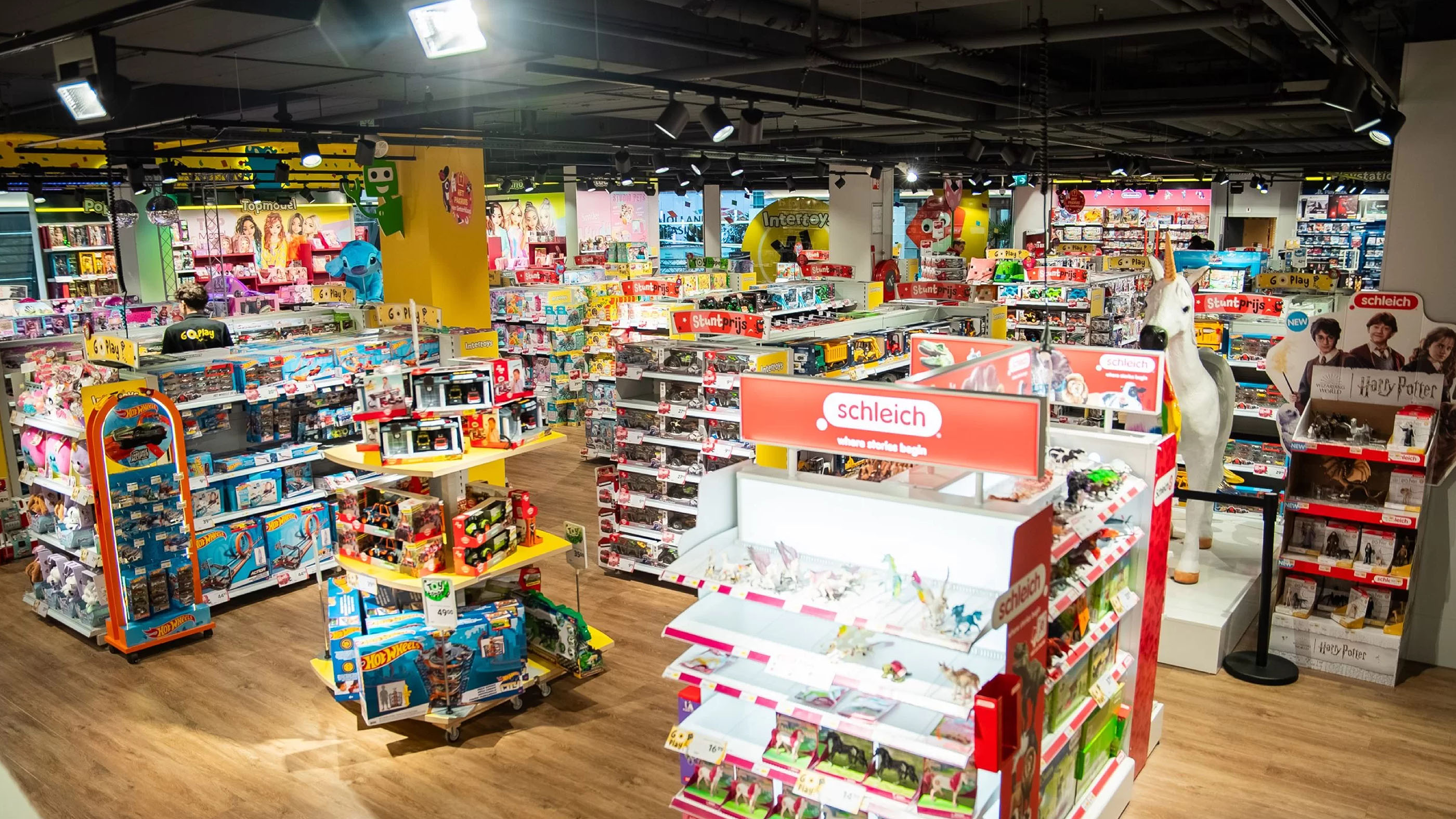
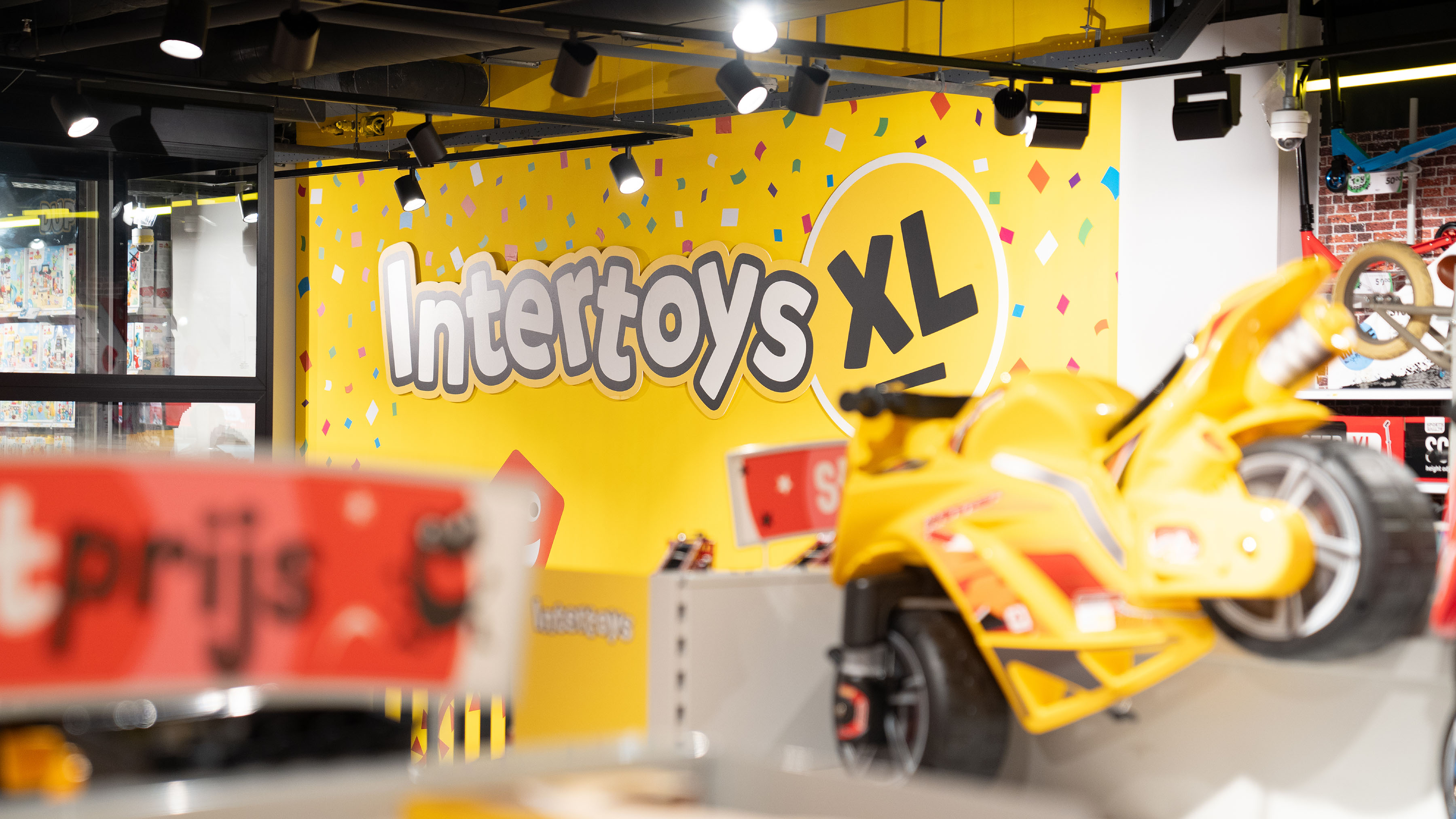
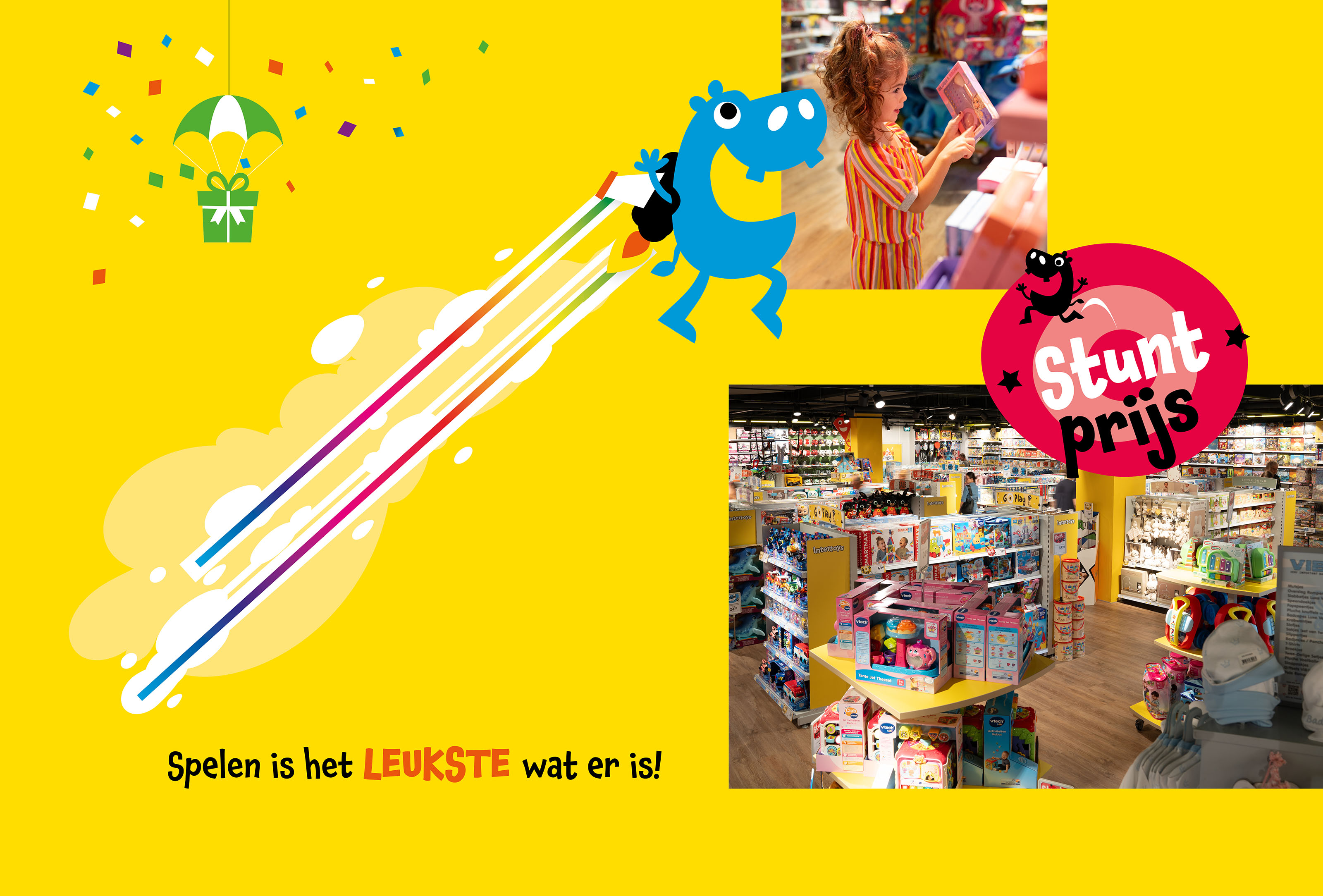
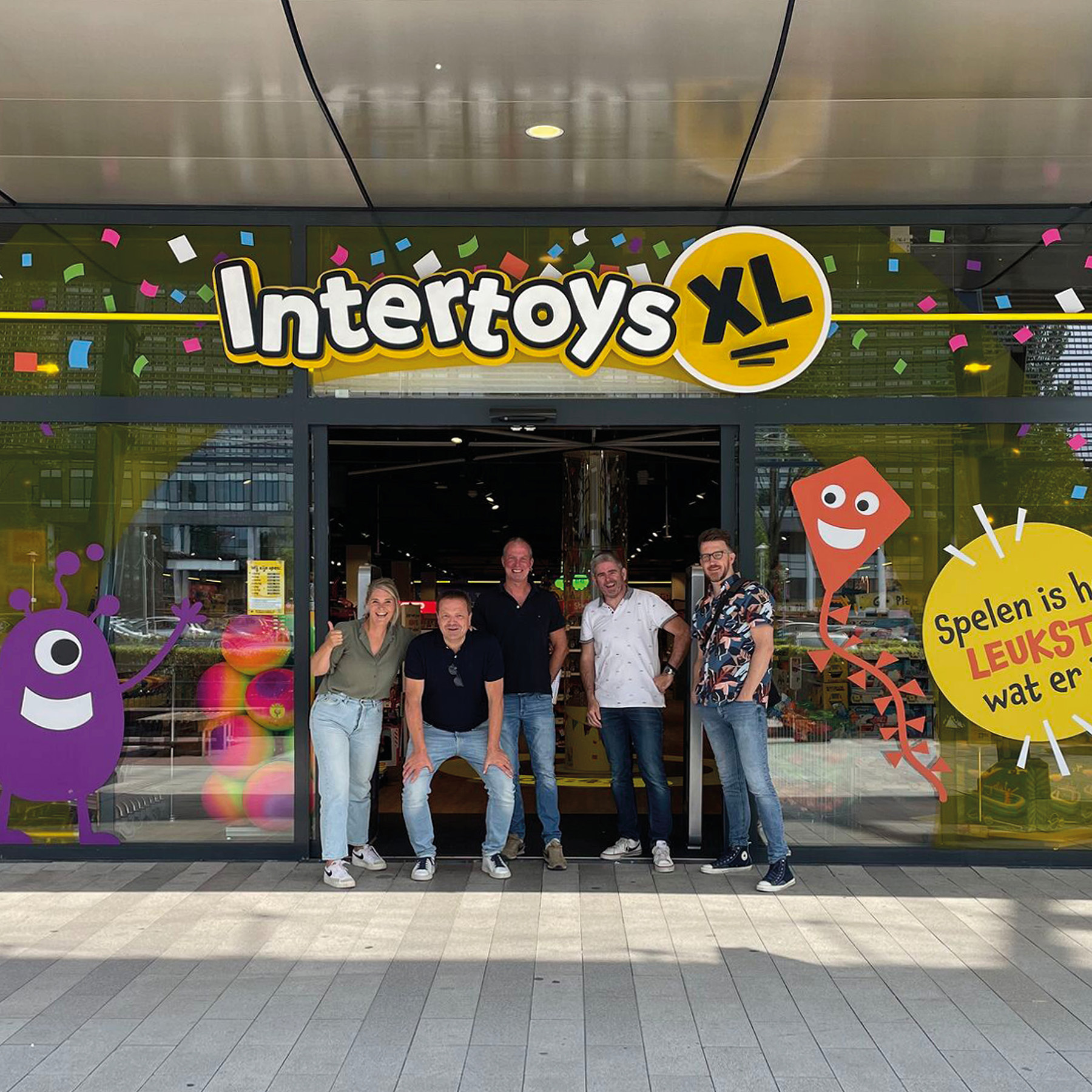
Laughing, running and full of enthusiasm, children run their favorite toys every day! They can't wait to play with that new Barbie, cool game or with one of the many LEGO building sets. It is the experience that Intertoys gives to children and what Intertoys so special. In recent months, the creative team from Vandeez together with Intertoys on new Intertoys XL stores. New locations were opened in, among others, Rotterdam Zuidplein, Eindhoven, Hilversum, Veenendaal, Assen, Haarlem and Hellevoetsluis.
- Brand Essential List:
Brand identity
- Approach:
Intertoys has 200 stores in the Netherlands. Intertoys has opened new stores at A-locations in recent months. These stores are being rebuilt to the latest store concept from Intertoys where the Intertoys brand experience is central.
Visualize new store
We are proud to make a structural contribution to this. A new location is always visited by our creative team. At such a moment we look, as it were 'through the concrete' and we visualize the new store in mind. We take photos, measure and sketch the first lines on the iPad. Although the lighting is missing and walls often still have to be moved, we ensure that the visualization appeals to the imagination.
creative effect
We then start working on its creative elaboration. We do this in co-creation with the shopping team and Stephan Buffing, sales director. Of course we take into account the real Intertoys feeling: color, kindness, fun. Consistency is Key, which is why this brand identity is implemented in all channels: from store to wrapping paper and website to social media. All this is therefore bundled in a visual identity and Formula Handbook.
- Result:
Vandeez realized the XL logo, the overall store identity , POS material, price cards, headboards and the unique and recognizable Intertoys brand identity . And what an impact we have managed to realize with these stores! We are very proud of the result and the unique collaboration. A team of professionals, each with their own specialty with which we can achieve maximum success.
And if you thought we were ready? Certainly not! Currently, a number of new stores and the preparation of the coolest playbook in the Netherlands are working.
Read all about the creation of the brand identity in our case .
- Logo:
- Quote:
"Thanks to a strong empathy and pragmatic approach, we immediately spoke the same language."
- Quote - Customer Name and Function:
Stephan Buffing - Director
- Quote image:
- About customer:
About Intertoys
- About customer information:
Intertoys , with more than 200 branches, is the largest chain of toy stores in the Netherlands. The informal organization is characteristic of Intertoys There is a high involvement and atmosphere of collegiality within the company. The toys product makes the organization young, dynamic and flexible. In addition to a wide range of toy items for young to old, Intertoys an extensive collection of games for all platforms.
Ultimate store experience for new Intertoys stores
- Product Category:
Brand Strategy , Brand identity , Website
- Slideshow:
- Type:
Image , Media Test:
- Type:
Image , Media Test:
- Type:
Video , Media Test:
vandeez -Case- karel doorman fonds -2024-Slider video-mobile.mp4
- Type:
Image , Media Test:
- Type:
Image , Media Test:
- Type:
Image , Media Test:

- Type:
Image , Media Test:
- Type:
Image , Media Test:
- Type:
Image , Media Test:
- Type:
Image , Media Test:
- Type:
Image , Media Test:
- Type:
Image , Media Test:
- Type:
Image , Media Test:
- Type:
Image , Media Test:
- Type:
Image , Media Test:
- Type:
Image , Media Test:
- Cases Logo - Diap:

- Headline Subtitel:
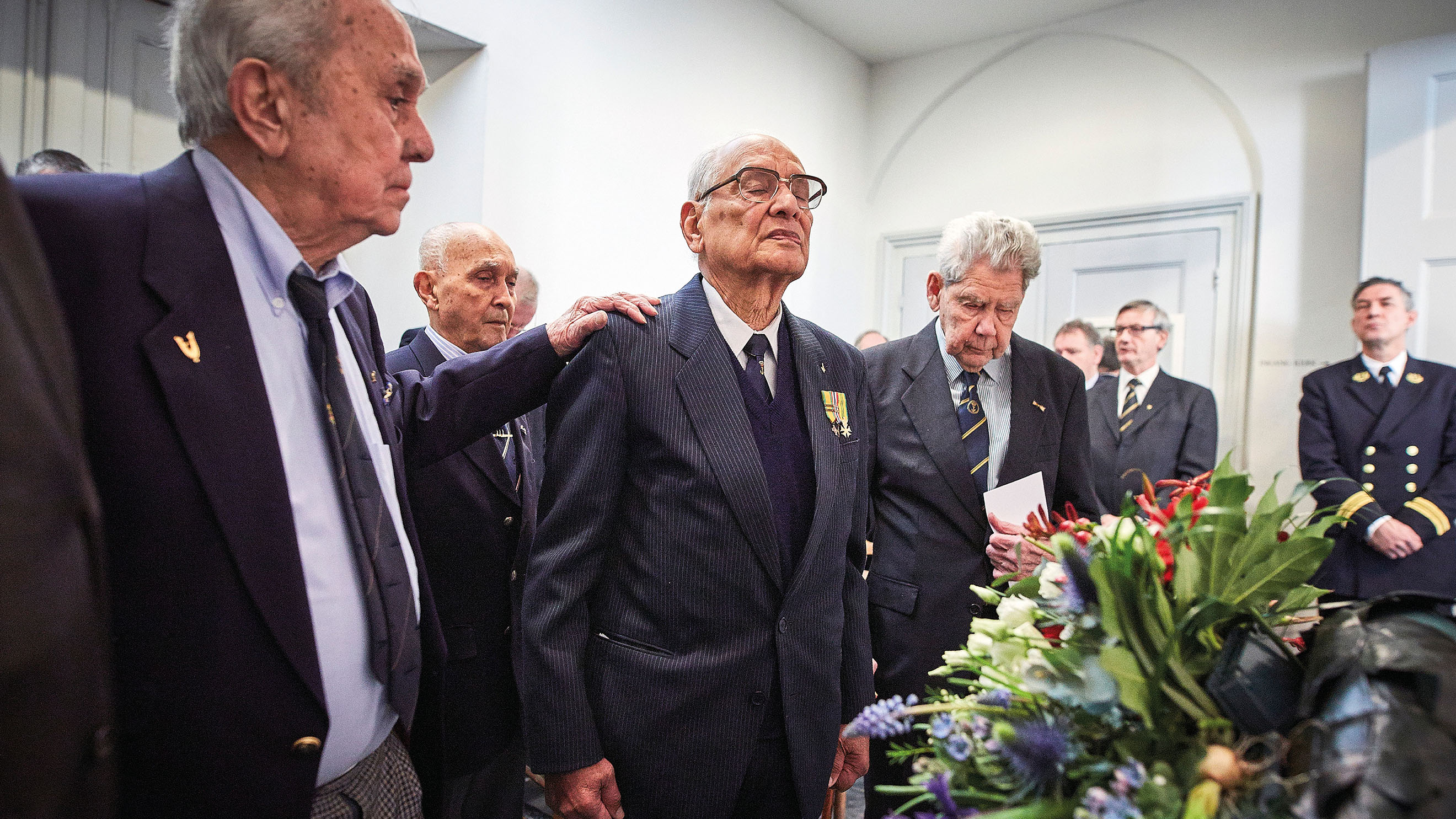
Making visible what the fund means for navy personnel
- Sectors list:
Non-profit
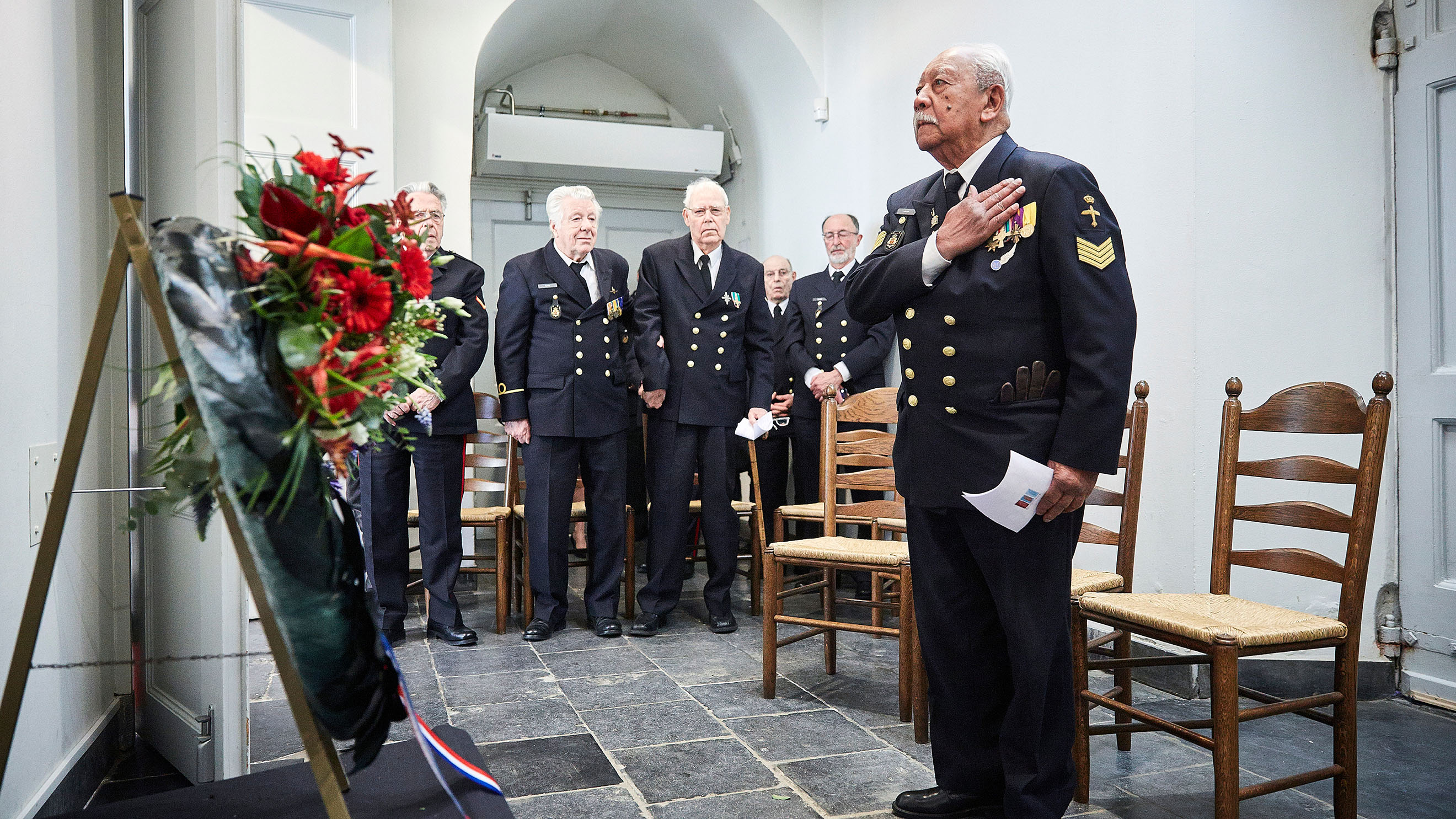
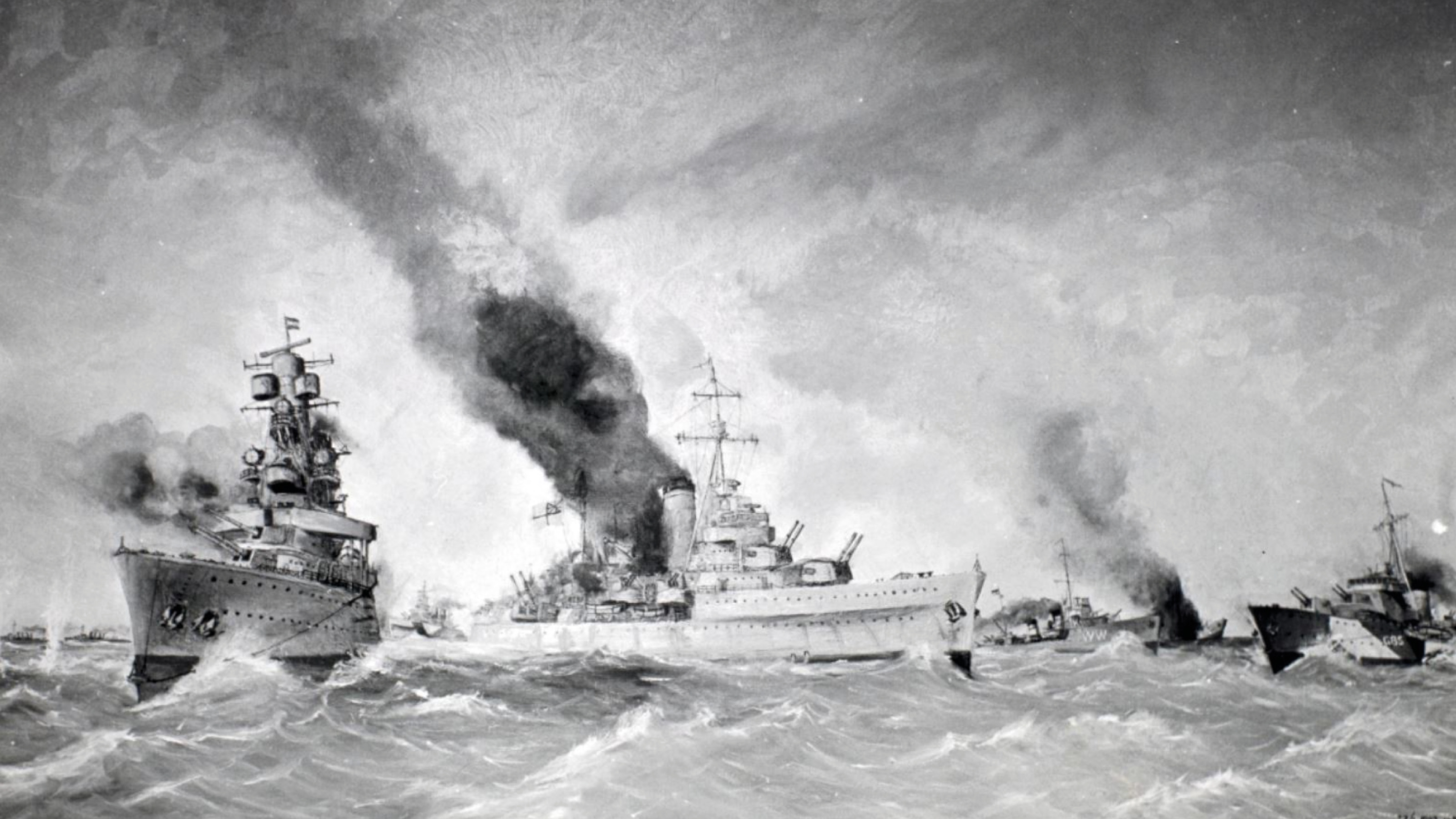
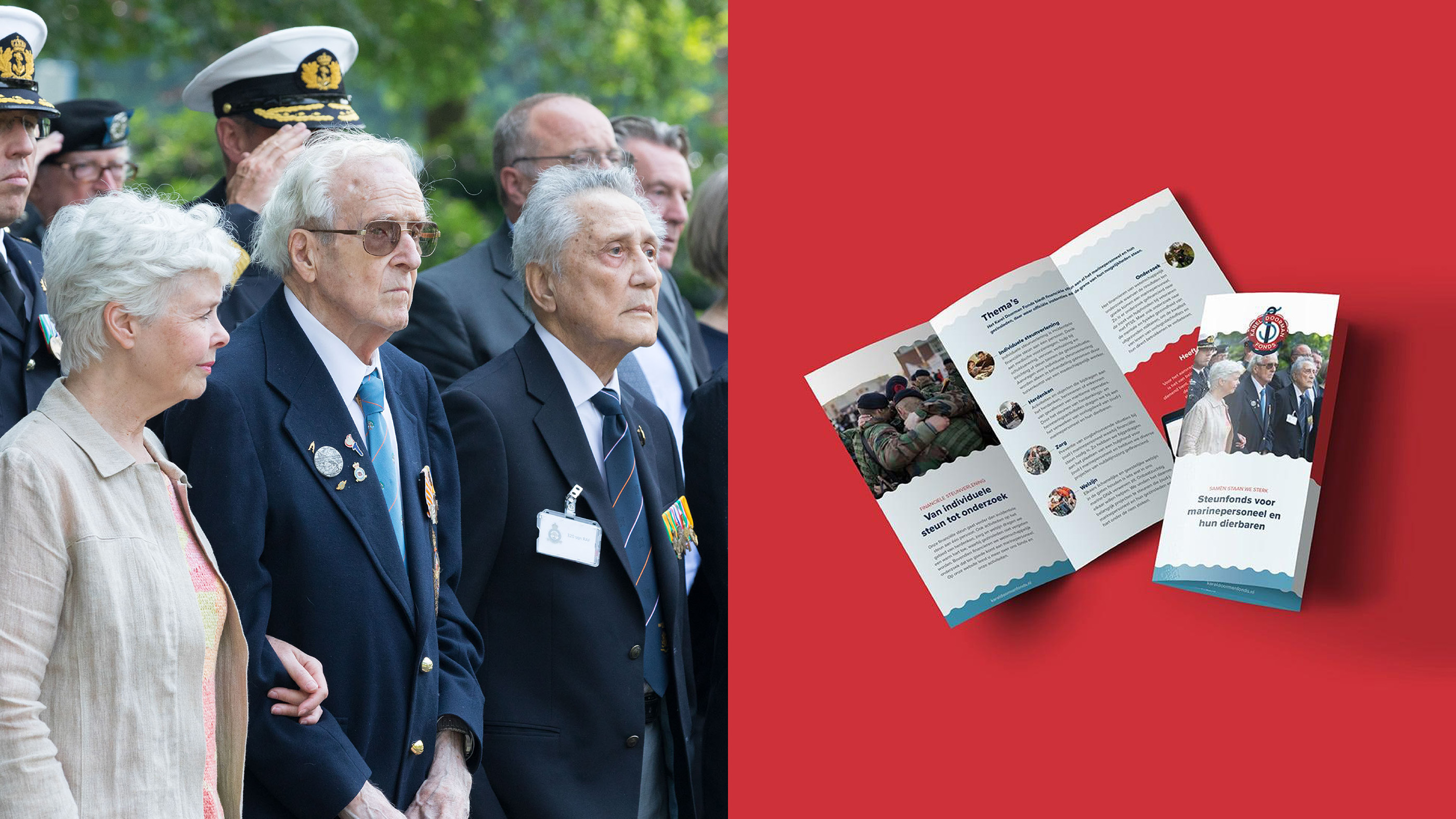
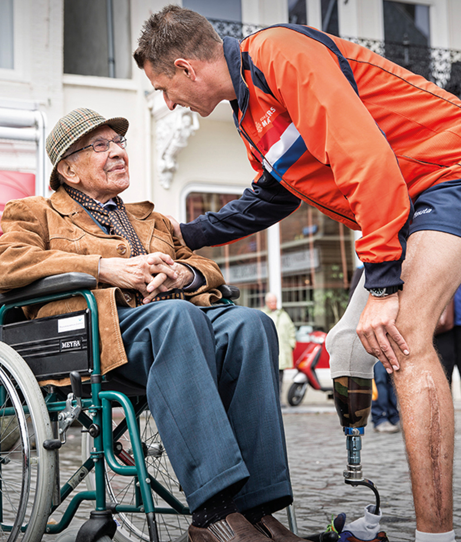
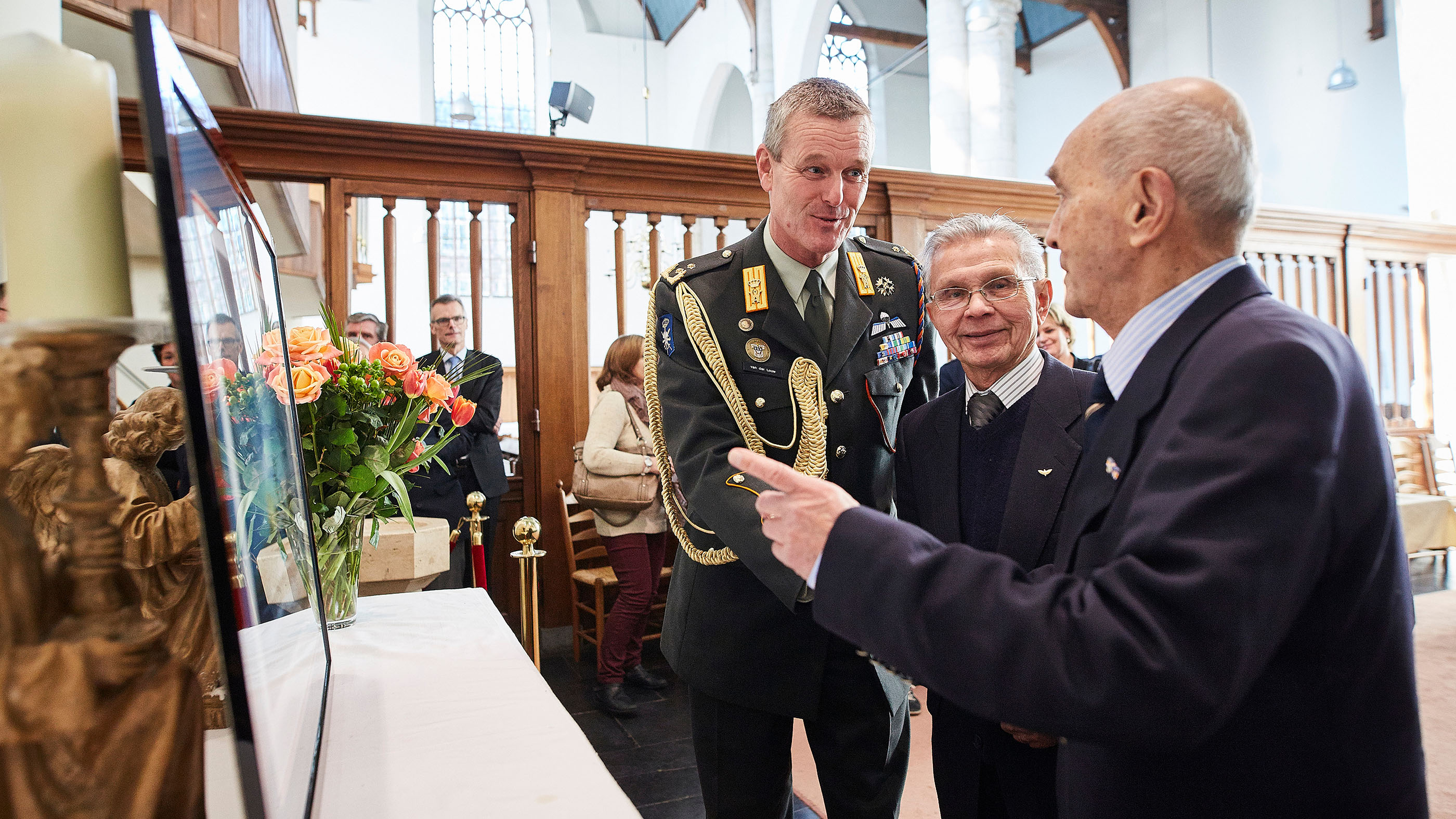
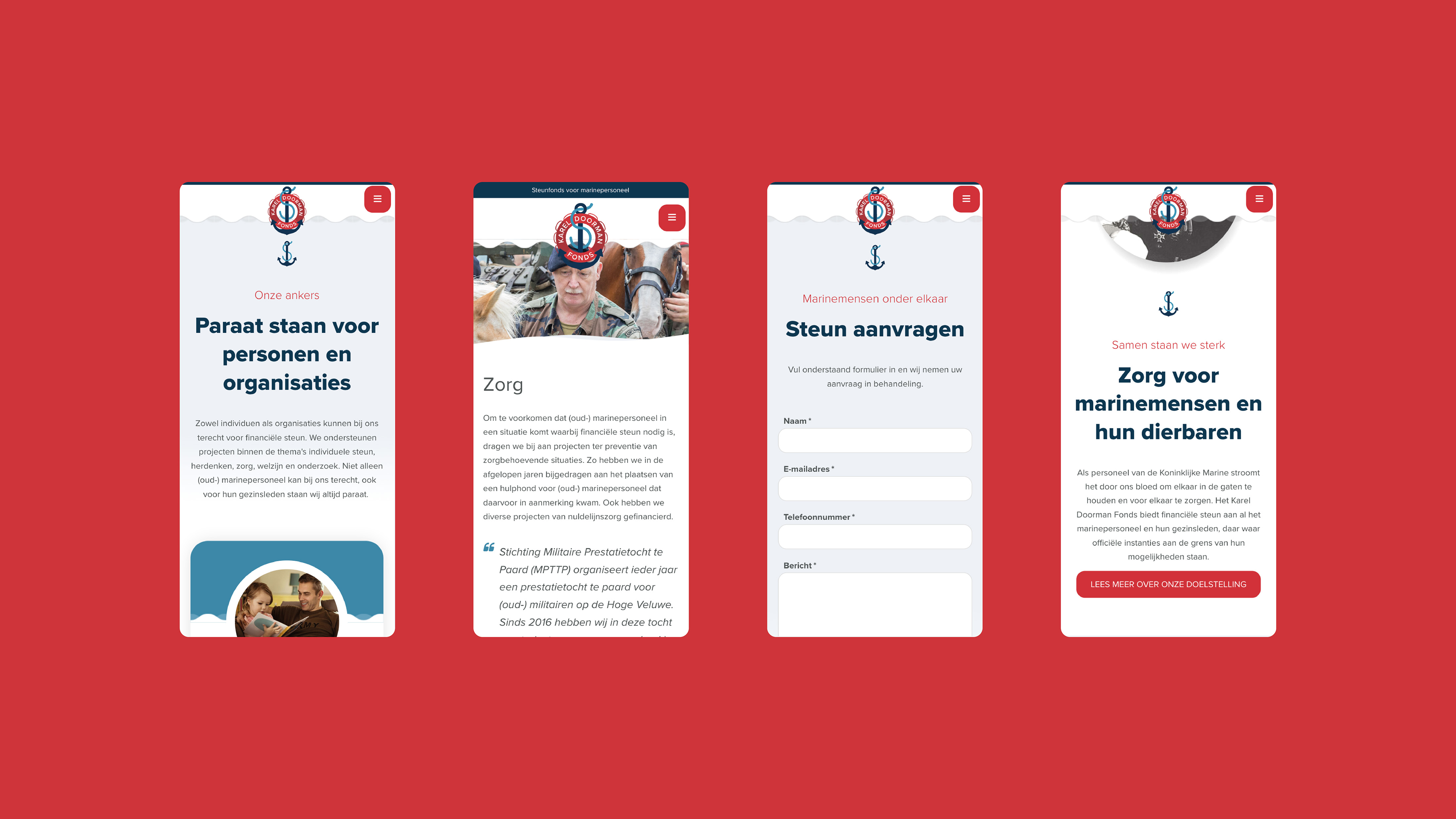
- Headline Introduction:
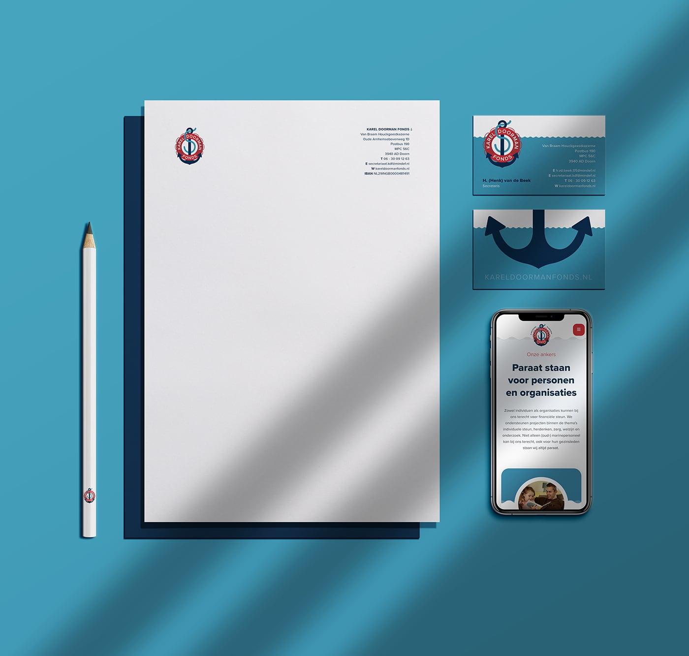
The Karel Doorman Fonds has been ready for navy personnel and their loved ones since 1944. It is an organization with the opportunity to help many people, provided they make their story visible to these people. With a new website and visual identity Karel Doorman fonds wants to make and offer their services to as many people as possible. For example, the navy personnel and their family members who want support can find the fund and find out what the fund can mean for them. Where official authorities are on the boundary of their possibilities, the Karel Doormans Fonds continues.
- Brand Essential List:
Brand positioning, Brand identity , Website
- Approach:
Attention and genuine involvement, that is the basis. We started to delve into the customer, their work, their people and their target group. The historical story has been supplemented with the current events and the services that the Karel Doorman fonds now offers.
New visual identity and Website
That story has been the basis for setting up the website and the visual identity . Their story fits together seamlessly and visually and is made available to everyone thanks to the website. The story was brought to life with the right dose of imagination.
- Result:
A clear and thorough brand positioning in the picture and text, with the possibility to continue building. The website can easily be managed by the customer. It is that a bit unburdening so that the organization can focus on their goal; support more and new people.
central point where their story is told powerfully
With the new website and visual identity of the Karel Doorman Fonds they have a central point where their story is told and the threshold for the target group is low. That way they can support more people.
- Logo:
- About customer:
About Karel Doorman Fonds
- About customer information:
The Karel Doorman Fonds offers financial support to all naval staff and their family members, where official authorities are on the border of their possibilities. Both individuals and organizations can go to the Karel Doorman Fonds for financial support. They support projects within the themes of individual support, commemorating, care, well -being and research.
Make visible what the fund means for navy personnel
- Product Category:
Brand Strategy , Brand identity , Website
- Slideshow:
- Type:
Image , Media Test :
 , Alt-Tag:
Kneppers Rozen Photography
, Alt-Tag:
Kneppers Rozen Photography - Type:
Image , Media Test :
 , Alt-Tag:
Kneppers Rozen Photography
, Alt-Tag:
Kneppers Rozen Photography - Type:
Video , Media Test:
vandeez -Case kneppers rozen -Mobile video.mp4 , Alt-Tag:
Kneppers Rozen Website
- Type:
Image , Media Test :
 , Alt-Tag:
Kneppers Rozen Photography
, Alt-Tag:
Kneppers Rozen Photography - Type:
Image , Media Test :
 , Alt-Tag:
Kneppers Rozen Visual Identity
, Alt-Tag:
Kneppers Rozen Visual Identity - Type:
Image , Media Test :
 , Alt-Tag:
Kneppers Rozen Photography
, Alt-Tag:
Kneppers Rozen Photography - Type:
Image , Media Test :
 , Alt-Tag:
Kneppers Rozen Website
, Alt-Tag:
Kneppers Rozen Website - Type:
Image , Media Test :
 , Alt-Tag:
Kneppers Rozen Photography
, Alt-Tag:
Kneppers Rozen Photography - Type:
Video , Media Test :
 , Alt-Tag:
Kneppers Rozen Visual Identity
, Alt-Tag:
Kneppers Rozen Visual Identity - Type:
Image , Media Test :
 , Alt-Tag:
Kneppers Rozen Visual Identity
, Alt-Tag:
Kneppers Rozen Visual Identity - Type:
Image , Media Test :
 , Alt-Tag:
Kneppers Rozen Photography
, Alt-Tag:
Kneppers Rozen Photography - Type:
Image , Media Test :
 , Alt-Tag:
Kneppers Rozen Photography
, Alt-Tag:
Kneppers Rozen Photography - Type:
Image , Media Test :
 , Alt-Tag:
Kneppers Rozen Photography
, Alt-Tag:
Kneppers Rozen Photography - Type:
Image , Media Test :
 , Alt-Tag:
Kneppers Rozen Photography
, Alt-Tag:
Kneppers Rozen Photography - Type:
Image , Media Test :
 , Alt-Tag:
Kneppers Rozen Website
, Alt-Tag:
Kneppers Rozen Website - Type:
Image , Media Test :
 , Alt-Tag:
Kneppers Rozen Visual Identity
, Alt-Tag:
Kneppers Rozen Visual Identity
- Cases Logo - Diap:

- Headline subtitle:
as a nursery and trading house in the sights of the target group
- Sectors list:
agriculture and horticulture
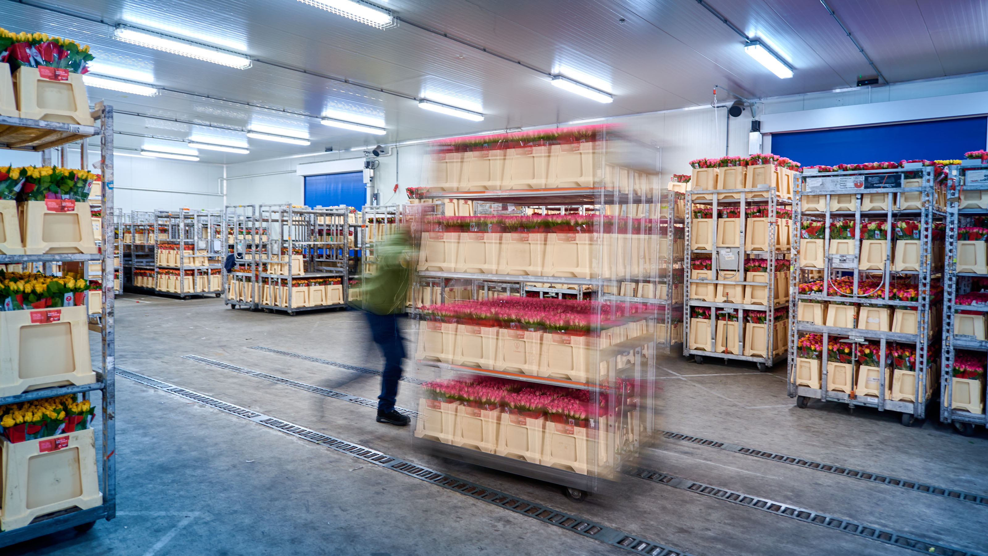
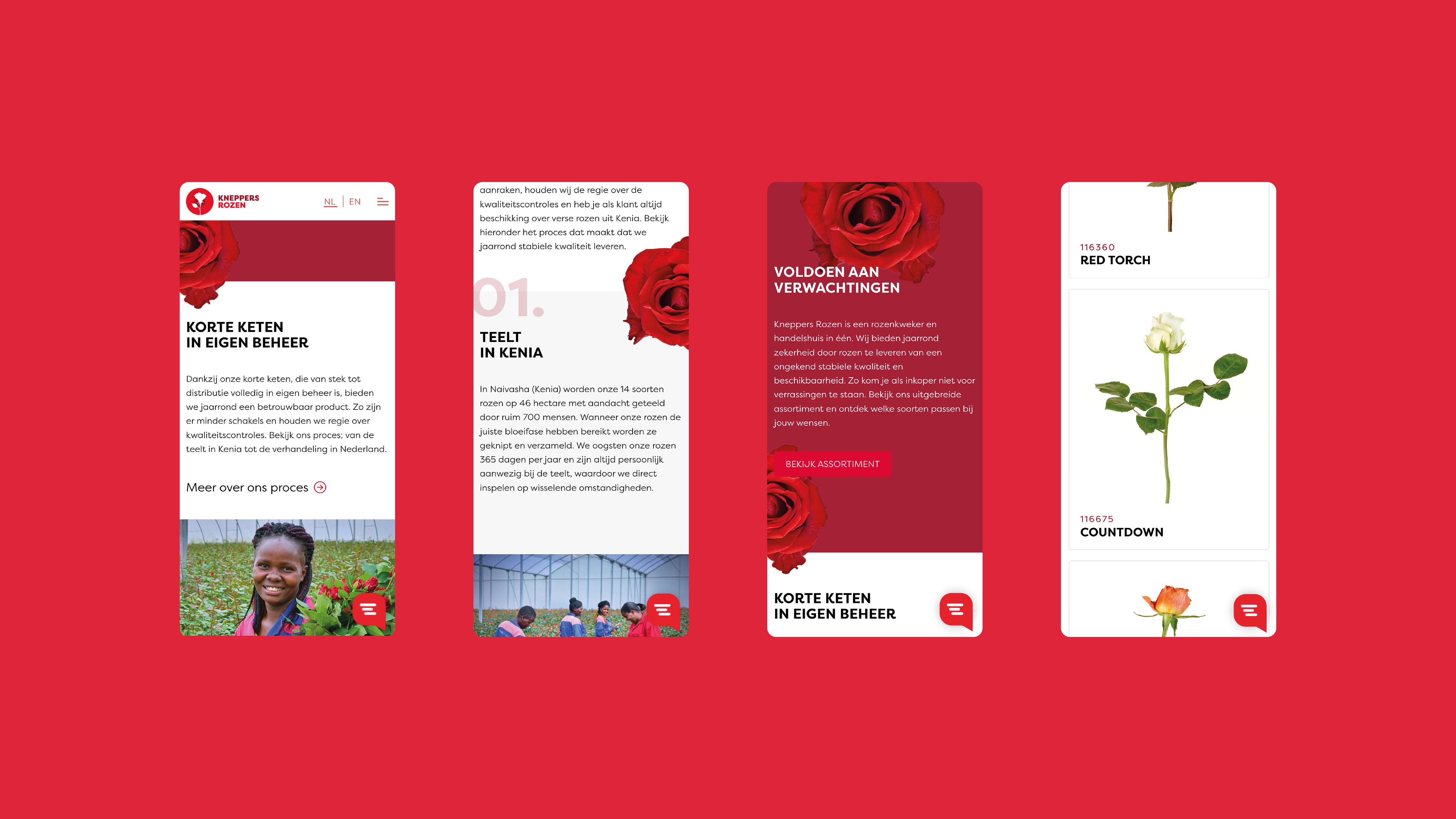
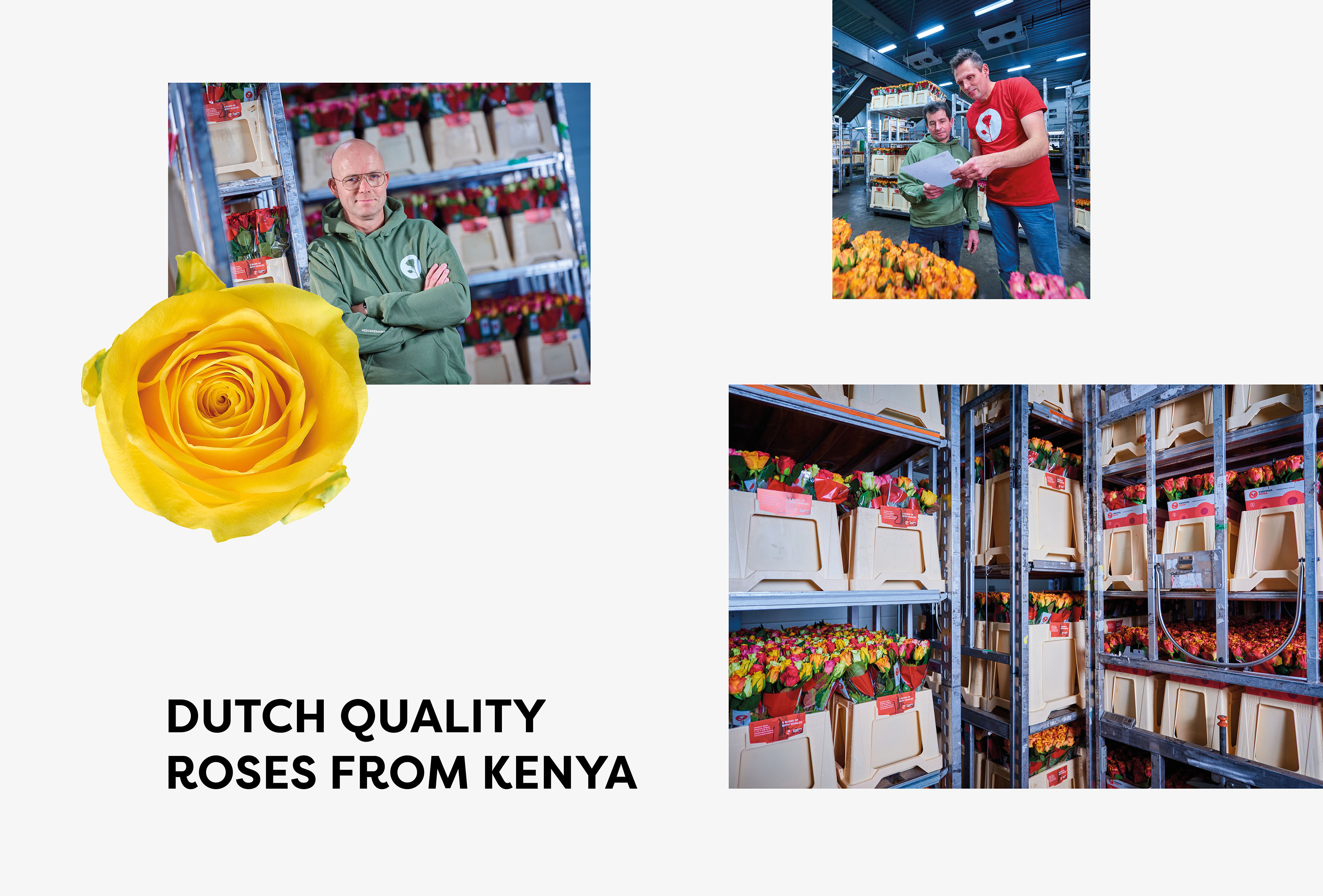
- Headline Introduction:
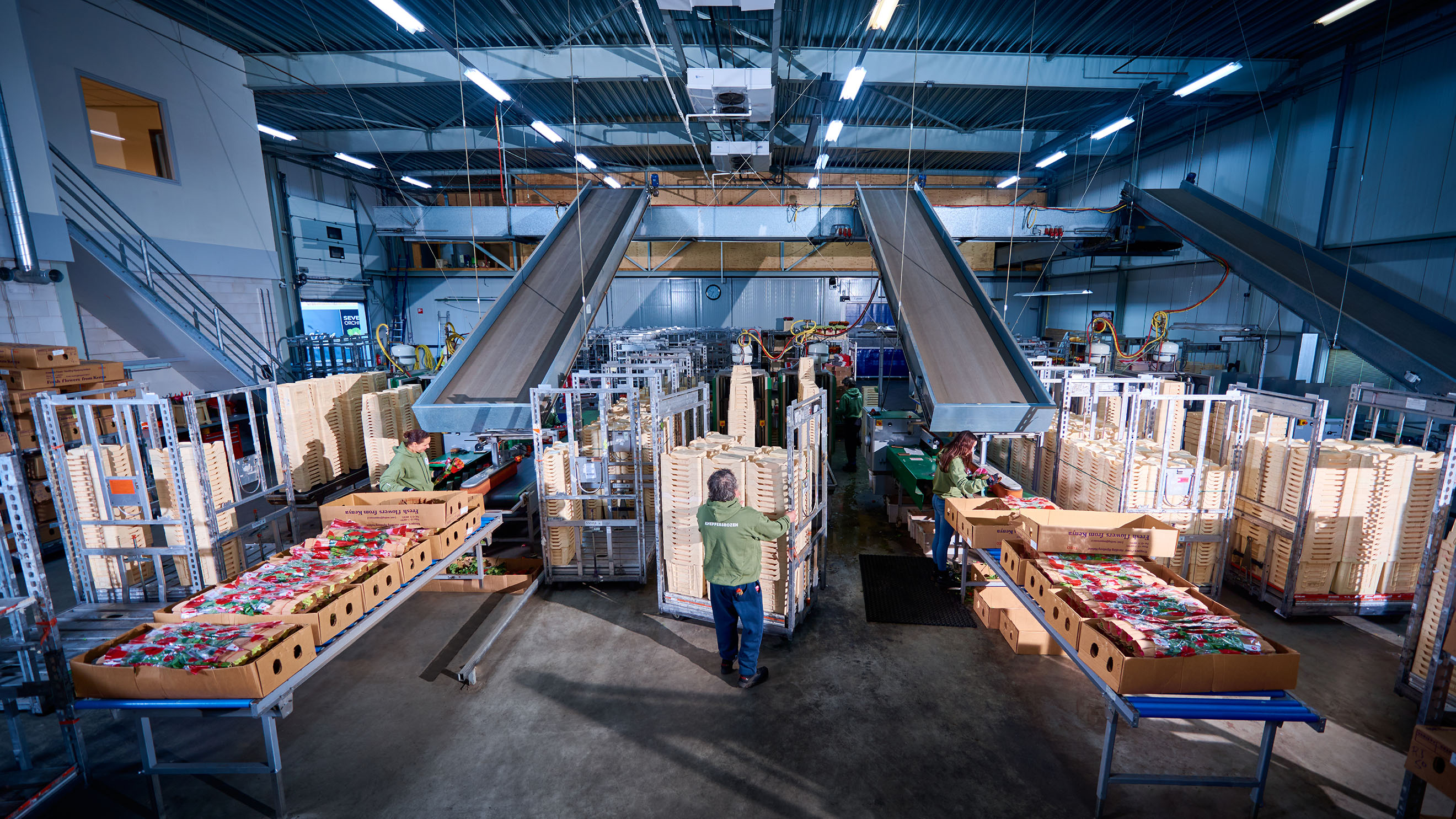
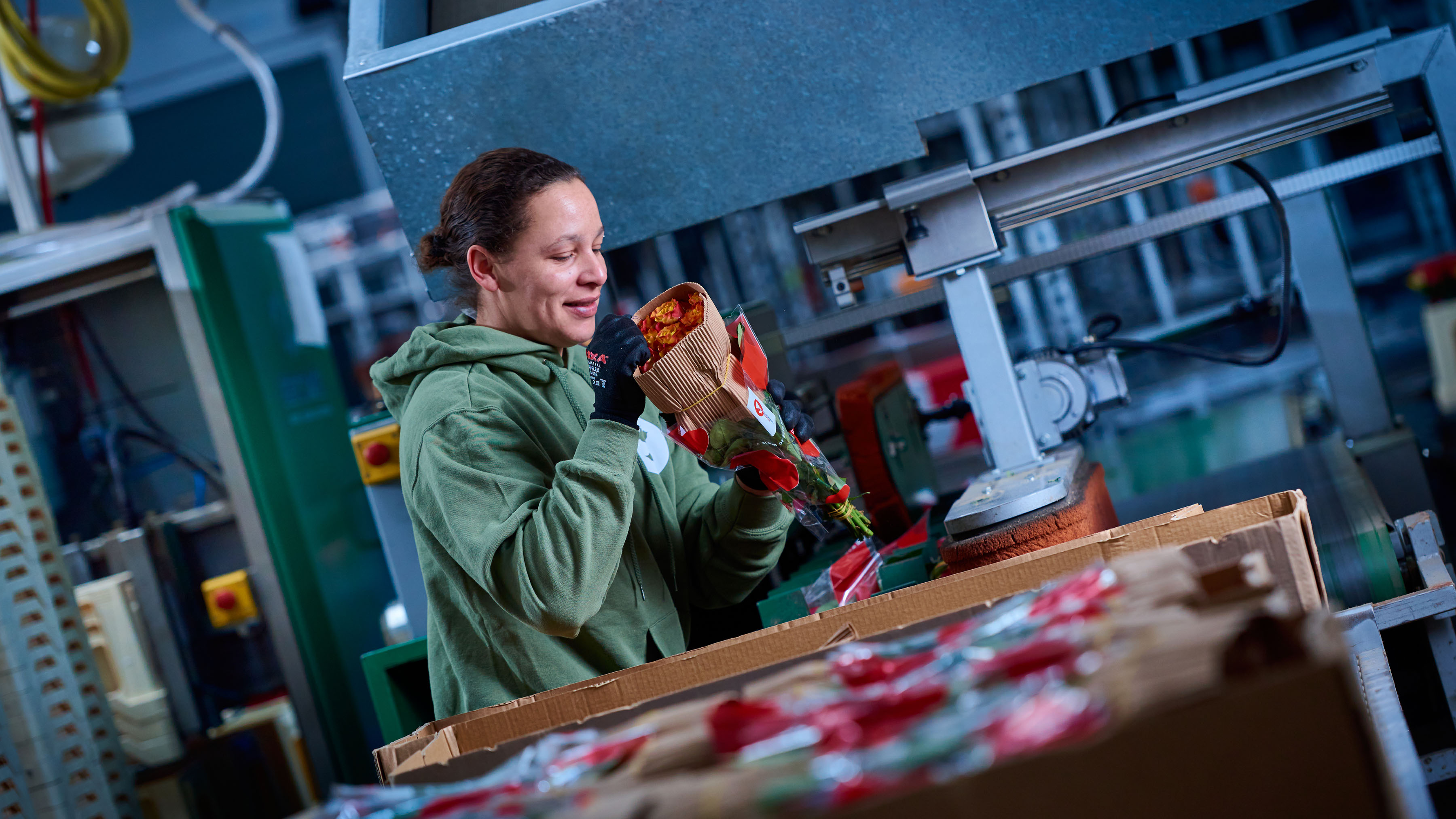
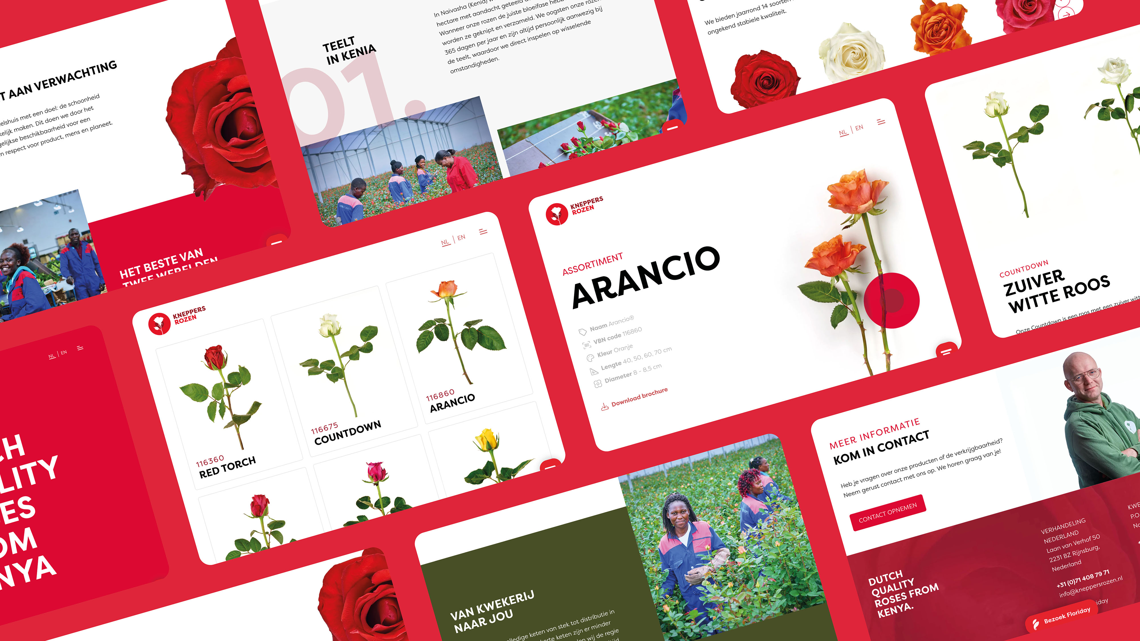
The floriculture trade is subject to major changes. It is becoming increasingly important to distinguish yourself and to stay in sight of your target group. Kneppers Rozen saw a chance to tell their story and to highlight the unique factors of their company in the Netherlands and Kenya.
- Brand Essential List:
Brand positioning, Brand identity , Website
- Approach:
Together with Kneppers Rozen we have examined their business. We pulled them out of the issues of the day to jointly build a brand foundation through our proven approach: 1. Merk positioning 2. Brand Identity 3. Website 4. Merk activation.
- Result:
A brand positioning has been developed that indicates that Kneppers Rozen always meet the expectations of buyers. They are reliable in quality and delivery, thanks to a perfectly furnished process from cultivation in Kenya to treatise in the Netherlands.
brand identity and Website
We have translated the positioning to the identity , website and a content plan brand. Kneppers Rozen now has a strong brand foundation to build from further.
- Logo:
- Quote:
"By leaving and turning in from the issues of the day, we are clear again where our distinctive character is."
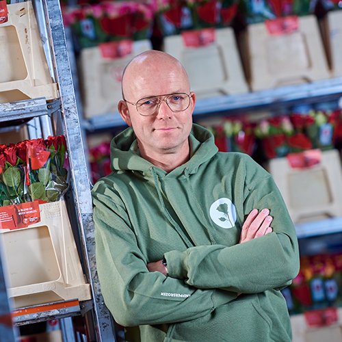
- Quote - Customer Name and Function:
Richard Kneppers - Director
- Quote image:
- About customer:
About Kneppers Rozen
- About customer information:
Kneppers Rozen is a rose grower and trading house in one. They offer certainty year -round by supplying roses of an unprecedented stable quality and availability. For example, buyers at Kneppers Rozen not be faced with surprises. Thanks to their short chain, which is fully in -house from Stek to Distribution, they offer a reliable product all year round.
As a nursery and trading house in sight of the target group
- Product Category:
Home, Brand Strategy , Brand identity , Website
- Slideshow:
- Type:
Image , Media Test:
- Type:
Image , Media Test:
- Type:
Video , Media Test:
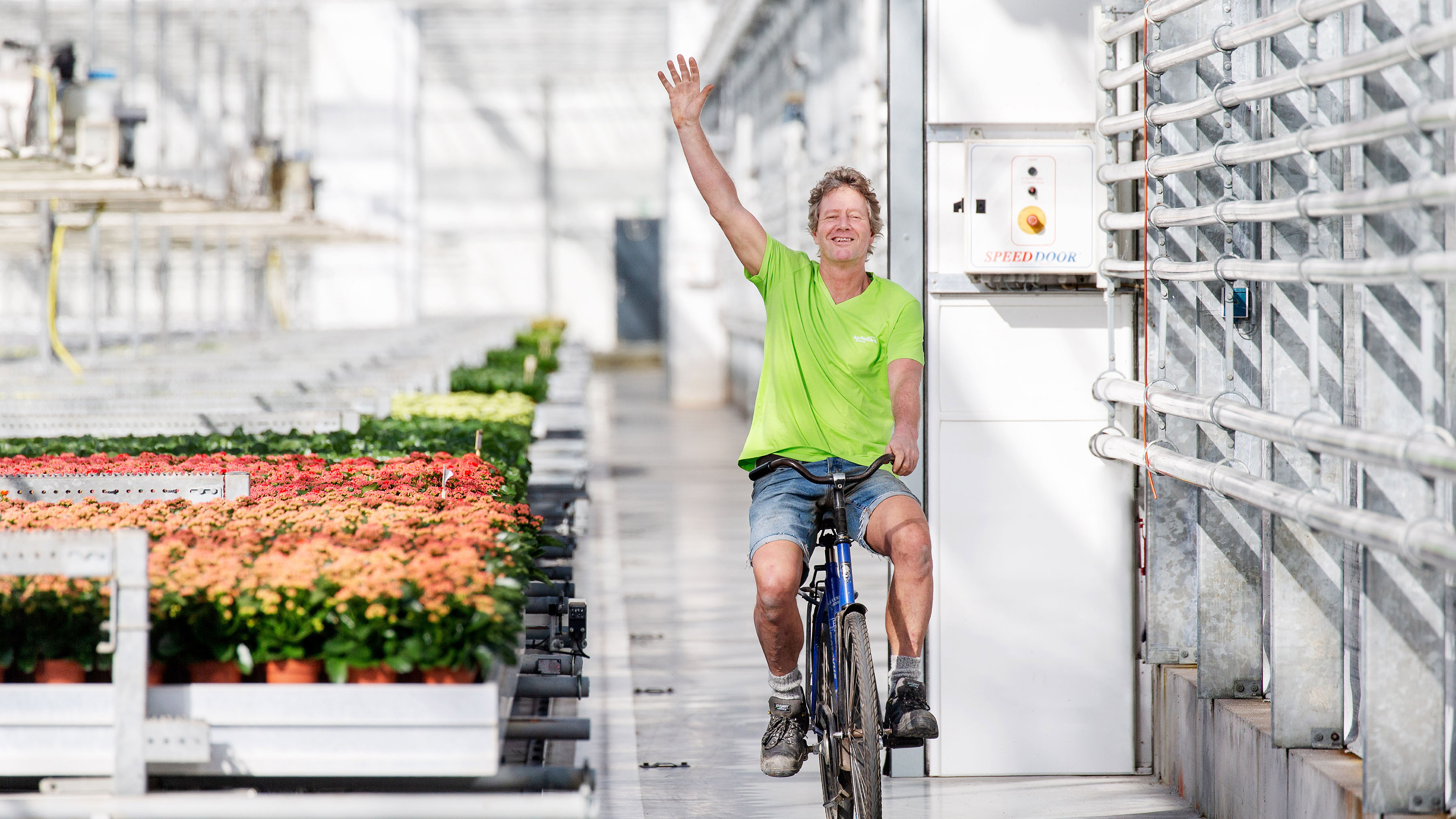
vandeez -Case- kp holland -2024-Video-mobile.mp4
- Type:
Image , Media Test:
- Type:
Image , Media Test:
- Type:
Video , Media Test:

- Type:
Image , Media Test:
- Type:
Image , Media Test:
- Type:
Image , Media Test:
- Type:
Image , Media Test:
- Type:
Image , Media Test:
- Type:
Image , Media Test:
- Type:
Image , Media Test:
- Type:
Image , Media Test:
- Type:
Image , Media Test:
- Type:
Image , Media Test:
- Cases Logo - Diap:

- Headline subtitle:
rebranding of breeders and producer of plants
- Sectors list:
agriculture and horticulture
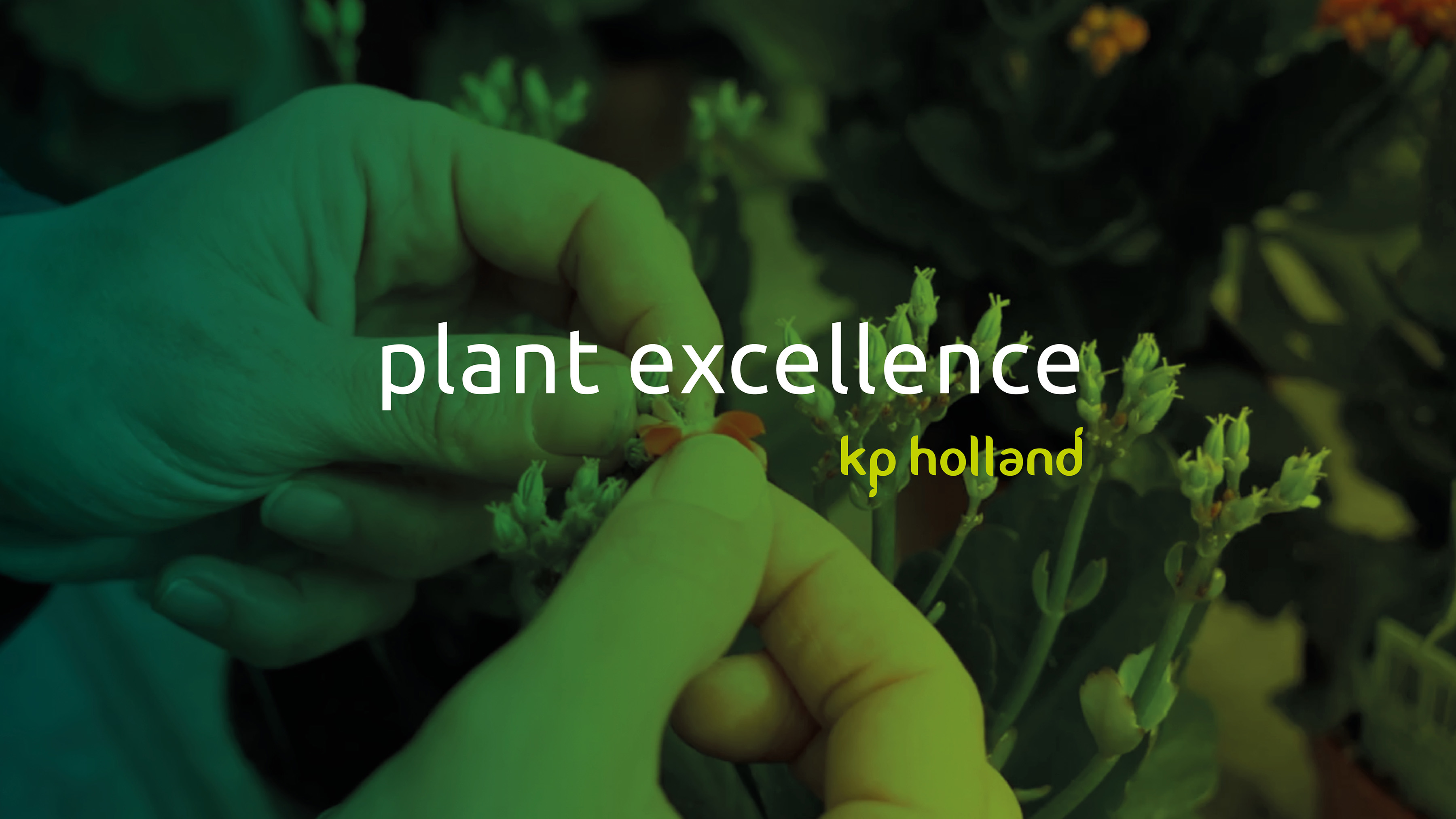
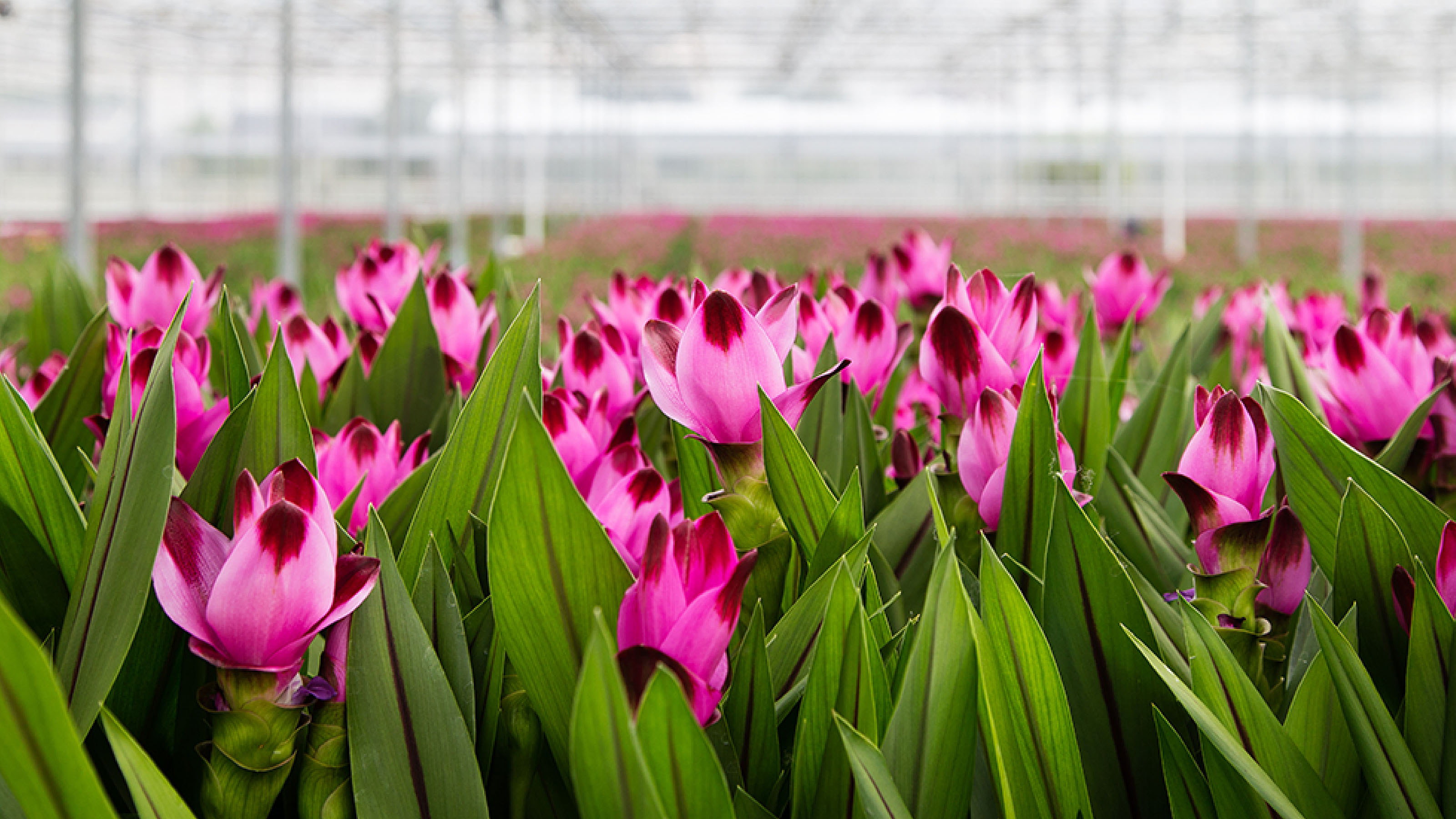
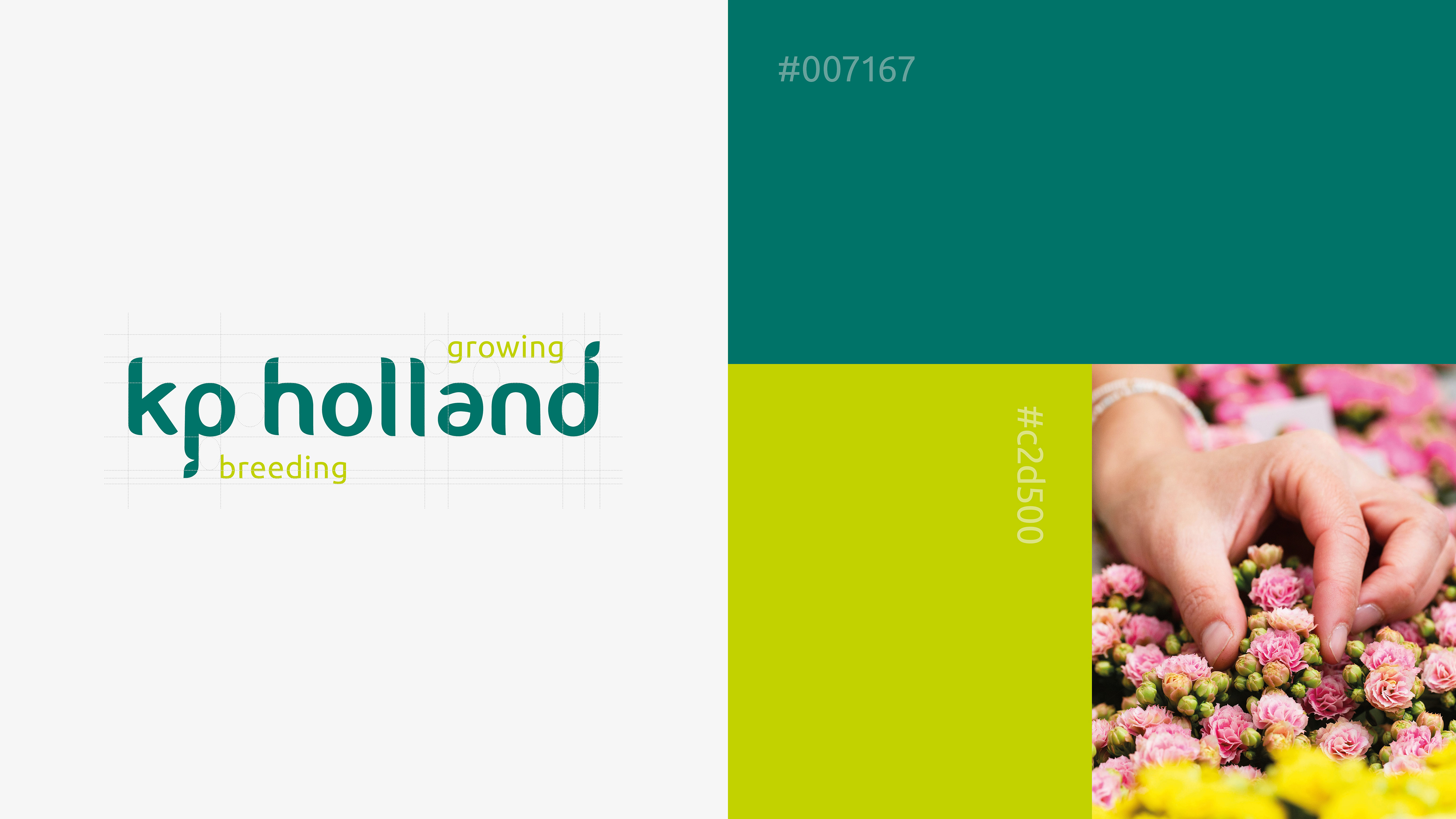
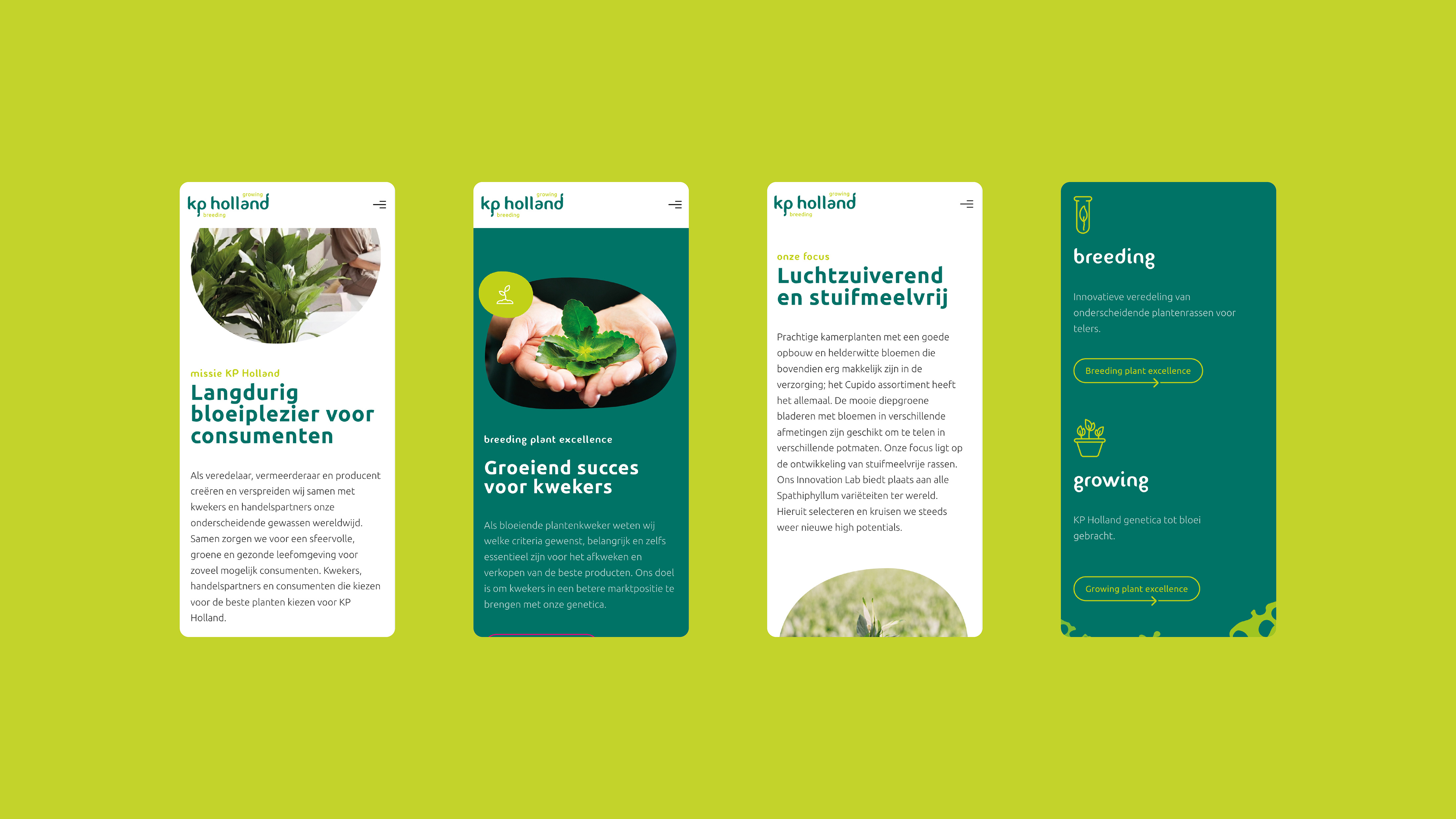
- Headline Introduction:
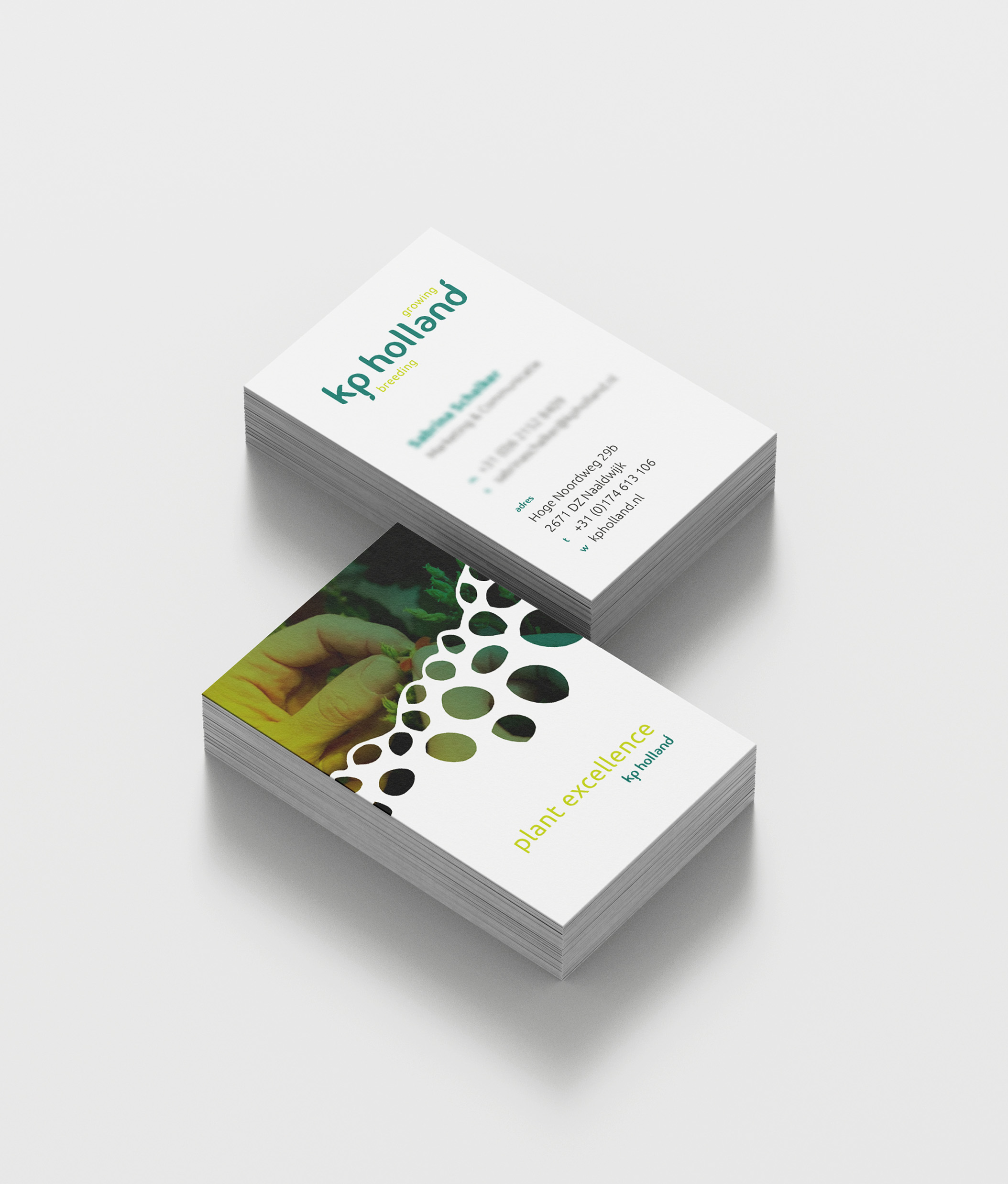
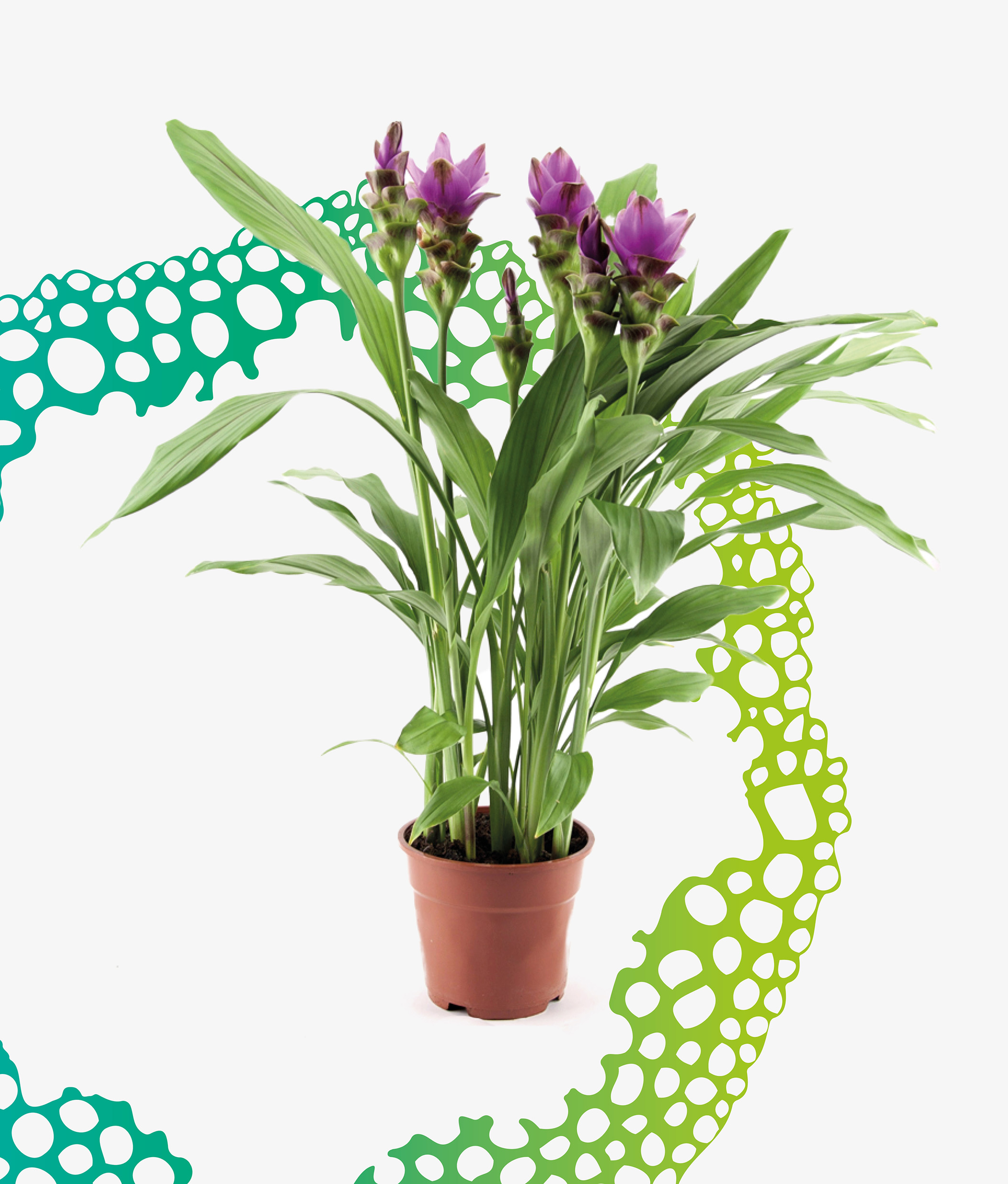
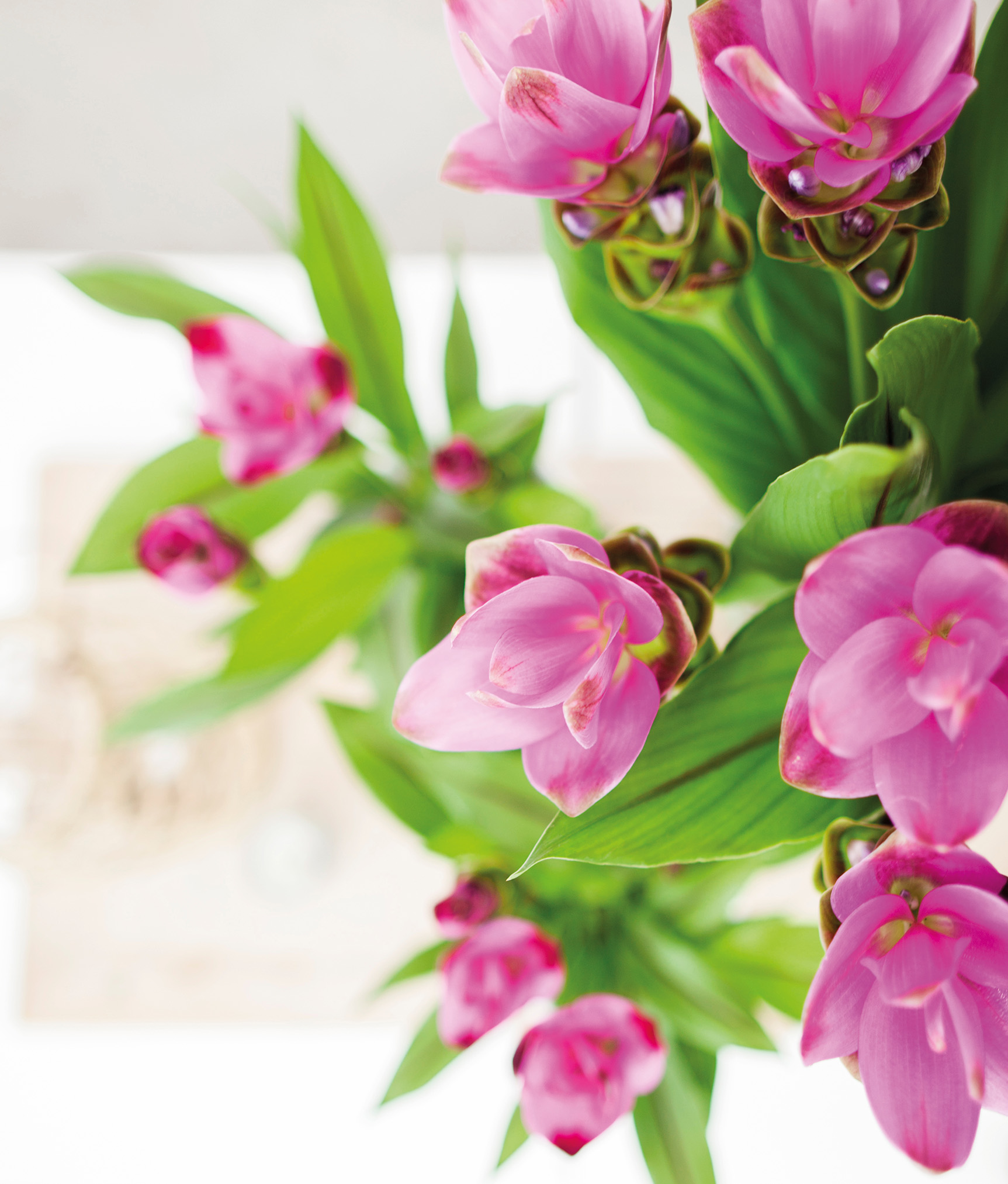
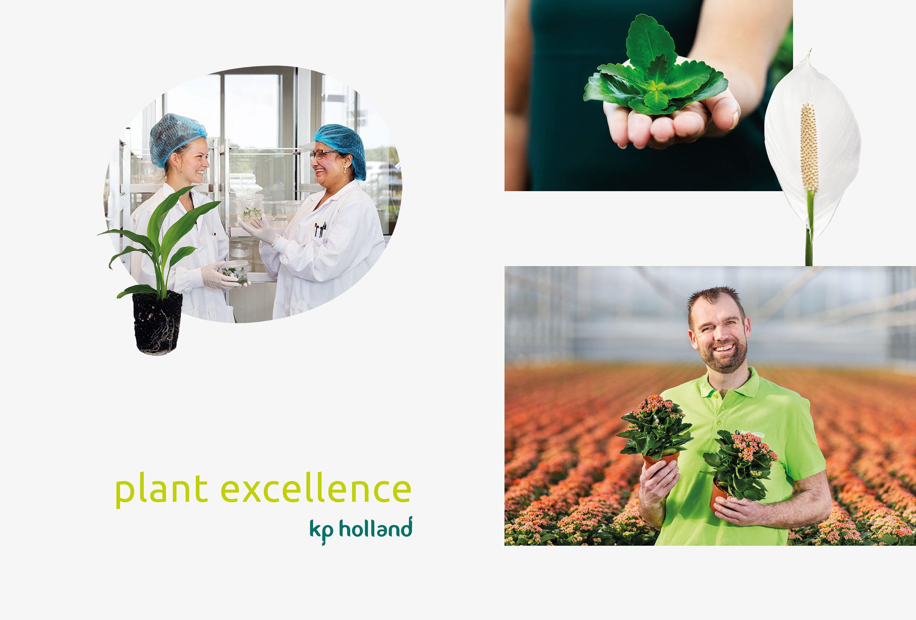
The breeding, propagation and production of the most beautiful plants is in the genes KP Holland Because with their expertise from both the breeding and breeding of the products Spathiphyllum, Kalanchoe and Curcuma, they take a unique position within the market. communicate this position and the power of KP Holland realized their brand foundation KP Holland
- Brand Essential List:
Brand positioning, Brand identity , Website
- Approach:
Together with KP Holland we have examined their business. We pulled them out of the issues of the day to jointly build a brand foundation through our proven approach: 1. Merk positioning, 2. Brand identity , 3. Website. Step by step we have put their brand more sharper towards the target group.
- Result:
KP Holland always goes for 'Plant Excellence'. That is the brand promise that has been recorded with the new brand positioning and KP Holland interviews internationally. Within the product groups Spathiphyllum, Kalanchoe, Curcuma and Bemini they always go for the highest attainable. KP Holland 's products only come on the market after they have proven themselves in stability, uniformity, shelf life and market potential. For example, growers and trading contact us Tners are assured that they have a leading range of plants.
Successful rebranding
The rebranding has not only strengthened brand positioning, but has also led to a restyling of the brand identity and a new website. With this, KP Holland has an even stronger brand foundation, with which they go for market leadership within their crops. With the rebranding, KP Holland now has an even stronger brand foundation with which they can determine their objectives. We look forward to the further growth and flowering of KP Holland.
- Logo:
- Quote:
"With the Rebranding of KP Holland we have a solid foundation to go for market leadership within our crops."
- Quote - Customer Name and Function:
Pim van der Knaap - Commercial Director
- Quote image:

- About customer:
About KP Holland
- About customer information:
KP Holland is a globally operating player in the field of breeding, propagating and producing distinctive plant varieties within Spathiphyllum, Curcuma and Kalanchoe. They are also the grower of the Bemini brand, a green mini -plants mix. All KP Holland have been developed with the latest techniques, intensively tested and they know exactly how the plant behaves in practice. KP Holland always goes for the highest attainable.
Rebranding of breeders and producer of plants
- Product Category:
Home, Brand Strategy , Brand identity , Website
- Slideshow:
- Type:
Video , Media Test:
vandeez -CASE LEER FACES SYSTEMEN Video-element.mp4 , Alt-Tag:
Meer Gevelsystemen Video
- Type:
Image , Media Test :
 , Alt-Tag:
Meer Gevelsystemen visual identity
, Alt-Tag:
Meer Gevelsystemen visual identity - Type:
Video , Media Test:
vandeez -CASE LEER FACES SHIPS-Video website.mp4 , Alt-Tag:
Meer Gevelsystemen Website
- Type:
Image , Media Test :
 , Alt-Tag:
Meer Gevelsystemen Photography
, Alt-Tag:
Meer Gevelsystemen Photography - Type:
Image , Media Test :
 , Alt-Tag:
Meer Gevelsystemen Website
, Alt-Tag:
Meer Gevelsystemen Website - Type:
Image , Media Test :
 , Alt-Tag:
Meer Gevelsystemen Logo
, Alt-Tag:
Meer Gevelsystemen Logo - Type:
Image , Media Test :
 , Alt-Tag:
Meer Gevelsystemen Colors
, Alt-Tag:
Meer Gevelsystemen Colors - Type:
Image , Media Test :
 , Alt-Tag:
Meer Gevelsystemen Website
, Alt-Tag:
Meer Gevelsystemen Website - Type:
Video , Media Test :
 , Alt-Tag:
Meer Gevelsystemen Website
, Alt-Tag:
Meer Gevelsystemen Website - Type:
Image , Media Test :
 , Alt-Tag:
Meer Gevelsystemen visual identity
, Alt-Tag:
Meer Gevelsystemen visual identity - Type:
Image , Media Test :
 , Alt-Tag:
Meer Gevelsystemen visual identity
, Alt-Tag:
Meer Gevelsystemen visual identity - Type:
Image , Media Test :
 , Alt-Tag:
Meer Gevelsystemen Photography
, Alt-Tag:
Meer Gevelsystemen Photography - Type:
Image , Media Test :
 , Alt-Tag:
Meer Gevelsystemen Photography
, Alt-Tag:
Meer Gevelsystemen Photography - Type:
Image , Media Test :
 , Alt-Tag:
Meer Gevelsystemen Photography
, Alt-Tag:
Meer Gevelsystemen Photography - Type:
Image , Media Test :
 , Alt-Tag:
Meer Gevelsystemen Website
, Alt-Tag:
Meer Gevelsystemen Website - Type:
Image , Media Test :
 , Alt-Tag:
Meer Gevelsystemen visual identity
, Alt-Tag:
Meer Gevelsystemen visual identity
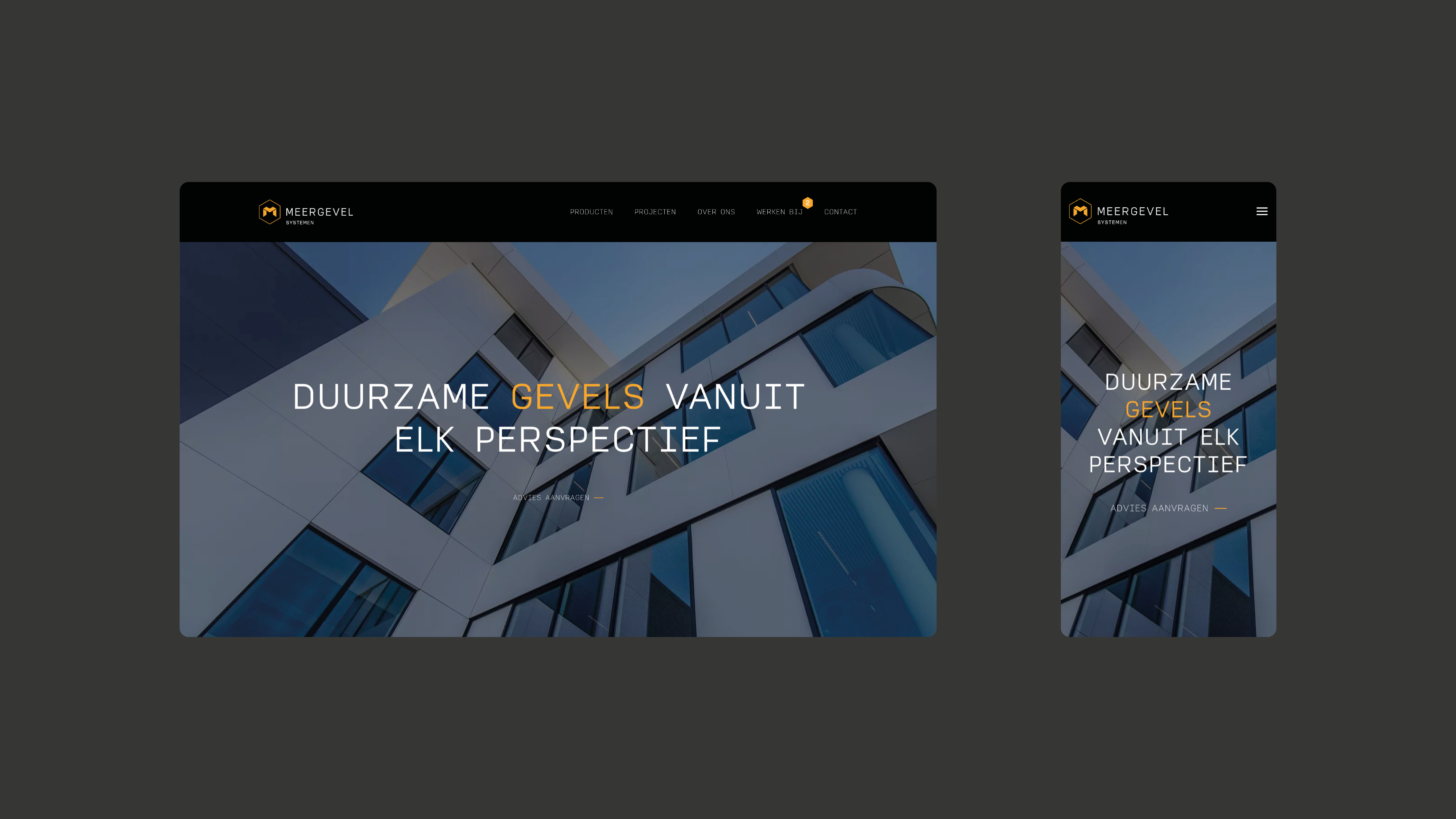
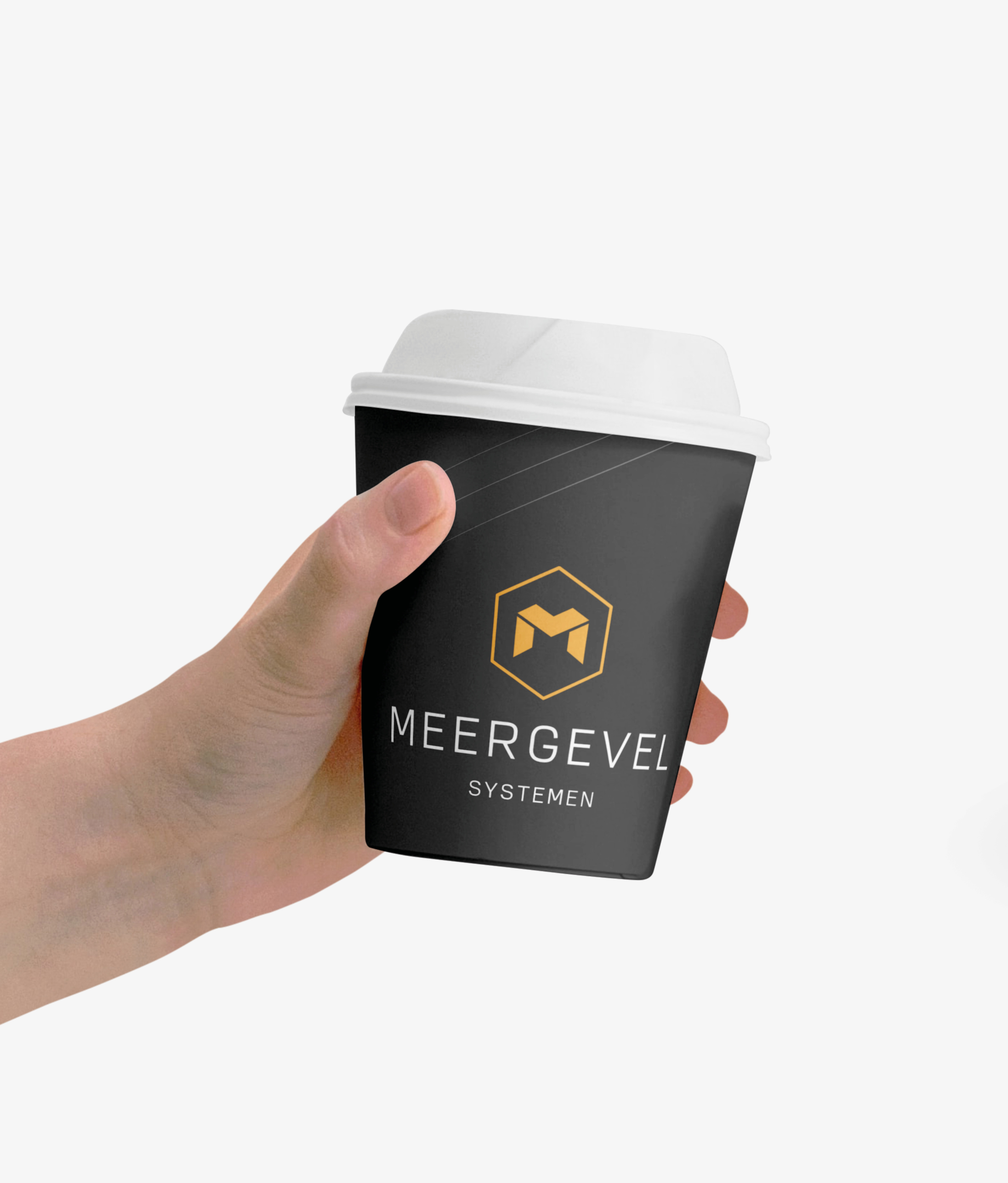
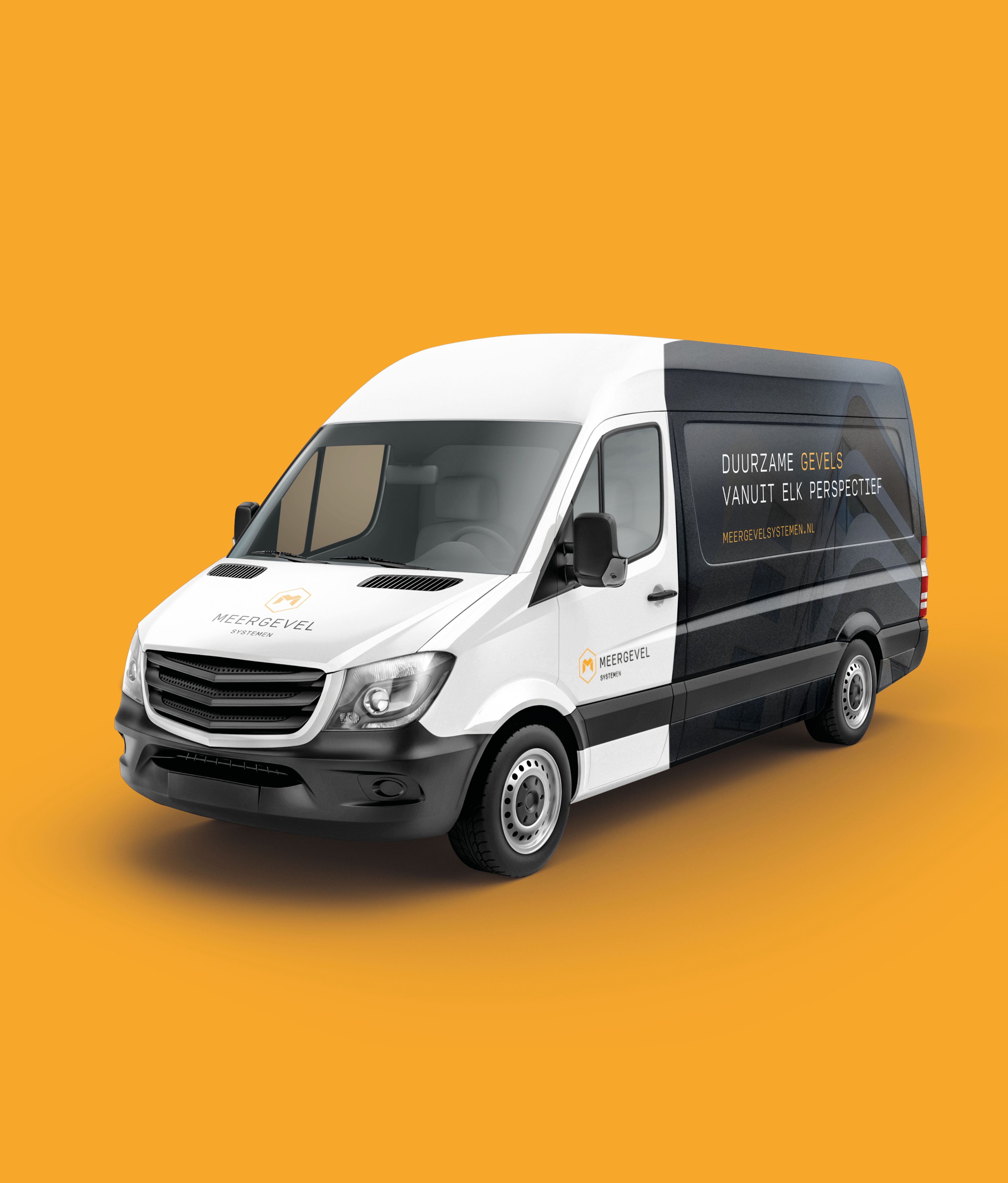
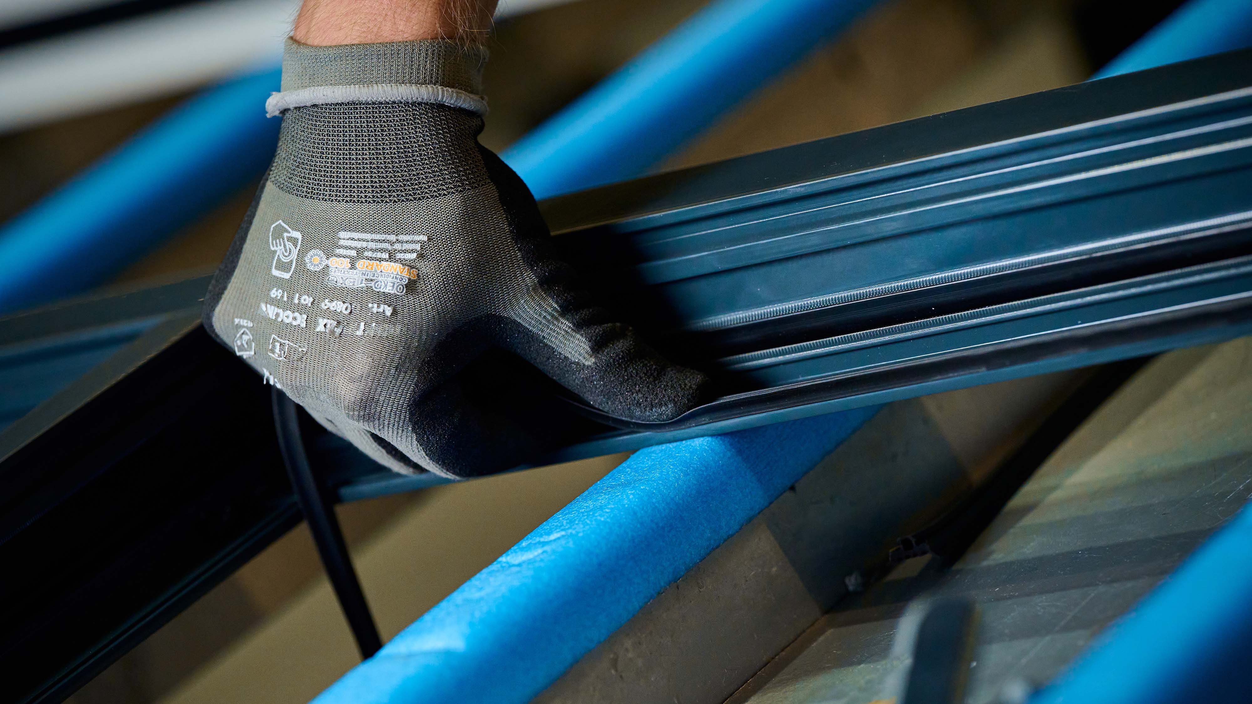
- Cases Logo - Diap:

- Headline Subtitle:
Complete rebranding for facial experts
- Sectors list:
manufacturing industry, construction
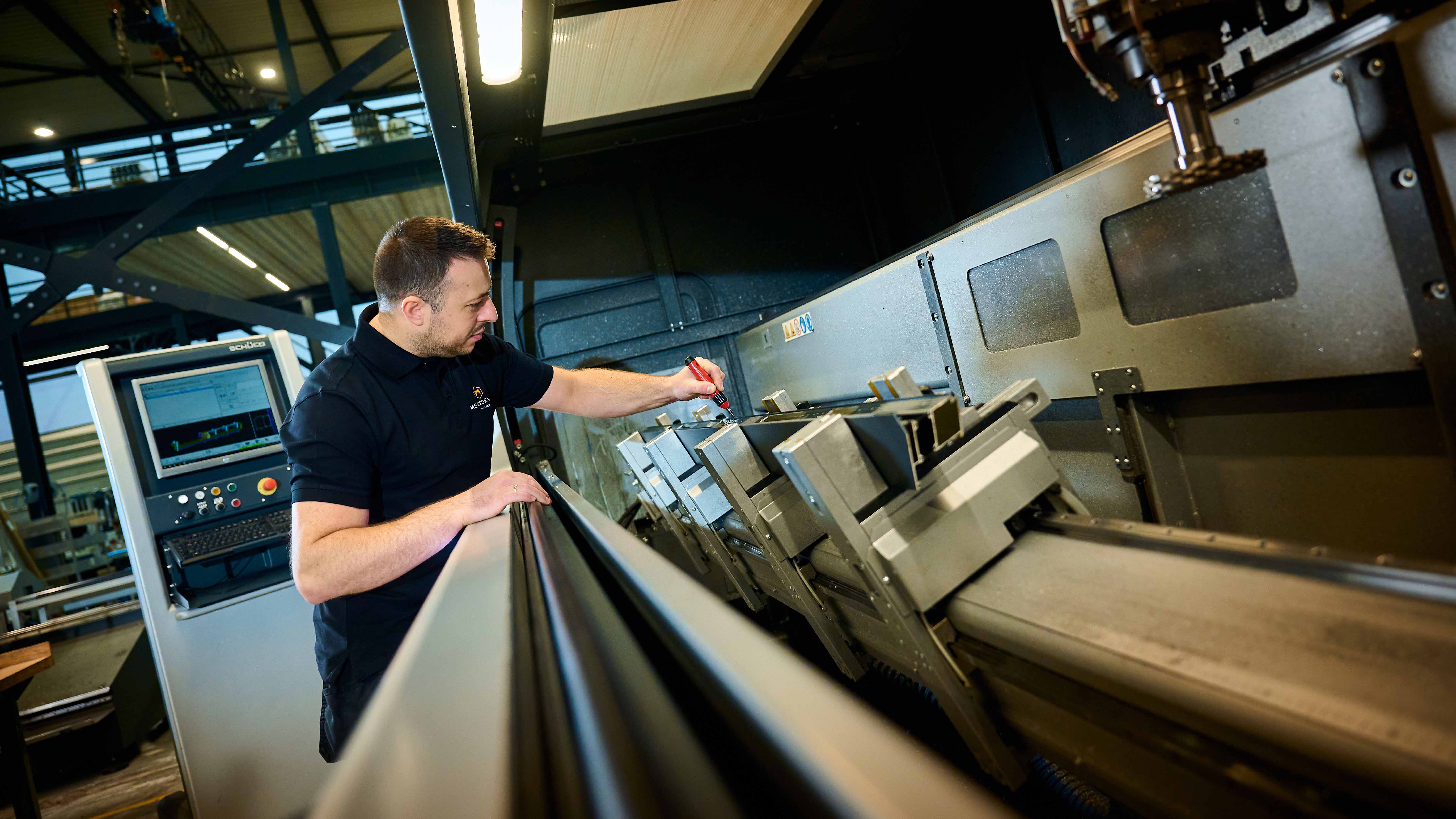
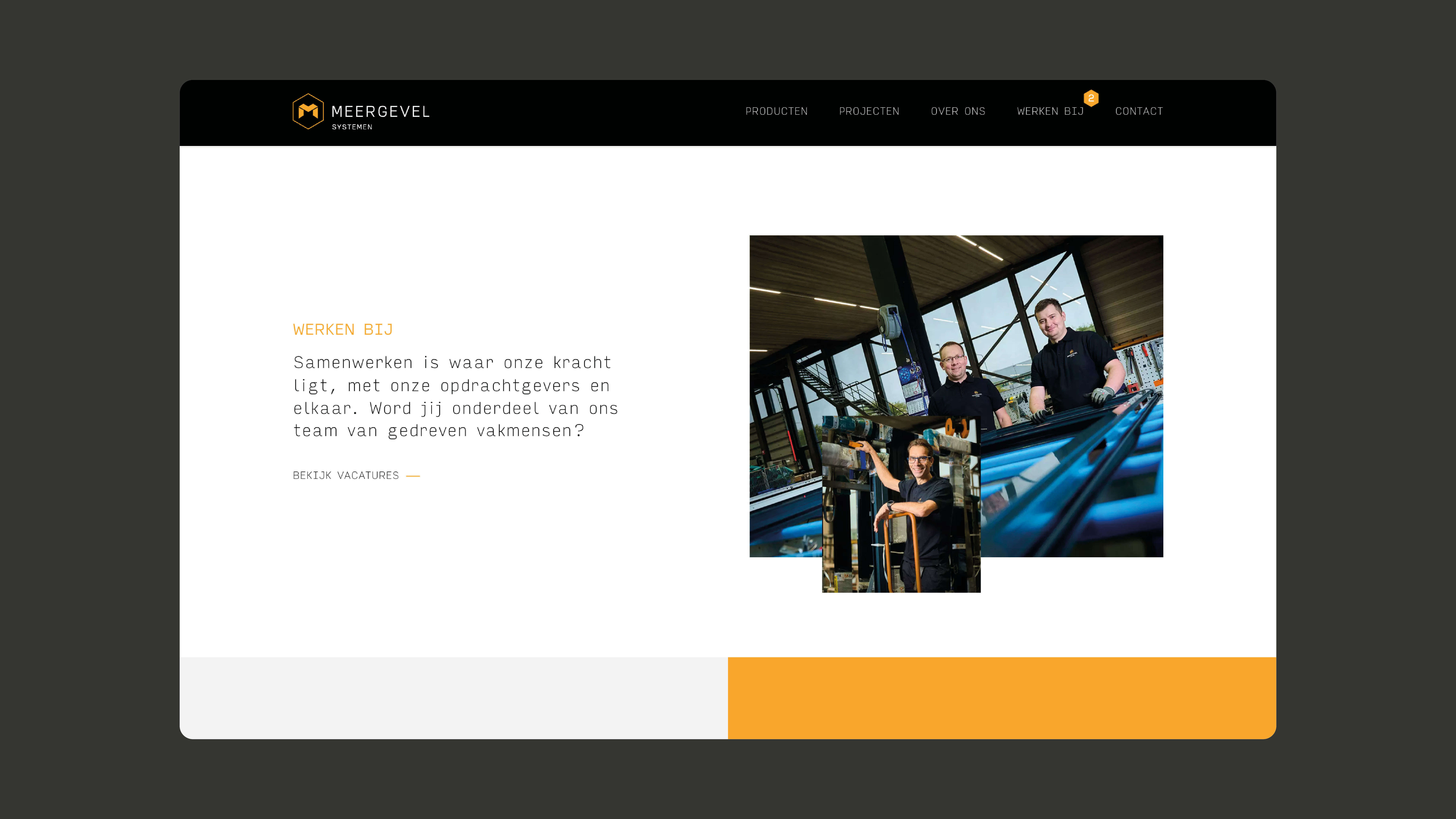
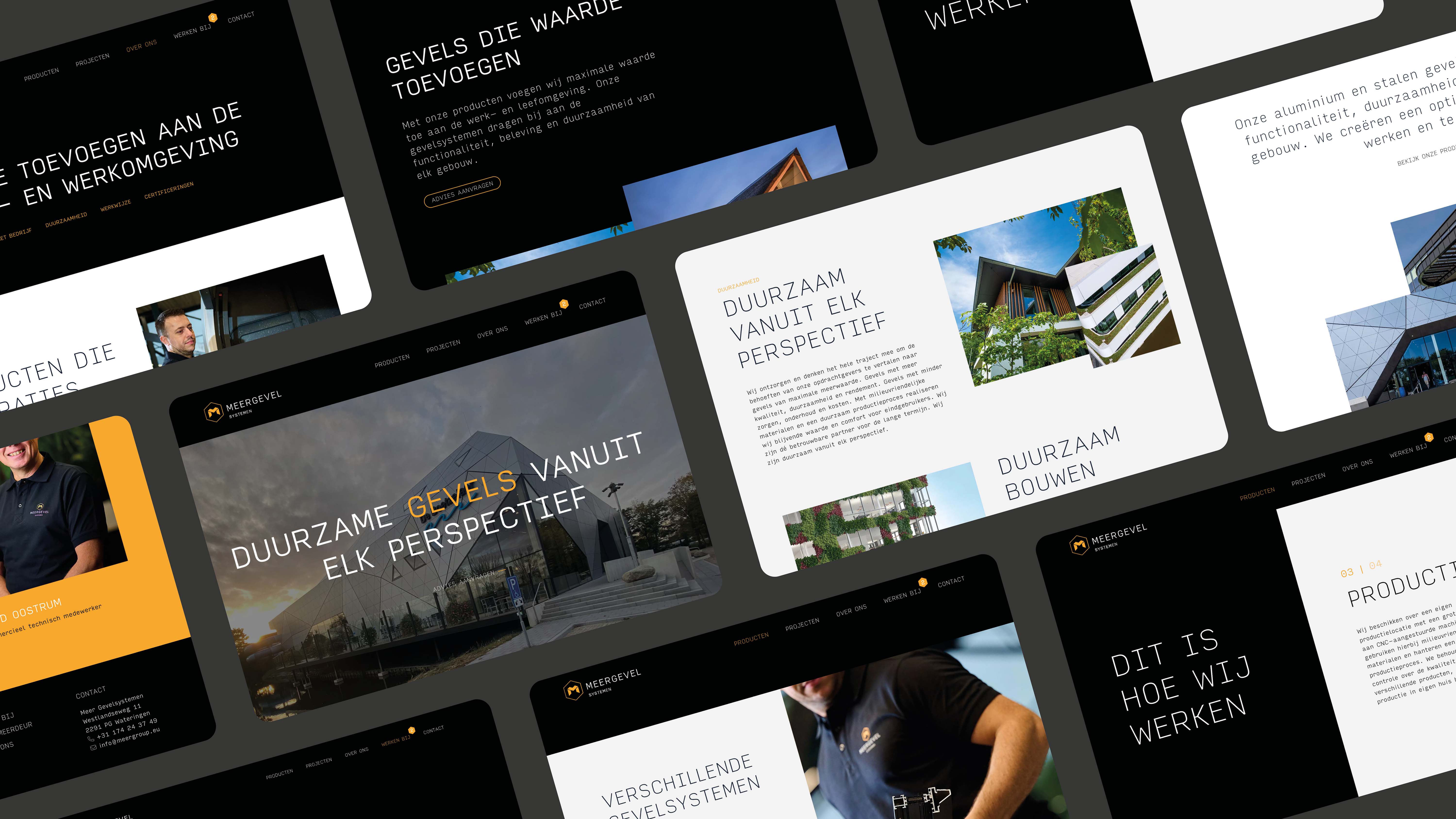
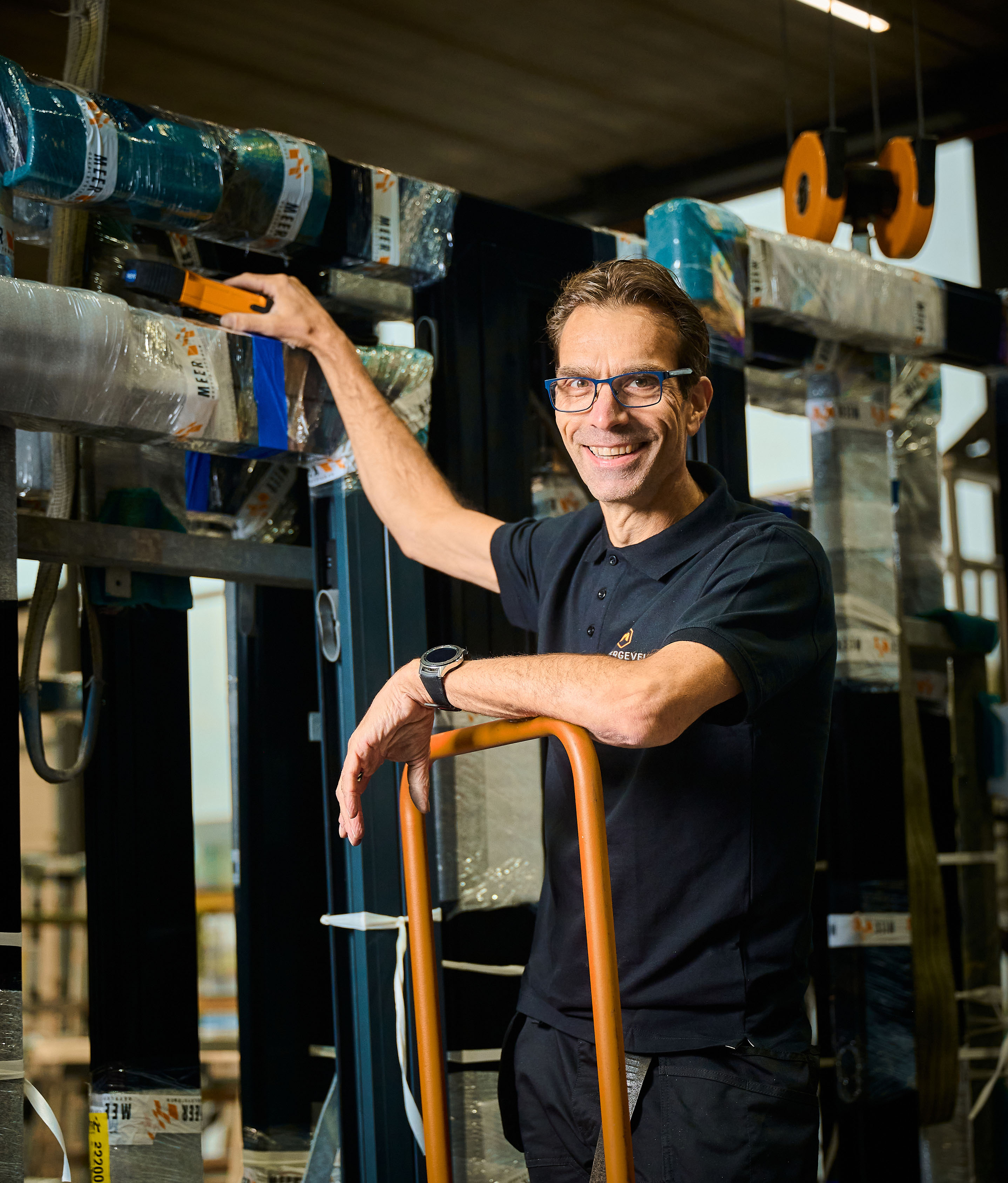
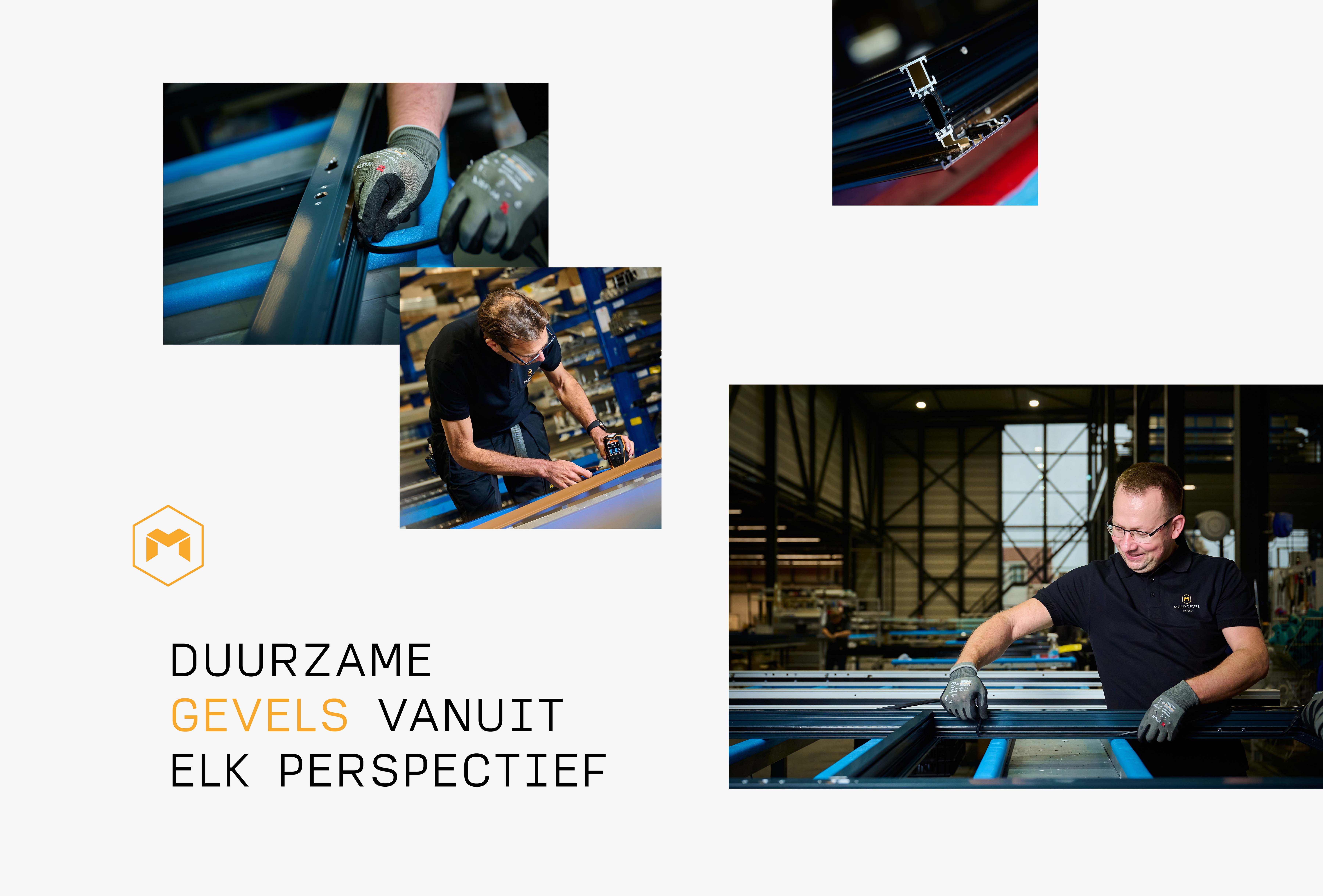
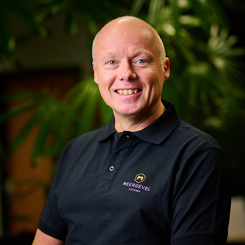
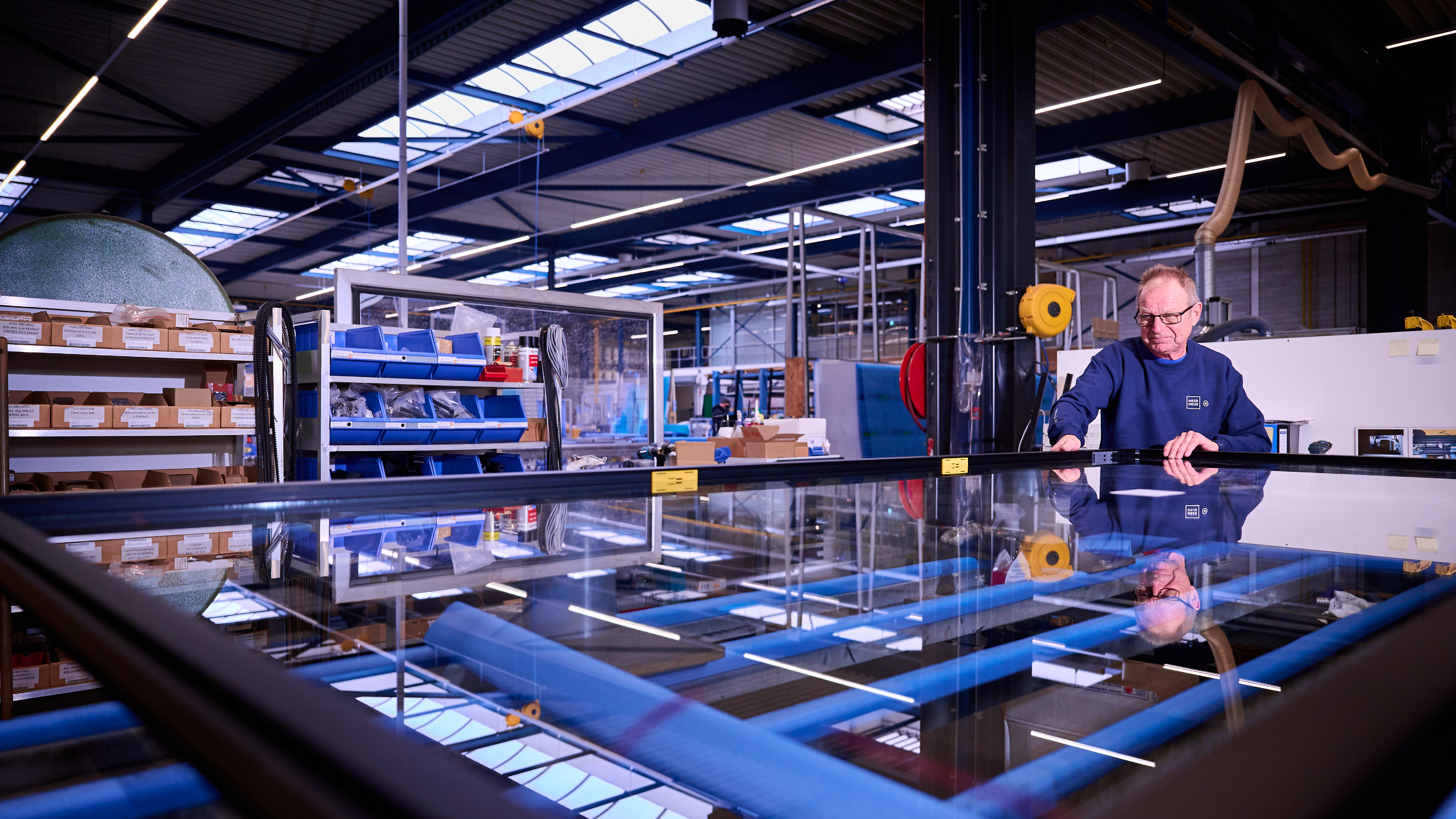
- Headline Introduction:
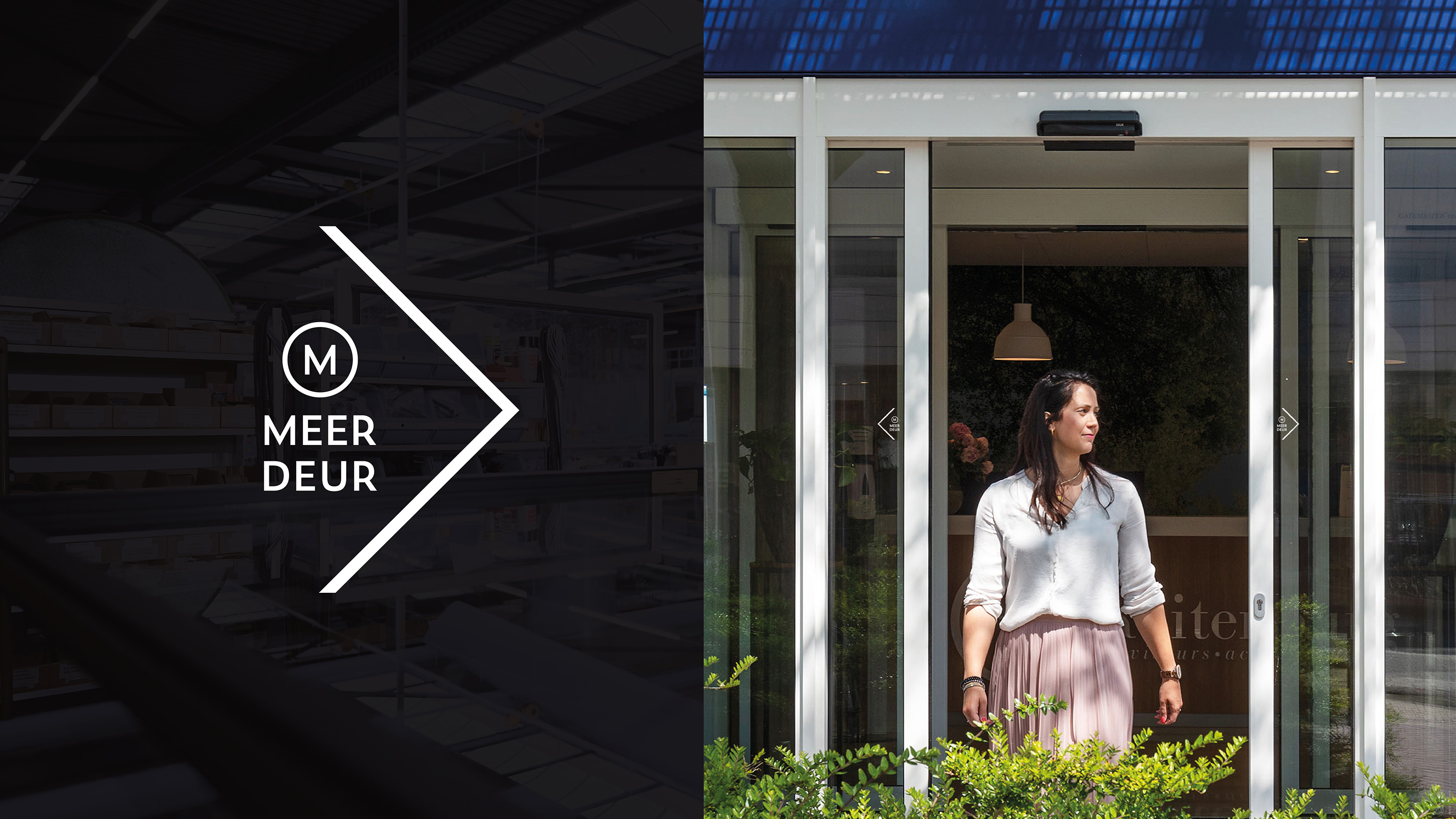
In recent years, Meer Gevelsystemen grown. New clients, projects, products. But their story and presentation were no longer in line with who they are: a leader in realizing window, door and facade systems of the highest quality. The successful rebranding of their sister company MeerDeur earlier this year, gave Meer Gevelsystemen realize a stronger brand together with Vandeez
- Brand Essential List:
Brand positioning, Brand identity , Website
- Approach:
In collaboration with Meer Gevelsystemen we have built up a solid brand foundation. We started with a positioning process, where the distinctive story of Meer Gevelsystemen came up from desk research and strategic sessions.
the facing experts
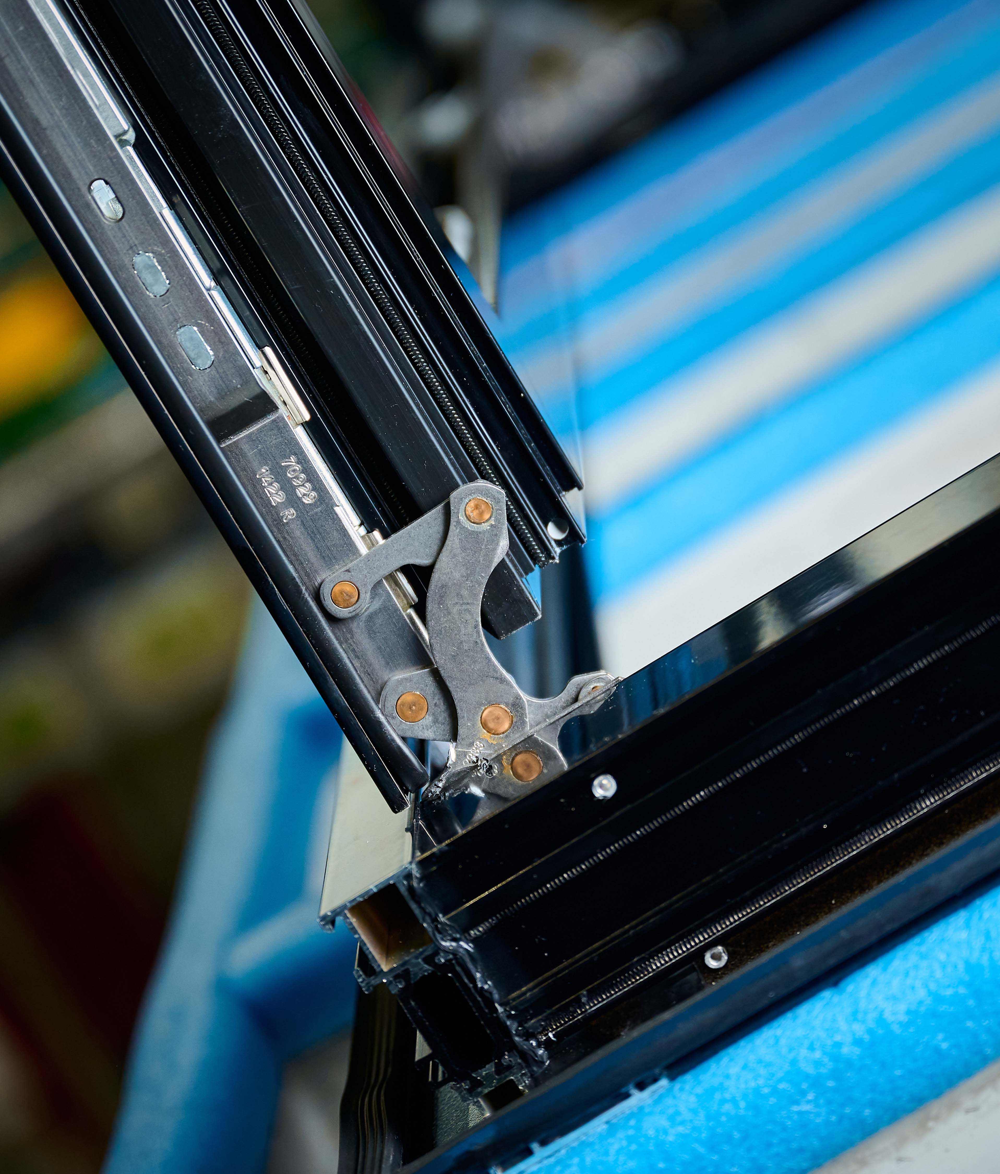
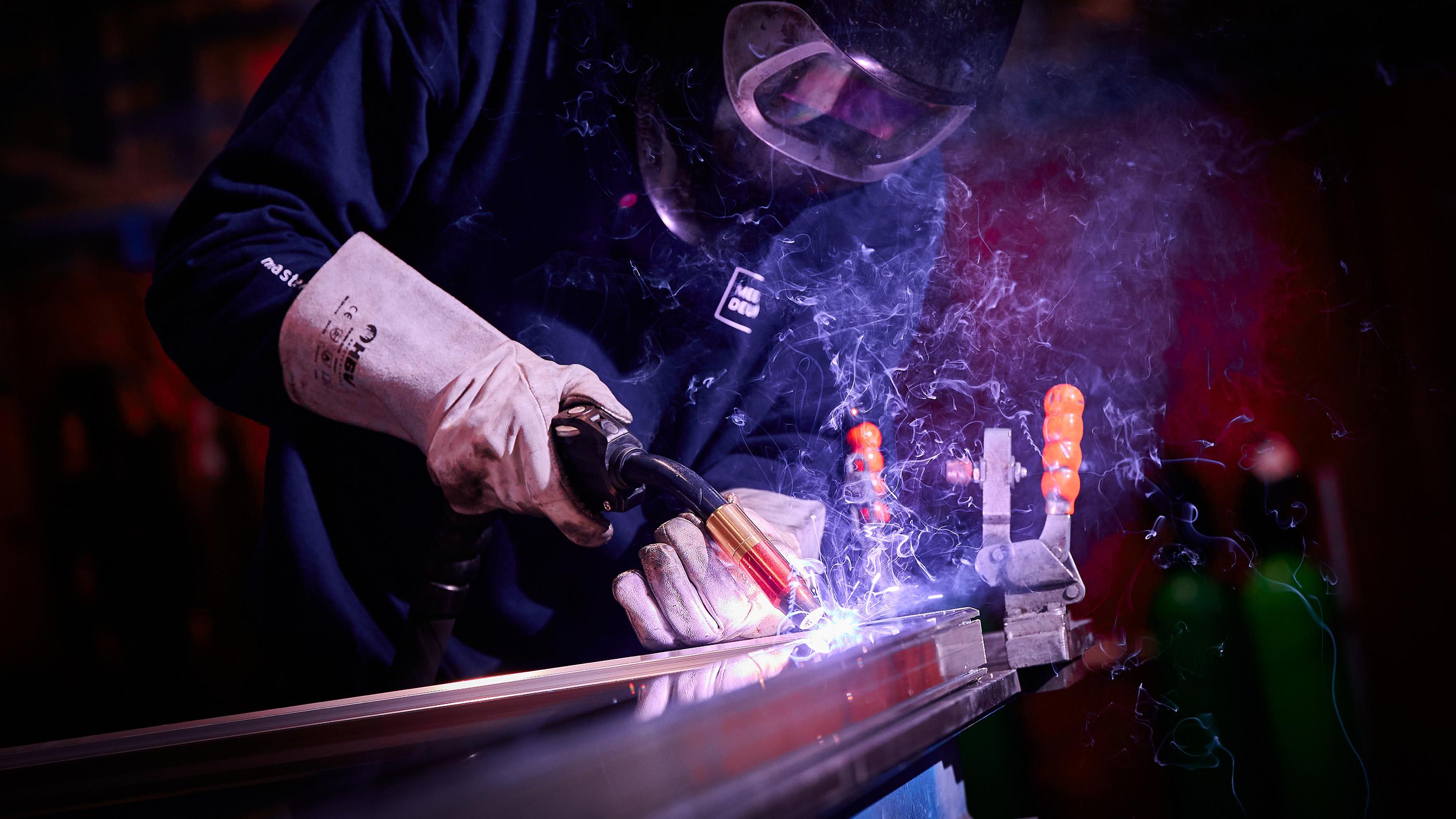
Meer Gevelsystemen has the ability to translate the needs of their clients into products that are not only aesthetically attractive, but also sustainable, functional and of top quality. Meer Gevelsystemen adds value to the living and working environment and is sustainable from any perspective. They are the facing experts.
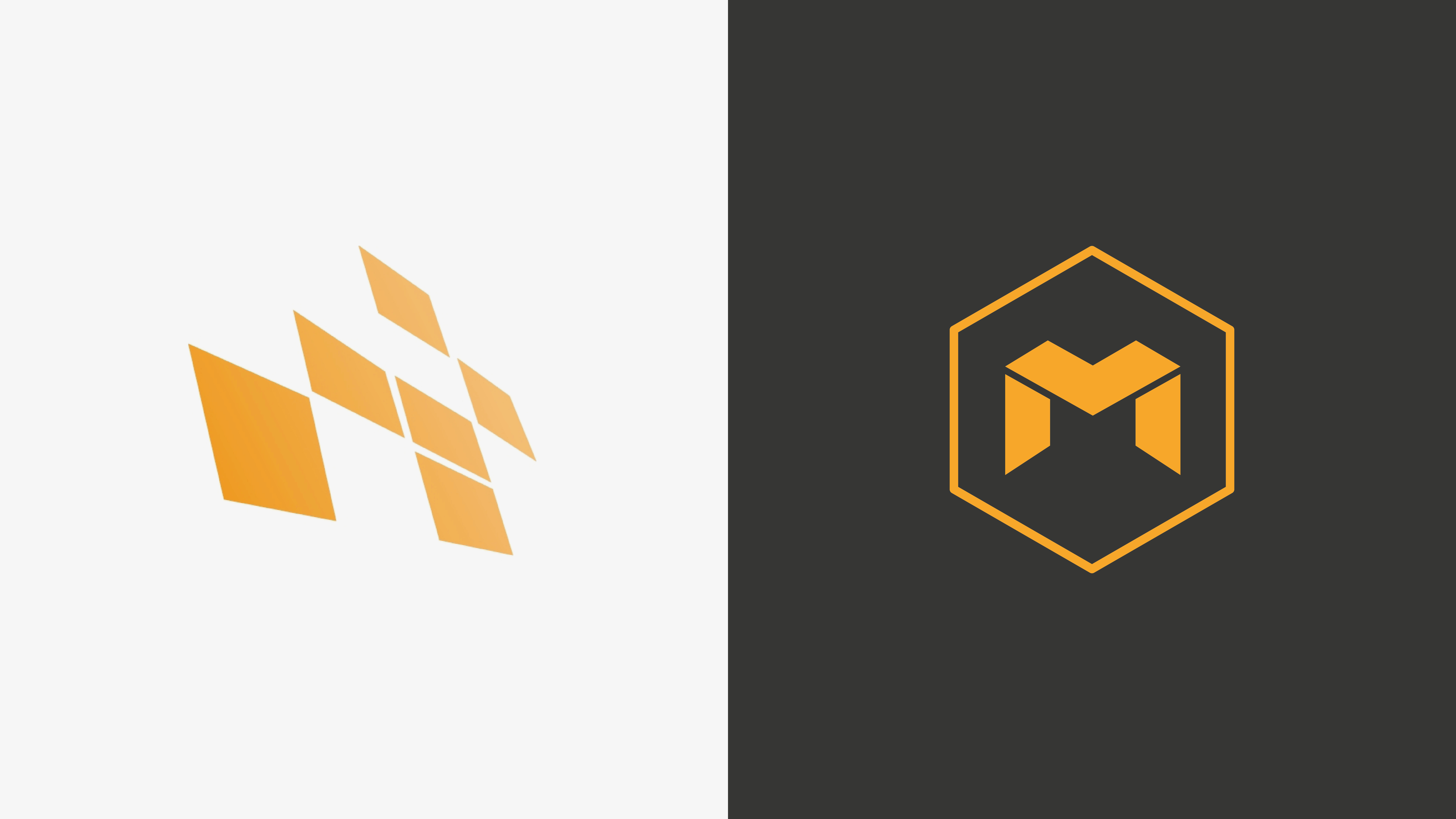
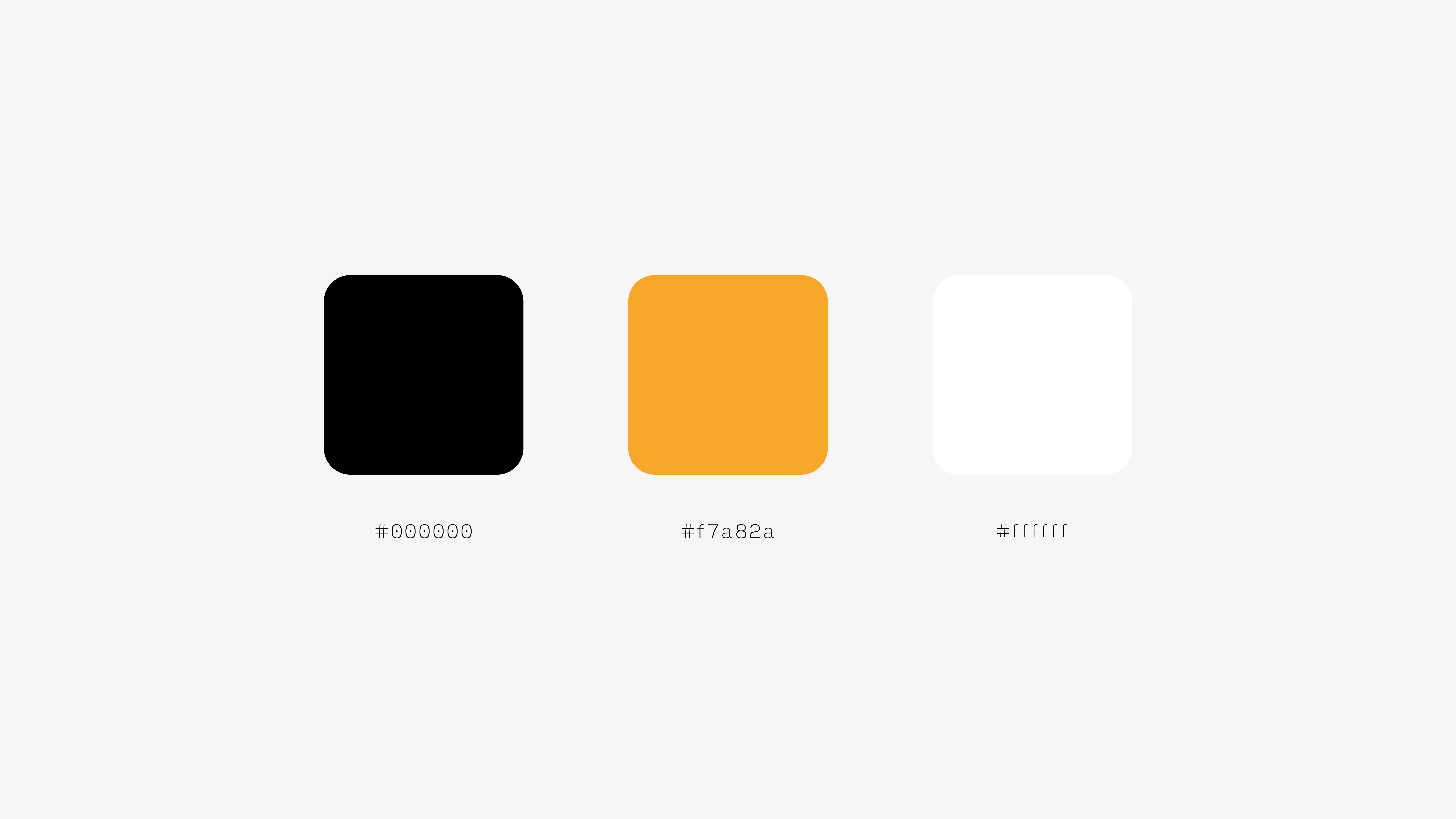
Optimal recognisability
The brand identity has also been revised, with the orange color retaining for optimum recognisability. The rebranding has yielded a contemporary and striking identity . The new logo, with the letter 'M' in the logo, and the line game on the visual identity carriers, refer to the profiles in the facades of Meer Gevelsystemen. The letter 'M' in the hexagoon is also a subtle reference to sister company MeerDeur, where the letter 'm' returns to the logo in a circle.
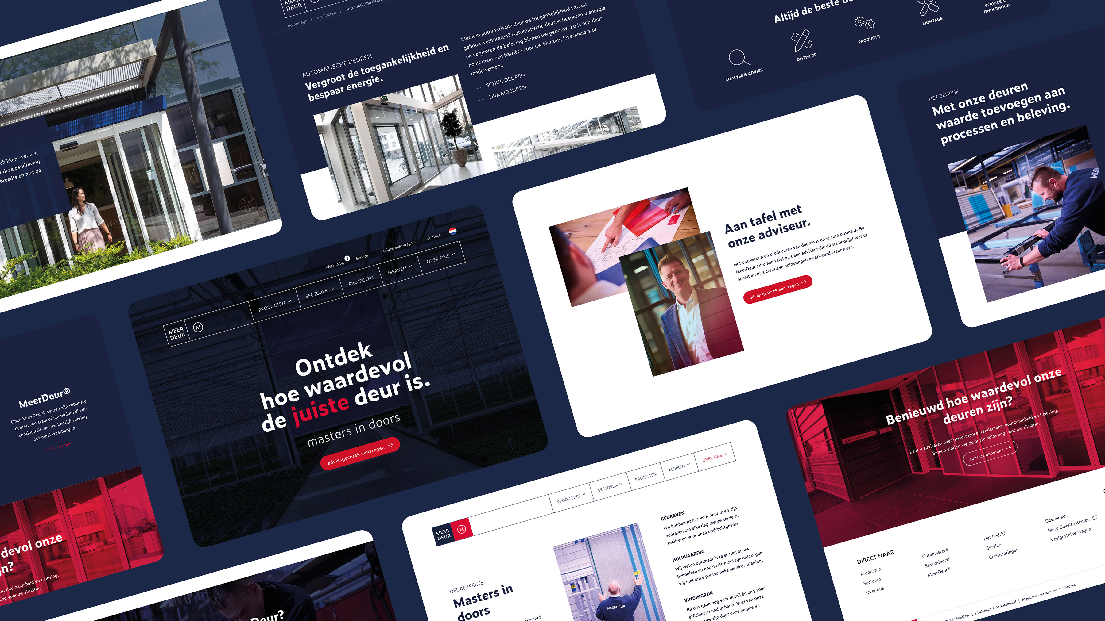
New website
The brand foundation was completed with the development of a new website. The website acts as a stage to present their story, method, products and completed projects. The website perfectly tells what they stand for and what they have to offer.
- Result:
Meer Gevelsystemen has a strong brand foundation that fits their DNA and ambition. A foundation with which they will convince potential customers and where they can continue to build. They are ready to make an impact. We are proud of the collaboration with Meer Gevelsystemen and the rebranding.
- Logo:
- Quote:
"With this rebranding we can present our offer and distinctive power more effectively and more convincingly."
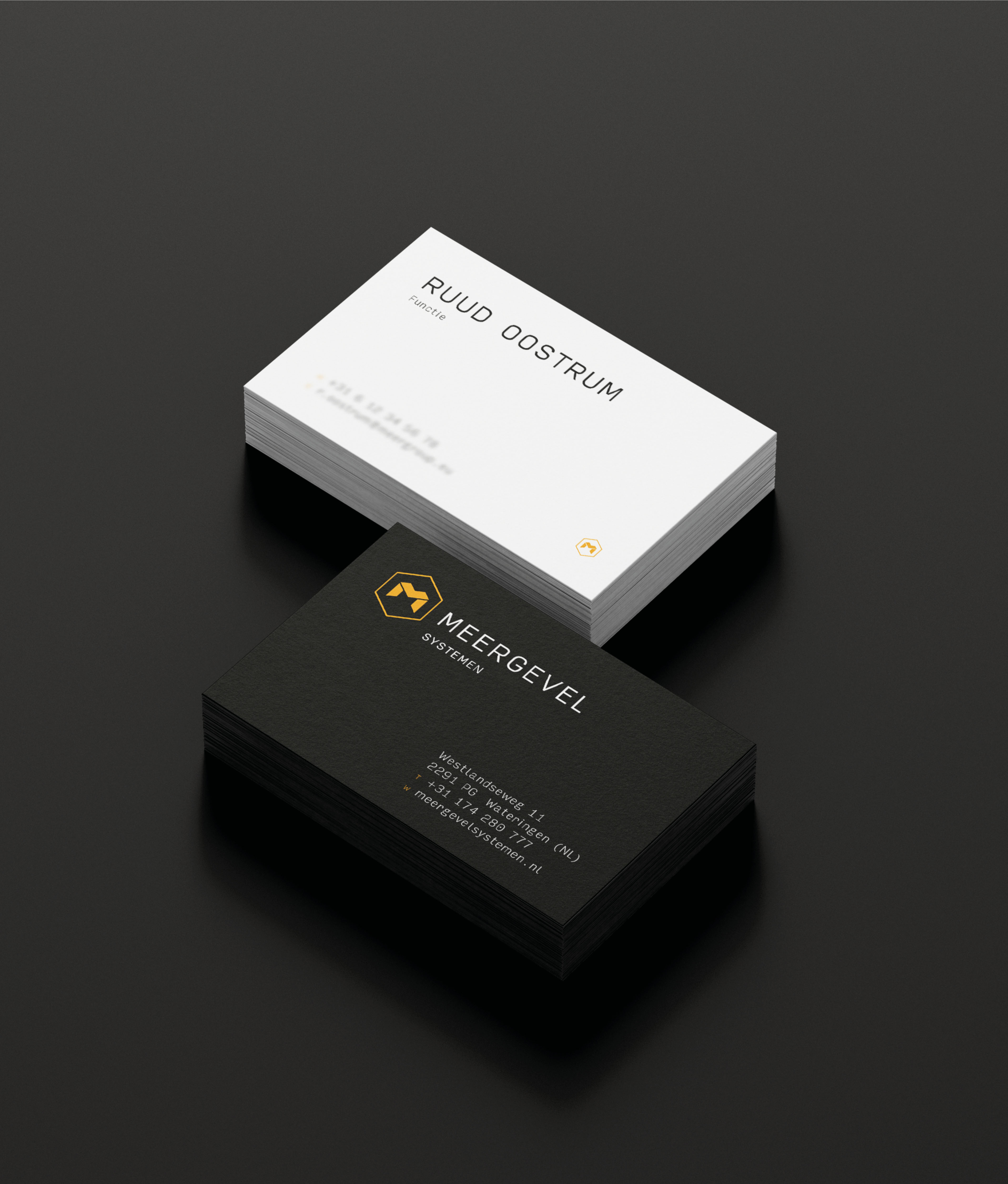
- Quote - Customer Name and Function:
Ruud Oostrum - Commercial Technical Employee
- Quote image:
- About customer:
About Meer Gevelsystemen
- About customer information:
Meer Gevelsystemen is an expert in designing, producing and assembling aluminum and steel window, door and facade systems. Whether clients are looking for a complete facade or customized parts, Meer Gevelsystemen offers high -quality, sustainable and reliable long -term solutions.
Complete rebranding for conceptions
- Product Category:
Brand Strategy , Brand identity , Website
- Slideshow:
- Type:
Image , Media Test :
 , Alt-Tag:
MeerDeur photography
, Alt-Tag:
MeerDeur photography - Type:
Image , Media Test :
 , Alt-Tag:
MeerDeur Visual Identity
, Alt-Tag:
MeerDeur Visual Identity - Type:
Video , Media Test:
vandeez -Case- meerdeur -2024 video website.mp4 , alt-tag:
MeerDeur website
- Type:
Image , Media Test :
 , Alt-Tag:
MeerDeur photography
, Alt-Tag:
MeerDeur photography - Type:
Image , Media Test :
 , Alt-Tag:
MeerDeur Visual Identity
, Alt-Tag:
MeerDeur Visual Identity - Type:
Video , Media Test:
vandeez -Case- meerdeur -Slider-slider door-animation.mp4 , alt-tag:
MeerDeur Visual Identity
- Type:
Image , Media Test :
 , Alt-Tag:
MeerDeur Visual Identity
, Alt-Tag:
MeerDeur Visual Identity - Type:
Image , Media Test :
 , Alt-Tag:
MeerDeur website
, Alt-Tag:
MeerDeur website - Type:
Image , Media Test :
 , Alt-Tag:
MeerDeur website
, Alt-Tag:
MeerDeur website - Type:
Image , Media Test :
 , Alt-Tag:
MeerDeur Visual Identity
, Alt-Tag:
MeerDeur Visual Identity - Type:
Image , Media Test :
 , Alt-Tag:
MeerDeur Visual Identity
, Alt-Tag:
MeerDeur Visual Identity - Type:
Image , Media Test :
 , Alt-Tag:
MeerDeur photography
, Alt-Tag:
MeerDeur photography - Type:
Image , Media Test :
 , Alt-Tag:
MeerDeur photography
, Alt-Tag:
MeerDeur photography - Type:
Image , Media Test :
 , Alt-Tag:
MeerDeur photography
, Alt-Tag:
MeerDeur photography - Type:
Image , Media Test :
 , Alt-Tag:
MeerDeur website
, Alt-Tag:
MeerDeur website - Type:
Image , Media Test :
 , Alt-Tag:
MeerDeur Visual Identity
, Alt-Tag:
MeerDeur Visual Identity
- Cases Logo - Diap:

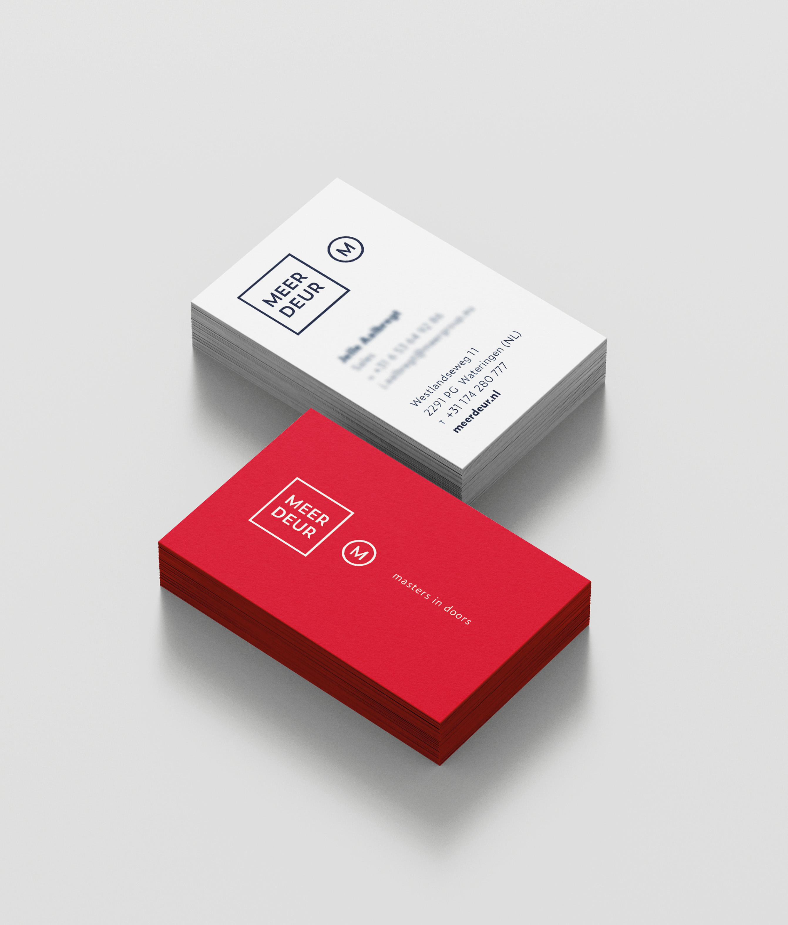
- Headline Subtitel:
New Merkfundament for leading doors producer and supplier
- Sectors List:
manufacturing industry
- Headline Introduction:
After the focus was on MeerDeur in recent years on developing their products and organization, it was now time to position their brand stronger in the market. Reason to call in Vandeez Together with MeerDeur we started working on realizing a solid brand foundation.
- Brand Essential List:
Brand positioning, Brand identity , Website
- Approach:
Together with MeerDeur we have examined their business. We pulled them out of the issues of the day to jointly build a brand foundation through our proven approach: 1. Merk positioning, 2. Brand identity , 3. Website.
New brand Fundament
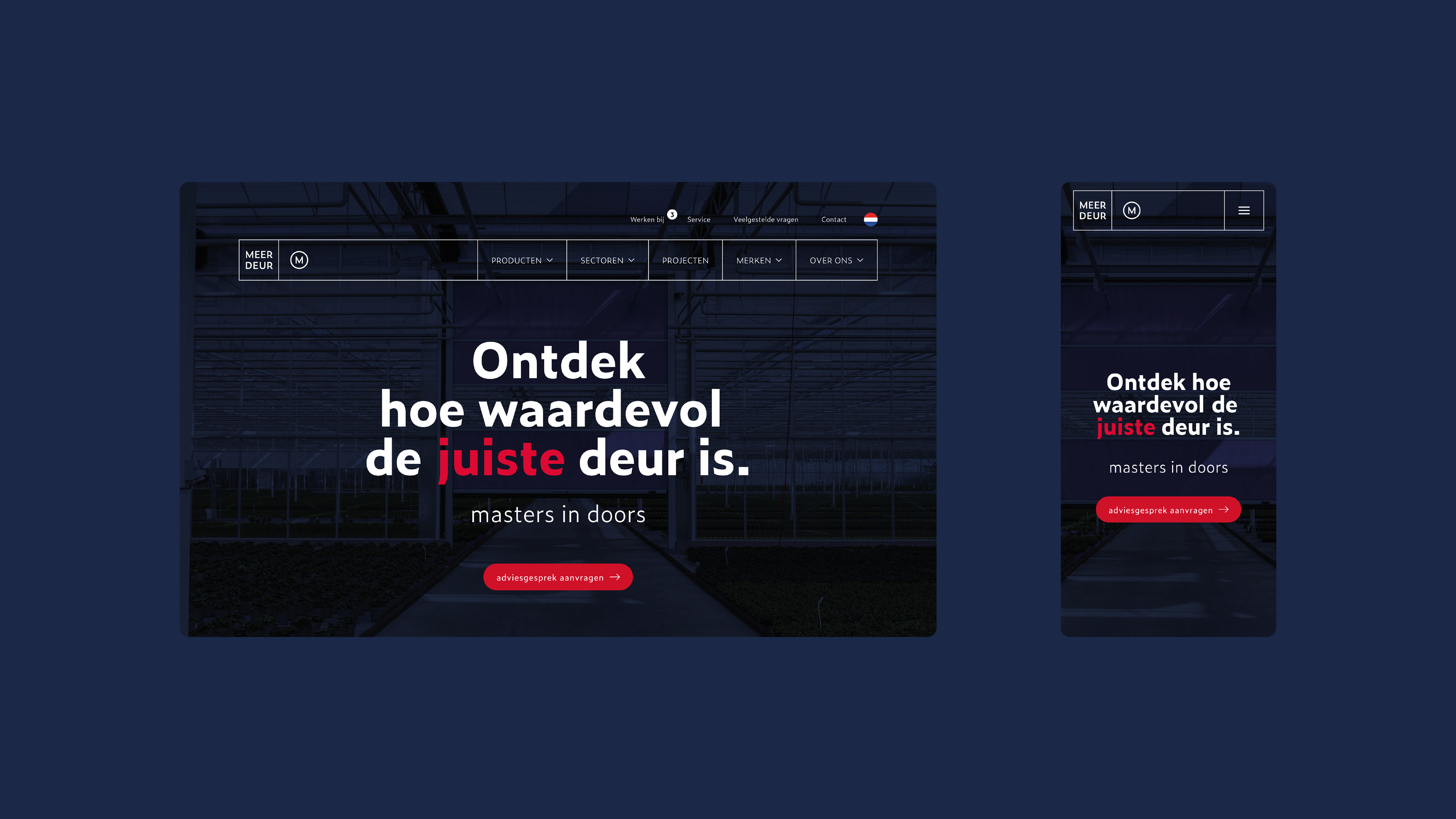
With the brand positioning we went looking together for the deepest motivation of their target group and we determined MeerDeur to communicate even sharper towards the target group. We then create a powerful and recognizable brand identity with the restyling of their existing visual identity . With the realization of the new website, the new positioning and identity became visible to the world. MeerDeur can realize their ambitions with the new brand foundation.
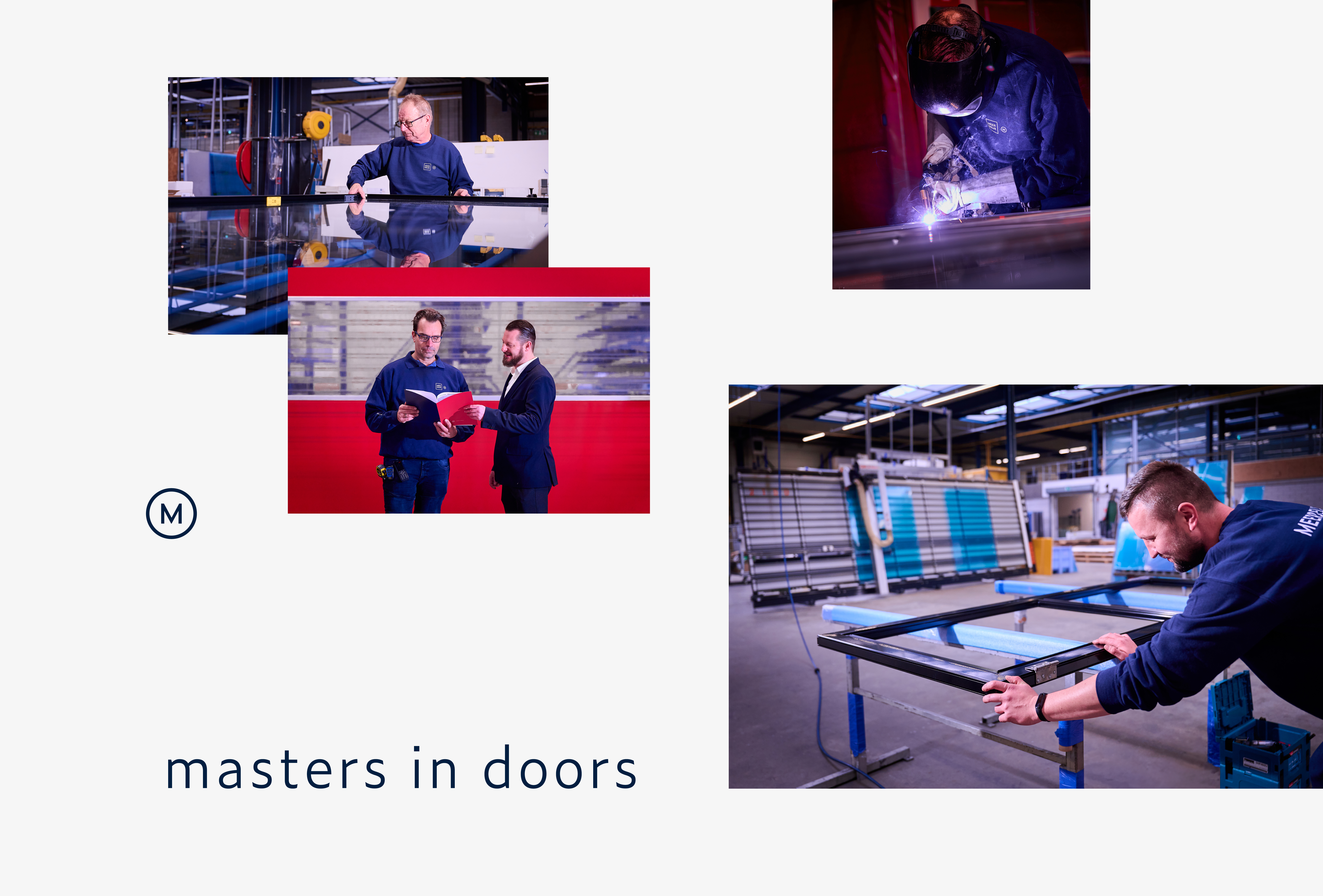
- Result:
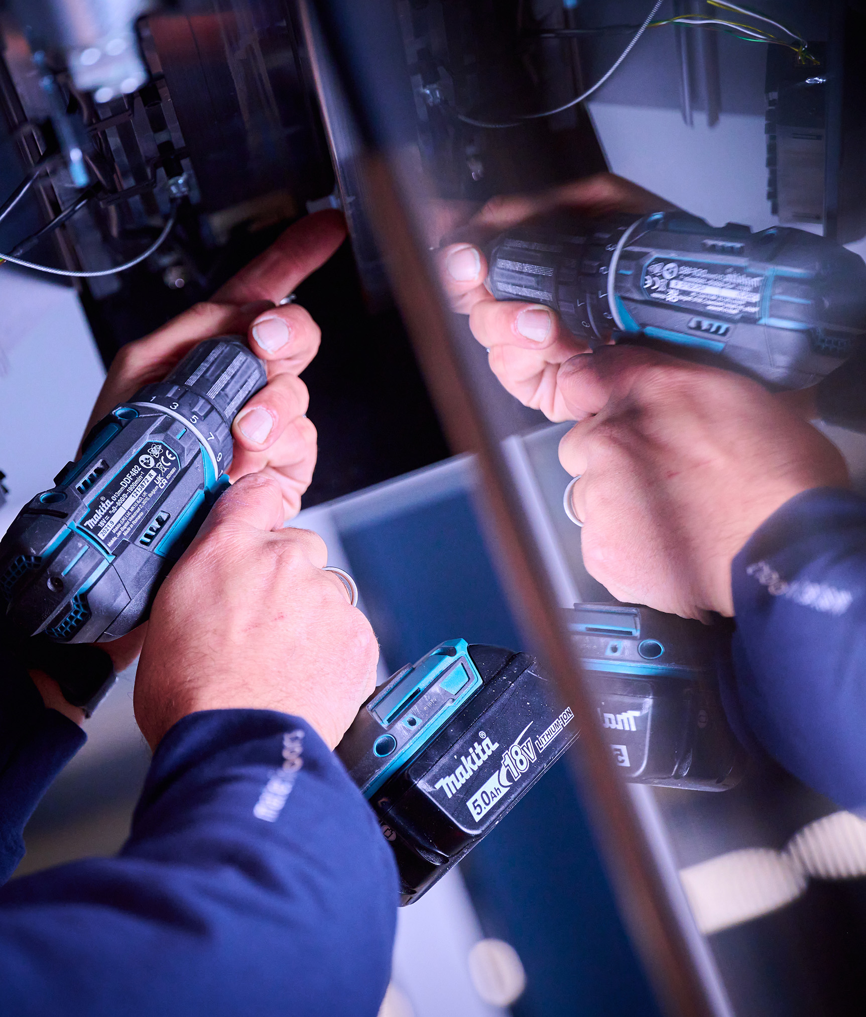
MeerDeur is positioned as a brand as the 'masters in Doors'. They always know how to translate the needs of customers into doors and automation of maximum added value. More sustainability, performance, return and experience. Less maintenance, worries and costs. Customers can expect more at MeerDeur With the realized brand foundation, consisting of a sharp brand positioning, recognizable brand identity and effective website, MeerDeur continue to build on their strong brand. We are proud of the collaboration with MeerDeur and the rebranding of their brand.
- Logo:
- Quote:
"With the rebranding we can better propagate who we are, what we stand for and what we have to offer."
- Quote - Customer Name and Function:
Mitchell van der Meer - Operational Manager
- Quote image:

- About customer:
About MeerDeur
- About customer information:
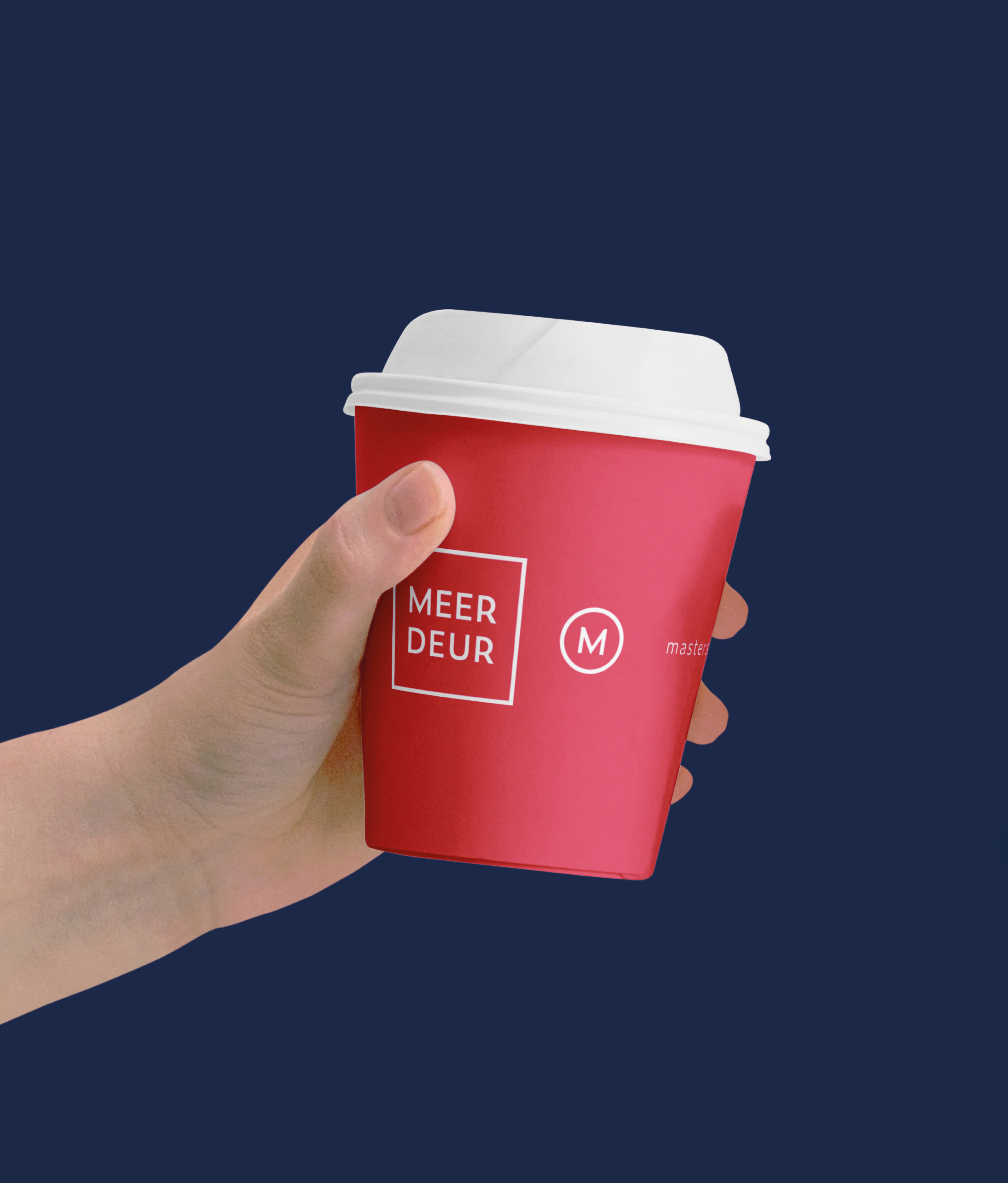
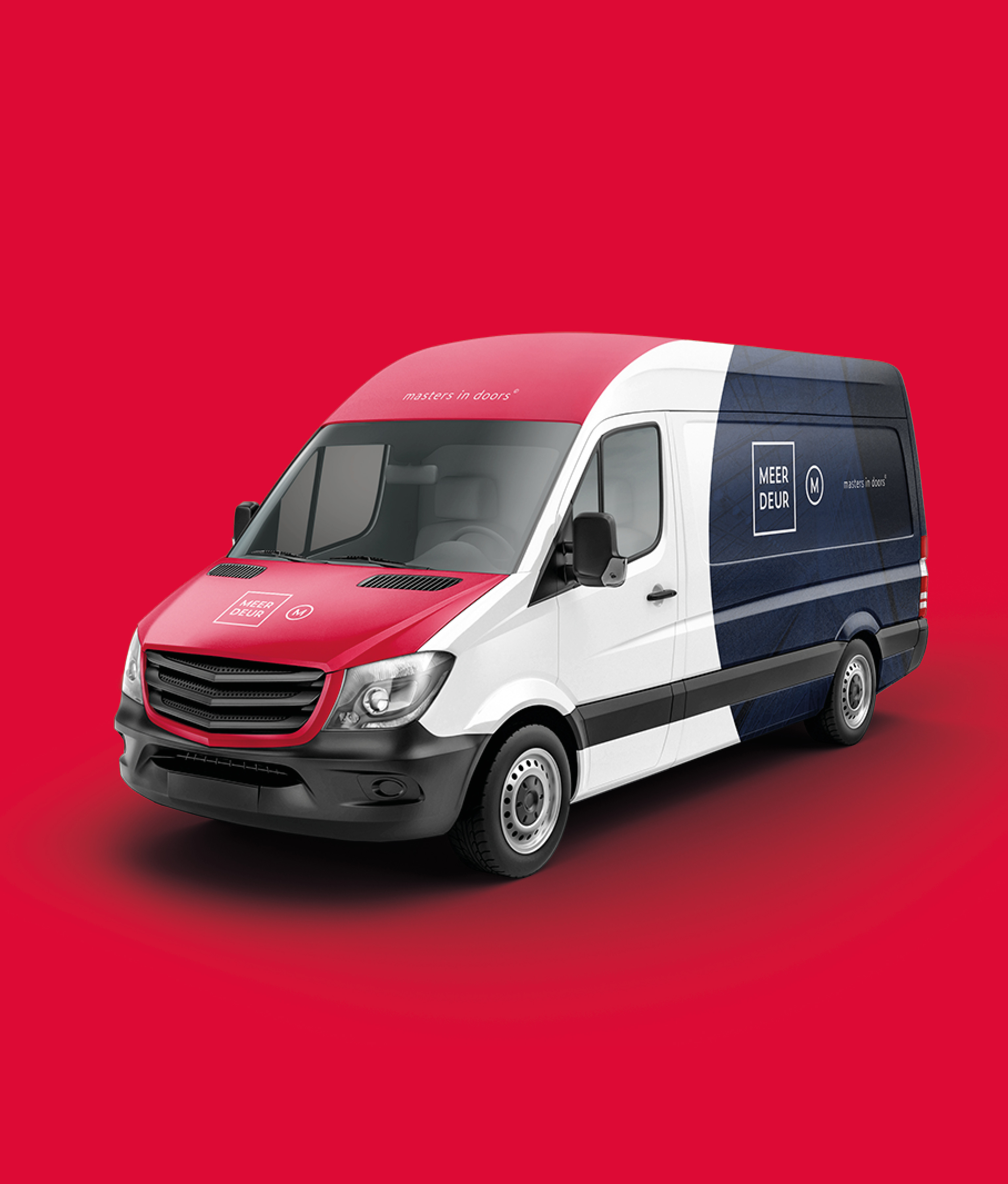
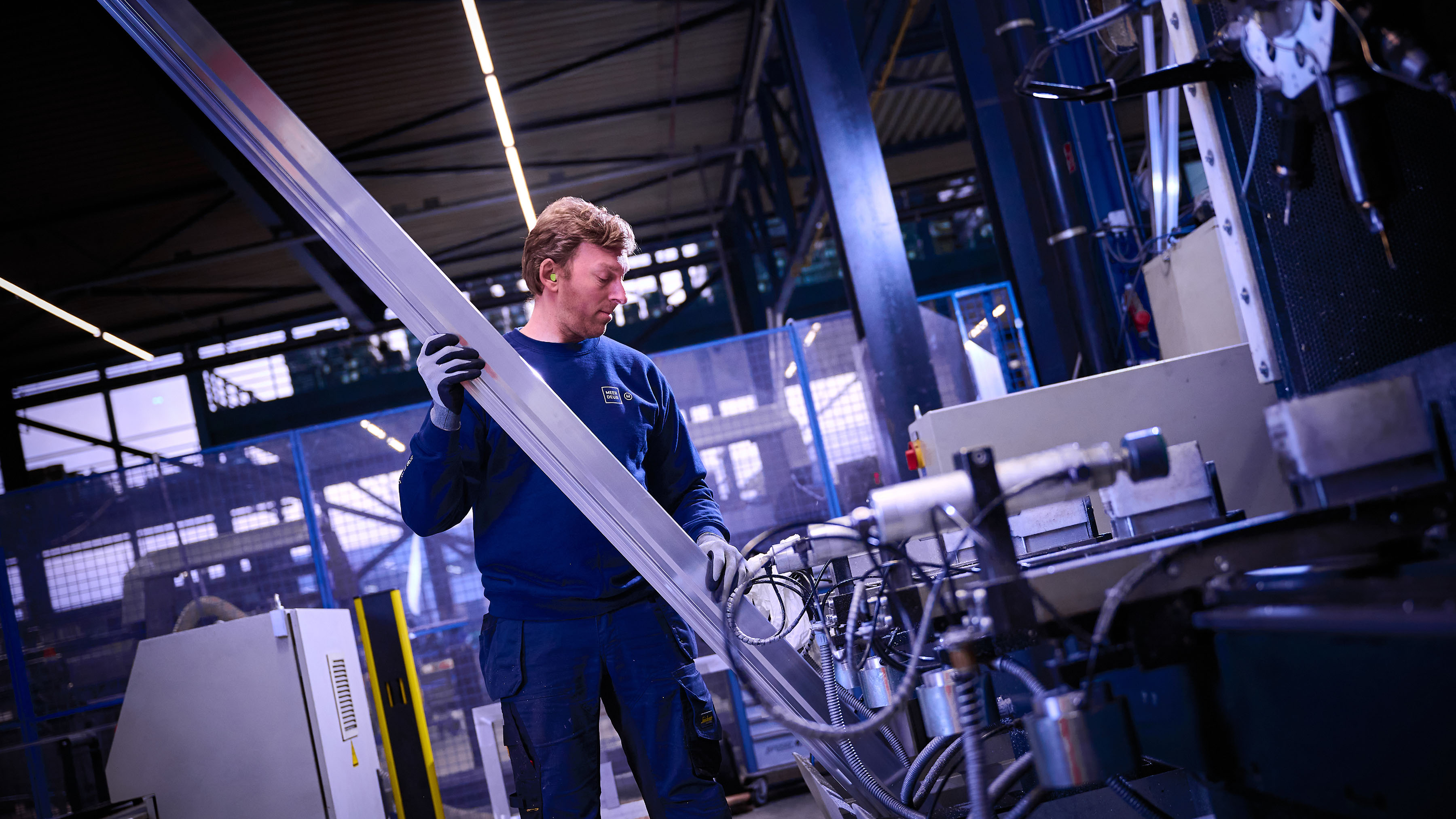
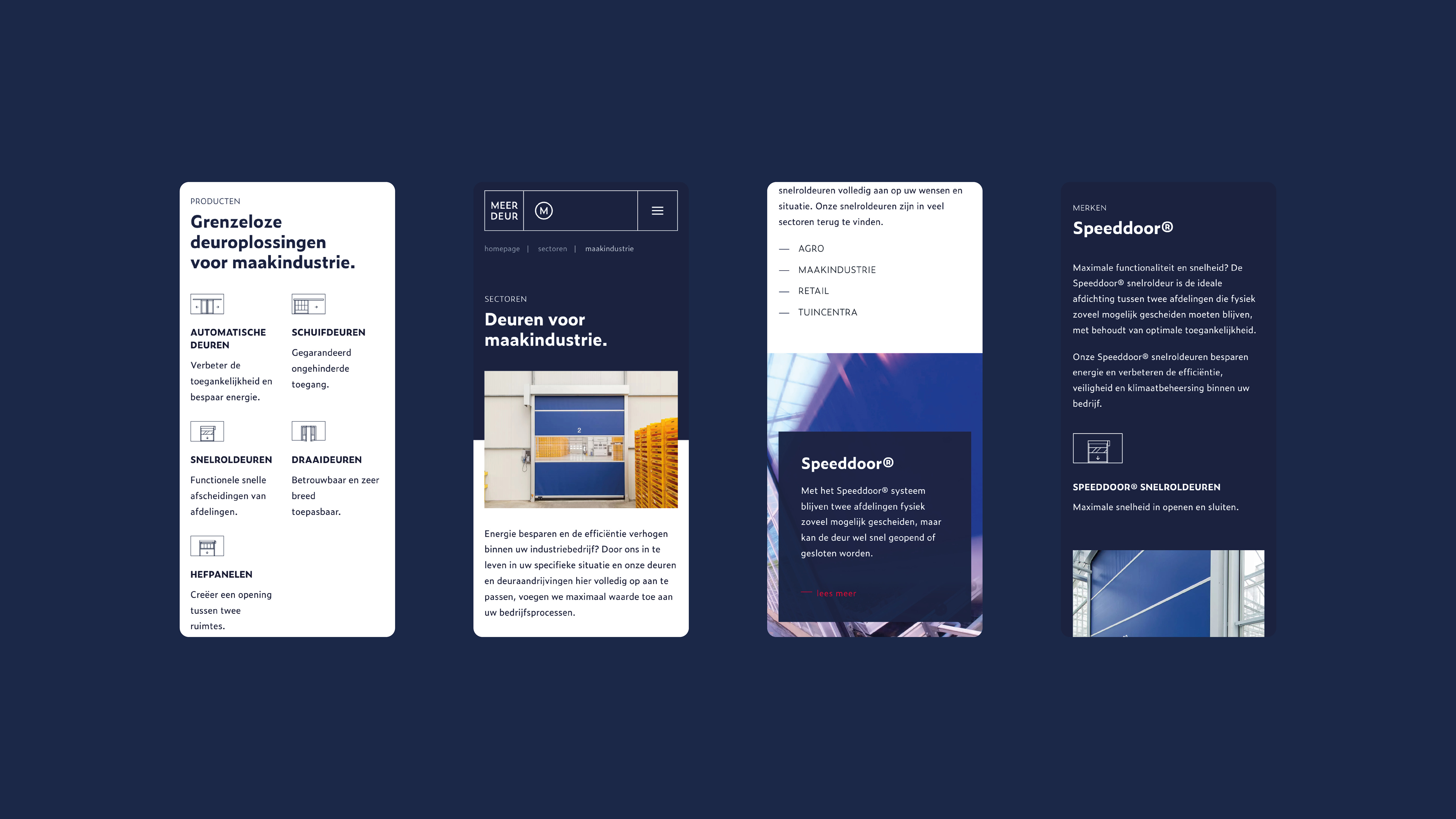
MeerDeur advises, designs, produces, assembles and maintains (automatic) doors for companies in various sectors. From agro to manufacturing industry and from utility to retail. With their brands MeerDeur ®, Speeddoor® and Gatemaster®, they always have the best doors and door drives for every situation and wish.
New brand foundament for leading doors producer and supplier
- Product Category:
Home, Brand activation
- Slideshow:
- Type:
Image , Media Test :
 , Alt-Tag:
bi-color Gerbera
, Alt-Tag:
bi-color Gerbera - Type:
Image , Media Test :
 , Alt-Tag:
Duo Gerbera
, Alt-Tag:
Duo Gerbera - Type:
Video , Media Test :
, Alt-Tag:
Gerbera Stylen
- Type:
Image , Media Test :
 , Alt-Tag:
dresser gerbera
, Alt-Tag:
dresser gerbera - Type:
image , media test :
 , alt tag:
gerbera colors your day
, alt tag:
gerbera colors your day - Type:
Image , Media Test :
 , Alt-Tag:
Gerberas distribution campaign
, Alt-Tag:
Gerberas distribution campaign - Type:
Image , Media Test :
 , Alt-Tag:
Gerbera Curly
, Alt-Tag:
Gerbera Curly - Type:
Image , Media Test :
 , Alt-Tag:
Gerbera Always surprised
, Alt-Tag:
Gerbera Always surprised - Type:
Image , Media Test :
 , Alt-Tag:
Red Gerbera
, Alt-Tag:
Red Gerbera - Type:
Image , Media Test :
 , Alt-Tag:
Kambiz Photoshoot
, Alt-Tag:
Kambiz Photoshoot - Type:
video , media test :
, alt-tag:
heavenly flowers
- Type:
Video , Media Test :
, Alt-Tag:
Instagram Stories Gerbera
- Type:
Image , Media Test :
 , Alt-Tag:
Zendpaal Gerbera Always surprised
, Alt-Tag:
Zendpaal Gerbera Always surprised - Type:
Image , Media Test :
 , Alt-Tag:
Zendpaal Gerbera Always surprised
, Alt-Tag:
Zendpaal Gerbera Always surprised
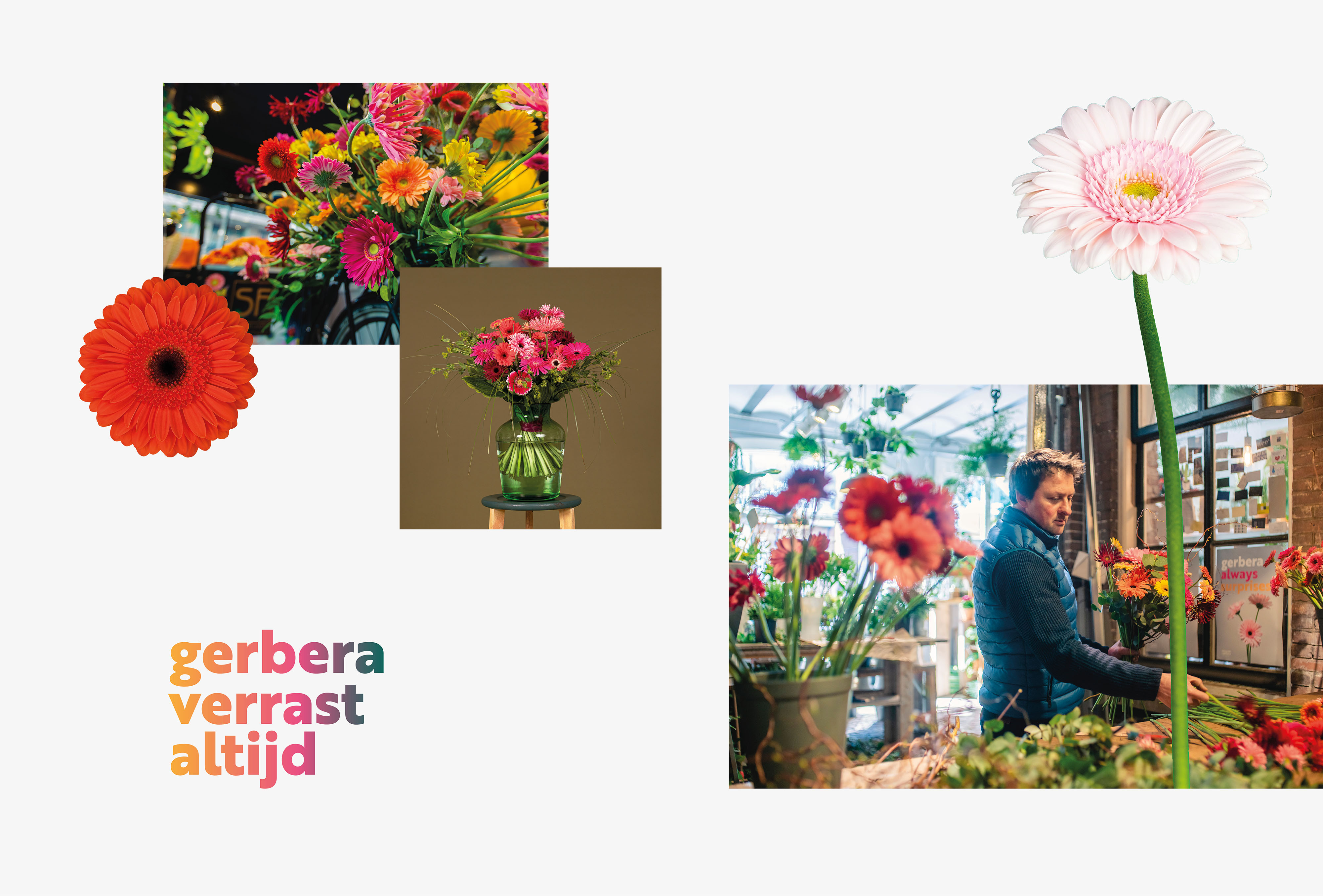
- Cases Logo - Diap:
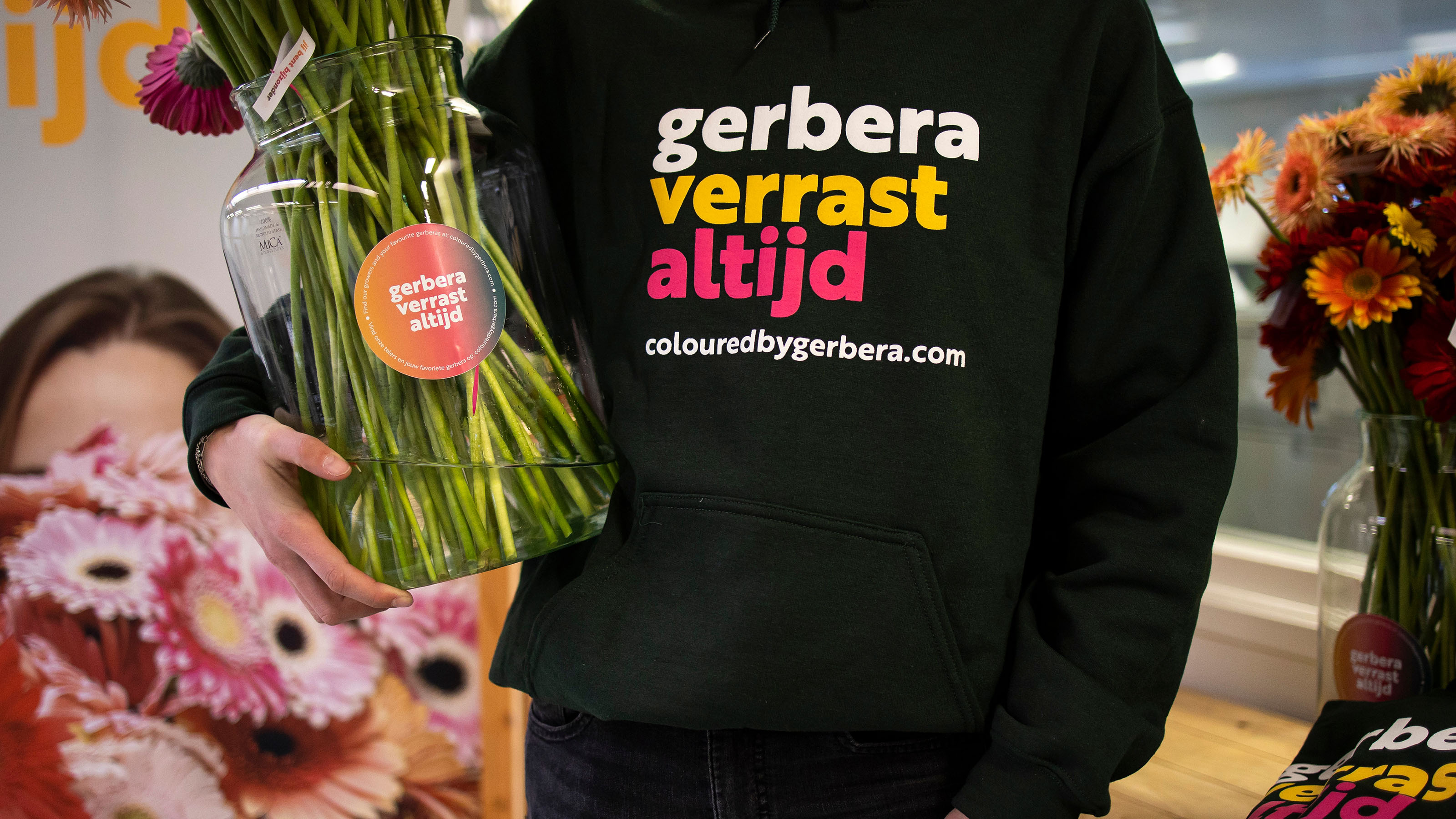
- Headline subtitle:
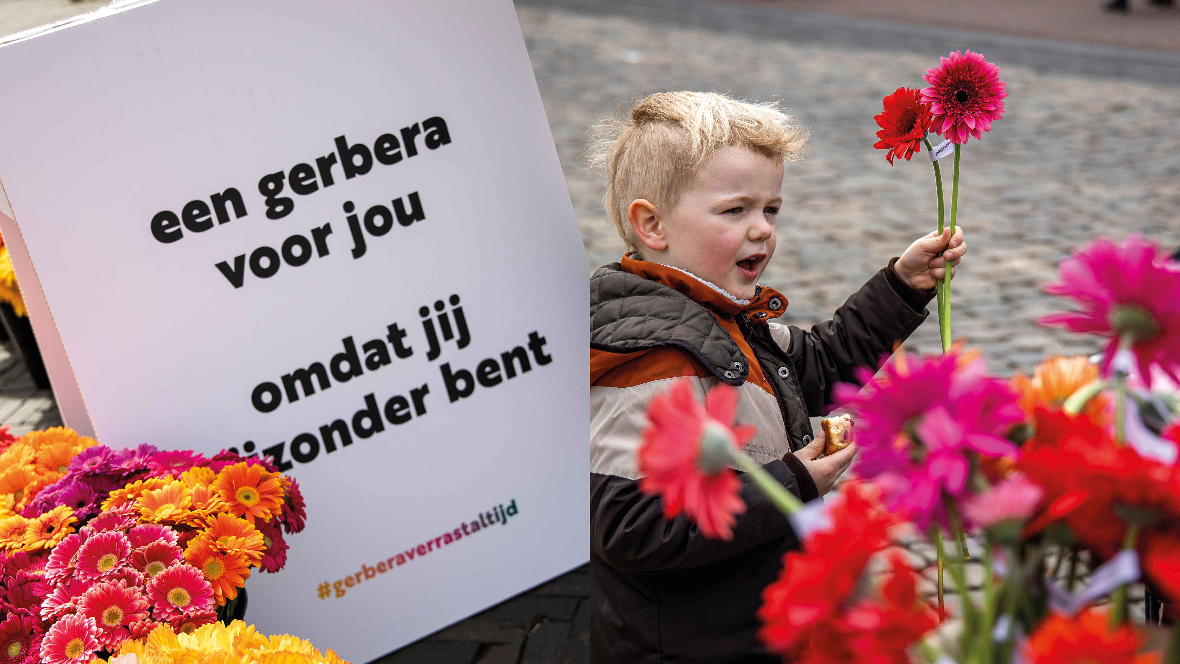
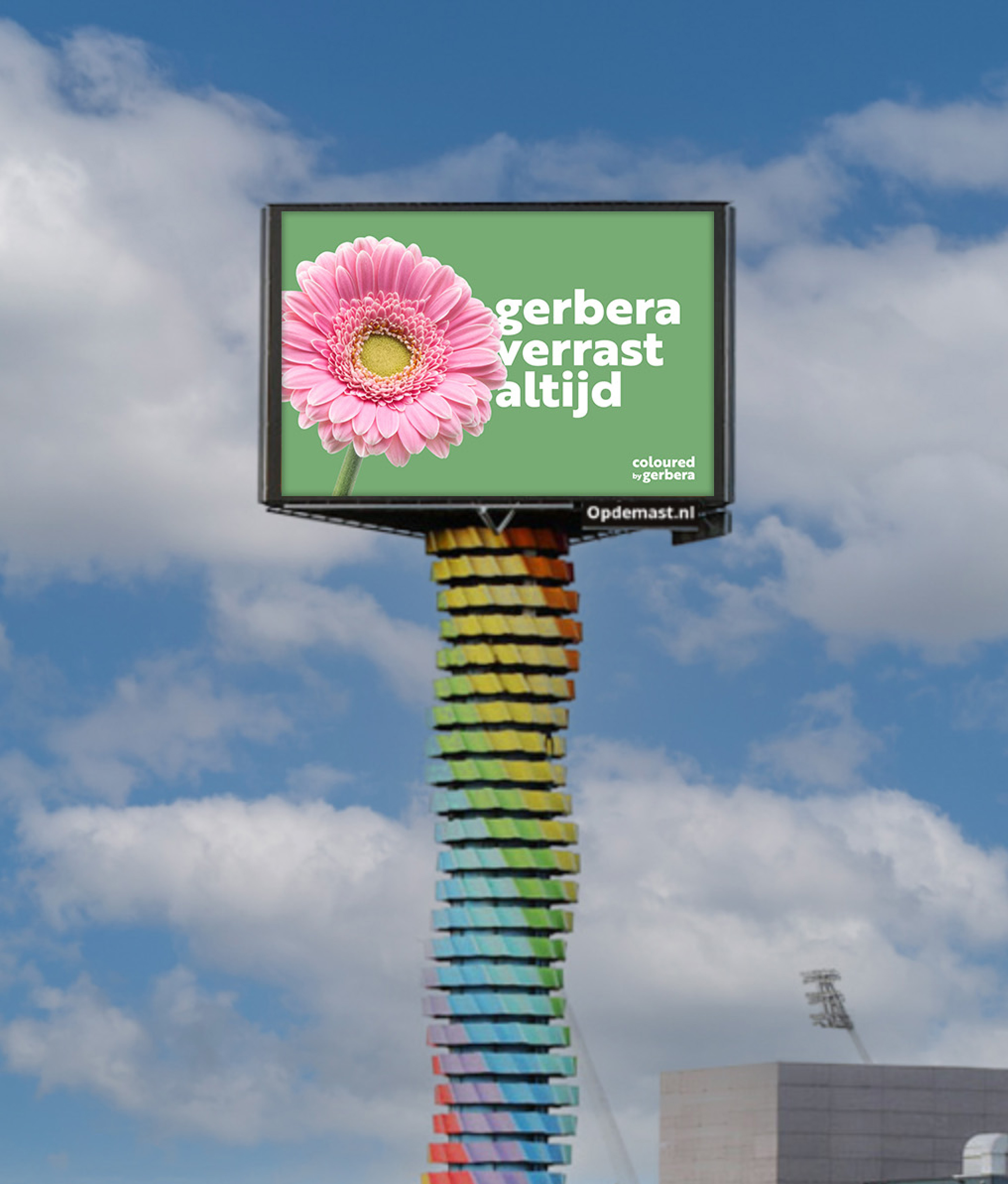
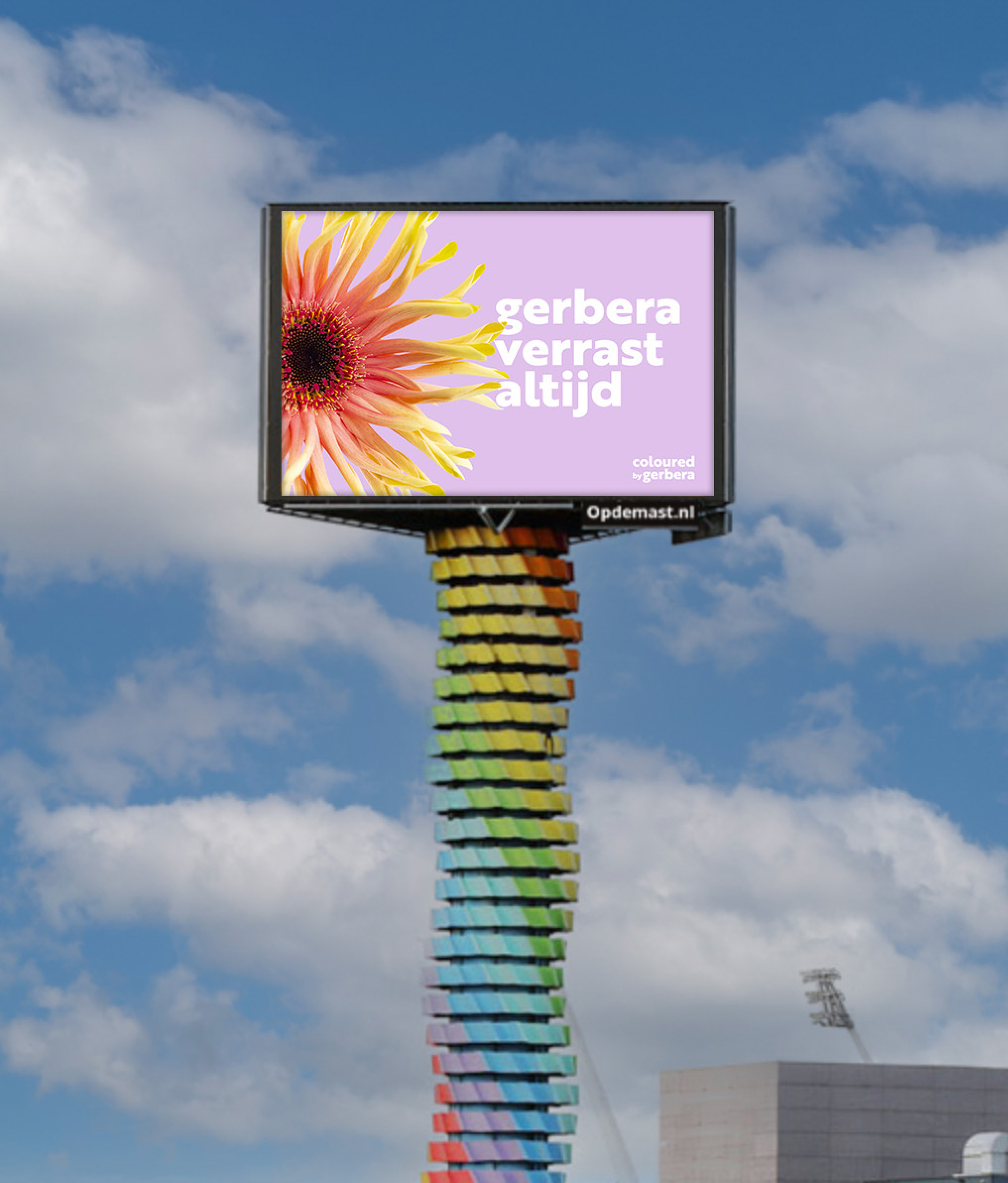
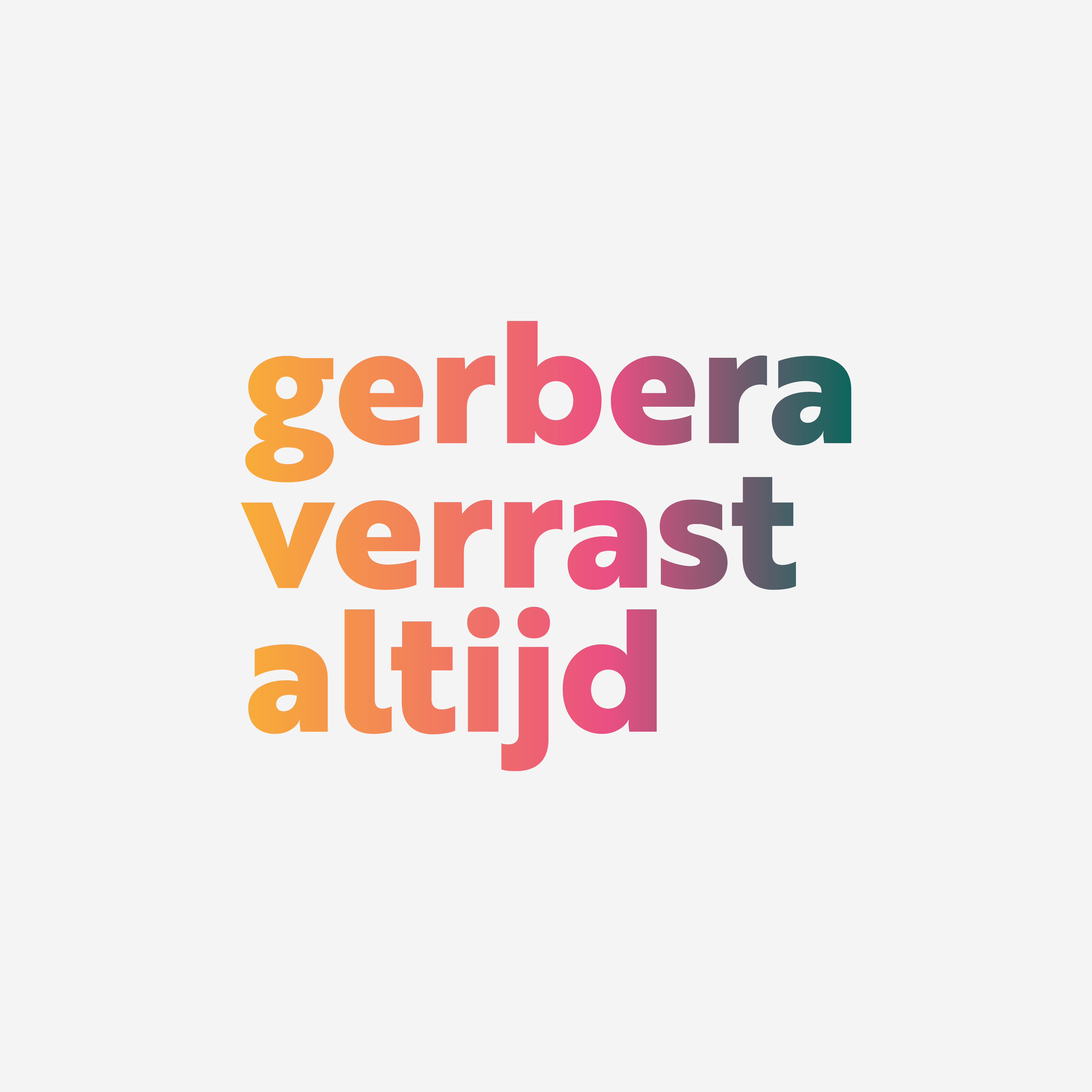
Autumn campaign 'Gerbera always surprises'
- Sectors list:
agriculture and horticulture
- Headline Introduction:
Coloured by Gerbera is the collective Gerberapromotie Nederland and aims to promote Gerbera internationally towards florist, retail and wholesaler. Every year there are various campaigns to stimulate the fame and brand preference among the various target groups. The new Gerbera range is available from the growers in September, with no less than 66 surprising new species. The moment to bring the strong quality, variations and trends to the attention.
- Brand Essential List:
Brand activation
- Approach:
With the main theme 'Gerbera always surprises', no less than 18 weeks has been provided for visibility. Every 3 weeks a different color was central to the campaign. With the aim of inspiring and informing our target groups with surprising new content in order to show as many people as possible the total range on the website.
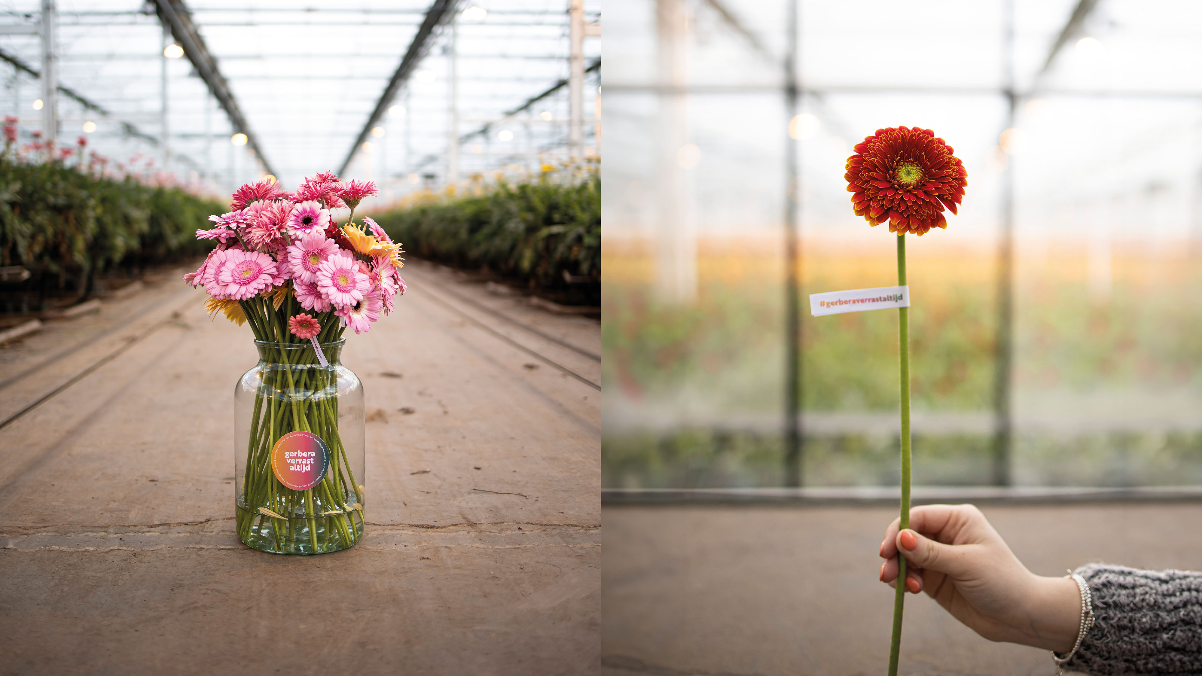
New product photography
With macro photography, the diversity and quality of the Gerbera has been mapped. Each flower is strong in steel, constant in structure and surprising in color or shape. Florists, arrangers and exporters throughout Europe were shown the class and quality of this beautiful, real photography.
Online Meta and LinkedIn campaign
The online campaigns are activated per color theme in Dutch, English and German. The advertisements consisted of beautiful carousel advertisements and new Insta Stories. We send people to the range on the website of Coloured by Gerbera.
Social Content Peter van Delft - Hand -out actions in cities
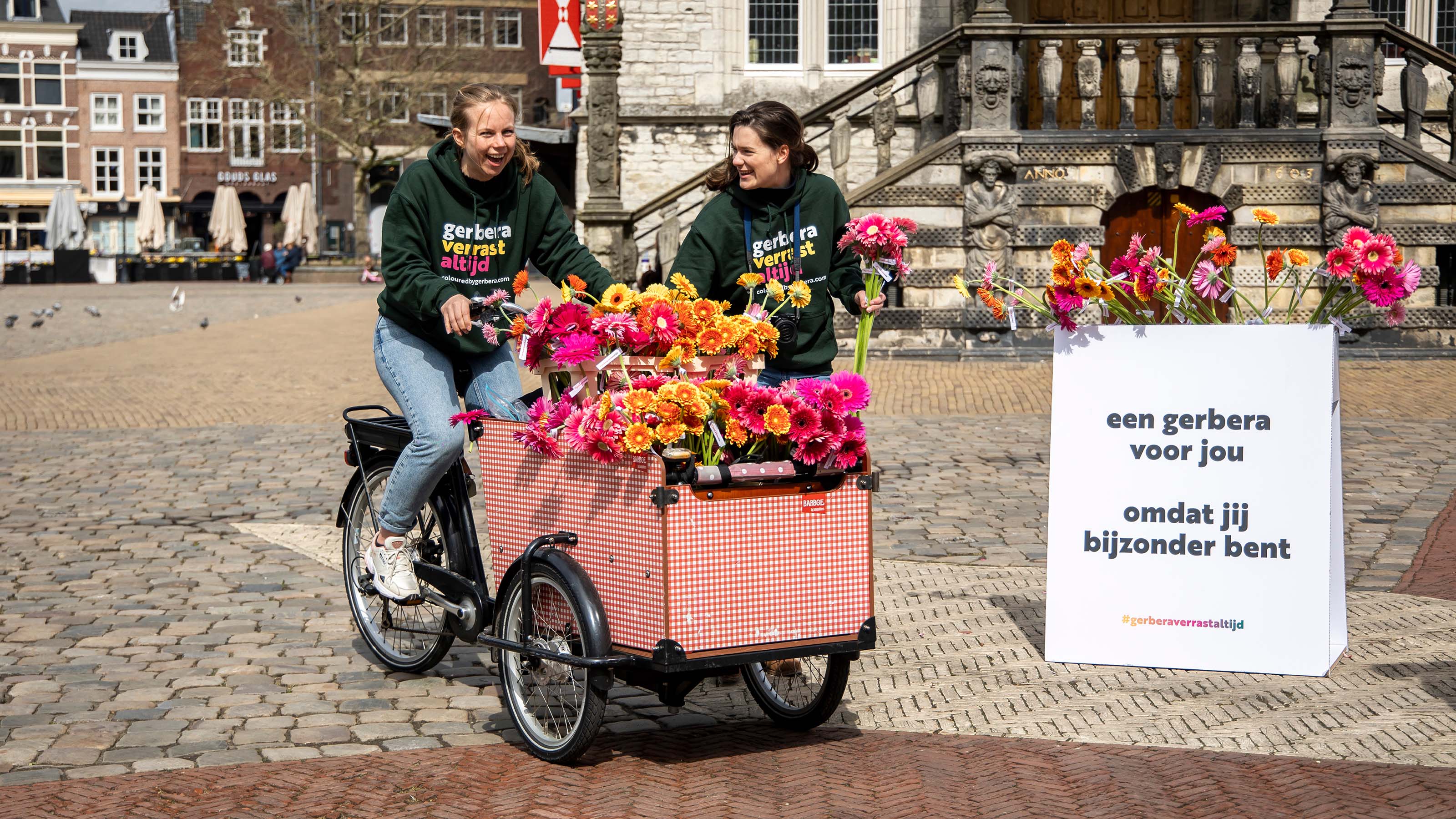
Thorsd is a platform where floriculture comes together. The goal is to connect all links in international floriculture. Peter van Delft is involved as a blogger and vlogger and has a large reach with 261k Instagram and 63k Tiktok followers. Our growers have visited 3 cities to surprise visitors with the new gerbera species. In addition, arrangers were deployed with a large reach to make arrangements. These moments were captured by Peter van Delft on camera and shared on Instagram through various reels.
Billboard Advertising A12
For 2 weeks, 2 digital advertisements appeared on a billboard along the A12. This surprises more than 100,000 motorists.
In addition, the owned channels have been deployed intensively, such as interviews with breeders on the blog of Coloured by Gerbera, and LinkedIn posts to generate extra traffic to the website.
- Result:
a striking omnichannel campaign, with the surprising Gerberas in the spotlight. The campaign is still running at the moment, but we are proud of the provisional results. In the campaign period we see a huge increase in reach and followers on both Instagram and Facebook. For Instagram that is a 47% increase in reach and a 329% increase in number of followers. For Facebook, those figures are a 525% increase in reach and 433% in number of followers. We present the final results at the end of the campaign period.
- Logo:
- Quote:
"Fantastic how with this Omnichannel campaign we reach our target groups with our new range over the entire autumn period."
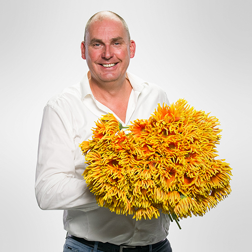
- Quote - Customer Name and Function:
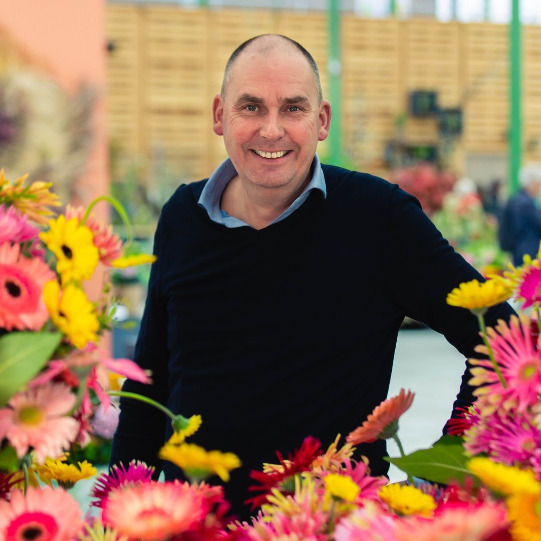
WP van den Berg - Chairman
- Quote image:
- About customer:
About Coloured by Gerbera
- About customer information:
Coloured by Gerbera is the collective of all 40 Dutch gerberatelers and breeders. They provide florist, wholesaler and exporter range information and inspiration. Through various campaigns and promotions they put the Gerbera on the international map.
Autumn campaign 'Gerbera always surprises'
- Product Category:
Brand Strategy , Brand identity , Website
- Slideshow:
- Type:
Image , Media Test :
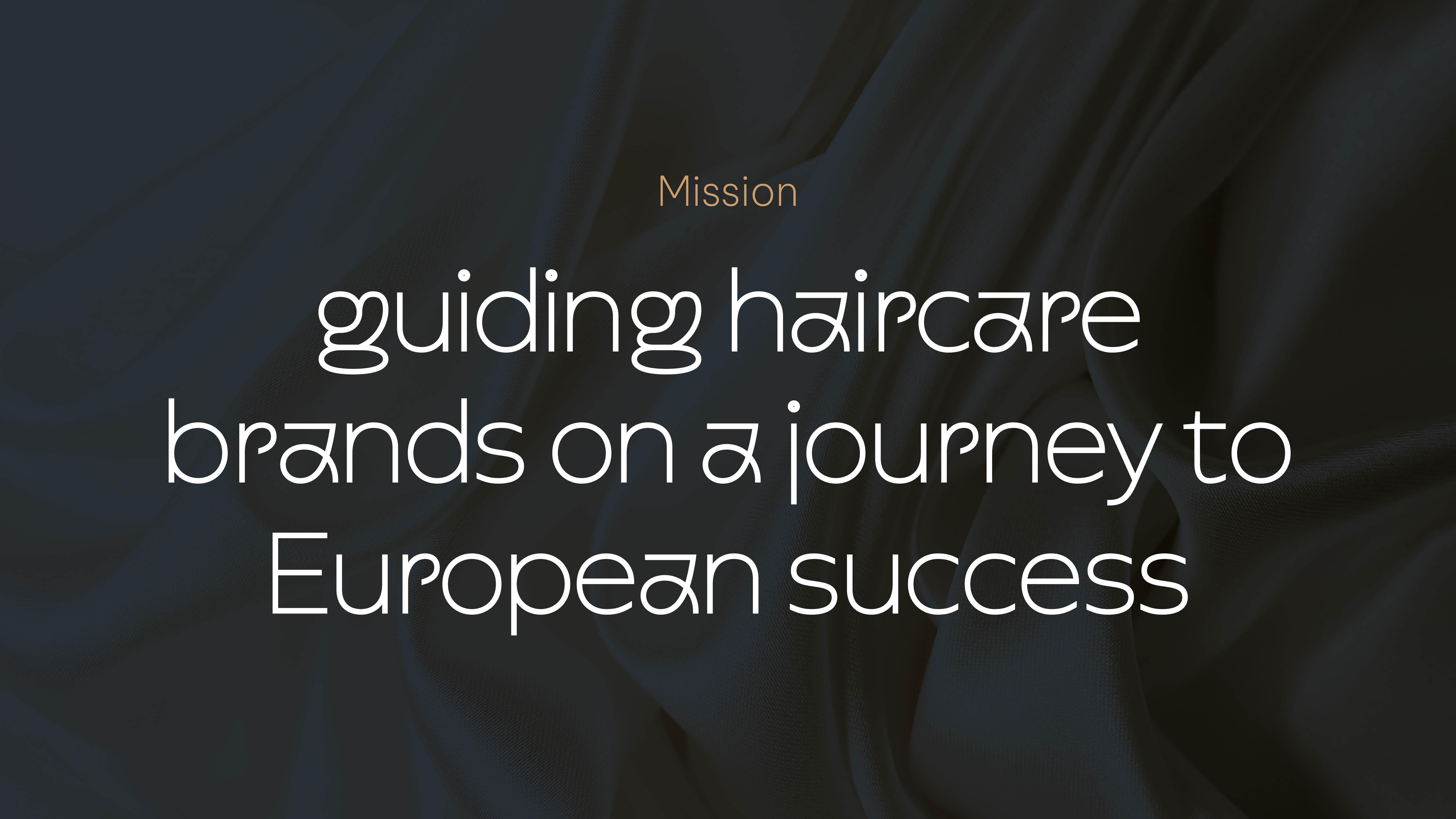 , Alt-Tag:
No Hat Needed
, Alt-Tag:
No Hat Needed - Type:
Image , Media Test :
 , Alt-Tag:
No Hat Needed
, Alt-Tag:
No Hat Needed - Type:
Video , Media Test :
, Alt-Tag:
No Hat Needed Website
- Type:
Image , Media Test :
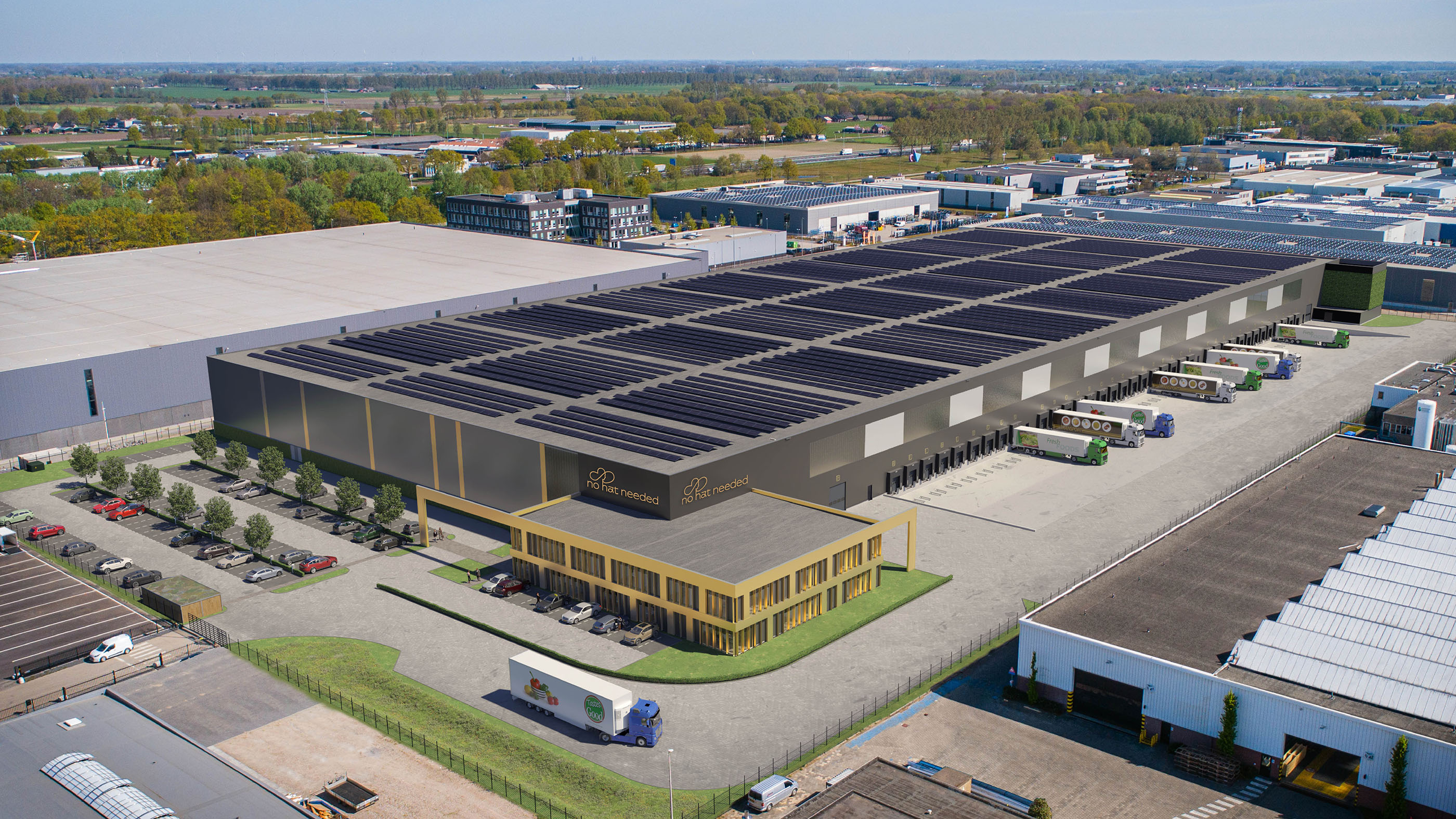 , Alt-Tag:
Distributor
, Alt-Tag:
Distributor - Type:
Image , Media Test :
 , Alt-Tag:
Colors visual identity
, Alt-Tag:
Colors visual identity - Type:
Image , Media Test :
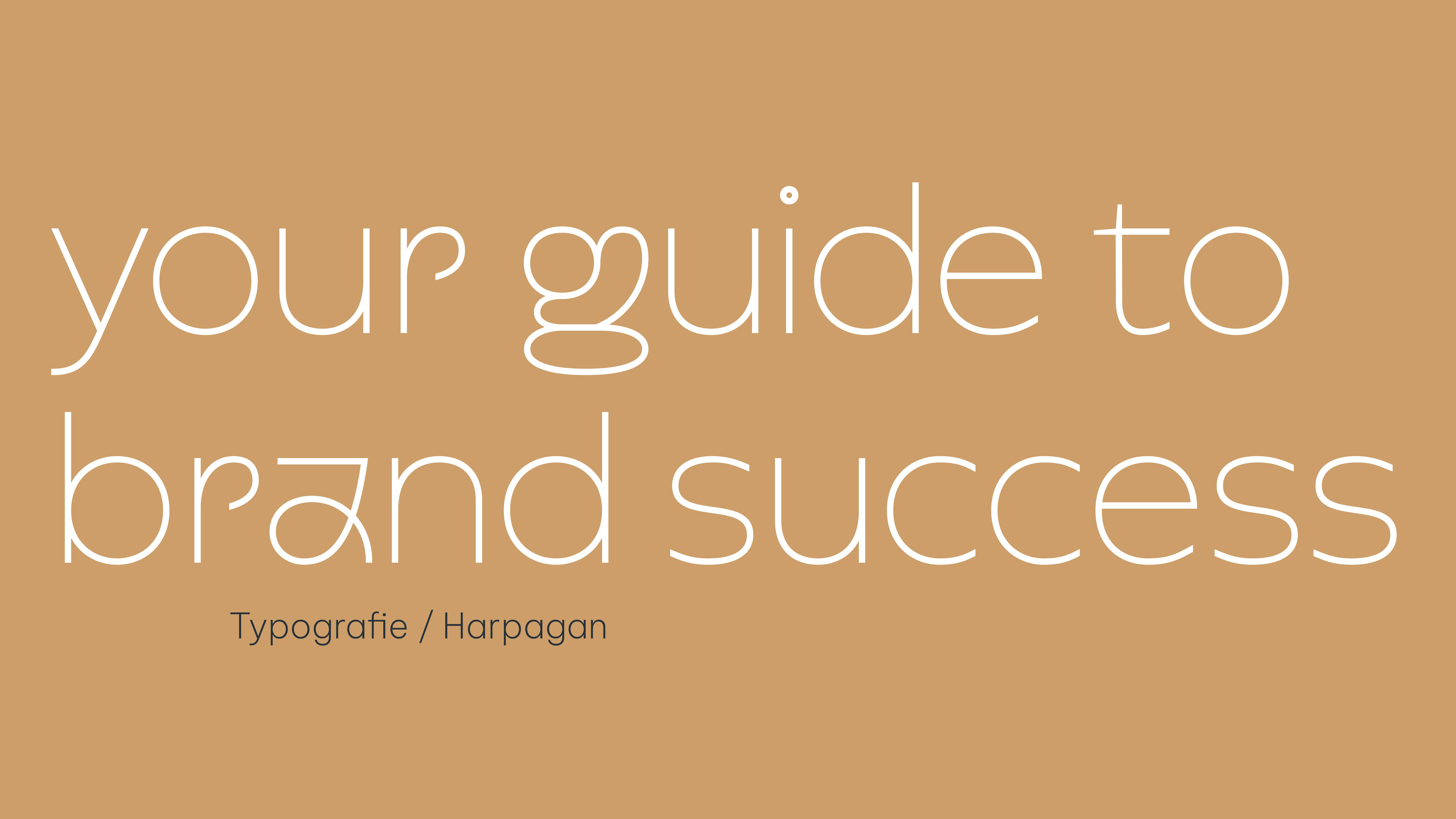 , Alt-Tag:
The Waterproof Company Bus bus
, Alt-Tag:
The Waterproof Company Bus bus - Type:
Image , Media Test :
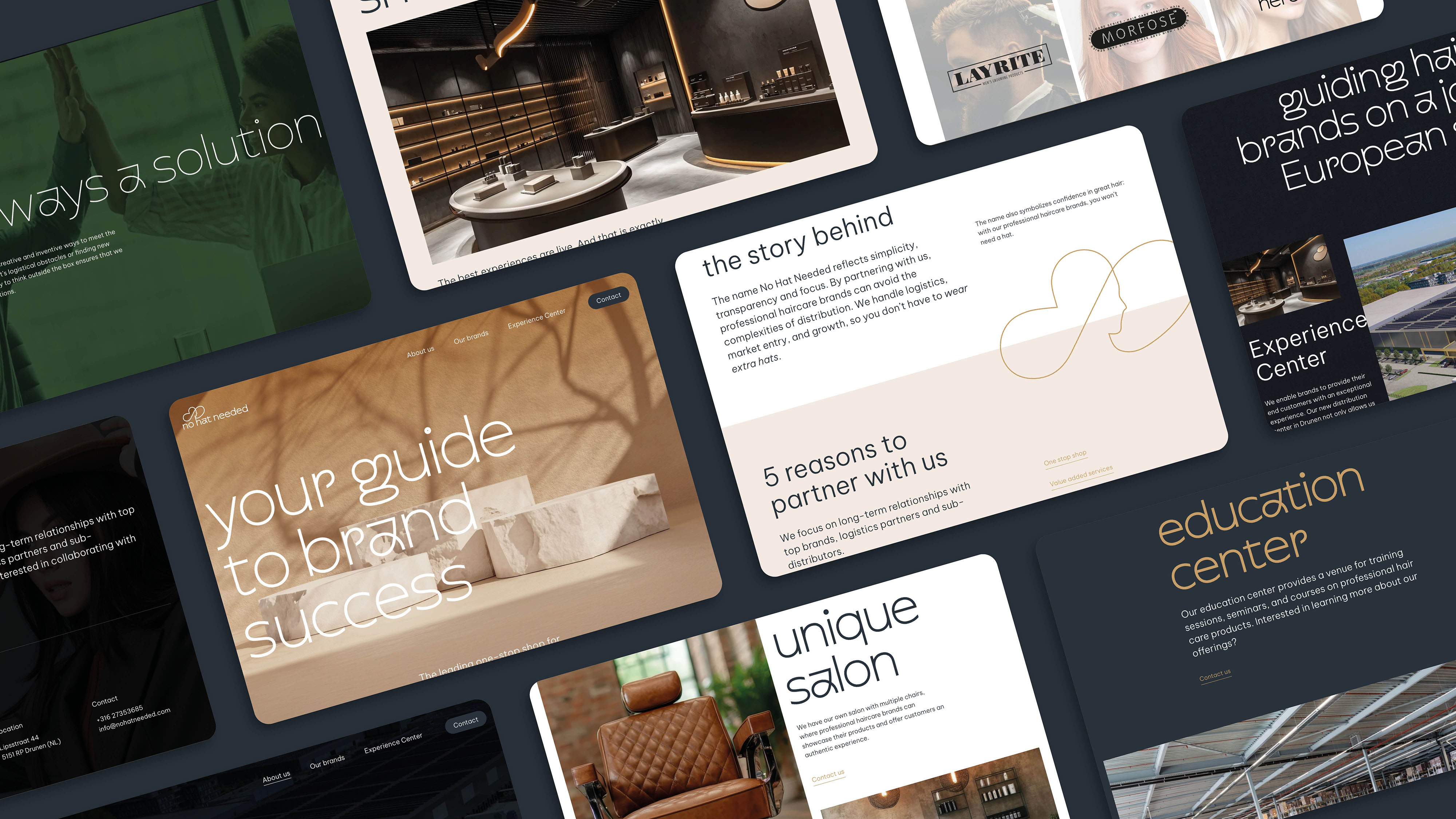 , Alt-Tag:
The Waterproof Company Website iPad
, Alt-Tag:
The Waterproof Company Website iPad - Type:
Image , Media Test :
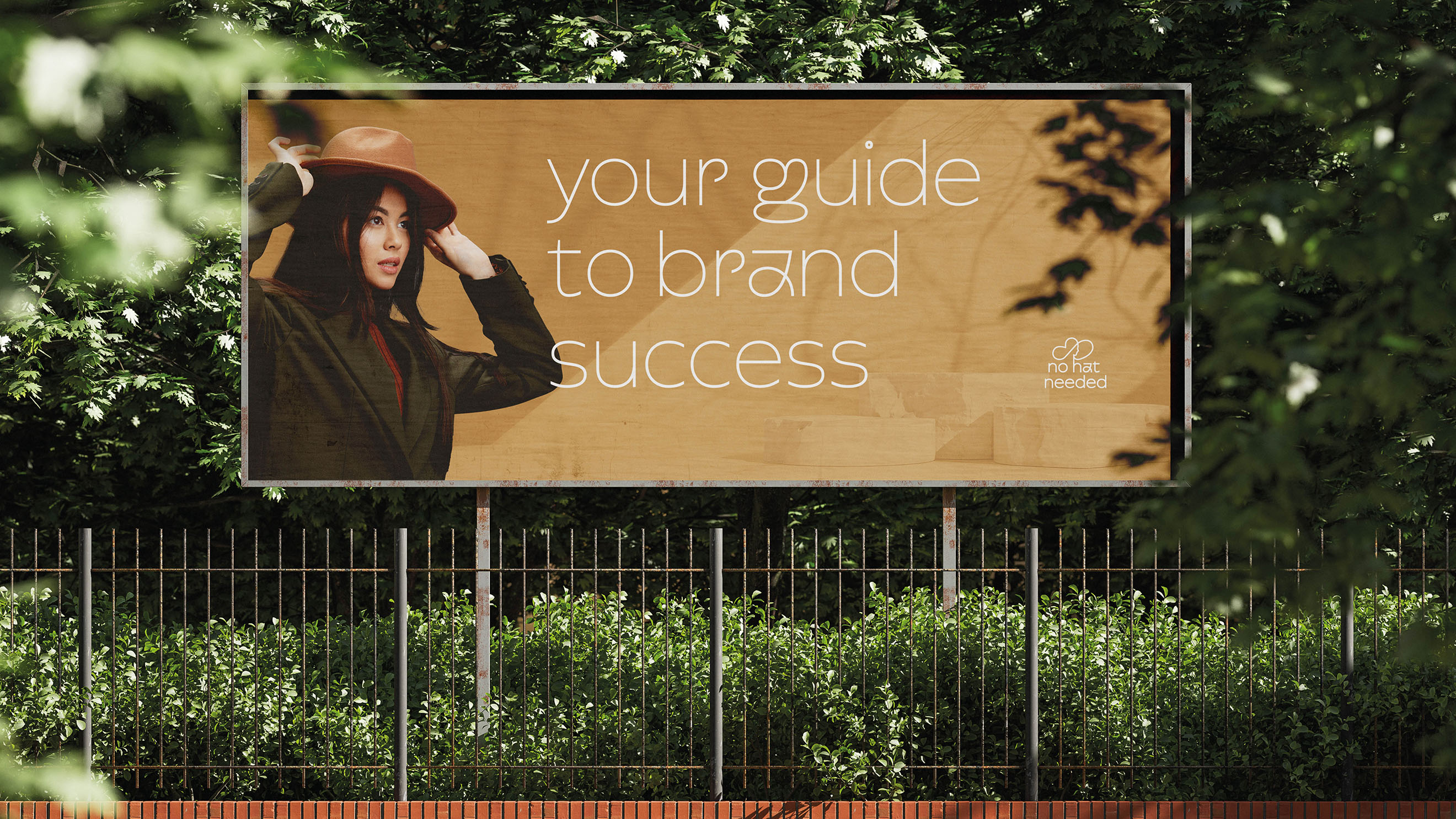 , Alt-Tag:
The Waterproof Company Slideshow
, Alt-Tag:
The Waterproof Company Slideshow - Type:
Image , Media Test :
 , Alt-Tag:
No Hat Needed Slider
, Alt-Tag:
No Hat Needed Slider - Type:
Image , Media Test :
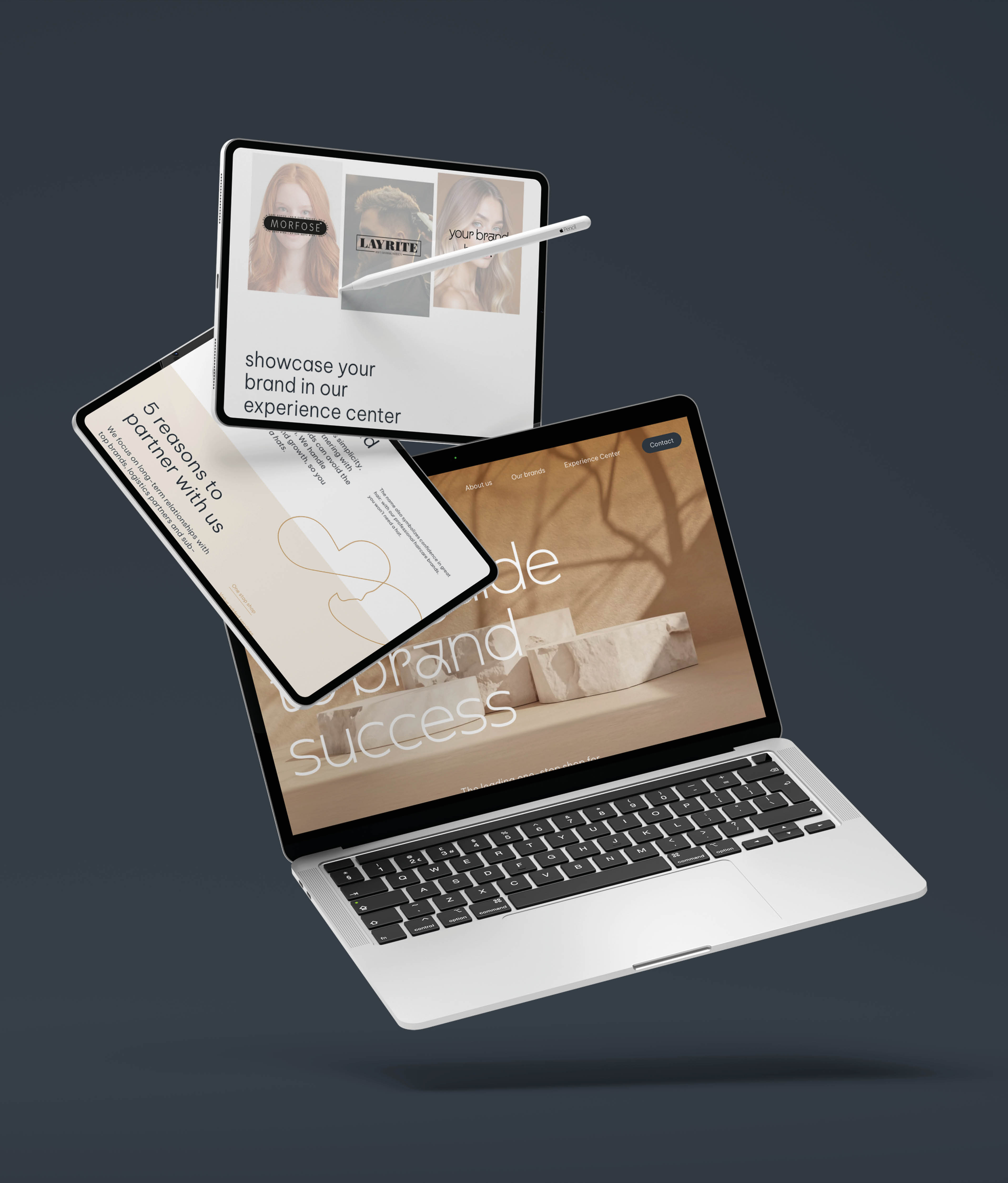 , Alt-Tag:
No Hat Needed Quote
, Alt-Tag:
No Hat Needed Quote - Type:
Image , Media Test :
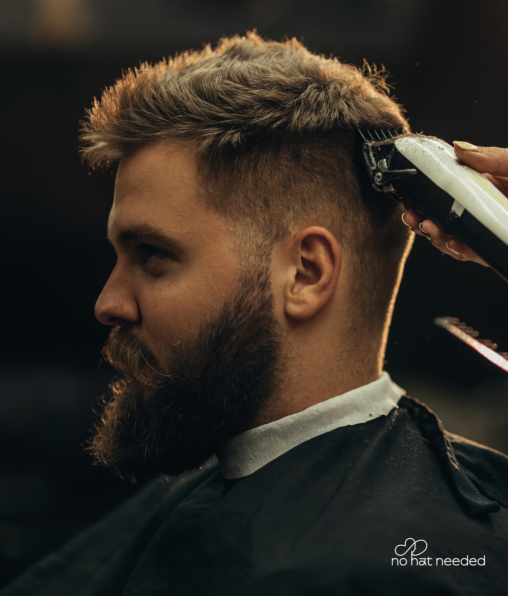 , Alt -Tag:
No Hat Needed - Logo
, Alt -Tag:
No Hat Needed - Logo - Type:
Image , Media Test :
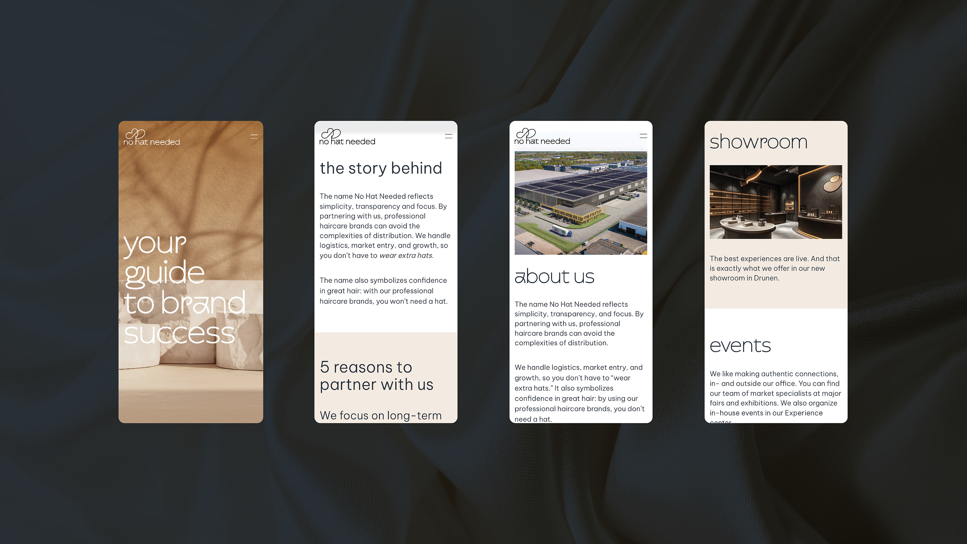 , Alt-Tag:
No Hat Needed Mobile Website
, Alt-Tag:
No Hat Needed Mobile Website - Type:
Image , Media Test :
 , Alt-Tag:
No Hat Needed Mobile
, Alt-Tag:
No Hat Needed Mobile - Type:
Image , Media Test :
 , Alt-Tag:
No Hat Needed Merchandise
, Alt-Tag:
No Hat Needed Merchandise
- Cases Logo - Diap:

- Headline Subtitle:
No Hat Needed : A new brand with guts
- Sectors list:
professional services
- Headline Introduction:
No Hat Needed is a brand new distributor of professional hair care products. With a clear vision and great ambitions, the team approached us for strategic advice, a striking visual identity and a website that tells their story. From the first sessions in November to the launch of the website: together we have built a brand that is ready for success.
- Brand Essential List:
Brand positioning, Brand identity , Website
- Approach:
a strategic start
Everything starts with a strong foundation, the strategy. What makes this new company unique? How do they distinguish themselves in a competitive market? Together we laid the foundation for a brand that is both credible and distinctive. It was very cool to host a kick off together to brainstorm and create vision boards. What followed was a creative process of naming and concept creation. The name No Hat Needed is the result. As a distributor, they have the knowledge, expertise and the right team to make professional haircare brands a success in Europe. 'They don't have to wear extra hats': they are relieved. And by using the hair products that they distribute, you don't need a hat;).
visual Identity: modern and professional
A strong brand requires a recognizable visual identity. We developed a logo and typography that perfectly matches what No Hat Needed stands for: professional, reliable and stylish. The identity radiates trust and quality, exactly what is needed to convince premium brands of their services.
website: a digital home base
To give No Hat Needed a flying start, we built a website that stands out in their sector. Informative and convincing. With unique effects, a clear structure and a sleek, modern identity . A website that is easy to expand with new 'Brands' for which they will work, the possibilities in the Experience Center, reviews and, for example, a webshop.
- Result:
ready for the future
No Hat Needed has everything to make an impact in the professional haircare industry. It is a team that starts with a lot of energy and guts. It was fantastic to work together on their brand. We look forward to following their growth and taking new steps together.
- Logo:
- Quote:
"After months of preparation we are very happy with the result: the official launch of our new company: No Hat Needed . Thank you for the great team at VanDeez that inspires us to be Bold and Brave, while" We Embrace Our Hats "".
- Quote - Customer Name and Function:
Dominik Bakker - Founder No Hat Needed
- Quote image:
- About customer:
About No Hat Needed
- About customer information:
No Hat Needed is a leading distribution company of professional hair care brands. They help A-brands to increase their visibility and success in Europe. They do this because of their extensive network, market knowledge and innovative approach.
No Hat Needed: a new brand with guts
- Product Category:
Brand Strategy , Brand identity , Website, Brand activation
- Slideshow:
- Type:
Video , Media Test:
vandeez -S-OFG-2024-Video-animation-4K.MP4 , Alt-Tag:
One Flora Group Video
- Type:
Image , Media Test :
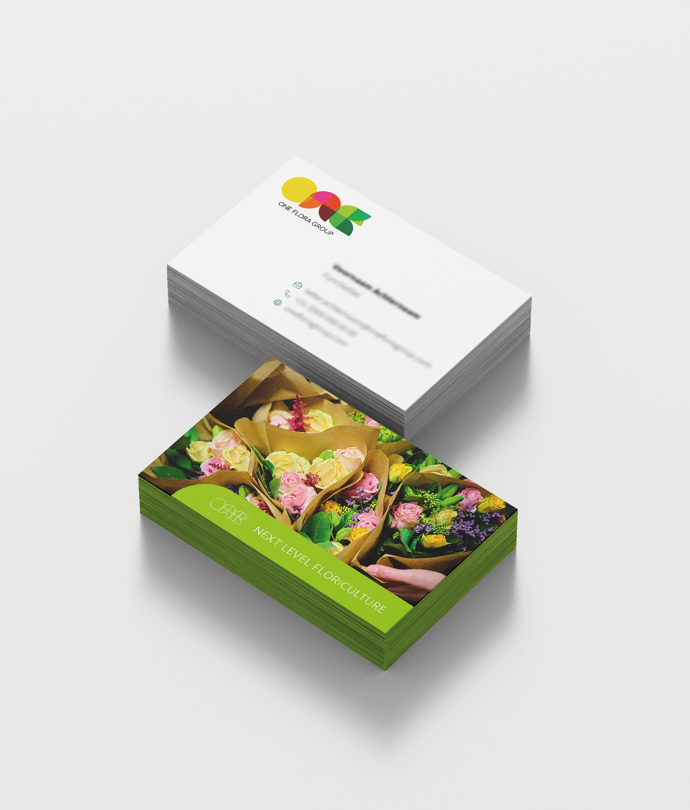 , Alt-Tag:
One Flora Group Visual Identity
, Alt-Tag:
One Flora Group Visual Identity - Type:
Video , Media Test:
vandeez -S-OFG-2024-Video-Mobile.mp4 , Alt-Tag:
One Flora Group Website website
- Type:
Image , Media Test :
 , Alt-Tag:
One Flora Group Photography
, Alt-Tag:
One Flora Group Photography - Type:
Image , Media Test :
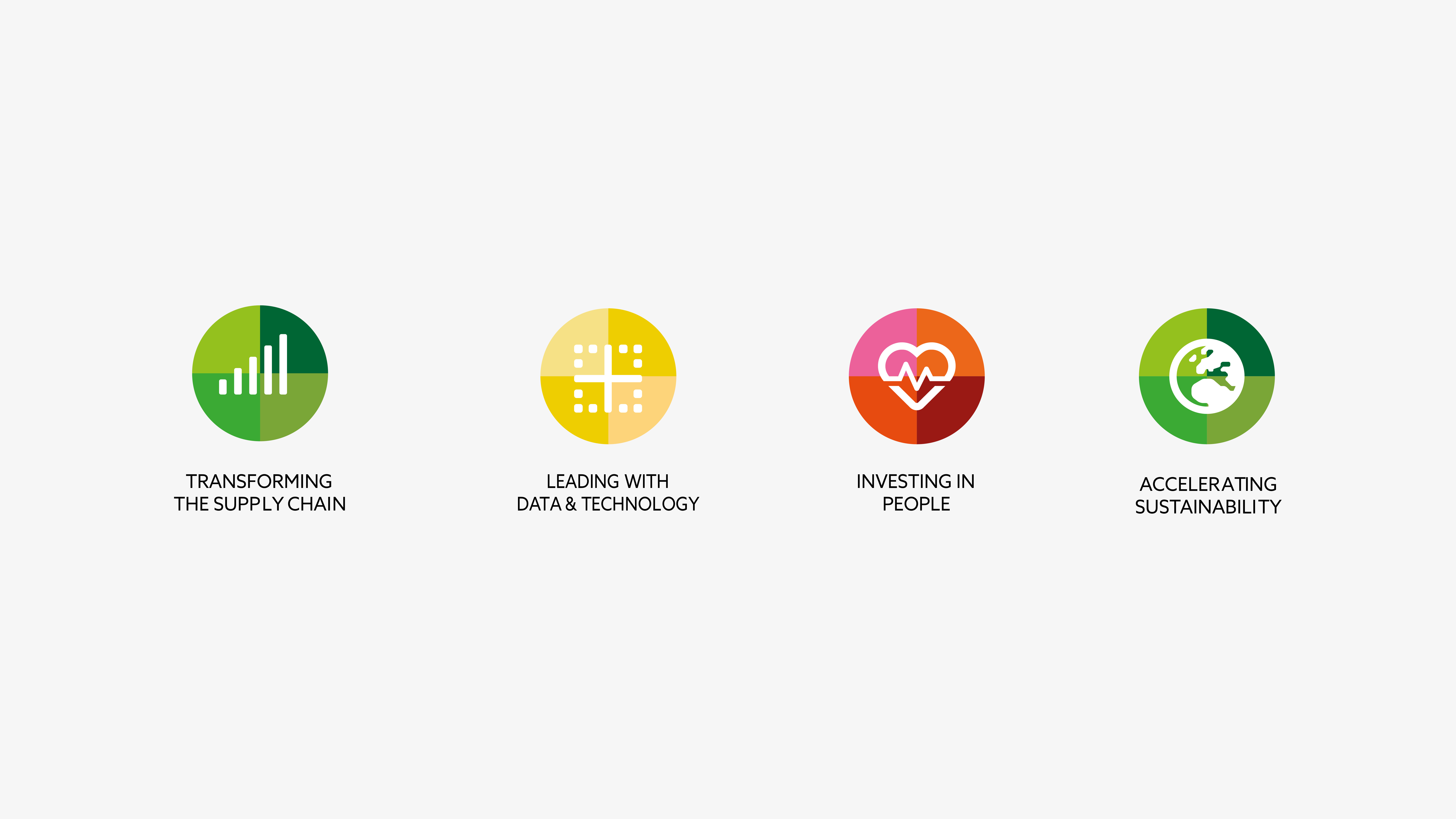 , Alt-Tag:
One Flora Group Visual Identity
, Alt-Tag:
One Flora Group Visual Identity - Type:
Image , Media Test :
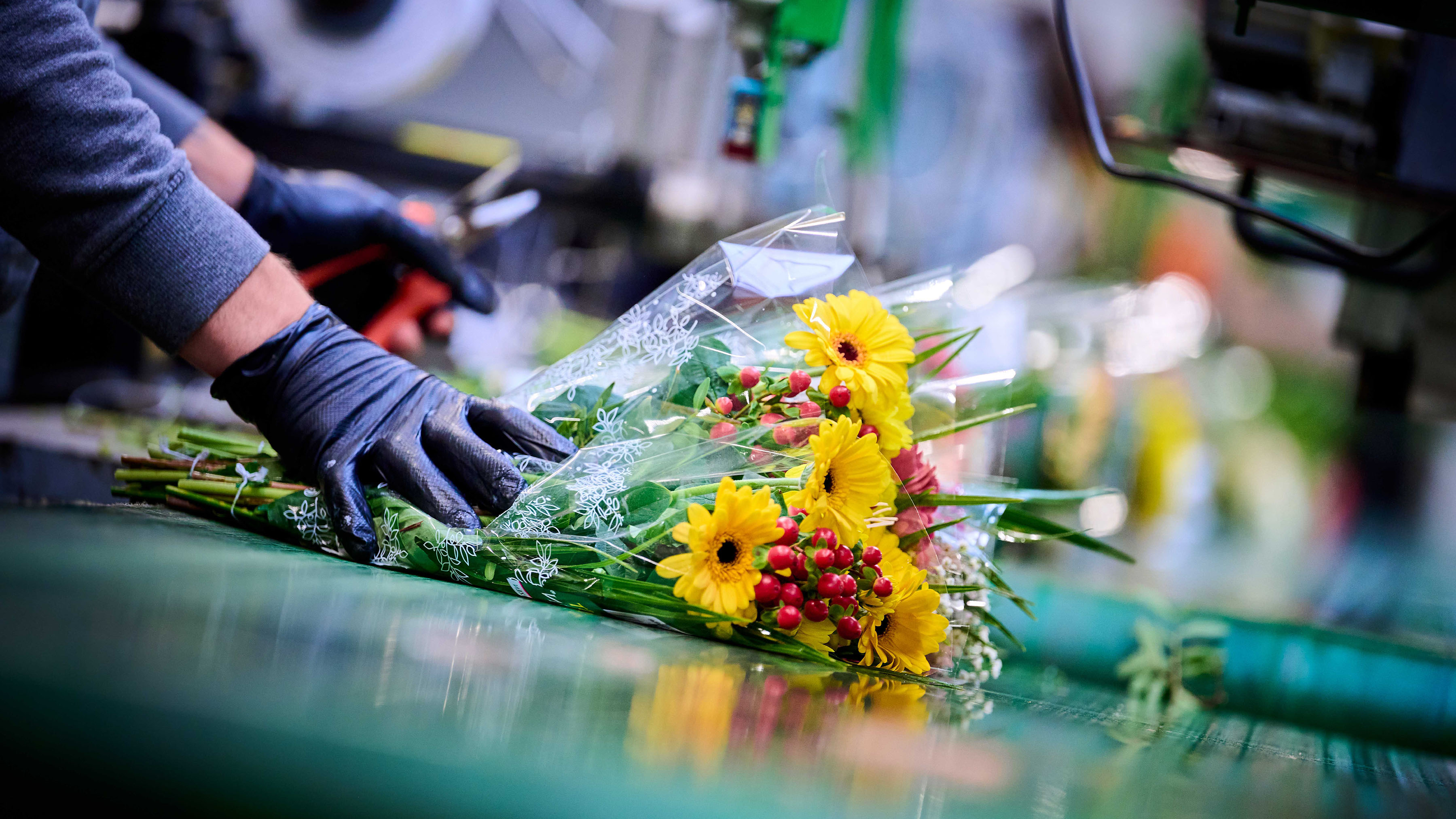 , Alt-Tag:
One Flora Group Photography
, Alt-Tag:
One Flora Group Photography - Type:
Image , Media Test :
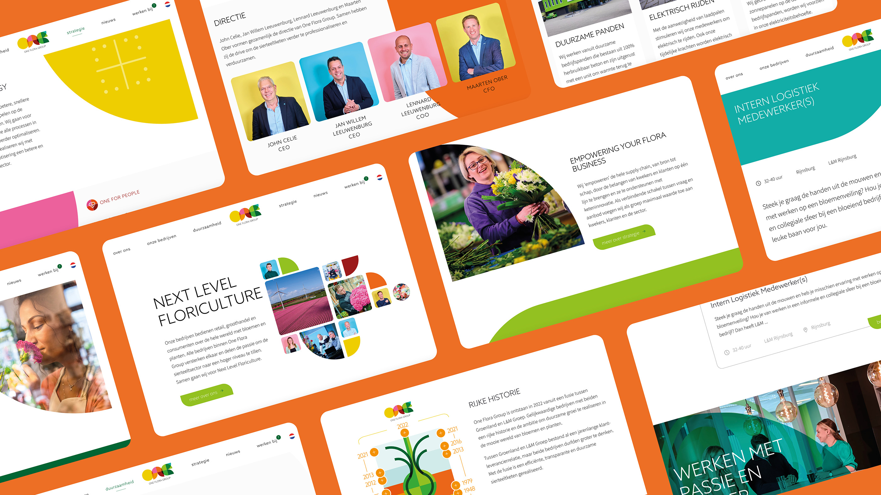 , Alt-Tag:
One Flora Group Website
, Alt-Tag:
One Flora Group Website - Type:
Image , Media Test :
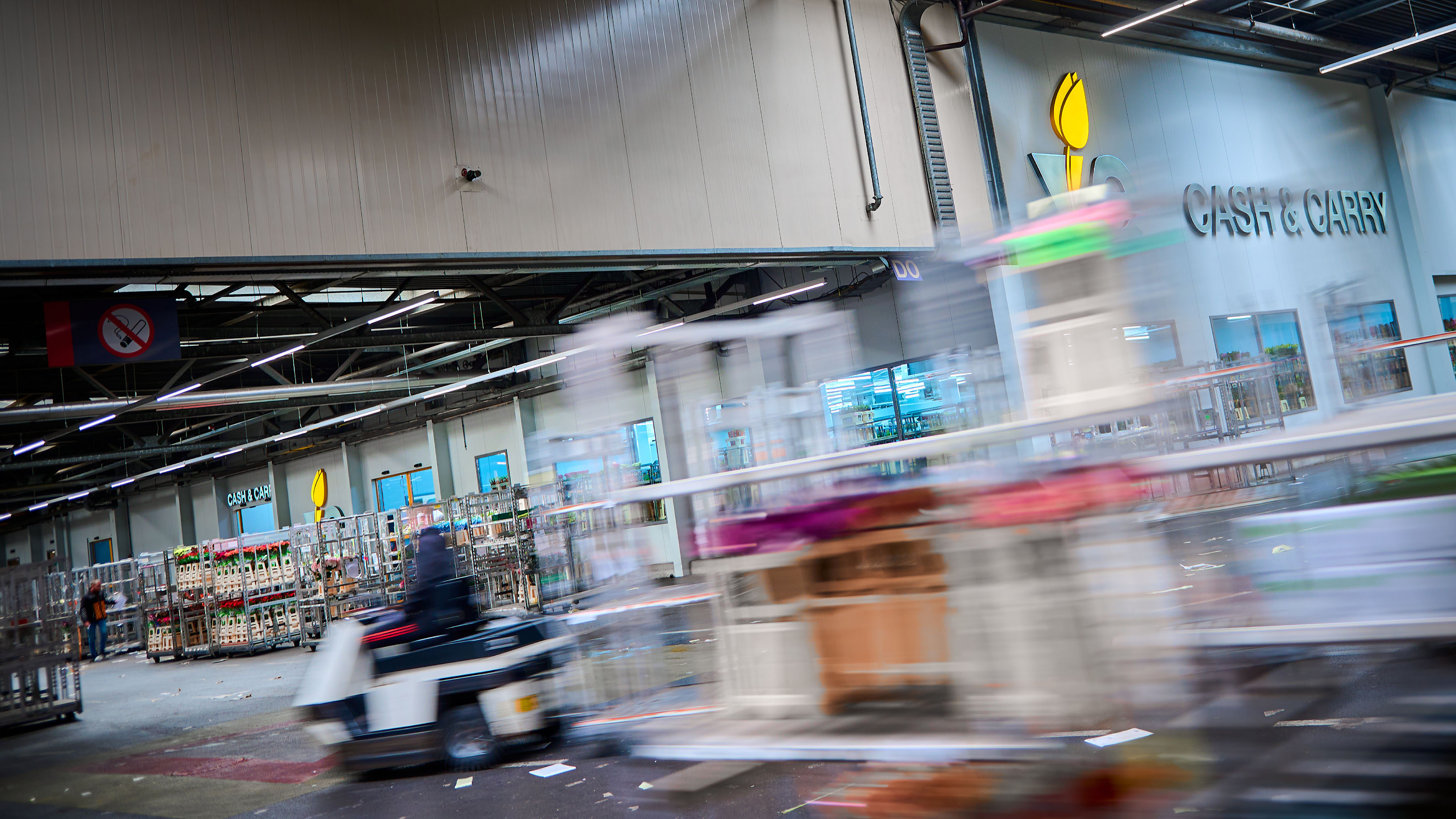 , Alt-Tag:
One Flora Group Photography
, Alt-Tag:
One Flora Group Photography - Type:
Image , Media Test :
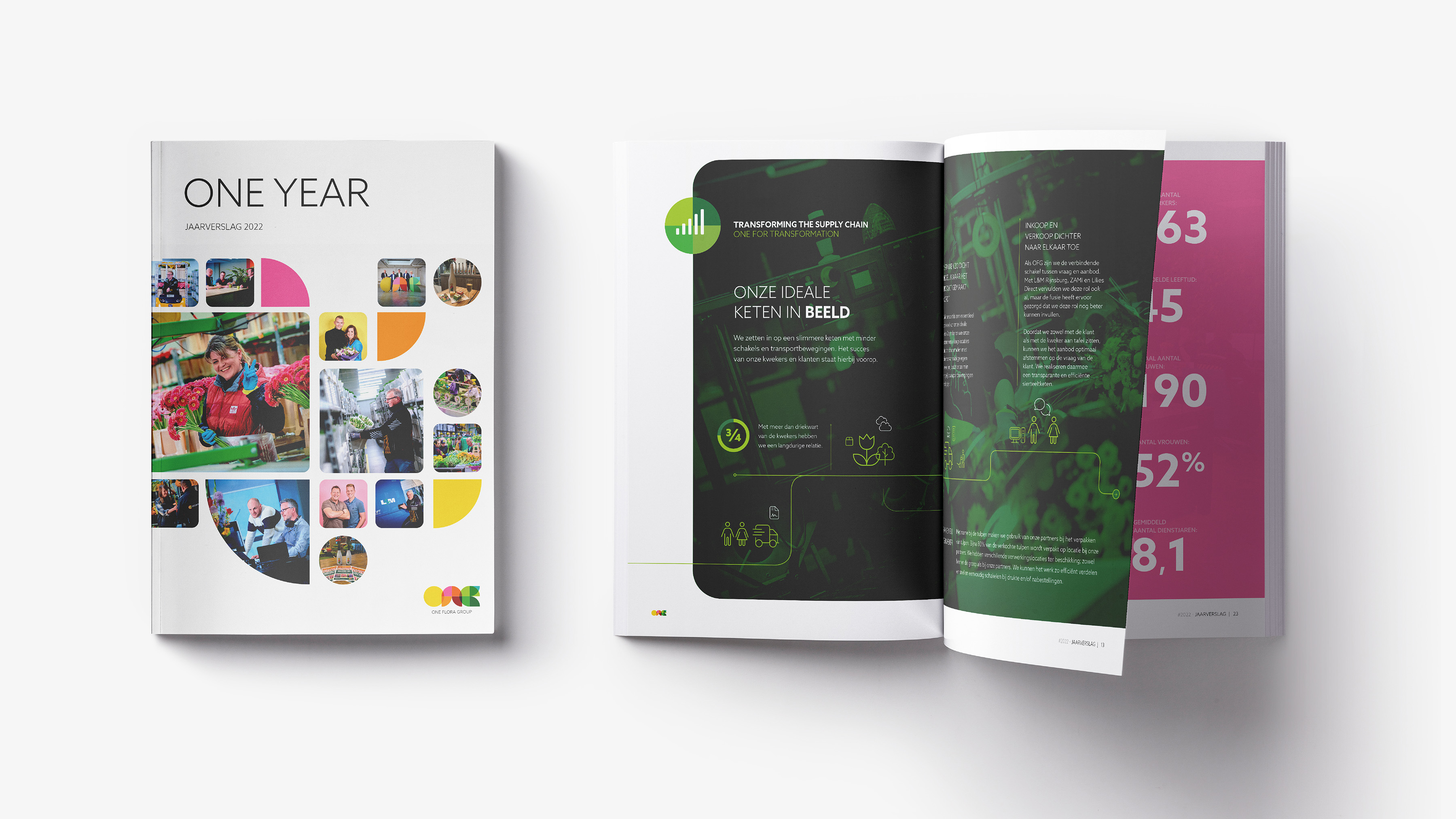 , Alt-Tag:
One Flora Group Visual Identity
, Alt-Tag:
One Flora Group Visual Identity - Type:
Image , Media Test :
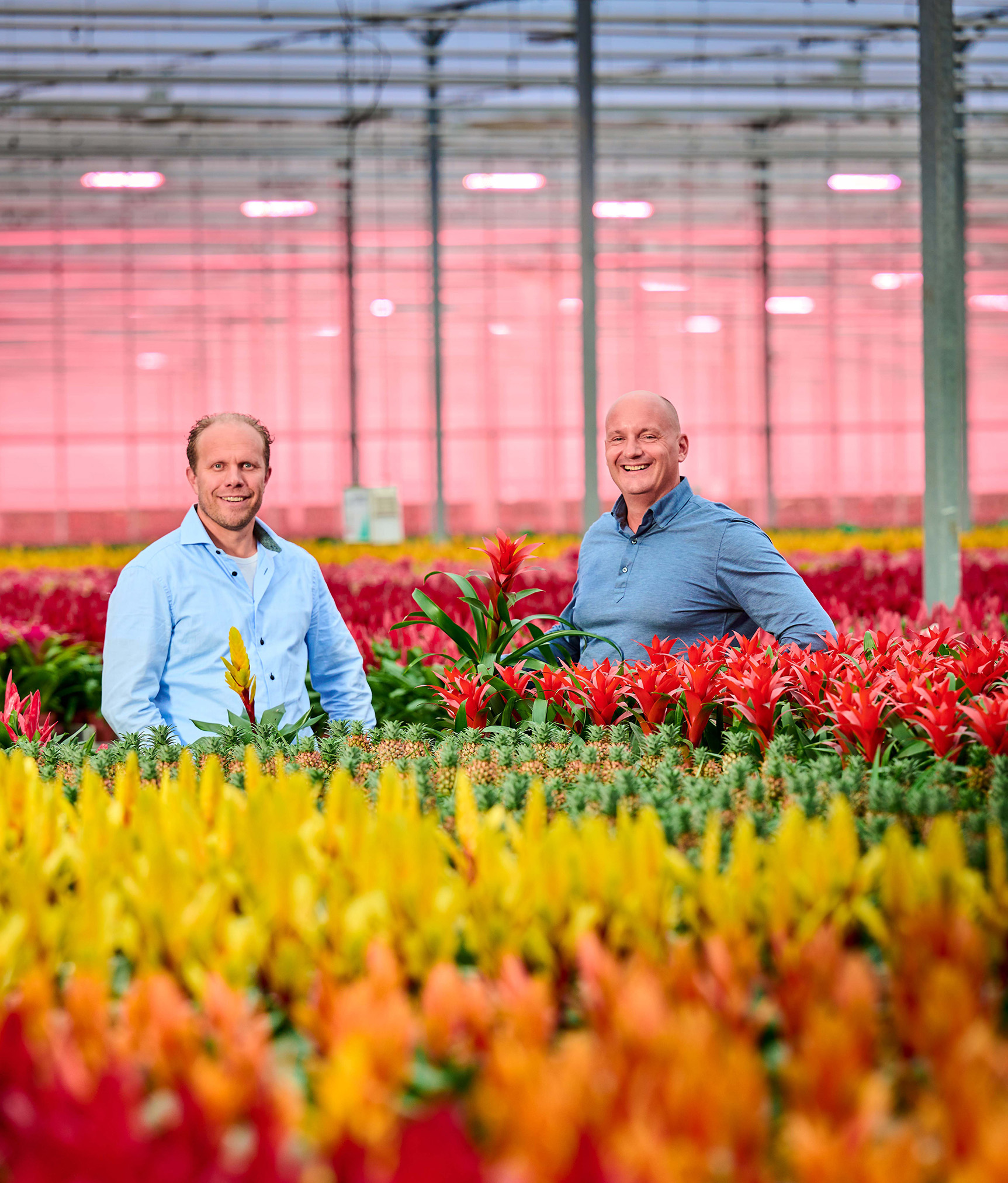 , Alt-Tag:
One Flora Group Photography
, Alt-Tag:
One Flora Group Photography - Type:
Image , Media Test :
 , Alt-Tag:
One Flora Group Photography
, Alt-Tag:
One Flora Group Photography - Type:
Image , Media Test :
 , Alt-Tag:
One Flora Group Photography
, Alt-Tag:
One Flora Group Photography - Type:
Image , Media Test :
 , Alt-Tag:
One Flora Group Photography
, Alt-Tag:
One Flora Group Photography - Type:
Image , Media Test :
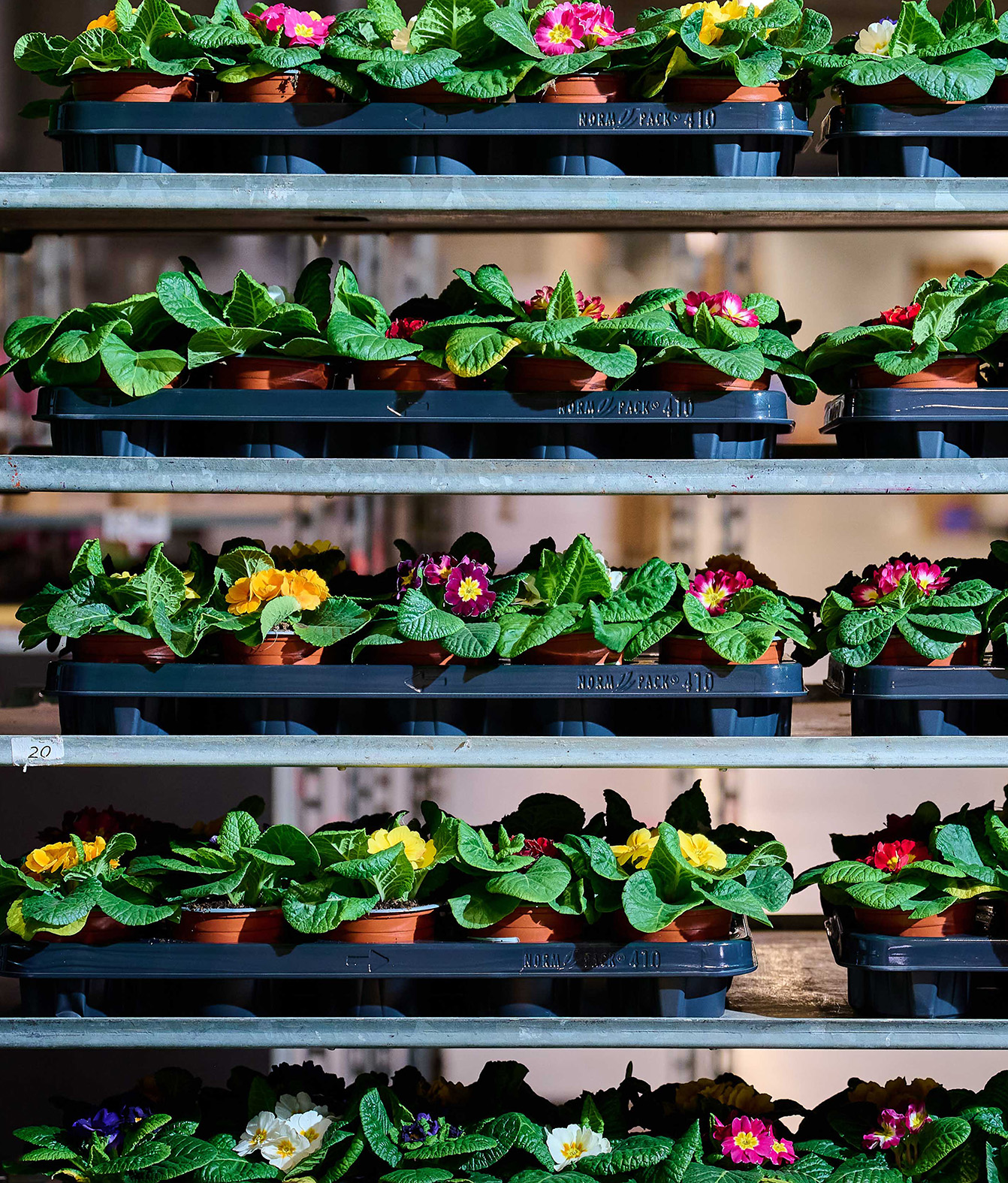 , Alt-Tag:
One Flora Group Photography
, Alt-Tag:
One Flora Group Photography - Type:
Image , Media Test :
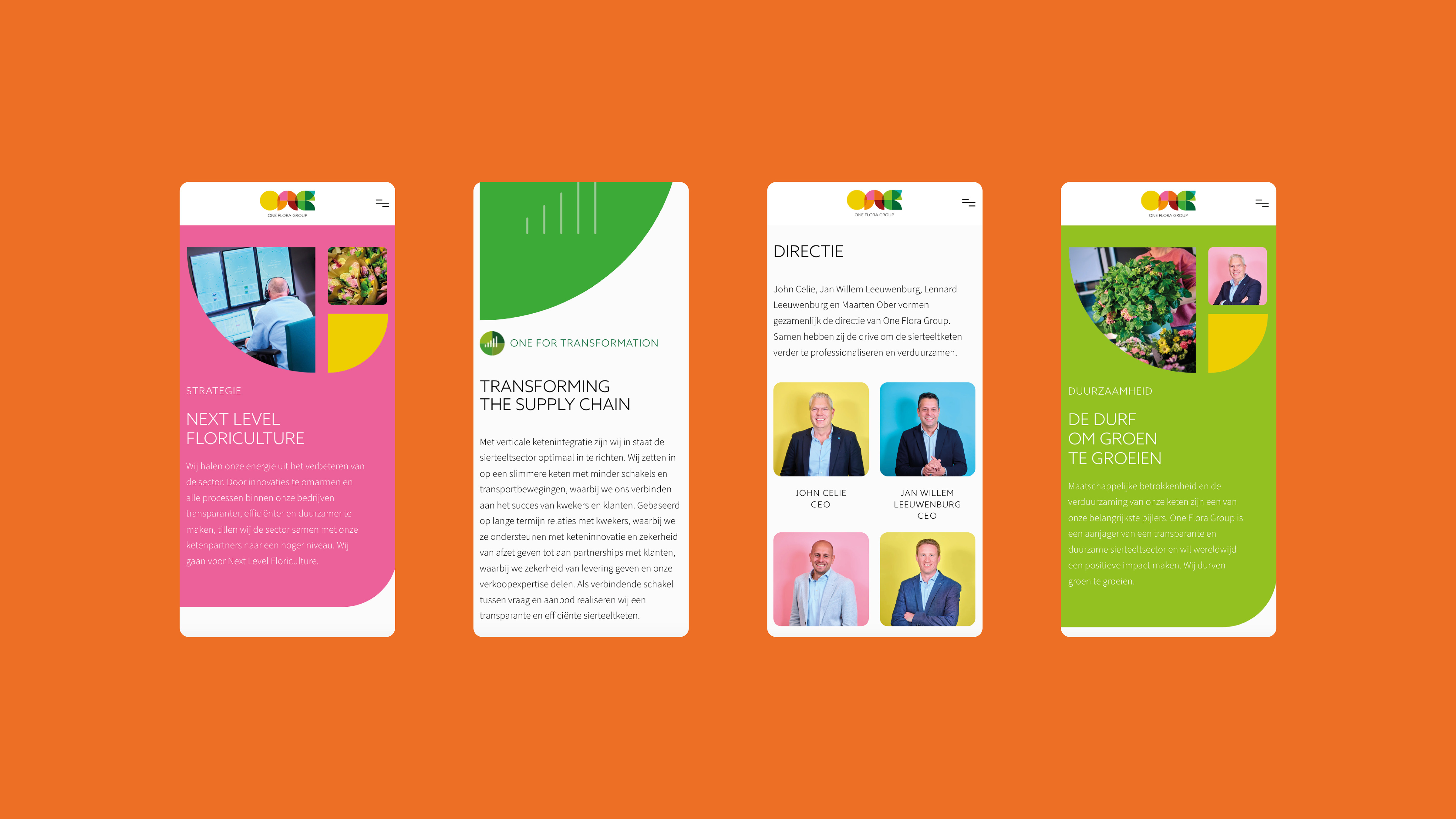 , Alt-Tag:
One Flora Group Website
, Alt-Tag:
One Flora Group Website - Type:
Image , Media Test :
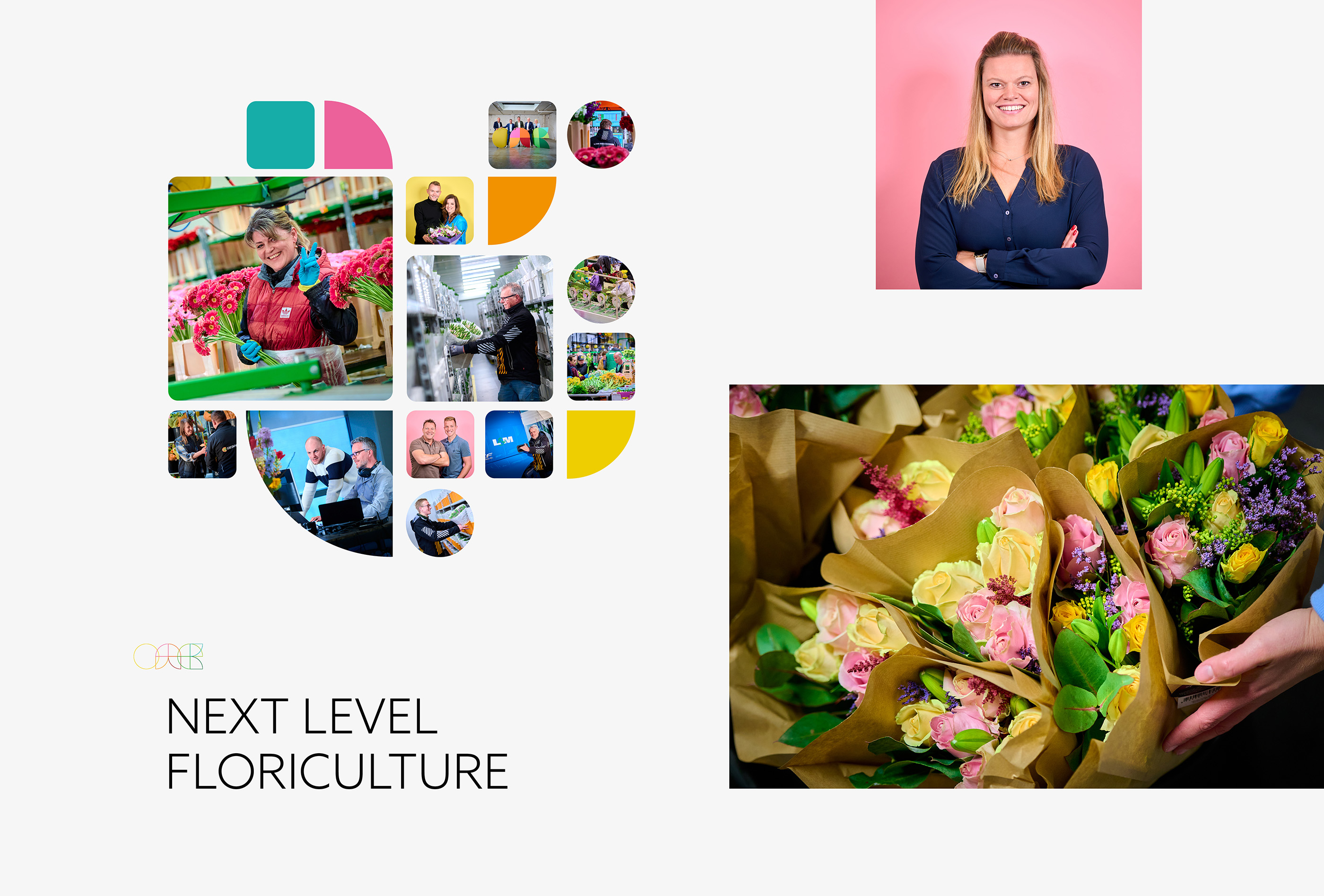 , Alt-Tag:
One Flora Group Visual Identity
, Alt-Tag:
One Flora Group Visual Identity
- Cases Logo - Diap:

- Headline subtitle:
merger between two major players in the floriculture sector
- Sectors list:
agriculture and horticulture
- Headline Introduction:
If two of the largest players in the floriculture sector merge, crystal clear communication from a strong brand foundation is an important success factor. There is only one time to announce the merger and to introduce the new organization. As a strategic and creative partner, together with Greenland and L&M Group, we have given their new organization One Flora Group a face and made them publicly.
- Brand Essential List:
Brand positioning, Brand identity , Website
- Approach:
With the management and marketing team of Greenland and L&M Group we have examined their organization. We have placed the identity and playing field of both companies side by side and jointly determined the positioning for One Flora Group.
full brand Fund
The new positioning of the group was then translated into a suitable brand identity and website and an effective content plan. Together with One Flora Group we have built up their entire brand foundation. From determining the new brand name and designing the logo to the realization of a new website and the introduction of One Flora Group in the Markt.
- Result:
One Flora Group is positioned as the future -proof organization in the ornamental sector. The brand exudes 'Next Level Floriculture', which is also the appropriate pay-off of the new group. With the realized brand foundation, we have made it clear for all target groups how One Flora Group as a connecting link between supply and demand realizes an efficient, sustainable and tran contact us ante ornamental cultivation chain. Together with One Flora Group we have realized a brand foundation that fits one of the largest floriculture groups in the world. We are extremely proud of the collaboration and the successful launch of One Flora Group .
- Logo:
- Quote:
"Together with Vandeez we really put down something beautiful. Our new group launched is, just like our new group: 'Next Level'."
- Quote - Customer Name and Function:
Jan Willem Leeuwenburg - CEO
- Quote image:

- About customer:
About One Flora Group
- About customer information:
One Flora Group is one of the largest floriculture groups in the world. The companies of One Flora Group connect supply and demand by optimally aligning the range of breeders to the wishes of customers. As a group they serve the entire market efficiently and directly from the source. Together with their employees, companies, growers, customers and partners, One Flora Group sustainable growth in the beautiful world of flowers and plants.
Merger between two major players in the floriculture sector
- Product Category:
Website, Brand activation
- Slideshow:
- Type:
Image , Media Test:
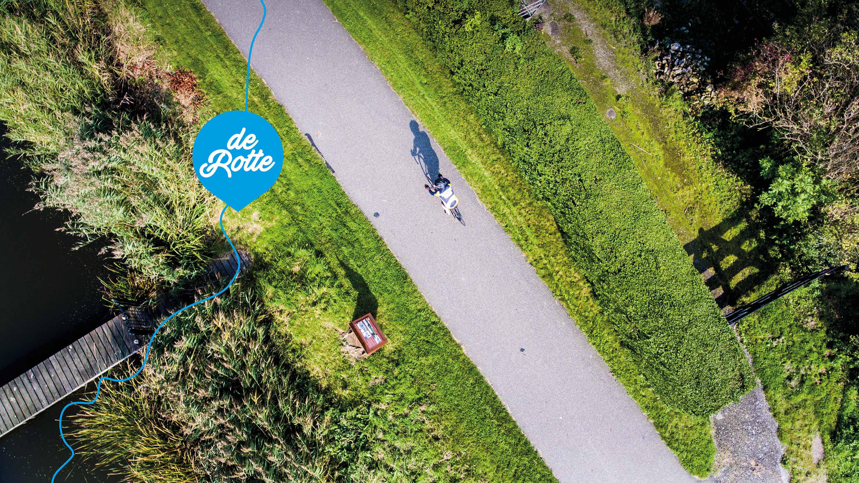
- Type:
Image , Media Test:
- Type:
Video , Media Test:
vandeez -Case-Rotte-2024-Slider-Mobile video.mp4
- Type:
Image , Media Test:
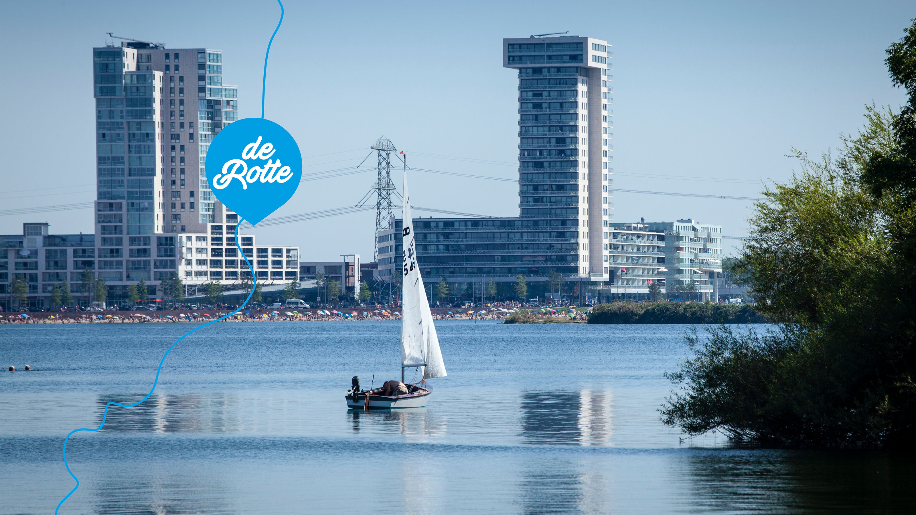
- Type:
Image , Media Test:
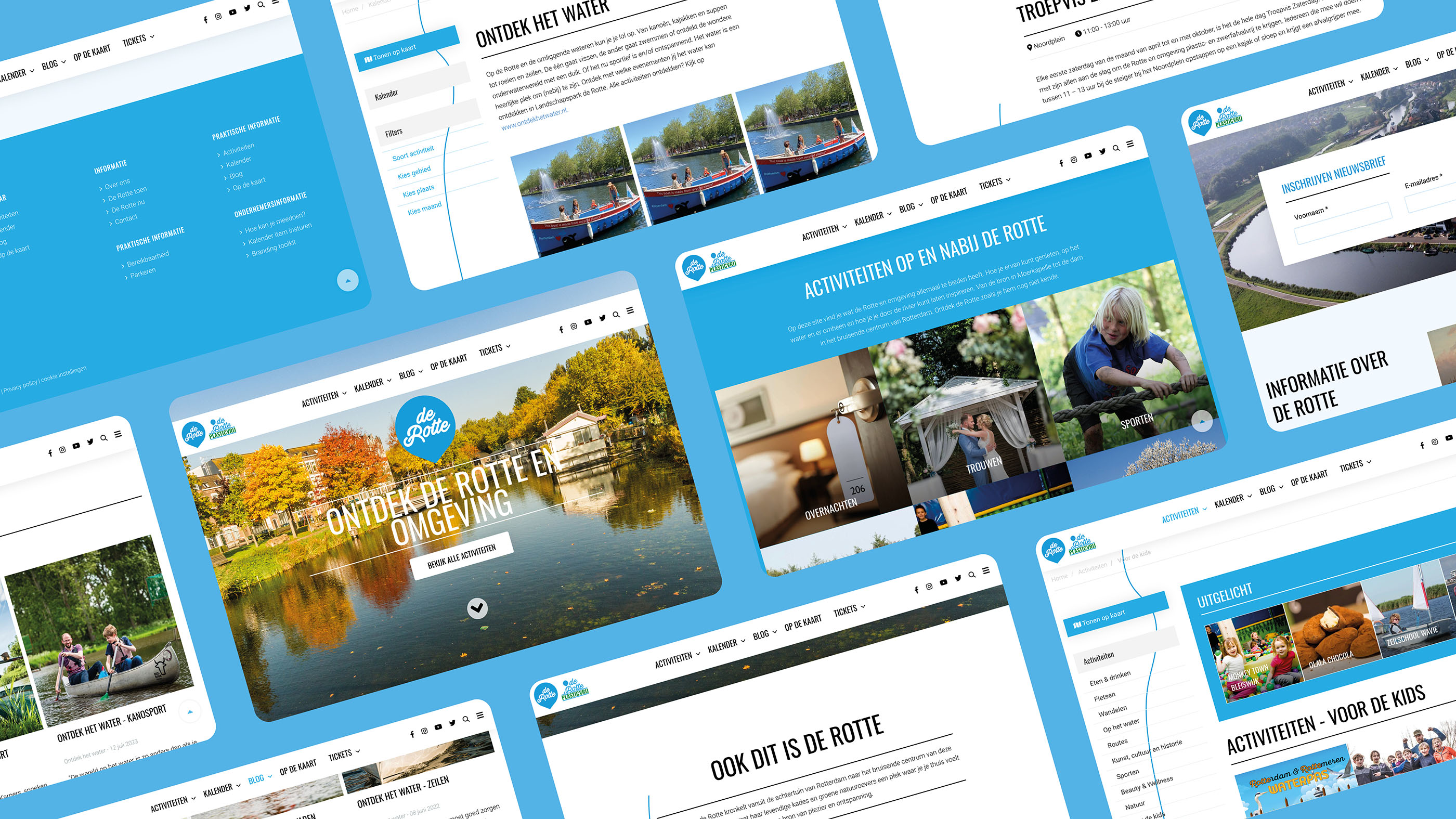
- Type:
Image , Media Test:
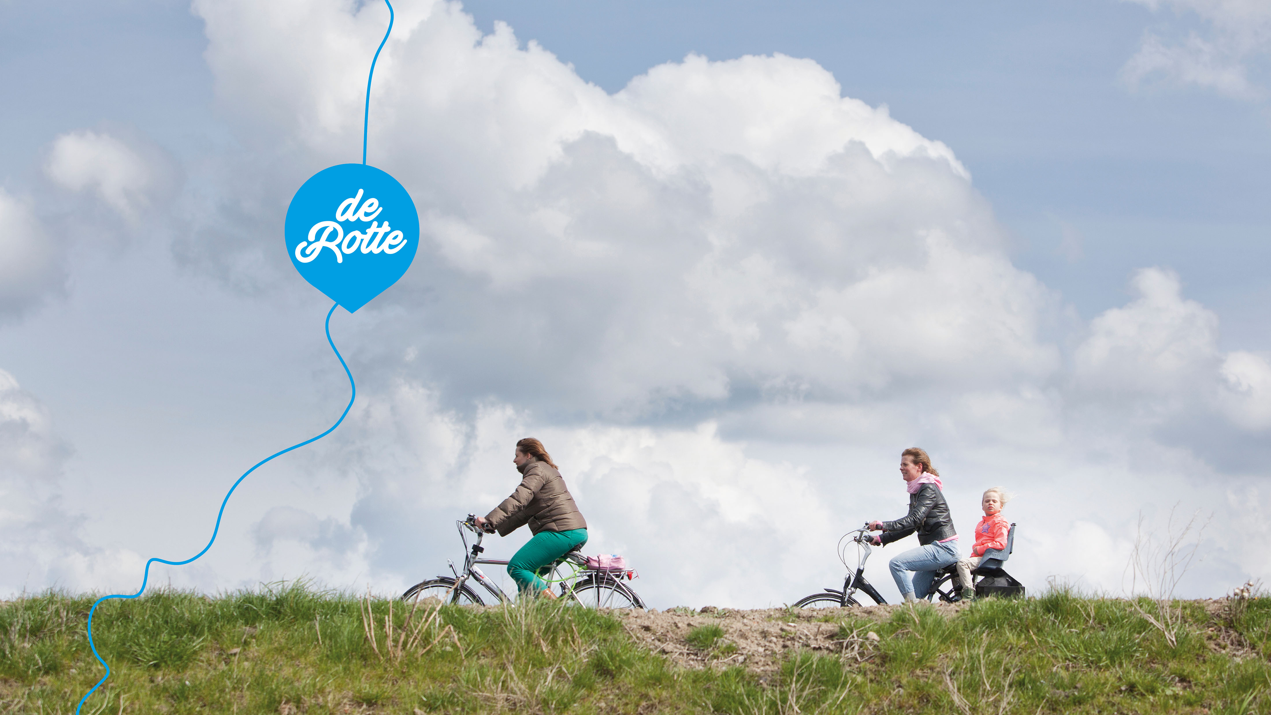
- Type:
Image , Media Test:
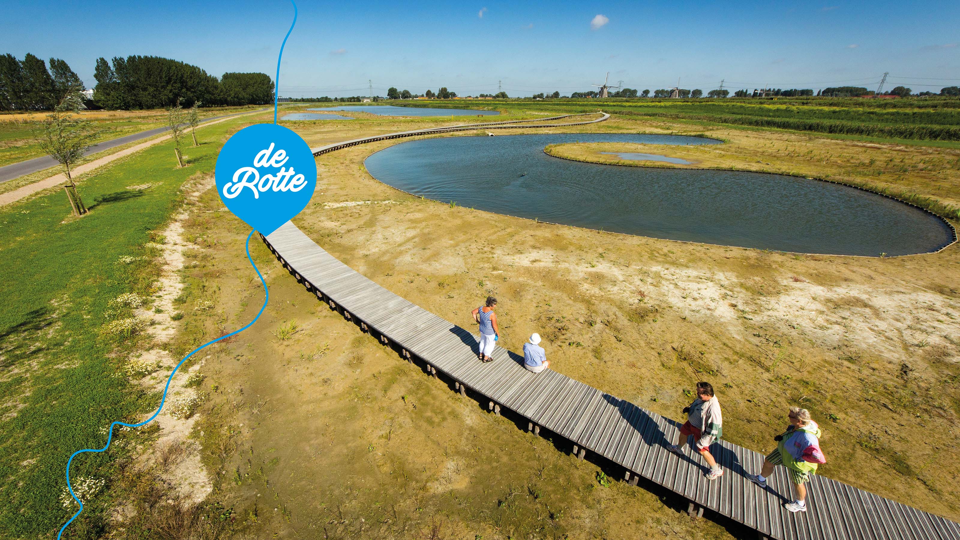
- Type:
Image , Media Test:
- Type:
Image , Media Test:
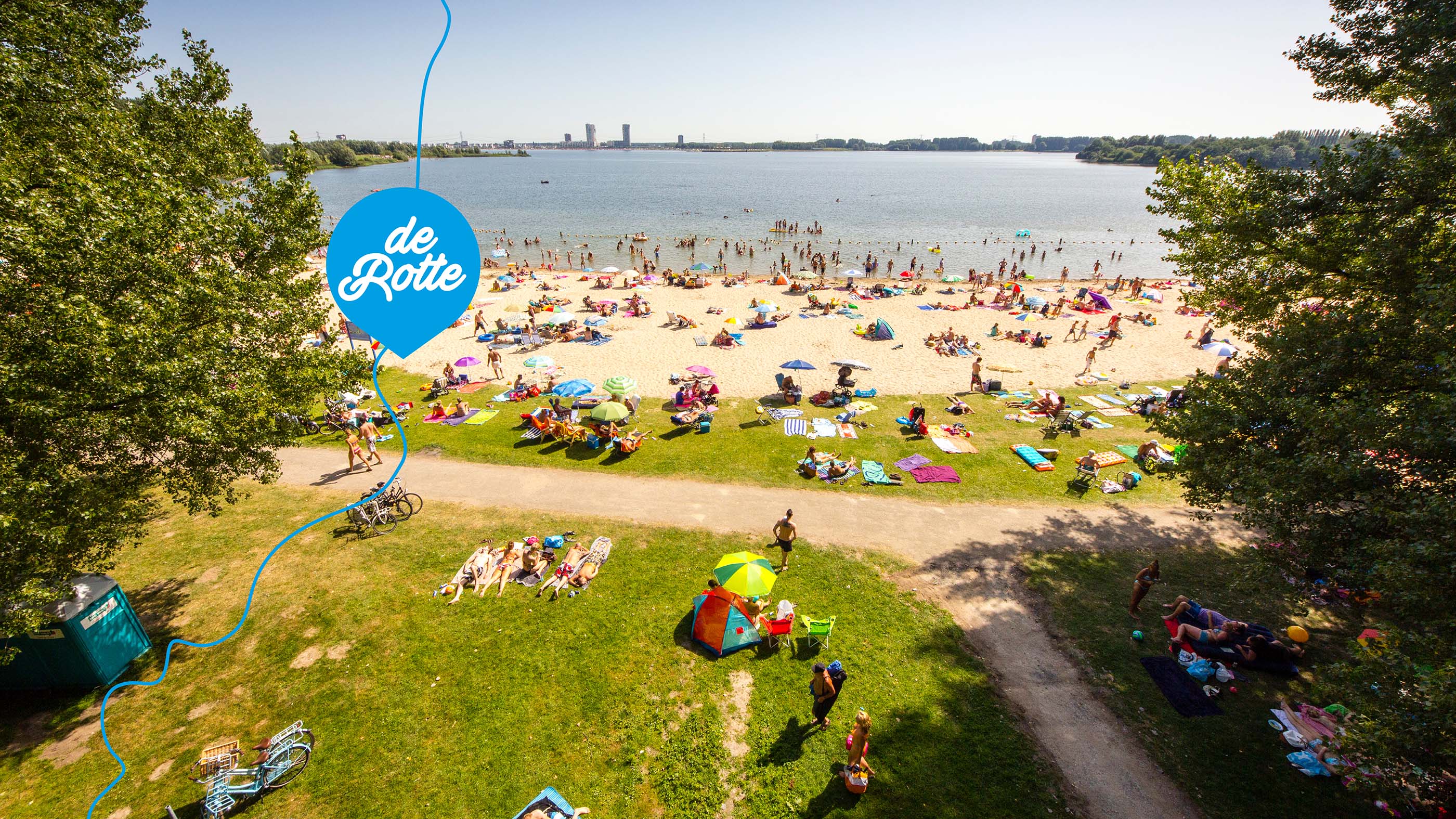
- Type:
Image , Media Test:
- Type:
Image , Media Test:
- Type:
Image , Media Test:
- Type:
Image , Media Test:
- Type:
Image , Media Test:
- Type:
Image , Media Test:
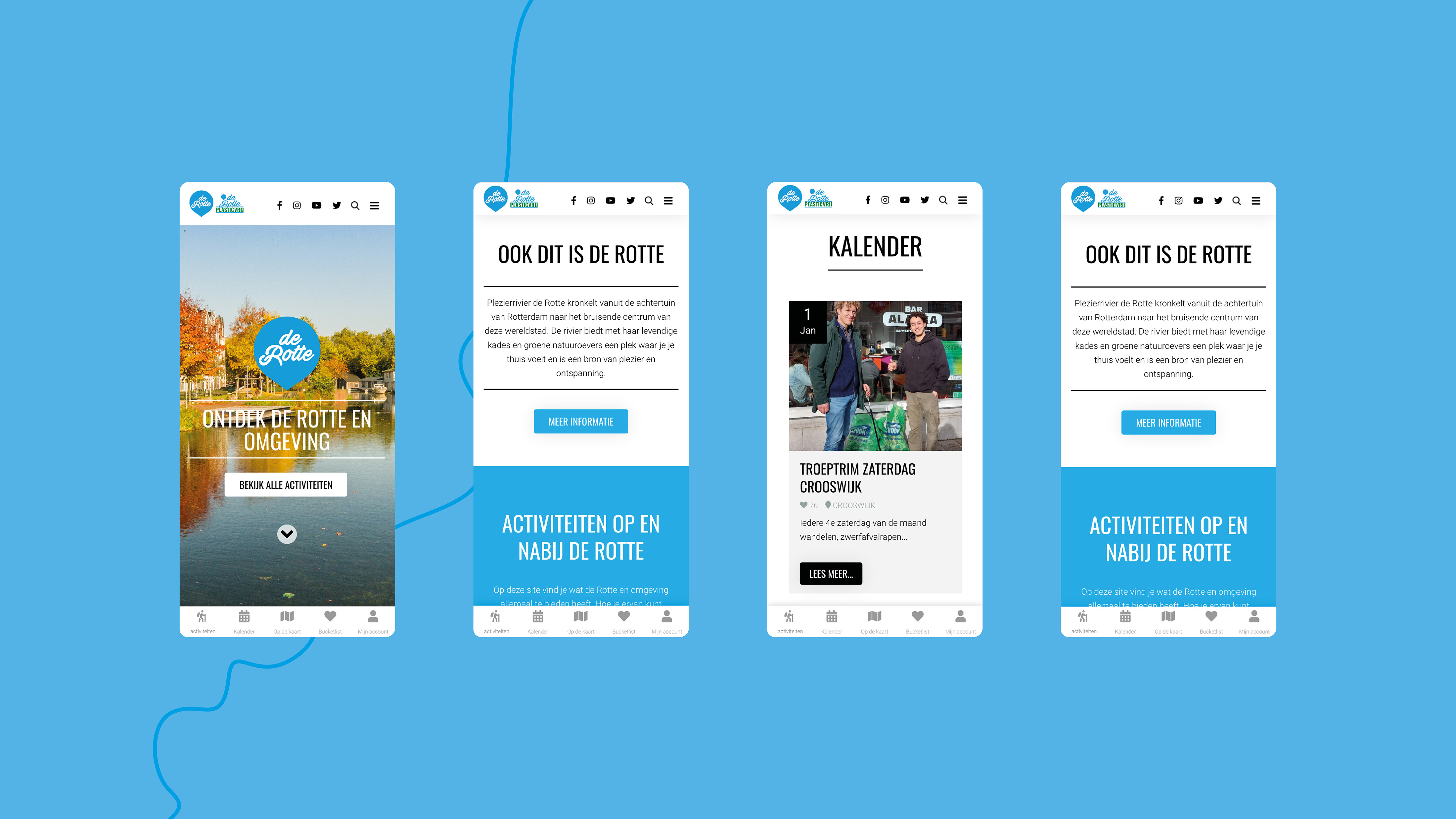
- Type:
Image , Media Test:
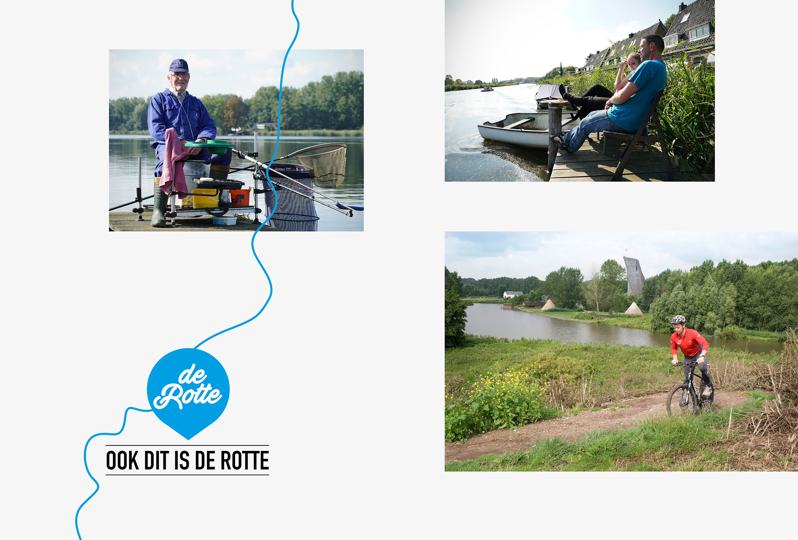
- Cases Logo - Diap:

- Headline subtitle:
Fame of the nature reserve around the River Rotte enlarge
- Sectors list:
Non-profit
- Headline Introduction:
Rottemeren recreation board (Staatsbosbeheer), the municipality of Rotterdam, pleasure river De Rotte and entrepreneurial association De Rottemeren want to make the beautiful nature reserve around the River Rotte even more attractive for visitors. As part of the marketing communication strategy aimed at increasing the awareness of the area, we have created a new website. A place where entrepreneurs in the area can showcase their business and associated activities.
- Brand Essential List:
Brand activation
- Approach:
With the development of the new website also ditrisderotte.nl we started with a functional design. This design was further developed in technology after approval. There was an interim test of the website with a user panel to further optimize the user-friendly nest.
user-friendly e website
During the development of also ditrisderotte.nl, various customized components, including a Google Maps API coupling. With this link we can generate real -time locations on the Google card. The CMS of the site is user-friendly set up, so our client can manage everything in one place.
- Result:
The website alsoditisderotte.nl is the One-Stop website where people can (re) discover the Rotte as a source of pleasure and relaxation. From activities to events, everything is clearly displayed on the website in an interactive map to find and plan nice outings easily and quickly. A project in which we are constantly developing in the field of technology and user-friendly .
Custom components
In the meantime, the website has been expanded with even more customized components such as a bucket list to be put together and the possibility to order tickets directly. In this way both entrepreneurs and the visitors experience even more pleasure at De Rotte.
- Logo:
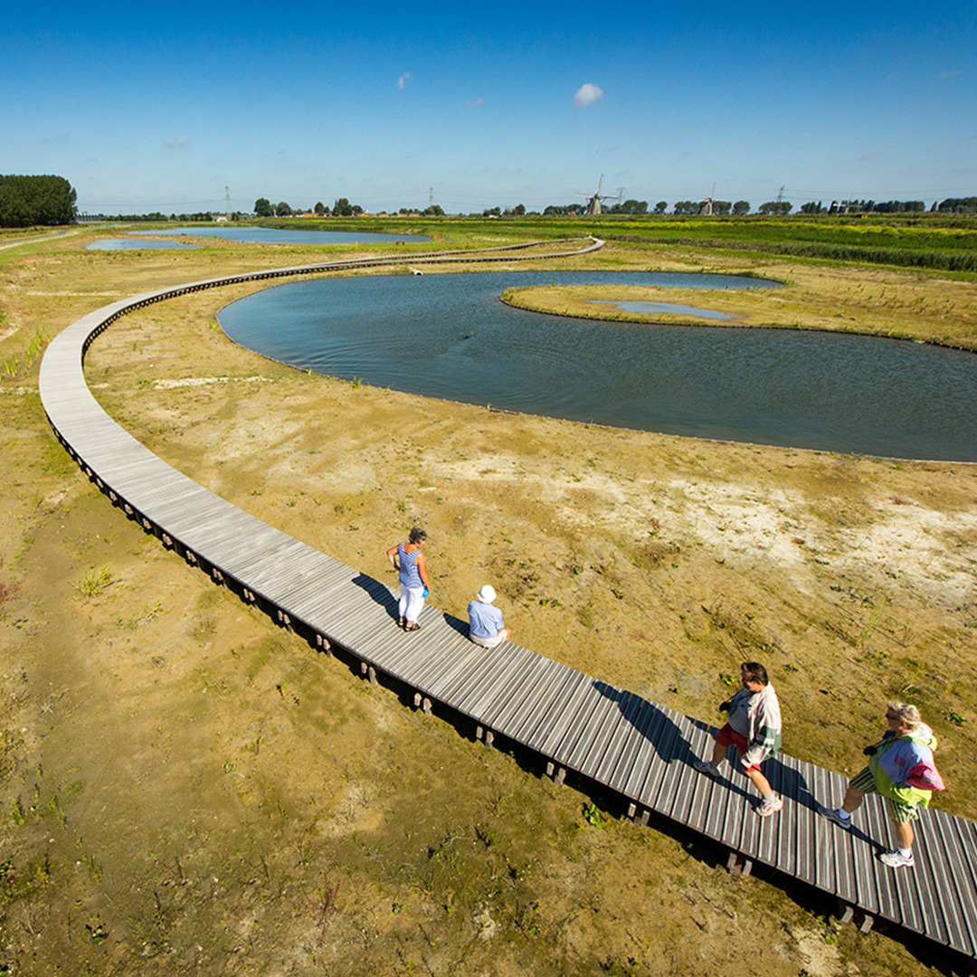
- About customer:
about Ook dit is de Rotte
- About customer information:
Also ditrisderotte.nl is a collaboration between Recreatieschap Rottemeren, municipality of Rotterdam, entrepreneurial association Rottemeren and Stichting Gezelrivier De Rotte. Together with various parties from the area, the development of a marketing communication strategy started to bring the rotten and environment to the attention of residents and visitors. This resulted in Ook dit is de Rotte and we are also the rotten. On the website also ditrisderotte.nl you will find what the rotten and surroundings have to offer. How you can enjoy it, on the water and around it and how you can be inspired by the river. From the source in Moerkapelle to Dam Square in the bustling center of Rotterdam. Discover the rotten as you didn't know him yet.
Familiarity of the nature reserve around the River Rotte enlarge